When type turned cursive: the culture of typography
As you read this sentence you can probably identify what typeface this is without much hesitation.
You may have come across this right sloped lettering while reading an important passage in a novel or an important word, or maybe you’ve typed up words yourself in italics to add emphasis on what you’re saying. Though it might seem odd to come across a book written completely in italics today, it was quite common centuries ago.
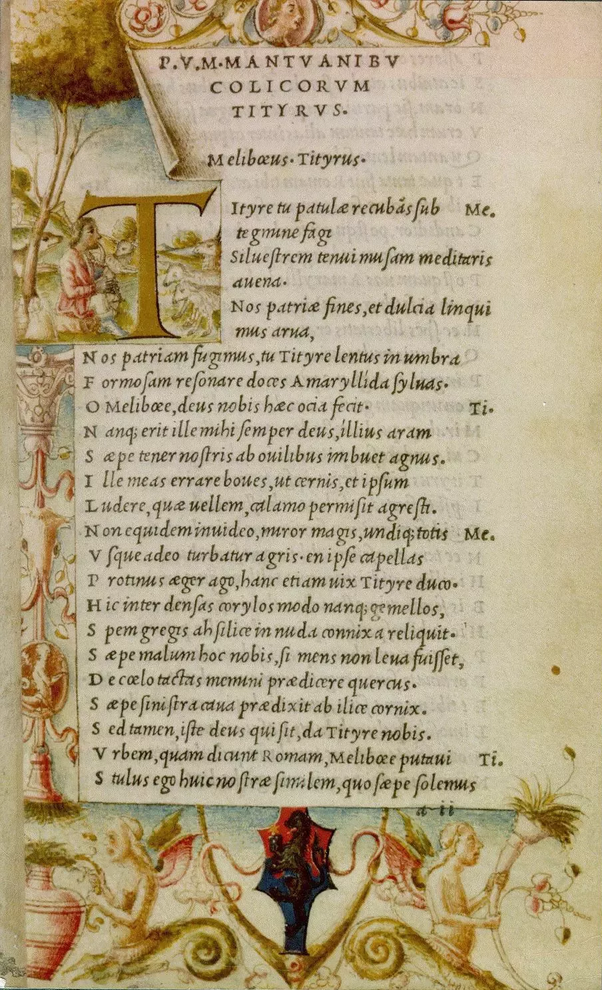
In fact, this cursive font based on a stylized form of calligraphic handwriting has been around since the 1500s. Back in the day it was referred to as Aldine italic and was first used in a complete volume in a series of small pocketbooks by Virgil (the Ancient Roman poet), first published in 1501. Aldus Manutius was the founder of the Aldine press and designer of the Italic font. Francesco Griffo also cut for Aldus the first italic type (Italic 1). With quite narrow letters inclined towards the right Chancery, the italic script was efficient and popular among humanists and chanceries.
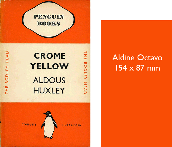
This image is a useful depiction of just how small Aldus’ octavo editions were.
The typeface was fitting for these pocketbooks as it provided more room to fit text than the typical roman type due to its narrow proportions, and retained its clarity better at smaller sizes.
The first sight of the slant.
Before the italic typeface was seen in books it made a small earlier appearance as five words in the woodcut in this 1500 edition of the letters of St. Catherine of Siena.
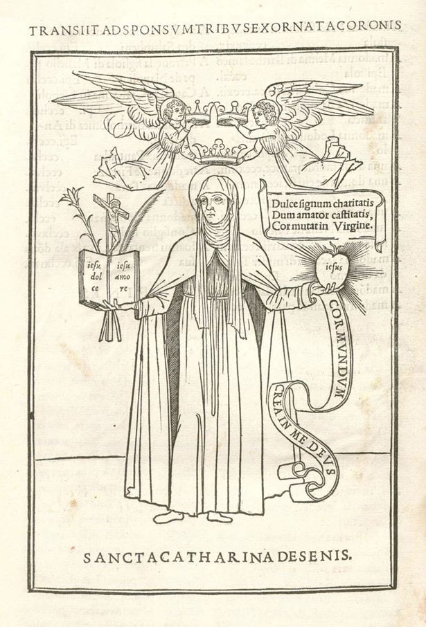
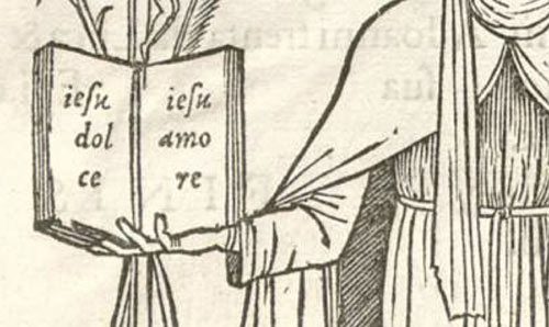
It was set within a beautiful woodcut illustration of St. Catherine. Looking closer you can see the italic appears printed across the open book and heart in either hand.

The italic type was revolutionary in the printing industry especially at this time when books were larger in size and costly which catered to the wealthy. Its smaller typesetting also allowed for printing smaller books which meant lowering prices, increasing their production, and an added bonus of portability.
The choice of using italic type, rather than the roman type in general use at the time, was suggestive of informality in editions designed for leisure reading and more accurately replicated handwritten manuscripts. Though used for some of the same purposes today, italic is used mostly to highlight text and implies a change of intonation when reading. The appearance of the italic typeface reminiscent of handwriting seems to be more personal and confiding, than direct “printed” letters; and it ultimately allowed writers to enhance their written form of emotion and expression.
Sources:
https://enacademic.com/dic.nsf/enwiki/164024 https://en.wikipedia.org/wiki/Italic_type#History https://www.nytimes.com/2015/02/27/arts/design/a-grolier-club-tribute-to-the-printer-aldus-manutius.html https://ilovetypography.com/2014/11/25/notes-first-italic/