Peter Behrens typography and architectural influence

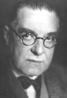
The first appearance of san serif in body text was created by the fellow Peter Behrens. He was a German artist, architect, and designer and had a great influence on architecture and typography. As an early advocate of sans-serif typography, he applied a grid system to structure space in his design layouts.

Behrens poster for the Anchor Linoleum exhibition pavilion, 1906, J.L. Lauwerik’s grid theory is applied 
Anchor Linoleum exhibition Pavillion, 1906. Classical forms and proportions are combined w/ mathematically derived geometric structure and pattern.
Behrens played a vital role in the transition from 19th-century decorative art to the functional and geometric forms of the first half of the 20th Century. He helped to develop a philosophy of Neue Sachlichkeit (“New Objectivity”) in design, which emphasized technology, manufacturing processes, and function, with style related to purpose.

Behrens is best known for his AEG working Germany between 1907 and 1914, the first example of a coordinated corporate identity of which he successfully co-ordinated all activities from architecture to the design of electrical appliances. Architecture was not only Behrens’s main vocation, after WW1 he concentrated on designing buildings and industrial design. However, in the late 19th century he was at the forefront of Jugendstil, the German equivalent of Art Nouveau, leading him into the field of Buchkunst (book art/ decoration) and type design.

Timeline in his career
In 1906 Peter Behrens received his first commission from AEG (Allgemeine Elektricitäts-Gesellschaft) to design advertising material. He was hired as an artistic consultant to work on a wide range of projects. In 1908-09 Behrens designed the AEG Turbinenhalle in Berlin, a concrete, steel and glass factory building with an outspoken agenda.
In 1890 he was not practicing as an architect but as a painter and graphic designer.
Sans-serif first used for body text in 1900

Take a look at the first use of sans-serif type as running book text.
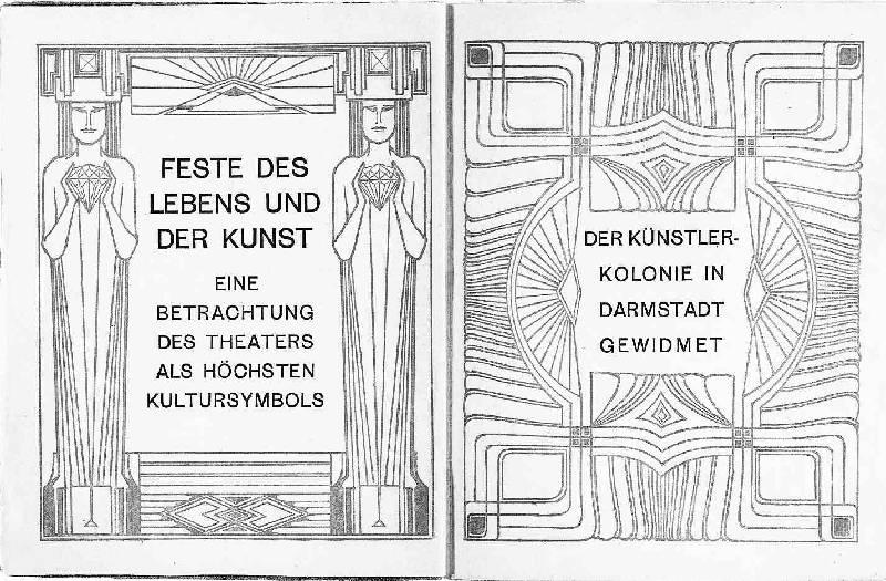
Behrens sought typographic reform and was one of the earliest advocates of sans-serif typography. German typographic historian Hans Loubier believed his booklet Celebration of Life and Art: A Consideration of the Theater as the Highest Symbol of a Culture may represent the first use of sans-serif type as running book text. In his book ”Feste des Lebens and der kunst” he describes typography as:
-Peter Behrens
“watching a bird’s flight or the gallop of a horse. Both seem graceful and pleasing, but the viewer does not observe details of their form or movement. Only the rhythm of the lines is seen by the viewer, and the same is true of a typeface.”
Behrens was a true universal designer of the 20th century with a unique quality to his work. He had a long career, designing objects, typefaces, and important buildings in a range of styles that still live on to this day.

Works Cited:
http://www.jstor.org/stable/1315850