Calson Egyptian
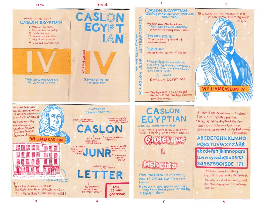
For my zine, I wanted to create a clean and informative layout to highlight the simplicity of Caslon Egyptian. I knew I wanted to research a san-serif font and I was drawn to the typeface for its modern look. I was also surprised to find it was not a widely known typeface and due to its unpopularity, there was not a large amount of information that I could choose from. But I found that helped in narrowing the 6 facts for my zine.
I added supplementary hand-drawn images to aid in telling the story but not too many images since I worked on a smaller scale. For colour, I chose to go for a neutral background for my spread to give a sort of vintage look, while also enhancing the writing in blue and red. Here is a small mood board I created with images I found during research.
As my first ever zine I am quite proud of what I created and I had a lot of fun in the process by using colour and incorporating textures. I especially liked the front page as I cut out the “IV” and had a textured yellow page of a vintage book that peeks through the letters.
Having said that I feel as though I did the project justice. Although did my best in making the composition look neat and aligned I think I could’ve made certain areas a bit more straight. I also think that implementing a more captivating story would’ve made the piece flow better. Overall, I would probably give myself an 8.5/10.
Works Cited:
https://fontsinuse.com/typefaces/41924/egyptian-caslon
https://www.behance.net/gallery/88145933/English-Egyptian-Revival-Typeface
https://worddisk.com/wiki/Sans-serif/ http://davethedesigner.net/kabk/palladiumcaslon.pdf