Categories
IDEA

Neoclassicism, Romanticism, & Rococo

 German landscape painter

Caspar David Friedrich

Caspar David Friedrich, Self-portrait, 1810, chalk on paper,) 

Born into a strict Lutheran family, Caspar David Friedrich was the sixth of ten children. He became familiar with tragedy at an early age, losing his mother when he was seven, and two sisters to childhood illnesses. But maybe the most impactful loss which is said to have influenced his piece, The Sea of Ice, was the tragic death of his brother Johann, who drowned while trying to rescue thirteen-year-old Friedrich when he slipped through the ice.


Caspar David Friedrich, The Sea of Ice. 1823–1824 Oil on canvas
German: Das Eismeer

At the age of twenty, Friedrich enrolled at the Copenhagen Academy and while studying the masters, he developed his lifelong interest in nature and landscape. But it was his interest of spiritual and mystical poetry that would serve to influence his later work and his role as one of the key artists of German Romanticism.

Although Friedrich did not directly gain from his masters styles of Danish Neoclassicism, he was able to create his own themes and techniques and revived an interest in German landscapes.

Contemplative Works

I am captivated by Friedrich’s serene landscape paintings in nature where every so often lies a human presence amid an expansive landscape. I admire his ability to accurately portray a mood through nature without a need for expressions in people’s presence. Seen in many of his paintings, he places characters facing outward into the landscapes which physically reminds us of human insignificance in relation to nature.
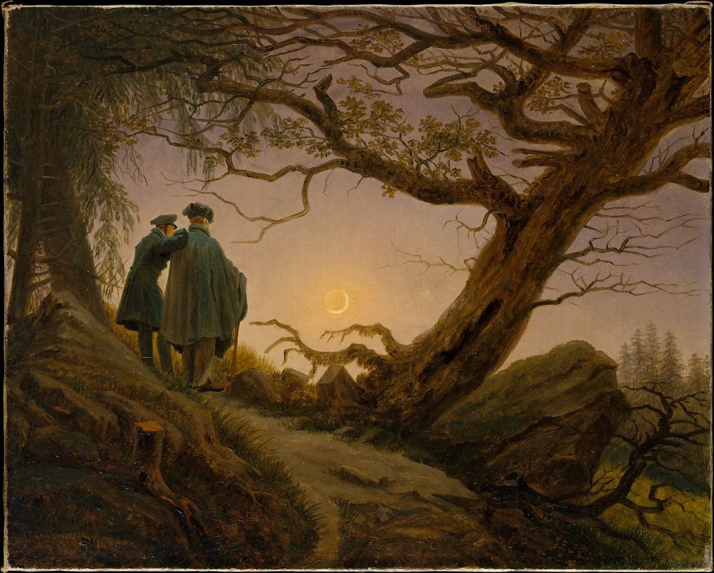
Two Men Contemplating the Moon  Metropolitan Museum of Art, c. 1825–30.

In this work two figures are seen from behind so that the viewer may participate in their communion with nature. Friedrich is seen to the right, with his friend and disciple August Heinrich (1794–1822). 
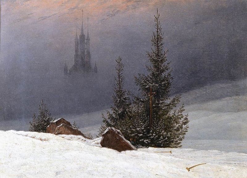
Winter Landscape with a Church (1811) by Caspar David Friedrich

This painting is more than a calm desolate winter scene. Look closer and you can see a man resting against one of the rocks. His hands are raised in prayer; a wooden cross pressed into the foliage of the tree is the apparent object of his meditation.

Controversy from Critics

His first major oil painting, The Cross in the Mountains (1807-08) (pictured left) commissioned as an altarpiece for a private chapel became controversial when Friedrich opened his studio to the public in 1808. Art critic Wilhelm von Ramdohr argued that a landscape like his could not function as an altarpiece. Critics disregarded the work for its beauty and were instead outraged that Christ’s crucifixion cross remained an afterthought to the landscape instead of the focal point it had been in traditional art.

In his response to critics he compared the sun-rays to the light of God saying the painting represented man’s continuous faith and hope in Jesus Christ still amidst the decline in formalized religion. Friedrich changed Christian art for the first time by infusing it with natures dominance. 

Friedrich encouraged his contemporaries to reconsider the genre of traditional religious or history painting

Hidden Political Statements

Friedrich is known to have made political statements in his painting, often coded in subtle ways. In this work the costume the figure wears was apparently worn by students and others during Germany’s Wars of Liberation. During the time of this painting, the clothing was forbidden by Germany’s new ruling government. By deliberately depicting the figure in this outfit, he made a visual, understated, stand against the current government.
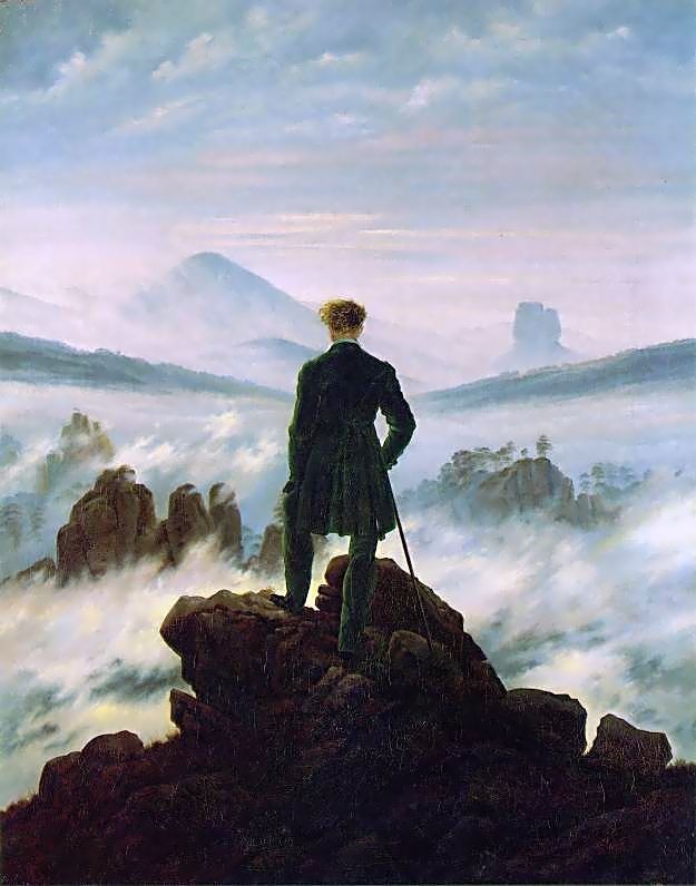
Wanderer above the Sea of Fog (1818).

However, the political nature of this work did not stop there as his work (especially this painting) were adopted and abused by the Nazi regime as symbols of intense German nationalism. Because Friedrich replaced more literal illustration with merely suggestive messaging, his paintings were easily reinterpreted to fit new political intentions. It would take more than three decades, into the 1980s, for his work to be viewed and appreciated once again without the taint of Nazism.

The Stages of Life

In 1835 Friedrich suffered a stroke that left him partially paralyzed, although he managed to continue working until his death, reverting to the small-scale formats of his early years.
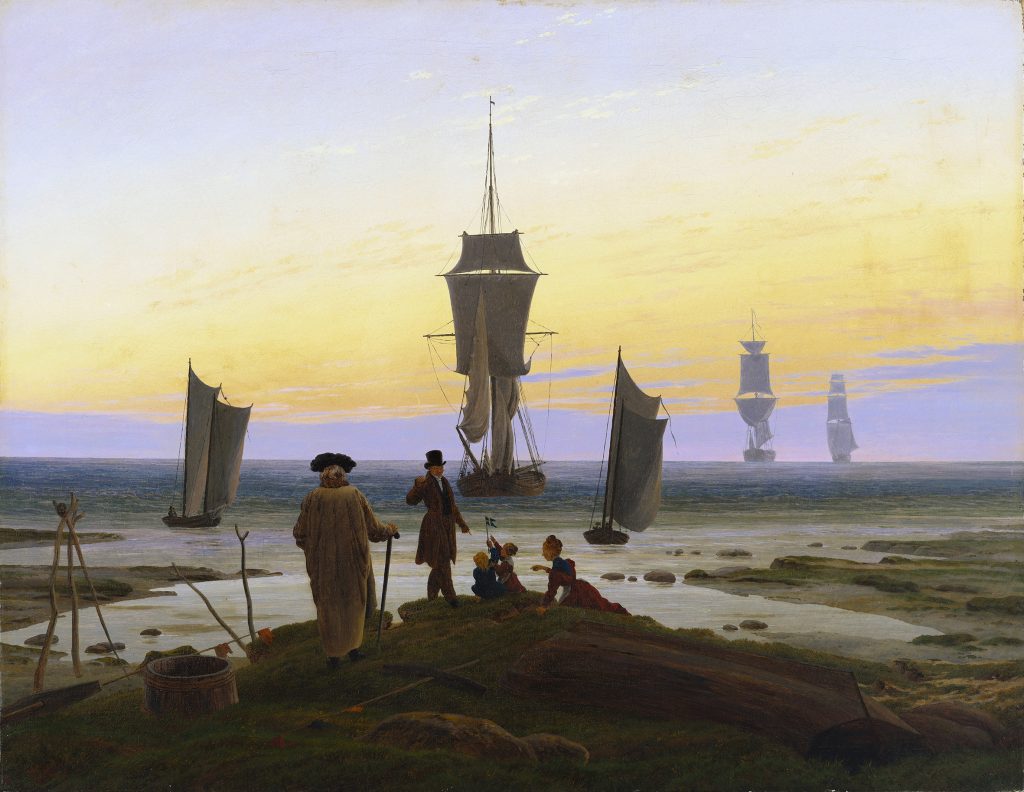
Caspar David Friedrich, The Stages of Life (1835), oil on canvas

This is one of Friedrich’s last works before multiple strokes prevented him from working in oils. An allegory on the passing of time and the journey of life, the various stages of life are echoed in the five ships that move from the shore (start, birth) to the horizon (death, infinity), as well as in time as depicted from childhood to old age. Like many of his paintings the sky dominates a majority of the canvas, changing from shades of blue to a wide wash of orange and yellow in the center, placing the time of day as early evening. As the sun sets and the ships move out to sea, there is a sense of peace, completeness, and acceptance.

After several years of mental deterioration, Friedrich died in Dresden, May 7, 1840.
Works Cited:

https://www.caspardavidfriedrich.org/ http://romanticisminthevisualarts.blogspot.com/2012/10/caspar-david-friedrich-pictured-world.html https://search-credoreference com.ezproxy.capilanou.ca/content/entry/routromanticera/friedrich_caspar_david_1774_1840/0 https://www.theartstory.org/artist/friedrich-caspar-david/life-and-legacy/#biography_header https://medium.com/thinksheet/great-paintings-winter-landscape-by-casper-david-friedrich-4207f7ba83b2
Categories
IDEA

Survey 4

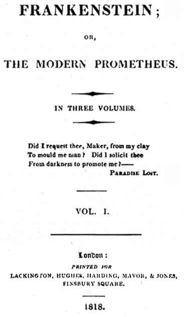
1818 The Brains Behind Frankenstein

Marty Feldman in Young Frankenstein 1974 American comedy horror film 

It’s time to get into the Halloween spirit with Mary Shelley’s famous novel Frankenstein.

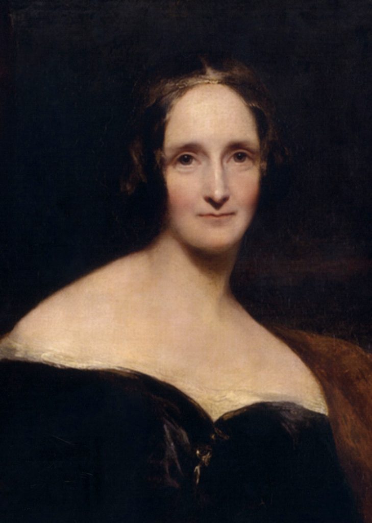
Imagine being only 19 years old and publishing your own novel that would become an English literature classic for hundreds of years while having a great influence on pop culture. Mary Shelley really did that!

Without giving away spoilers to those who haven’t read it, it is a tale of scientist Victor Frankenstein who succeeds in giving life to a being of a creature constructed from dismembered corpses. However, this is not the perfect creation he imagines that it will be, but rather a grotesque creature who is rejected by his own creator and mankind. The monster is left desolate and desperately desires someone who will accept him as a friend, but as society cruelly rejects him the monster begins to seek vengeance and havoc breaks lose.

Shelley’s work has inspired numerous films with the character of Frankensteins Monster (below), television programs, video games and derivative works.

Frankenstein’s monster, played by Boris Karloff, in James Whale’s classic film adaptation from 1931

The tale of creation and destruction has claimed a central place in Anglo-American culture since its first publication in 1818. Along the way, Frankenstein has come to stand for a genre we call Gothic. Though there are many ways to define what Gothic really is, for its conventions and their meanings depend upon the historical, ideological context in which they were created and construed. Cultural criticism endeavours to reconstruct Gothic, as far as it can, by exploring the ways in which its writers and readers understood its intention and its impact.

Gothic fiction emerged from 1760 to 1820, was associated with the development of new forms of popular literature. The emergence of accessible reading matter became a source of entertainment and was linked with the extension of literacy to new classes of readers; in turn, concerns about reading and its uses were part of larger debates over education, the location of power in society, and the nature and control of individual behaviour. The development of Gothic fiction, and of Mary Shelley’s novel, takes its meaning from the tensions informing these cultural concerns about human nature, its potentials and limits, and the forces that go into its making.

Gothic architecture that set the tone for the novel.

Frankenstein Castle (German: Burg Frankenstein)

Frankenstein Castle (pictured above) is a hilltop castle in the Odenwald overlooking the city of Darmstadt in Germany. This dark, eye-catching architecture was said to have been an inspiration for Mary Shelley’s novel.

Architecture during this time played a role in the naming of Gothic novels, with many titles referring to castles or other common Gothic buildings. In fact, Frankenstein is a German name consisting of two words: The Franks are a Germanic tribe and “stein” is the German word for “stone”. Accordingly, the meaning of Frankenstein is “Stone of the Franks”. The word “stein” is common in names of landscapes, places and castles in Germany. Consequently, the term “Frankenstein” is a rather ordinary name for a castle in this region.

The history of Gothic as a style was complex, a narrative of how architecture affects art and how art affects architecture. The style began as a technological marvel in the Middle Ages, the epitome of stone construction and decoration, but was later shunned and abandoned in the Renaissance. The isolated, dilapidated, and haunting ruins of abandoned structures inspired Gothic stories of isolation, dilapidation, and the supernatural. Those dark romances then started a ‘Gothic Revival’ in architecture, producing buildings to echo the eerie grandeur of the stories that came before and the ruins that came before them.

There’s no doubt that the gothic architecture helped set the tone of Shelley’s novel.

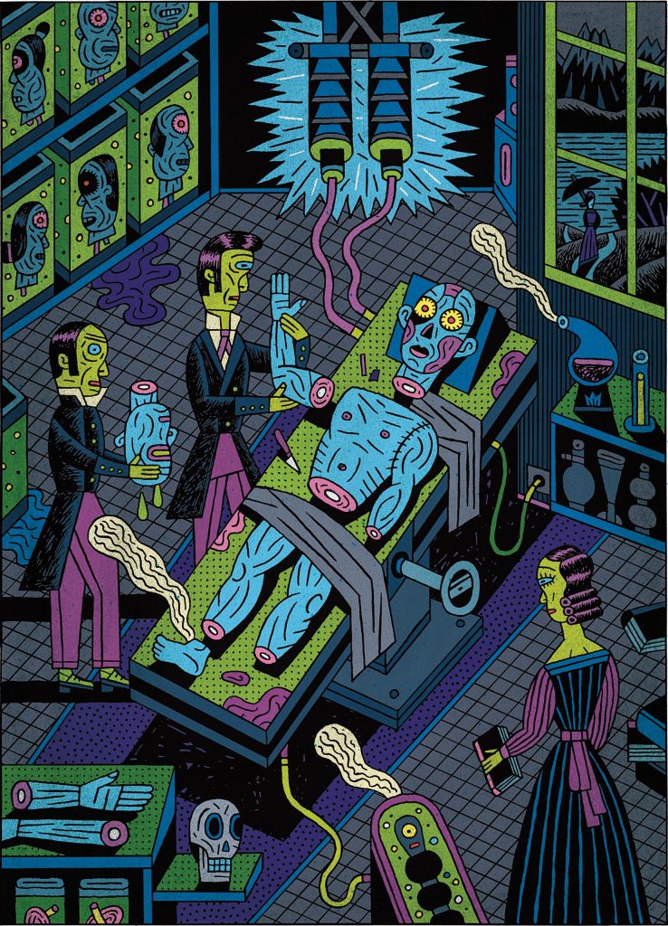
Illustration by Henning Wagenbreth

Works Cited:

https://en.wikipedia.org/wiki/Frankenstein

https://www.history.com/this-day-in-history/frankenstein-published

http://origins.osu.edu/milestones/march-2018-mary-shelleys-frankenstein

https://lib.guides.umd.edu/c.php?g=741698&p=5306112

https://www.newyorker.com/magazine/2018/02/12/the-strange-and-twisted-life-of-frankenstein

Categories
IDEA

Survey 3

When type turned cursive: the culture of typography

As you read this sentence you can probably identify what typeface this is without much hesitation.

You may have come across this right sloped lettering while reading an important passage in a novel or an important word, or maybe you’ve typed up words yourself in italics to add emphasis on what you’re saying. Though it might seem odd to come across a book written completely in italics today, it was quite common centuries ago.

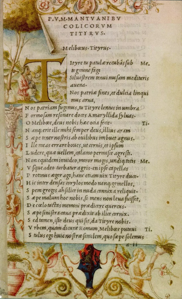
In fact, this cursive font based on a stylized form of calligraphic handwriting has been around since the 1500s. Back in the day it was referred to as Aldine italic and was first used in a complete volume in a series of small pocketbooks by Virgil (the Ancient Roman poet), first published in 1501. Aldus Manutius was the founder of the Aldine press and designer of the Italic font. Francesco Griffo also cut for Aldus the first italic type (Italic 1). With quite narrow letters inclined towards the right Chancery, the italic script was efficient and popular among humanists and chanceries.

The first of the standard octavo Aldines, and the first book printed in italic, published by Aldus Manutius’ Aldine Press in 1501. 

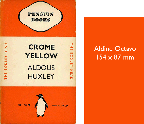
This image is a useful depiction of just how small Aldus’ octavo editions were.

The typeface was fitting for these pocketbooks as it provided more room to fit text than the typical roman type due to its narrow proportions, and retained its clarity better at smaller sizes.

The first sight of the slant.

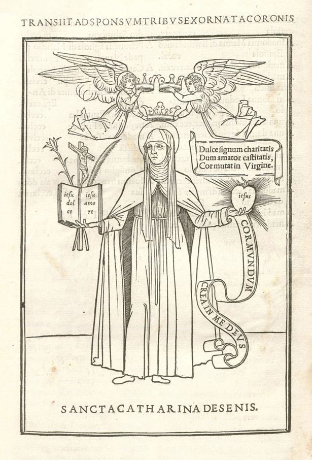
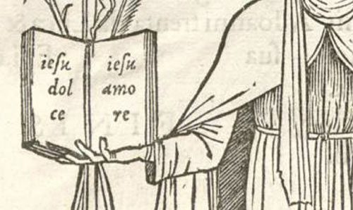
Before the italic typeface was seen in books it made a small earlier appearance as five words in the woodcut in this 1500 edition of the letters of St. Catherine of Siena.

The Epistole of St. Catherine of Siena

It was set within a beautiful woodcut illustration of St. Catherine. Looking closer you can see the italic appears printed across the open book and heart in either hand.

1501 edition of Petrarch

The italic type was revolutionary in the printing industry especially at this time when books were larger in size and costly which catered to the wealthy. Its smaller typesetting also allowed for printing smaller books which meant lowering prices, increasing their production, and an added bonus of portability.

 The choice of using italic type, rather than the roman type in general use at the time, was suggestive of informality in editions designed for leisure reading and more accurately replicated handwritten manuscripts. Though used for some of the same purposes today, italic is used mostly to highlight text and implies a change of intonation when reading. The appearance of the italic typeface reminiscent of handwriting seems to be more personal and confiding, than direct “printed” letters; and it ultimately allowed writers to enhance their written form of emotion and expression.

Sources:

https://enacademic.com/dic.nsf/enwiki/164024 https://en.wikipedia.org/wiki/Italic_type#History https://www.nytimes.com/2015/02/27/arts/design/a-grolier-club-tribute-to-the-printer-aldus-manutius.html https://ilovetypography.com/2014/11/25/notes-first-italic/

Categories
IDEA

Mood Board

Survey 3

Rationale

The objective of this project was to make an Invision mood board about one of the 10 survey periods.

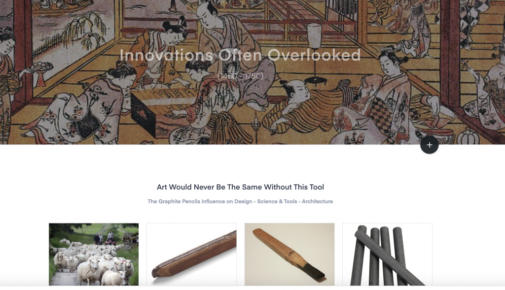
Here is my mood board for Survey 3: Block books and Baroque (1450-1750): https://projects.invisionapp.com/boards/TX40QPVQZRS/

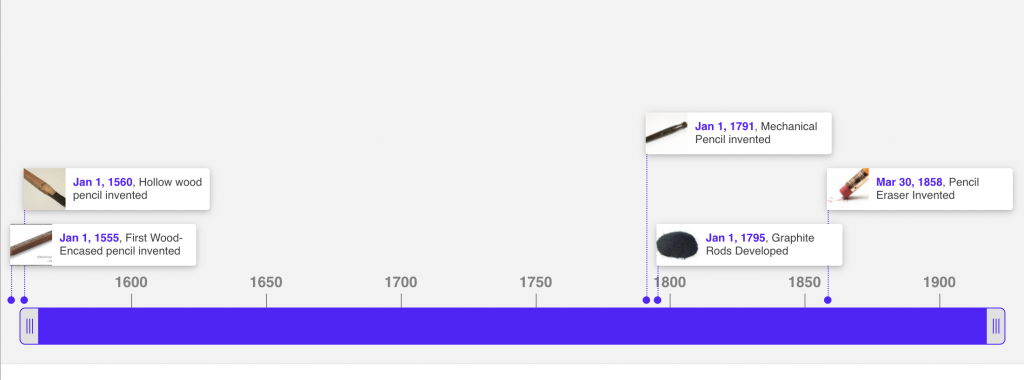
The 3 events that I chose for this particular Survey were, the invention of the graphite pencil (1565), tea introduced in England (1650), and Okumura Masanobu introduced linear perspective in Ukiyo-e prints (1740).

timeline of the innovation of the graphite pencil

I chose these events because I was interested to learn more about how these familiar inventions that we all know of and use today, came to be. I enjoyed learning about events and found it interesting that tea originated from China and didn’t actually get introduced to England till later. I also realized that though tea and the graphite pencil were introduced centuries ago, not much has been altered, and we still use them in much the same ways.

The challenging aspect of this project for me was researching to find the same amount of info on the event for each topic because even while doing thorough research on the event, I was still unable to find detailed information on the topic of architecture for both the graphite pencil and linear perspective. I was also surprised to find that there was not a lot of information on Okumura Masanobu, and most of his information was repetitive across several sources. As a result the moodboard took many hours to complete, and even then I had to stop myself from wanting to make more changes/additions to the layout.

With that being said I am happy with the result of my mood board especially as my first time using Invision. If I were to evaluate myself on this project I would give myself a 9/10. I believe that I understood the purpose of this project by clearly displaying necessary information about each event in a way that the reader would want to interact with and engage in. I deduct a point because I feel as if I don’t have full knowledge of how to customize mood boards in Invision. I also think that if I spent more time I would have included more images with detailed captions.

Categories
IDEA

High Renaissance & Mannerism

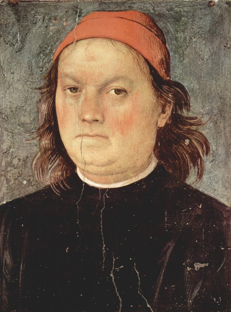
Self-Portrait – Pietro Perugino

Pietro Perugino 1446-1523 (Umbria)

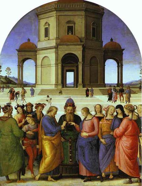
Pietro Vannucci, nicknamed Perugino from Perugia, the chief city of Umbria of which he was born (Città della Pieve Umbria, Italy), was a divine Italian Renaissance painter of the Umbria school. His artistic skill held equal to that of Leonardo da Vinci but unfortunately did not receive the same level of recognition.

Perugino was one of the earliest Italian oil painters and was apprenticed (at the early age of nine) to the local artistic workshops of Perugia. He later apprenticed to the workshop of Andrea del Verrocchio alongside his contemporary da Vinci. 

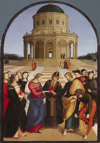
The most well-known pupil he taught and influenced was Raphael who’s early works of calm beauty owe much to Perugino.  

Perugino was regarded as one of the leading painters in Florence in the 1480s and as the “best master in Italy” in 1500, but soon afterward his reputation suffered. He had been criticized by artists in Florence for his repetition and mannerisms of figures and at times whole figures in his work. Even Michelangelo had called him a lousy artist. But Peruginos response was as serene as his paintings.

“The figures you find so bad now you used to praise. What can I do about it?”

-Perugino

 In 1481 he was summoned to Rome where, along with others, he worked on the frescos for the walls of the Sistine Chapel.

The Delivery of the Keys or Christ Giving the Keys to St. Peter is a fresco by executed in 1481–1482 and located in the Sistine Chapel, Rome.

Perugino tragically died of the plague in 1523. He produced a considerable body of work in his lifetime and influenced many of his contemporaries and pupils. 

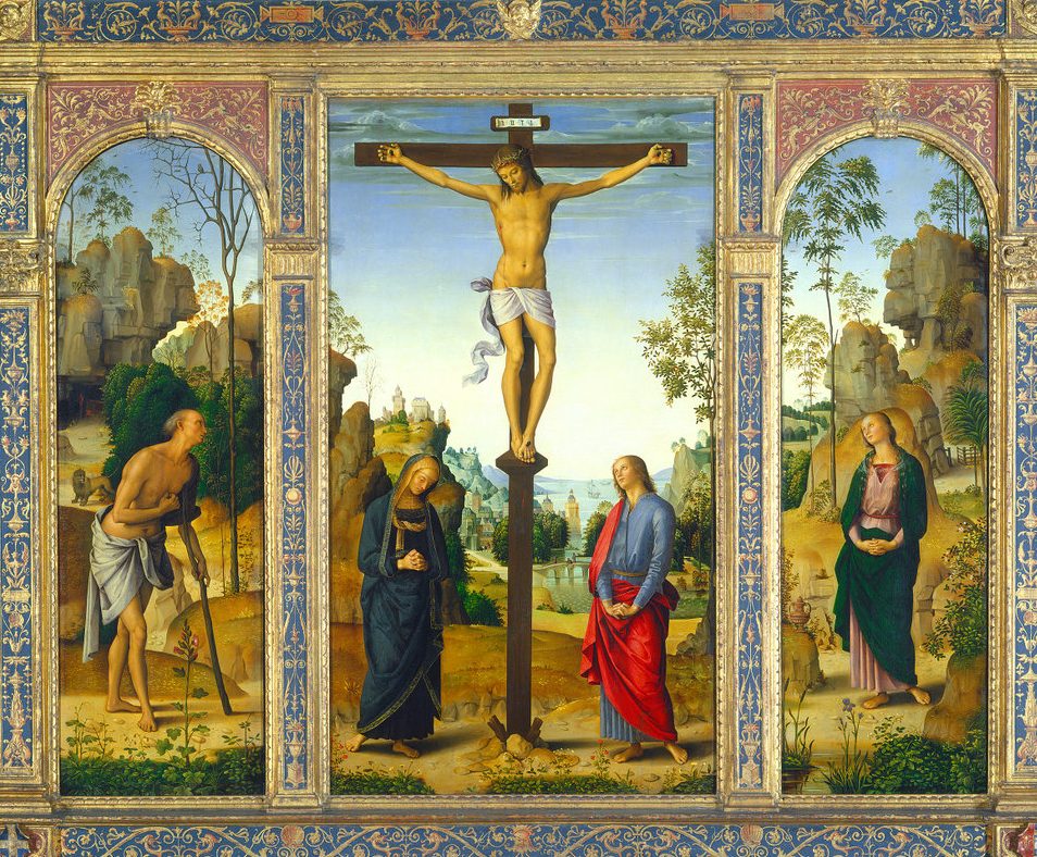
Calm serene and graceful are the works of Pietro Perugino and seen in his array of beautiful figures and delicate landscapes.  

The Crucifixion with the Virgin, Saint John, Saint Jerome, and Saint Mary Magdalene [middle panel], Italian, c. 1450 – 1523, c. 1482/1485, oil on panel transferred to canvas.

In this scene of tranquillity, one can notice the beautiful landscapes that extend out, repetition of curving forms, and figures that meditate on the death of Christ.

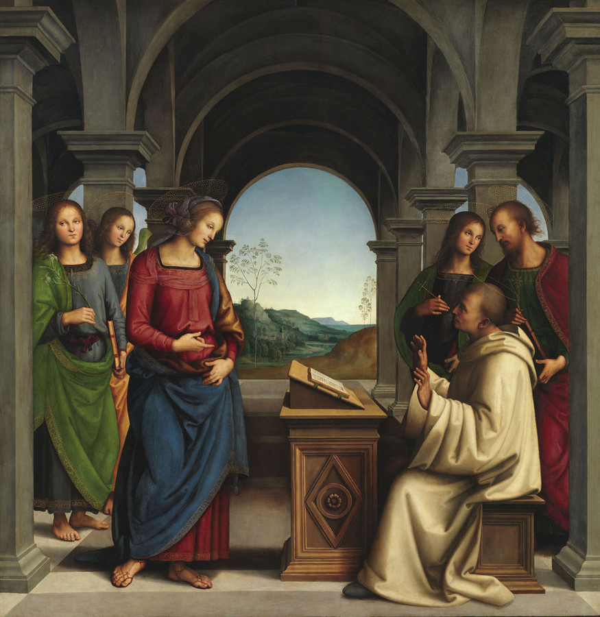
He painted respectful altarpieces in a sweet and devout manner and knew how to achieve a sense of depth without. upsetting the balance of the design.

The Virgin appearing to St. Bernard, c. 1490-4

Altar-painting, oil on wood, 173x 170cm.

Dedicated to St. Bernard, he looks up from his book to see the Holy Virgin standing in front of him. The almost symmetrical lay-out the figures form together a harmonious composition wonderful balance.

Categories
IDEA

Origins of Relief printing on textiles in China.

Survey 1: ca. 200 BCE

What is relief printing anyways?

Relief printing really refers to woodcut or woodblock printing.  The technical term for woodcut is actually xylography but is a term less used in English.

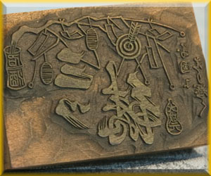
Woodcut is a technique of relief printing used for printing text, images or patterns.  It was used widely throughout East Asia and originated in China in antiquity as a method of printing on textiles before paper. 

A design is first drawn on the surface of the woodblock while the undrawn parts are cut away along the wood grain with a knife or chisel, leaving the characters or image to show in colour at the surface level. The design is then transferred to the preferred print medium and the print results in a reverse/ mirror-image, proving to be challenging when printing text.

When it comes to printing colour, separate blocks are individually inked and applied, though overprinting two colours may produce different colours on the print.

There are two general methods of transferring prints explained on the right. 

Stamping

Much like you would think, it involves pressing the inked woodblock to the desired medium like that of a rubber stamp on paper. Although it was not known to be a method used in woodblock at the time, printing with small stamps used to mark the seal of the emperor or pharaoh on materials that could receive an image, such as wood or clay plates, were used in ancient China as well as in ancient Egypt.

Rubbing

Rubbing is the method of placing the medium on top of the ink-wetted woodblock, then gently rubbing the medium against the ink-wetted surface of the woodblock underneath, often using a weighted rounded tool.

Carved Woodblock

You may know woodblock printing today is used to print many things, from books to fine art, but did you know it has long been an art form that traces back to ancient origins such as China, Egypt, Assyria, and India?  

Printing on textiles in China

Interestingly the application of block printing began on textiles. Woodblock printing on textiles involved printing patterns on textiles that were usually linen, cotton or silk. Though silk was more a luxury fabric and a symbol of Chinese culture, cotton cloth ultimately became a widespread material and an economic staple.

The earliest example of a Chinese woodblock image on textiles is a fragment of silk cloth with a flower motif in three colours that dates from the Eastern Han Dynasty. Older techniques in China involved using bronze or stone seals to make impressions on malleable materials like clay or silk and taking rubbings from reliefs made of bronze or stone.

Examples Uncovered

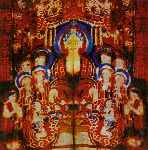
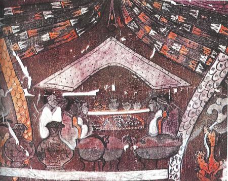
Printed silks found at the noble tombs at Mawangdui, Hunan province correspond to a relief stamp found in the tomb of the Second King of Nan Yue (in Guangzhou, datable to before 122 B.C.E.). It was an exciting finding that meant techniques and styles had spread throughout the empire.

Han Dynasty silken banner excavated from tomb in Hunan.
<https://fashion-history.lovetoknow.com/fabrics-fibers/chinese-textiles>

Han tombs have yielded a variety of silks, including plain weave, gauze weave, both plain and patterned, and pile-loop brocade similar to velvet. More than twenty dyed colours have been identified. The embellishment of woven fabrics included new techniques of embroidery incorporating gold or feathers, as well as block-printing, stencilling, and painting on silk. 

Block printing by hand may be a tedious process but it yields highly satisfying results, which other methods can’t replicate the same way.

Despite the convenience of newer technology, woodblock printing is a timeless art form that remains relevant in fashion and textiles. Whether a designer is using the technique as inspiration for a digital print or carving a stamp, the look is beautifully organic and timeless. 

Categories
IDEA

Gestalt Theory

Artist Unknown

Proximity

This work is an example of proximity where groups of closely related elements can form images. This example is made from a collection of shapes close together to form an image of a feminine figure looking downward at a moon.

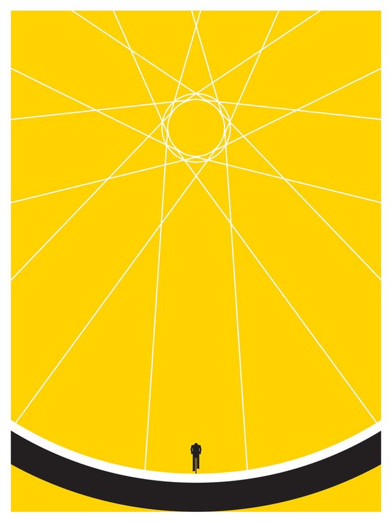
BIKER by Jason Munn

Continuation

The law of continuation asserts that the human eye follows lines, curves, or a sequence of shapes in order to determine a relationship between design elements.

Continuation is applied in this poster with lines that connect to larger shapes and form an image. Here we can see that the lines and shapes connect to form the shape of a bicycle wheel, while what would normally be a valve attached to the wheel is in the shape of a person cycling.

Categories
IDEA

Yearbook Spread

The objective of this project was to make a handmade spread for an imaginary yearbook that measures 17×8.5” flat.

https://ibb.co/D9N0ZLV

Ungraded, this was a simple way to introduce myself to the class as well as practice visual communication and storytelling skills. I did my yearbook spread vertically to suit the theme of a playlist on a mobile device. Music is one thing that always finds a way to bring me joy, and as I was jamming to some music while brainstorming, I thought to do a theme of an illustrative playlist of songs that I like, yet are also titled to reflect the prompts. As I went over each of the questions, I thought about songs that would be able to introduce each topic. Each subheading found on the work below is the title of a song. I thought this would be a playful way to introduce myself also while others in the class might be familiar or intrigued by the songs as well.

I was inspired to base my layout off of a Spotify playlist found on the mobile app and then customized different colours and altered the placement of buttons. I also chose the colours of the background because I like earthy tones and believe they had a striking contrast against each other.

All in all, I think the project turned out the way I laid it out for myself from beginning to end. There were changes made along the way, like making the colours of the background dark purple to match the purple tones in the painting of myself instead of a dark teal. I think the alignment and theme very well express my pleasure for graphic design and my adoration for painting in the mediums I used. However, if I were to do things differently next time, I think I would add more personal imagery. But if I were to rate my project, I would give it an 7.5/10.

Categories
IDEA

Visual Research of Design Elements

Lines in this album cover design help lead the eye to the centre of the page.

Artwork by Aaron Lowell Denton

Colour strongly contrasts the shadows and lighting of the scene. It emphasizes the subjects in the shadows and helps convey meaning in Avalons piece about difficult conversations.

Illustration by Avalon Nuovo

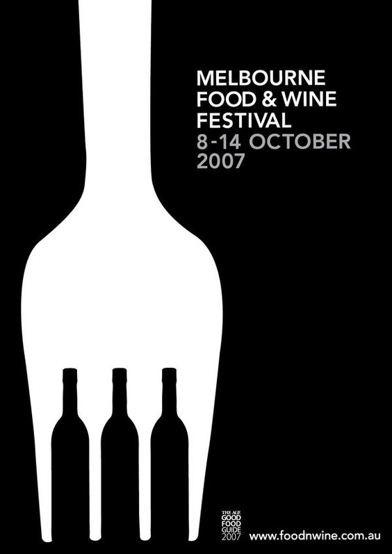
Space is used to create a balance between two shapes. Wine bottles are strategically placed to create the illusion of a large fork. In combining objects related to wine and food, this design conveyed the event’s message much more compellingly.

Melbourne food and wine festival by Kaushik Badarinarayana

Categories
IDEA

Hey There, Welcome to The Blog!

 Take a look at Joanne’s work below.