1920-1940 The Golden Age Part 1: Pruett Carter

Pruett Carter was an American illustrator who taught at the Grand Central Art School and Chouinard Art Institute. Carter was born in 1891 in Missouri and grew up on an Indian Reservation. He studied in Los Angeles at the Art Students’ League. After that, he moved to New York to study under Robert Henri.

Woman In An Interior. Carter’s early work.

It looks like in his early work Pruett Carter stuck to the more traditional style of painting, which is why it’s now very distinguishable from most other painters. However, in Woman In An Interior you can already see his love for painting female beauty, which later became the main feature in his paintings and illustrations.

Friends and Lovers. Carter’s later work.

Here, in Friends and Lovers, he pictures a man and a woman sitting on the rocks by the sea. We can only see the back of the man’s head but the woman is portrayed as an icon – a modern goddess.

He was known for doing illustrations for women’s magazines, working in mainly oil and gouache.

Summer Sands. Illustration for a magazine.

Most times Carter would be his own art director and layout designer.

Rough sketch of Summer Sands.

However, one of my favorite of his works has got to be this beautiful magazine spread for the story “Security”. The woman in this illustration looks beautiful yet very vulnerable. She needs security and her man is it.

Sources

http://gurneyjourney.blogspot.com/2014/06/pruett-carters-preliminaries.html

Tattered and Lost EPHEMERA: PRUETT CARTER lead me to a dead end

Pruett Carter (1891 – 1955) « AMERICAN GALLERY

https://en.wikipedia.org/wiki/Pruett_Carter

1920-1940 The Golden Age Part 1: Pruett Carter

1900-1920 Illustration’s Early Masters: Coles Phillips

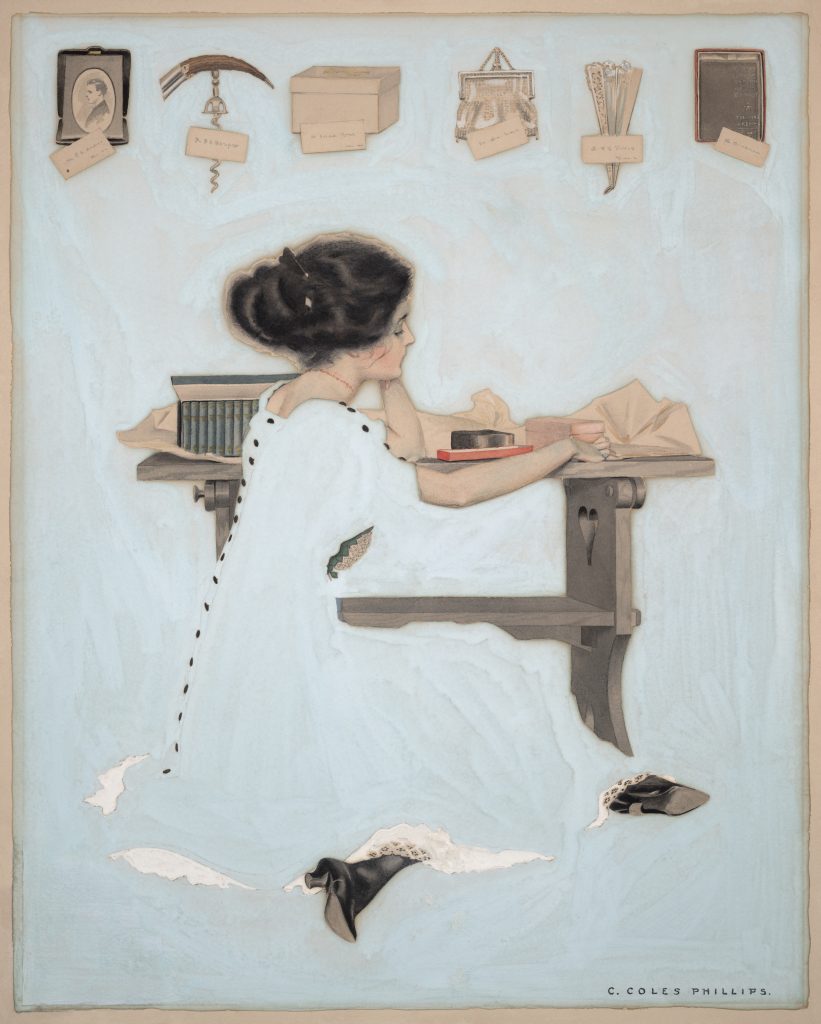
Coles Philips was an American artist and illustrator who signed his early works C. Coles Phillips, but after 1911 worked under the abbreviated name, Coles Phillips. He is known for his stylish images of women and signature use of negative space in the paintings he created for advertisements and the covers of popular magazines.

Portrait of Coles Philips

The first two decades of the 1900’s saw dramatic changes in how artists portrayed American women in magazines and other media. Instead of the prim, proper, and idealized “Gibson girl” socialite of the 1890’s, the public was treated to an outpouring of more modern, active, and athletic images of women. Chief among the early creators of this “Golden Age of American Illustration” was Coles Phillips who popularized the “fade-away” style.

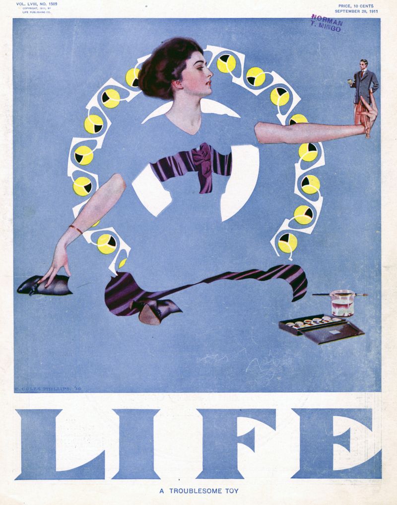
The work of Phillips quickly became popular with the Life readers. In May 1908, he created a cover for the magazine that featured his first “fadeaway girl” design with a figure whose clothing matched, and disappeared into, the background. Phillips developed this idea in many subsequent covers.

Coles Philips’ First “fadeaway” girl
Coles Philips’ Cover for LIFE magazine

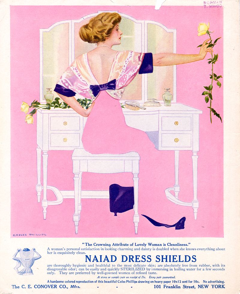
Although Phillips was a cover artist, he saw no difference in painting for a magazine cover or painting for an advertisement.  His clients included Oneida silverware, Luxite Hosiery, Holeproof Hosiery, Palmolive, Wamsatta linens, and Naiad Dress Shields.

Advertisement by Coles Philips

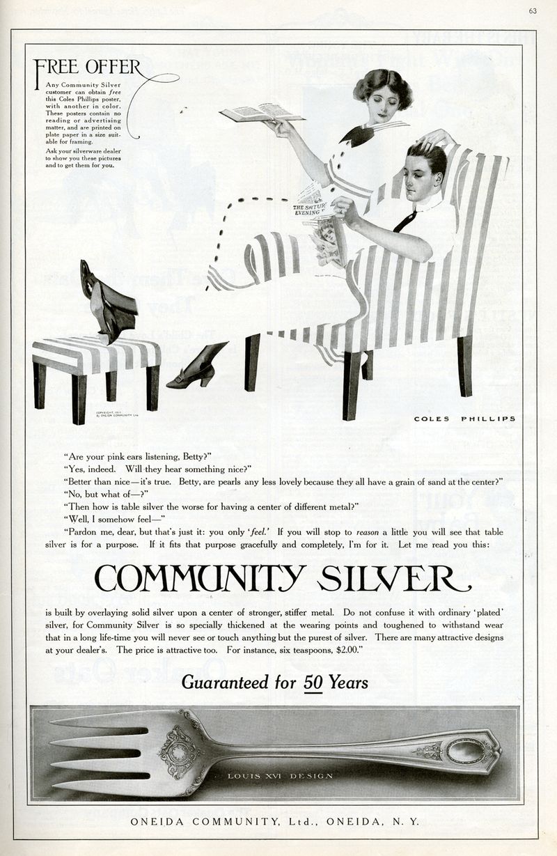
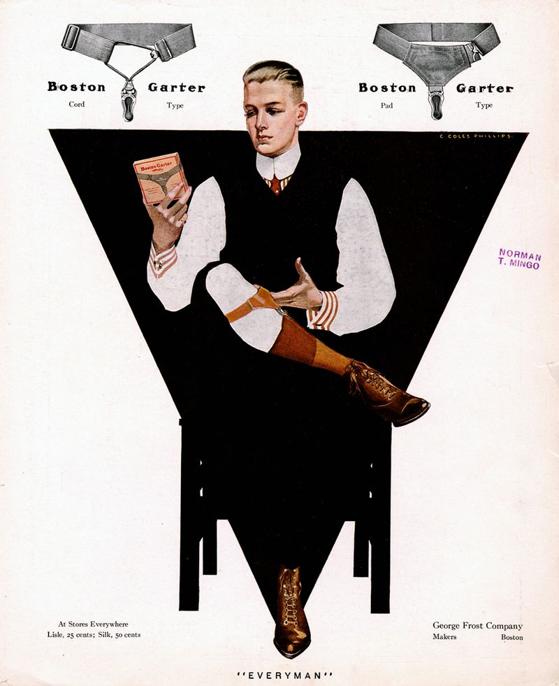
Phillips also expanded by creating Fade Away Men.  Often these gentlemen were paired with a Fade Away Girl, especially in advertisements.

mghl_phillips 7

Ad for Oneia Community Silver, by Coles Phillips, Ladies’ Home Journal, November 1911

Occasionally, the men would be featured independently for advertisements for men’s wear.

mghl_phillips 8

Ad for Boston Garters, by C. Coles Phillips, Life, 1911

Sources

http://www.americanartarchives.com/phillips,c.htm

https://library.wustl.edu/his-impact-wont-fade-away-a-look-at-c-coles-phillips/

https://en.wikipedia.org/wiki/Coles_Phillips

1900-1920 Illustration’s Early Masters: Coles Phillips

1860- 1900 Beginnings of the Golden Age: Aubrey Beardsley

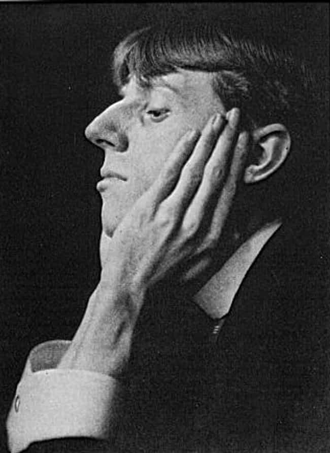
Aubrey Beardsley, 1894

Aubrey Beardsley’s artistic career was remarkably impactful for its conciseness. In the seven years, he was able to draw and write before dying of tuberculosis, Beardsley developed a reputation as one of the most controversial artists of his time. The linear elegance of his designs coupled with the artist’s bizarre sense of humor and fascination with the taboo simultaneously intrigued and repelled his Victorian audience. His illustrations comprised characteristics of Aestheticism, Decadence, Symbolism, and, most apparently, Art Nouveau.

Most Impactful Work

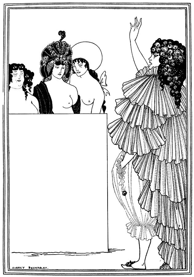
He was greatly influenced by the elegant, curvilinear style of Art Nouveau and the bold sense of design found in Japanese woodcuts. But what startled his critics and the public alike was the obvious sensuality of the women in his drawings, which usually contained an element of morbid eroticism. This tendency became pronounced in his openly licentious illustrations (1896) for Aristophanes’ Lystrata.

Beardsley’s Lystrata Drawing

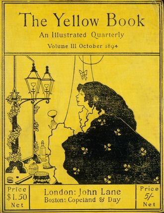
Although Beardsley was not homosexual, he was dismissed from The Yellow Book as part of the general revulsion against Aestheticism that followed the scandal surrounding Wilde in 1895. He then became principal illustrator of another new magazine, The Savoy.

Beardsley’s Yellow Book Illustration

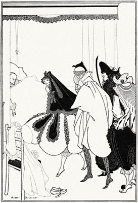
In this illustration of the deathbed of Pierrot the clown for The Savoy magazine in London, Beardsley depicts what he described as “strange hermaphroditic characters wandering about in Pierrot costume.” Characteristic of the decadent notion that life is a performance; here the artist creates a theatrical atmosphere to convey that message.

Beardsley’s Deathbed of Pierrot, the Clown for the Savoy magazine

Sources

https://www.theartstory.org/artist-beardsley-aubrey.htmhttps://www.theartstory.org/artist-beardsley-aubrey.htm

https://www.britannica.com/biography/Aubrey-Beardsley

https://arthive.com/…/61926~Aubrey_Beardsley/…/195725~The_Savoy_Magazine_c…

https://en.wikipedia.org/wiki/Aubrey_Beardsley

1860- 1900 Beginnings of the Golden Age: Aubrey Beardsley

Post Modernism: Jeff Koons

Jeffrey Koons

is an American artist known for working with popular culture subjects and his reproductions of banal objects, such as balloonImage result for jeff koons animals produced in stainless steel with mirror-finish surfaces.
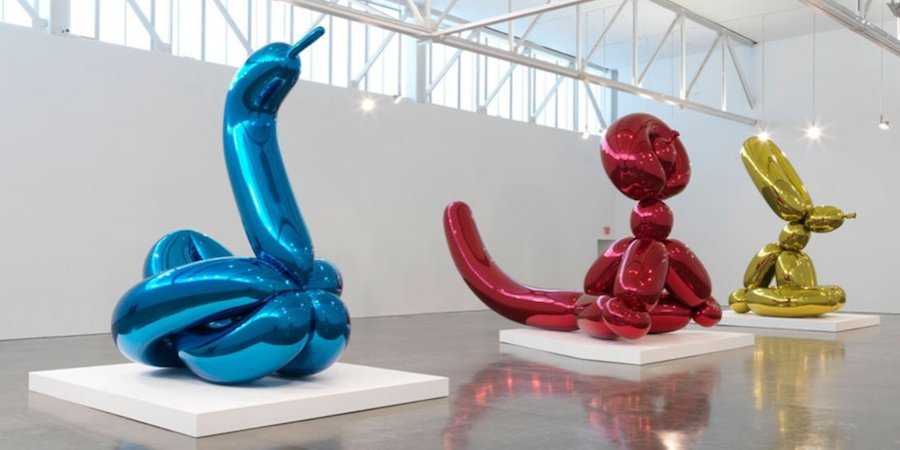
He is the epitome of Neo-Pop, a 1980s movement that looked to earlier Pop artists, particularly Warhol, for inspiration. His steel Balloon Dog sculptures, probably his best-known works, transpose an ephemeral childhood memory into an enduring form. His work looks cheap, but is expensive, an ingenious reversal of economic logic that forms the basis for his stunning commercial success.

Image result for jeff koons


Steel Baloon Dog sculpture

Balloon Flower (Red)

Koons’ most famous works to date are the towering sculptures inspired by balloon animals. This one stands over ten feet tall and weighs in excess of a ton. Its sumptuous skin, according to the artist, is intended to “manipulate and seduce,” like the Baroque decor of Christian cathedrals. Like the cheap, shiny rubber it is meant to imitate, the surface of Balloon Flower evokes the eternal appeal of precious metal.

Balloon Flower (Red)

Rendering of Play-Doh

For generations of adults, from the baby boomers to millennials, the mere sight of Play-Doh is nostalgic, conjuring the scent and tactile appeal of this strange, yet calming synthetic substance.

Rendering of Play- Doh


Sources

https://www.tate.org.uk/art/art-terms/p/postmodernism

https://www.theartstory.org/artist-koons-jeff-artworks.htm#pnt_6

https://en.wikipedia.org/wiki/Jeff_Koons#Early_Works_and_Inflatables

Post Modernism: Jeff Koons

Survey 10: Weegee and NYC

Weegee

Photograph of Weegee

Weegee was an iconic photographer throughout the Great Depression in the US. His main thing was capturing scenes of crime in New York City. He centered his practice around police headquarters and in 1938 obtained permission to install a police radio in his car. This allowed him to take the first and most sensational photographs of news events and offer them for sale to publications such as the Herald-Tribune, Daily News, Post, the Sun, and PM Weekly, among others. During the 1940s, Weegee’s photographs appeared outside the mainstream press and met success there as well.

The Beginning of His Career

Weegee worked at the PM Daily paper which established a new model of reportage that Weegee took full advantage of to introduce new subjects as well as expand his own repertoire of images to include crime scenes, street people, and circus performers. His photographs had their own meaning and served as a source for various kinds of photo-essays, which ultimately appear in his photo book Naked City.

Cover of Weegee’s photobook “Naked City”

Artwork Description & Analysis

In Marilyn Monroe Distortion, Weegee uses a kaleidoscope lens to manipulate a portrait he took of Marilyn Monroe. The distortion scrunches her facial features, making her puckering lips appear smaller, elongating her closed eyes, and turning her nose into a pig’s snout. The iconic beauty is transformed into a caricature.

Marilyn Monroe Distortion

Sources

https://www.theartstory.org/artist-weegee-artworks.htm#pnt_9

https://en.wikipedia.org/wiki/Weegee

https://www.icp.org/browse/archive/constituents/weegee

http://www.stevenkasher.com/artists/weegee

Survey 10: Weegee and NYC

Roy Lichtenstein

Roy Lichtenstein was one of the most influential and innovative artists of the second half of the twentieth century. He is preeminently identified with Pop Art, a movement he helped originate, and his first fully achieved paintings were based on imagery from comic strips and advertisements and rendered in a style mimicking the crude printing processes of newspaper reproduction.

Lichtenstein’s success was matched by his focus and energy, and after his initial triumph in the early 1960s, he went on to create an oeuvre of more than 5,000 paintings, prints, drawings, sculptures, murals and other objects celebrated for their wit and invention.

Roy Lichtenstein, Self Portrait

What makes his art so special is the fact that nothing like this had been done before Lichtenstein came along. A lot of art critics did not take his art seriously because to them it wasn’t “real art“.

Roy Lichtenstein, Crying Girl

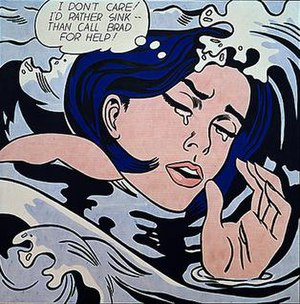
His work, along with that of Andy Warhol, heralded the beginning of the Pop art movement, and, essentially, the end of Abstract Expressionism as the dominant style. Lichtenstein did not simply copy comic pages directly, he employed a complex technique that involved cropping images to create entirely new, dramatic compositions, as in Drowning Girl, whose source image included the woman’s boyfriend standing on a boat above her.

Drowning Girl

Drowning Girl (Original Comic)

Later in his career, Lichtenstein was particularly fascinated by the abstract way in which cartoonists drew mirrors, using diagonal lines to denote a reflective surface. He once remarked, “Now, you see those lines and you know it means ‘mirror,’ even though there are obviously no such lines in reality.

Mirror #1 (1976)

Sources

https://lichtensteinfoundation.org/biography/

https://www.theartstory.org/artist-lichtenstein-roy.htm

http://www.dreamwallsglass.com/2012/06/roy-lichtenstein-mirrors/

https://www.tate.org.uk/art/artists/roy-lichtenstein-1508

Roy Lichtenstein

Survey 9: Viewfinding the Leica

Lecture Summary

This week’s lecture covered the time period of 1925 – 1930. It was a great time for science and technology. Communication was greatly improved after the TV and portable cameras were invented.

Leica Cameras 1913 – 1930

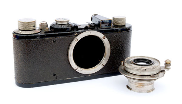
Leica I – was first introduced to the market at the 1925 spring fair in Leipzig, based on the Ur-Leica prototype developed by Barnack in 1913 and the Prototype 1 developed in 1923. Interchangeable lenses for these were introduced in 1930.

Ur Leica – 1914

The Leica was by no means the first 35mm camera, but it was the first to make 35mm truly viable, leading to the most popular film format ever. The camera was the brainchild of Oskar Barnack, who joined Leitz in 1911 as Director of Research. He soon began work on a movie camera, for use with 35mm film, the standard movie gauge of the time.

Leica Standard with Interchangable Lenses

Because emulsion speeds of then current films were unreliable and accurate metering was all but impossible, Barnack built a small device intended to test small batches of movie film. It became apparent, however, that what he had actually created was a miniature still camera, known today as the Ur-Leica. Specification was sparse. Shutter speeds, from the cloth focal plane shutter, covered 1/25 – 1/500 second. The lens was pulled out on a short metal tube and was pushed back almost flat with the body when not in use. It could not be detached. The viewfinder was mounted separately on the top plate, rather than built in, and there was no rangefinder, other than a separate accessory. The camera was covered with vulcanite, often mistaken for leather.

Sources

https://www.shutterbug.com/content/leica-i-camera-change-photography


Survey 9: Viewfinding the Leica

Yves Tanguy: Cubism, Dadaism & Surrealism


Yves Tanguy was a French surrealist painter famous for eating spiders as a party trick and painting misshapen rocks and molten surfaces. He painted the hyper-real world with exacting precision which helped him communicate his ideas easily.

Photograph of Yves Tanguy

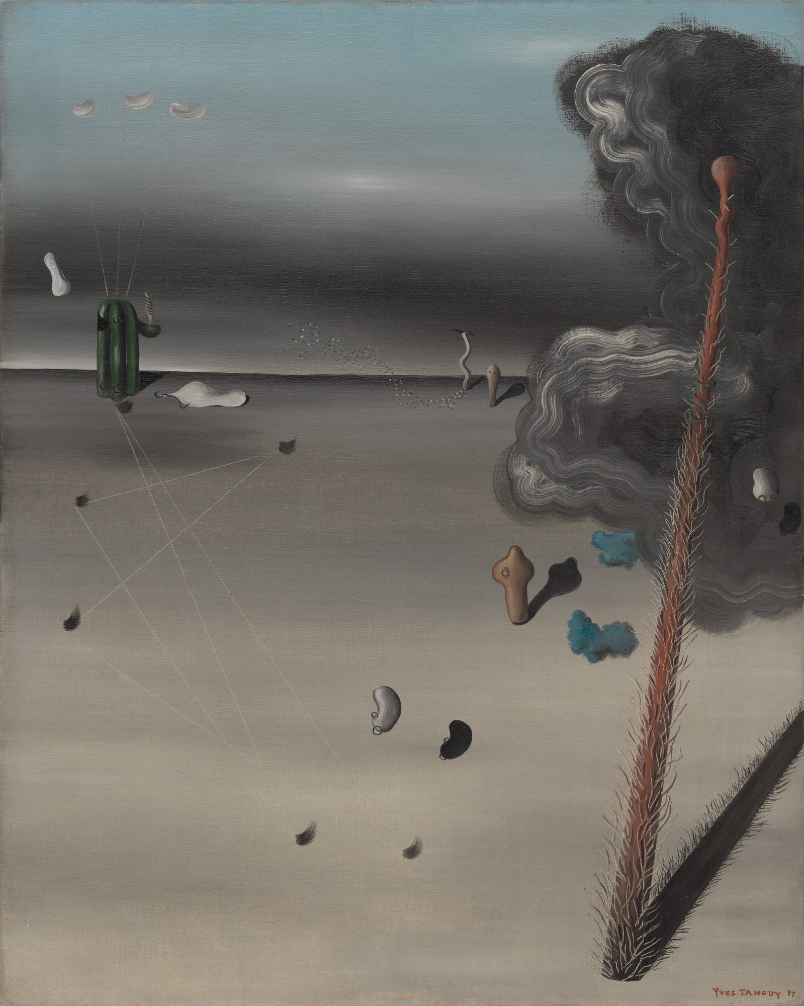
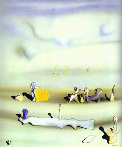
Like most of the surrealist painters, Tanguy relied largely on personal symbolism. For example, in this painting called Mama, Papa is Wounded! the title complicates rather than clarifies the meaning of the work. I personally think that this painting and its name represent World War I. The post-apocalyptic look of this artwork gives the viewer a deep feeling of anxiety and loss.


Mama, Papa is Wounded!

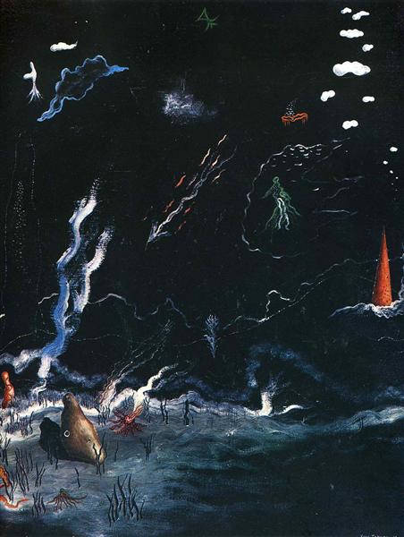
Storm is somewhat different from most of Tanguy’s works. It looks more like an underwater scene rather than desert-like landscape. The life forms that swim across look a lot like real animals like jellyfish, while most of his other work is a lot more surreal.


Storm(Black Landscape)

Tomorrow

Sources

https://www.theartstory.org/artist-tanguy-yves.htm

https://www.wikiart.org/en/yves-tanguy

http://davidsartoftheday.blogspot.com/2015/03/yves-tanguy-storm-black-landscape.html

Yves Tanguy: Cubism, Dadaism & Surrealism

Survey 8: Suprematism 1915- 1925

Lecture Summary 

This week’s lecture covered the time period of 1915 – 1925 which immediately tells us that World War I happened during that time. It influenced everything and everybody in the world, including design. A lot of propaganda posters were created to get people to participate in the war and support one’s country. Although it had one of the deadliest outcomes, the world of art and design was changed forever.

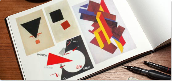
Suprematism is an art movement, focused on basic geometric forms, such as circles, squares, lines, and rectangles, painted in a limited range of colors. This was a completely new concept at the time – completely fascinated artists all over the world. It is also considered to be the beginning of conceptual art. The founder of this movement was a Russian artist Kazimir Malevich.

Examples of Suprematism

Kazimir Malevich 

He is most famous for his painting Black Square. The name pretty much sums up what the painting looks like, however, there is a lot more meaning behind it. Suprematism focused on the absence of any physical objects, and the Black Square communicated that perfectly.

Like Malevich explained once,

Under Suprematism, I understand the primacy of pure feeling in creative art. To the Suprematist, the visual phenomena of the objective world are, in themselves, meaningless; the significant thing is feeling, as such, quite apart from the environment in which it is called forth.”

Black Square, Kazimir Malevich

El Lissitzky

Lissitzky was one of the very successful Malevich’s students. His work greatly influenced the Bauhaus and constructivist movements, and he experimented with production techniques and stylistic devices that would go on to dominate the 20th-century graphic design. 


Beat the Whites with the Red Wedge, El Lissitzky

Contemporary Design Piece inspired by El Lissitzky

Sources

https://www.tate.org.uk/whats-on/tate-modern/exhibition/malevich
https://www.theartstory.org/artist-malevich-kasimir.htm
https://en.wikipedia.org/wiki/El_Lissitzky


Survey 8: Suprematism 1915- 1925