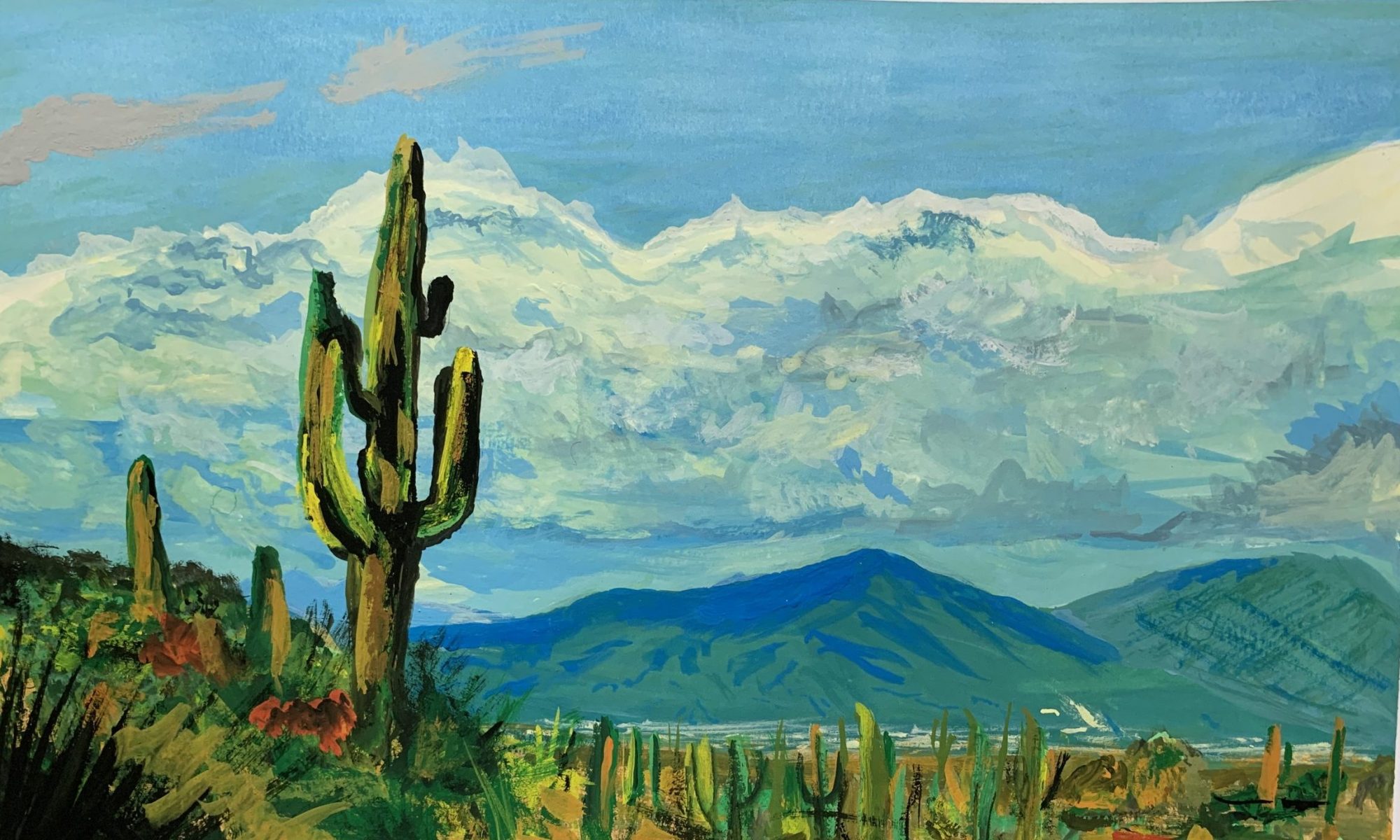
Matthew Funk is a student and an aspiring artist. He attends Capilano University and is in the IDEA program. He hopes that after his schooling that he can focus on the illustration side of visual communications. Matthew loves to create and hopes that one day he will be able to make a living doing what he loves.
After finishing a term completing general studies at Langara College, he decided to direct his studies to a field more curated to his interests. Matthew Loves his family and friends and when he isn’t doing his schoolwork, he enjoys spending time with them. Through creativity and hard work, he hopes that he can help other people in whatever career he chooses.
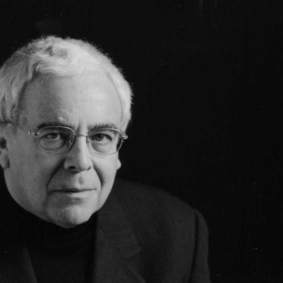
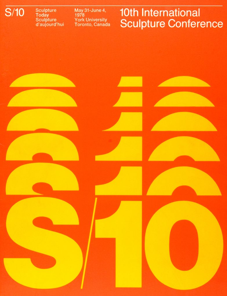
Born in 1932 in New York City, Burton Kramer was a leading pioneer in Canadian graphic design, but his influence on the design community is found worldwide. Throughout his life, Kramer has had an extensive history of schooling, attending such schools as New York State University, Institute of Design (New Bauhaus) in Chicago, and Yale. After schooling, Kramer went on to do many things for the design community he worked for many prestigious design companies. In 1974 Kramer got his Canadian citizenship which led him tBorn in 1932 in New York City, Burton Kramer was a leading pioneer in Canadian graphic design, but his influence on the design community has been found worldwide. Throughout his life, Kramer has had an extensive history of schooling, attending schools such as New York State University, the Institute of Design (New Bauhaus) in Chicago, and Yale. After schooling, Kramer went on to do many things for the design community as he worked for many prestigious companies. In 1974 Kramer got his Canadian citizenship which led him to create such things as the CBC Logo, after that he was then accepted into the AGI as one of the only Canadian designers to do so at that time. He taught at the Ontario College of Art & Design in the 80s but has given lectures all around the world. His body of work is bold and it speaks for itself. This is why it’s no surprise that he’s been given awards such as a Lifetime Achievement Award as well as in 2018 he was also awarded the Order of Canada, the country’s highest civilian honour. Kramer no longer continues to design, as he retired in 1993 and now uses his time to paint. His legacy, however, is carried on by his son, Jeremy Kramer who now runs his design company.
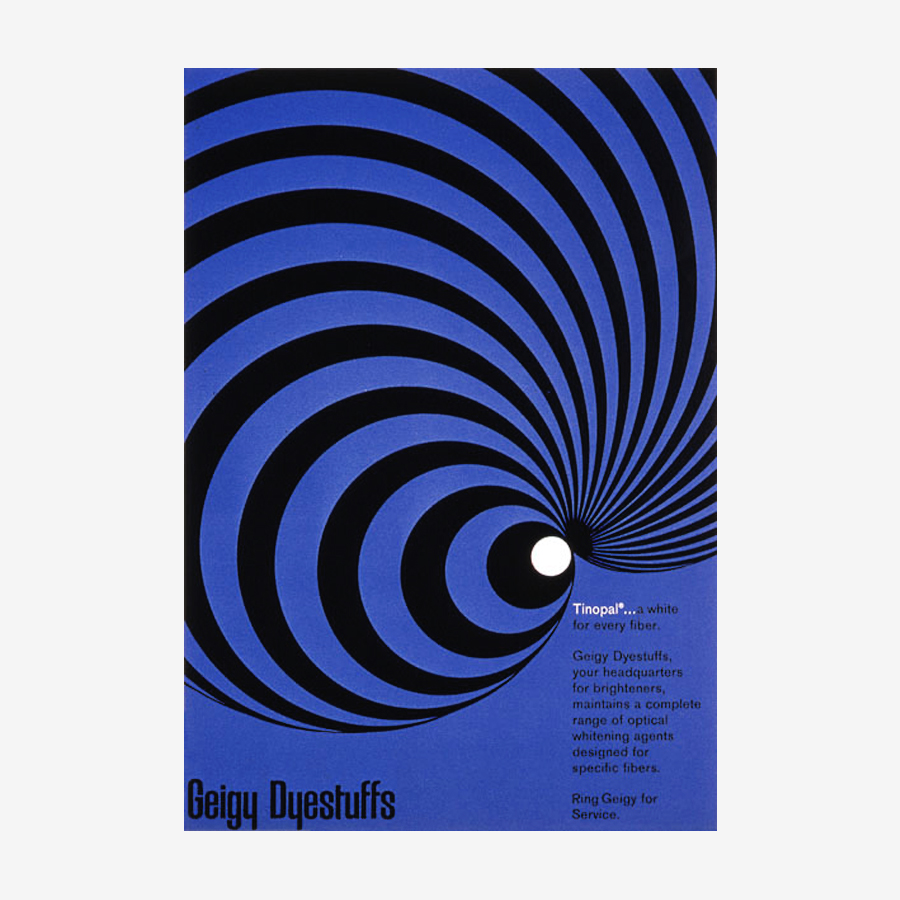
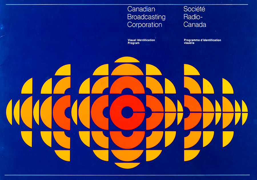
Tinopal Advertisement, 1960.New Guinea Poster, 1968.Visual Identification Program Brochure, 1974.10th International Sculpture Conference Brochure, 1978.
Work Cited.
Burton Kramer – Designculture. (n.d.). Retrieved April 15, 2022, from http://www.designculture.it/interview/burton-kramer.html
Wikimedia Foundation. (2021, April 8). Burton Kramer. Wikipedia. Retrieved April 15, 2022, from https://en.wikipedia.org/wiki/Burton_Kramer
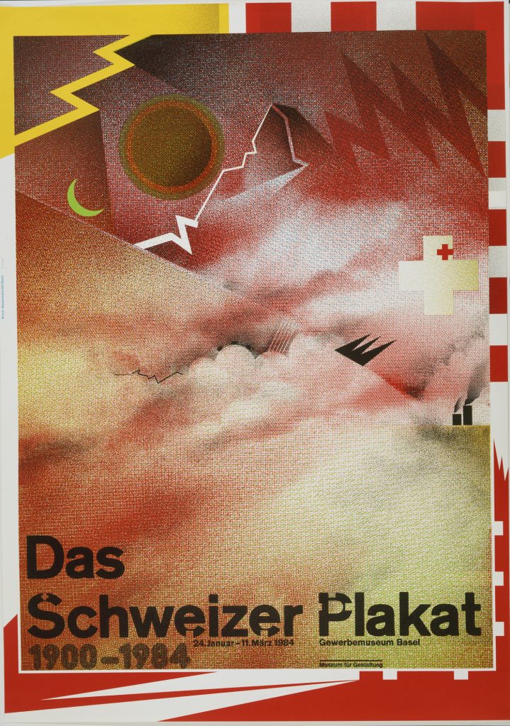
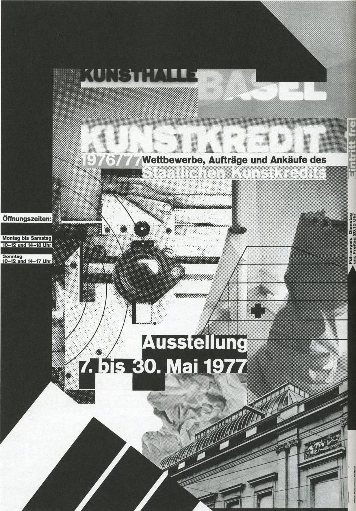
Born in 1941 in Salem Valley, Germany, Weingart was the leading individual in creating the “New Wave” Movement and his work is classified as Swiss typography. Weingart spend most of his childhood in Germany where he grew up and eventually went on to attend the Merz Academy in Stuttgart. He would go on to study design there for two years until his departure to do other things. Those things would include meeting Karl-August Hanke who would go on to be his mentor for a couple of years in Switzerland, Where Weinhart further developed his style and continued to learn. Throughout Weingart’s life, he has taught many students and his typographic influence is still heavily seen in modern-day design. Travelling the world to teach meant that there was nowhere in the world that didn’t see the influence of his teaching and design. He has written books about his typographic style and experience and has gone on to win numerous awards for his outstanding influence in the post-modern world.
Pattern Design for Poster and Wrapping Paper.New Wave Design “Das Schweizer Plakat” (1984)New Wave Design “Kunsthalle Basel Kunstkredit 76-77” (1977)New Wave Design “The Swiss Poster, Birkhäuser Publishers Basel” (1983)
Work Cited.
Wikimedia Foundation. (2022, March 10). Wolfgang Weingart. Wikipedia. Retrieved March 11, 2022, from https://en.wikipedia.org/wiki/Wolfgang_Weingart.
Wolfgang Weingart: Biography, designs and facts. Famous Graphic Designers. (n.d.). Retrieved March 11, 2022, from https://www.famousgraphicdesigners.org/wolfgang-weingart.
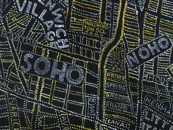
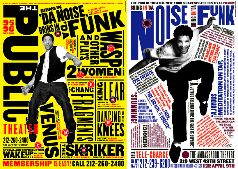
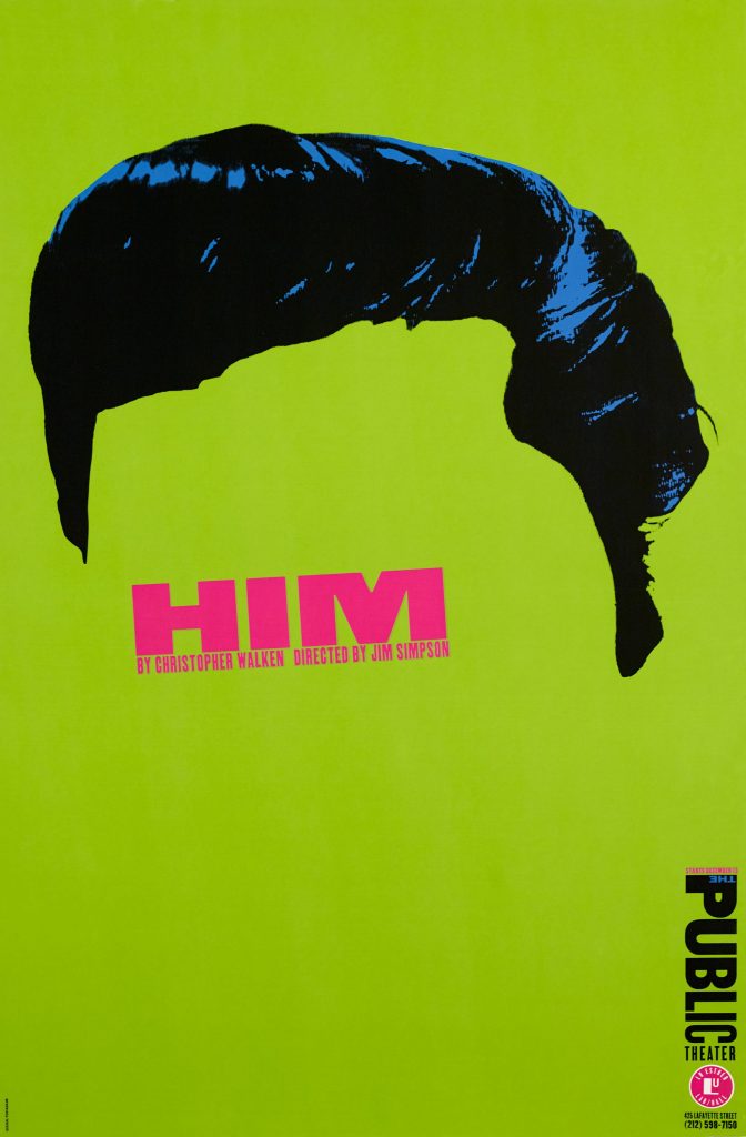
Born in Washington D.C. in 1948, Paula Scher is one of the most influential designers of all time. Throughout her career, she has become a master of type and design as a whole and has been described as a “master conjurer of the instantly familiar”. Earning a bachelor of arts at the Tyler School of Art, her career quickly took off after that. Earning herself hundreds of awards for numerous achievements, Paula solidified herself into the Art Directors Club Hall of Fame in 1998. Some brand work that Paula is known for is Adobe, Microsoft, Coca-Cola, Disney and many more. She has been displayed all over the world, in locations like the MOMA alongside other great artists. She combines type with shape and colour to make one-of-a-kind designs for brands and other clients. She did much of her work in and for new york, with a large portion combining the culture and feeling of new yorks urban scene into her work.
New York Map Design (1990s)Public Theatre Posters (1994)Him, Public Theatre Poster (1994)The Public Theatre Poster (1995)
Work Cited.
Paula Scher. Pentagram. (n.d.). Retrieved March 6, 2022, from https://www.pentagram.com/about/paula-scher.
Wikimedia Foundation. (2022, January 11). Paula Scher. Wikipedia. Retrieved March 6, 2022, from https://en.wikipedia.org/wiki/Paula_Scher.
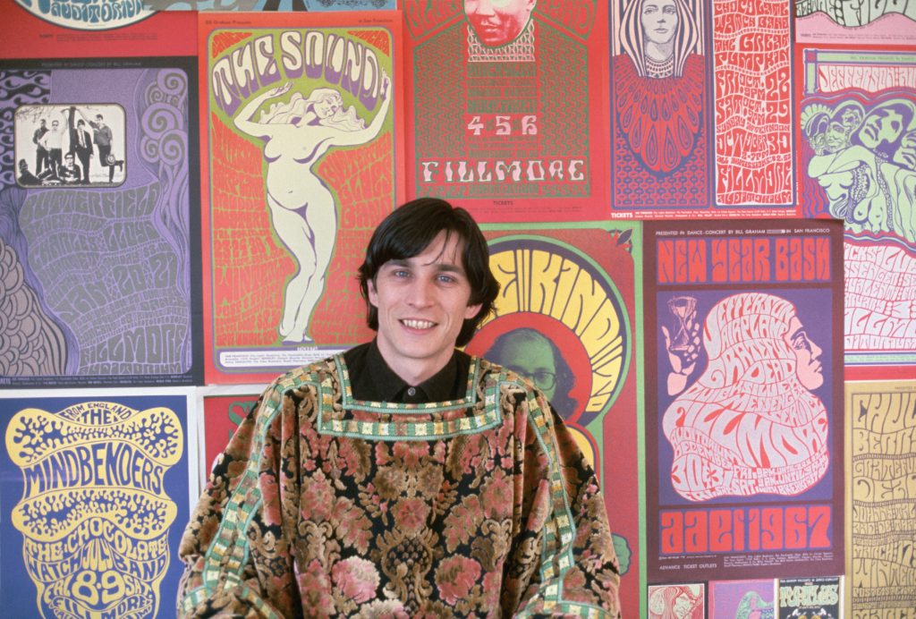
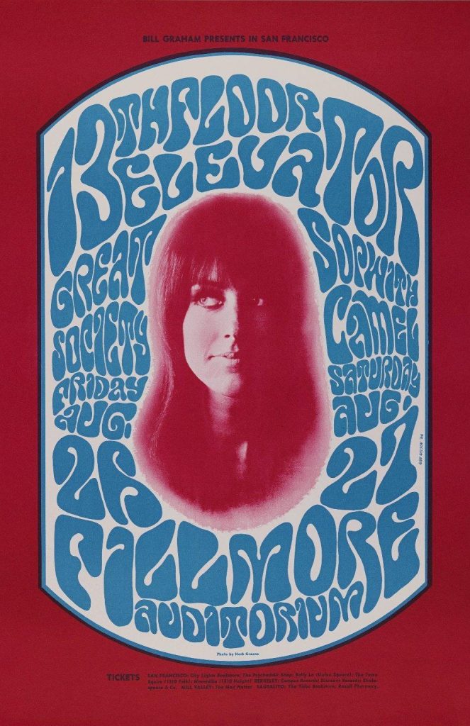
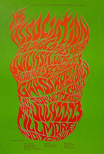
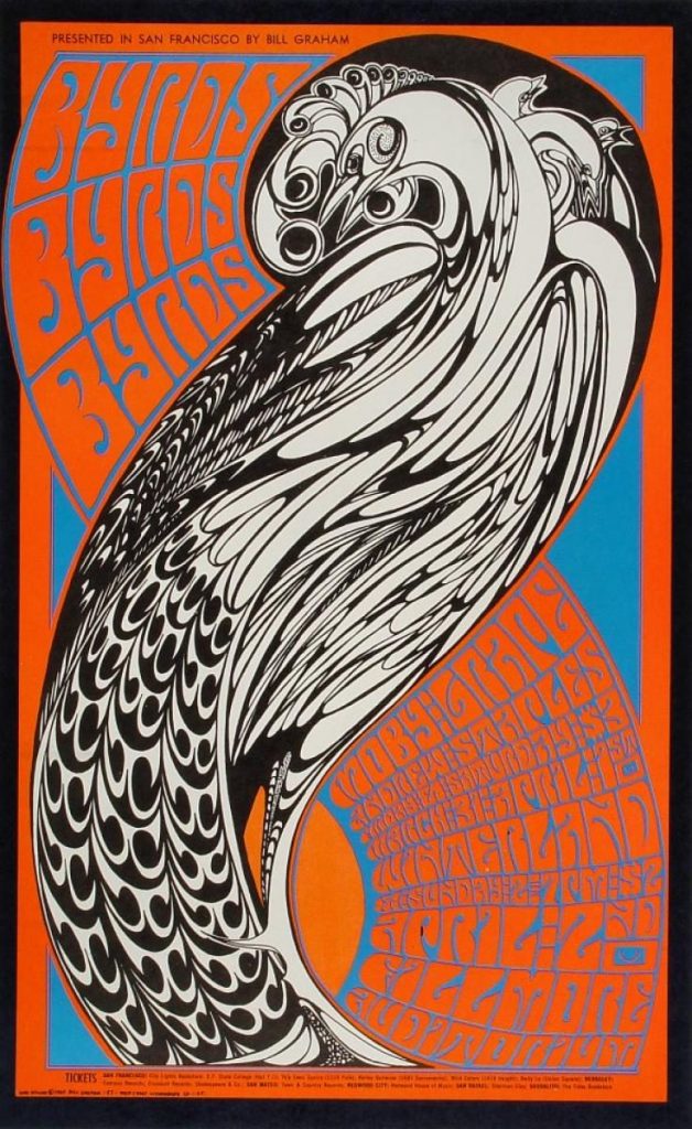
Born in Sacramento, California in, 1937, Wes Wilson was a leader in popularizing and creating the psychedelic poster design and art that was so prevalent in the 60s. Wilson primarily worked out of San Francisco and was considered one of the most important designers to come out of San Franciso. Primarily working with musicians, Wilson designed for big names like Bill Graham as well as working for venues like The Filmore. Wilson is heavily associated with the peace movement and this is partly because of how well he was able to capture and memorialize it in a visual aspect. He was heavily inspired by the art nouveau movement and those influences were clearly seen in his art. His ability to creatively use type as illustrated elements is just as recognizable as his visuals themselves, which is another reason he is so well known and respected. Sadly Wilson passed away in 2020, but fortunately, his art and influence are still seen today. His bold colours and melting lines are very recognizable to any art or music lover.
A Wes Wilson poster promoting the 13th Floor Elevators, Great Society, Sopwith Camel at the Fillmore Auditorium on August 26 and 27, 1966.Wes Wilson, Otis Rush & His Chicago Blues Band; Grateful Dead, Fillmore Auditorium, February 24-27, 1967.The Association at the Fillmore Auditorium, by Wes Wilson, 1966. Courtesy of Wes Wilson. The Byrds Vintage Concert Postcard from Winterland, April 1, 1967.
Work Cited.
About wes. Wilson.com. (n.d.). Retrieved February 14, 2022, from https://www.wes-wilson.com/about-wes.html
Wikimedia Foundation. (2022, January 11). Wes Wilson. Wikipedia. Retrieved February 14, 2022, from https://en.wikipedia.org/wiki/Wes_Wilson
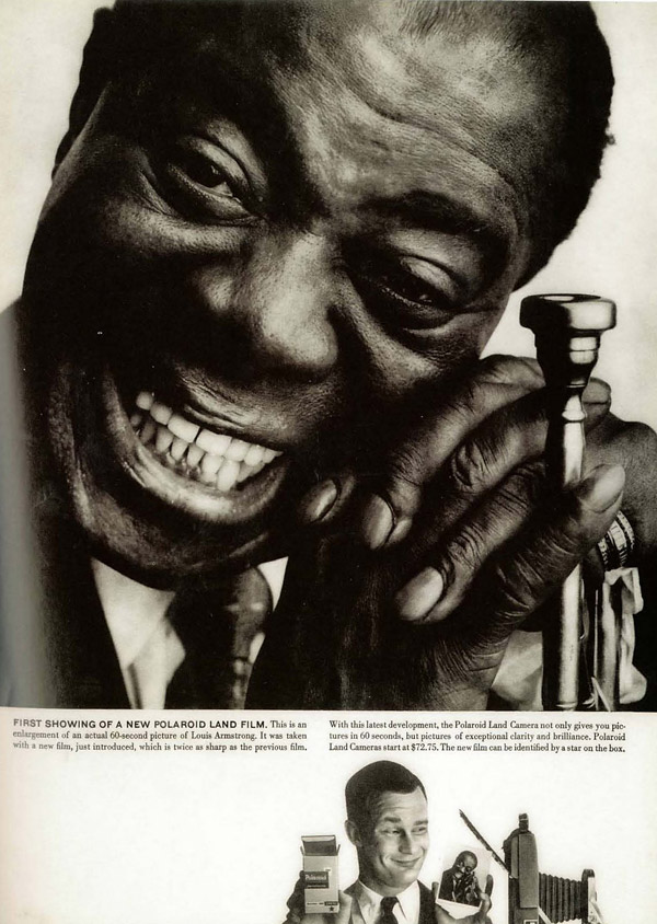
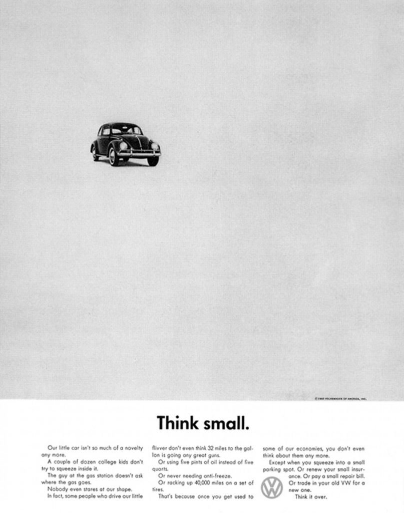
Born in New York in 1925, Helmut was a leader in the revolution of modern advertising. Named the number 1 campaign by the Advertising issue, Helmut was widely recognized as a master of his craft. Helmut spent most of his career working for the Doyle Dale Bernbach agency. While he worked there, he made incredibly unique and new advertisements that were unlike anything seen before. In a quote from Krone, he says, ” I’ve spent my whole life-fighting logos. Logos say I am an ad. Turn the page. I don’t just leave out the logo. I give something better. I try to make the page so clean and effective, you can’t stick a logo on it.” This quote summarizes the concepts and ideas that went into Krone’s revolutionary work. Krone did not want to make just an advertisement, and it would almost appear that he didn’t. It seemed that Krone rather wanted to make an idea, an idea that would stick with the viewer. Hardly ever using logos, Krone let the products do the talking, he made intelligent work and thus most of the genius of his technique what he left out rather than what he put out. The balance of adding and subtracting is something that no doubt, solidified Krone as one of the all-time greats.
Volkswagen Ad with Wilt ChamberlainPolaroid Ad with Louis Armstrong (taken on a polaroid camera)The Incredible “Think Small” Ad
Work Cited.
Helmut Krone. ADC. (n.d.). Retrieved February 3, 2022, from http://adcglobal.org/hall-of-fame/helmut-krone/.
Wikimedia Foundation. (n.d.). Helmut Krone. Wikipedia. Retrieved February 3, 2022, from https://en.wikipedia.org/wiki/Helmut_Krone.
“When an individual plays a part he implicitly requests his observers to take seriously the impression that is fostered before them. They are asked to believe that the character they see actually possesses the attributes he appears to possess” (Goffman 1956, 10)
Out of all the readings, Goffman’s, The presentation of self was definitely the most interesting. It was not that this reading was inherently new information, but the way the information was written and described was truly interesting. Identity is a super intense topic and for the most part, this reading deals with this topic quite well. Sometimes I find myself losing my true identity with fake personas so this reading was definitely eye-opening
Before taking this class, I honestly was pretty nervous. During high school and even in other post-secondary instances I always struggled with reading and writing. Since reading and writing is the main focus of this course I did not feel very confident going into it. Once the course started I realized that my fears were somewhat irrational.
This course by no means was easy, and there were times where I doubted my ability to perform. Now that I have reached the ending I can safely say that I enjoyed this course and was pleasantly surprised by how it ended up. I was able to learn a variety of helpful knowledge and tips, and am happy with how I did.
During my research for inspiration for this poster, I liked to look at the old posters that used type to create shapes as a visual. Because I knew that I would have to include a lot of information, I knew that my visual components would have to link the type information together. I chose the theme of shapes for a couple of reasons, the first is that It created a visually intriguing aspect to it. The second reason is that It allows me to use colour with an effective reason to include it. The last and most important reason is that a lot of typefaces are just a variety of shapes and lines to make a character, this is the reason the title is Shapes of Type. The title conveys the theme of shapes, as well that the shapes are relating to the various typefaces that I am researching and presenting on.
I would say that I was pretty successful in the execution of my poster design. The theme of shapes is pretty clear in the poster which I like, however, there are some things I wish I did a little differently. For example, the markers I used were a little streaky which makes the final product appear a little messy which is unfortunate. The writing I did also bled into the markers causing it to be a little less readable, so I think if I redid it again, I would try to write more carefully. Everything considered I would give myself an 8/10 taking off 2 marks for the streakiness of the markers and the readability level of the writing. I still worked really hard dedicating 10+ hours to this project which is why I gave myself the mark that I did.
Work Cited.
Haley, A., Tselentis, J., Poulin, R., Seddon, T., Leonidas, G., Saltz, I., . . . Alterman, T. (2012). Typography referenced: A comprehensive visual guide to the language, history, and practice of typography. Beverly: Rockport.
Bear, J. H. (2019, November 16). What Are the General Characteristics of Old Style Fonts? Retrieved from https://www.lifewire.com/old-style-typeface-1079103
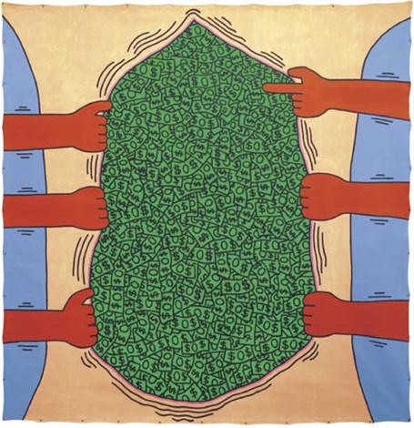
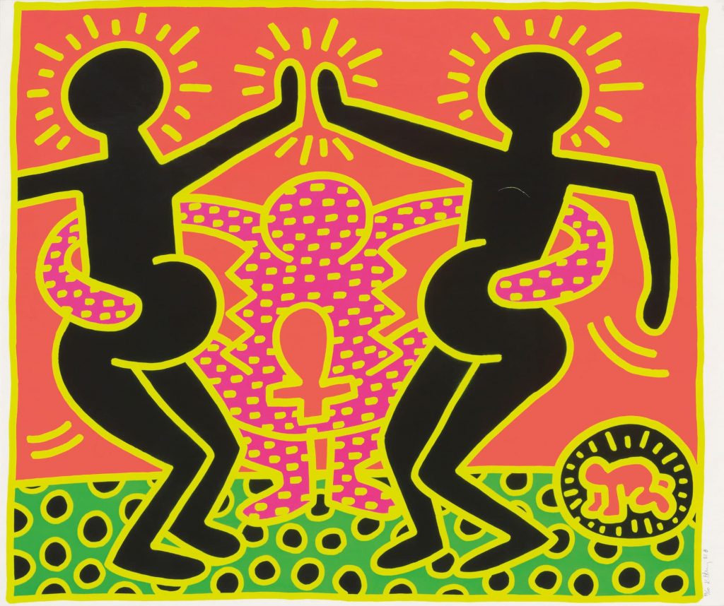
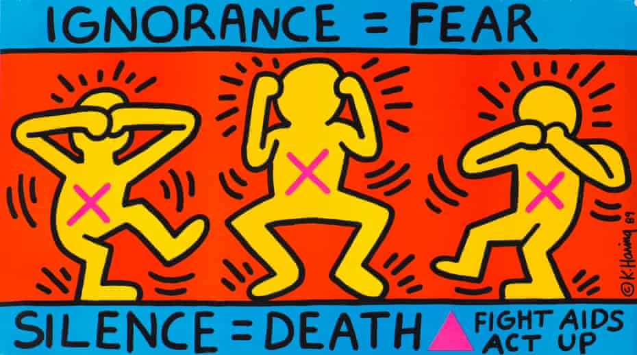
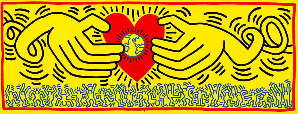
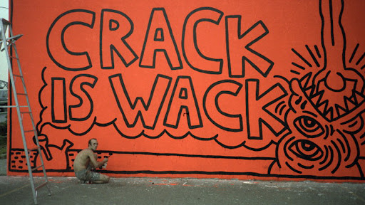
Untitled (1985) Image 1Fertility Suite Untitled 4 (1983) Image 2Ignorance = Fear / Silence = Death (1989) Image 3Untitled (1985) Image 4Crack Is Wack Mural (1986) Image 5
Like Basquiat, Keith Haring is one of my favourite artists. Born in Reading,Pennsylvania on May 4, 1958, and died February 16th, 1990, he was one of the most influential American artists of the late 20th century. I was introduced to his art while visiting an exhibition and instantly loved it. His artwork at first can strike the viewer as simple, fun, bold illustrations, but his work is much more than just surface value. Haring was a gay man who spoke on LGBT issues in his artwork, as well as creating images inspired by drug abuse and the issue of aids (see images 3 and 5). Tragically Haring died of aids, but he would live on through his artwork and influence in the modern-day, inspiring new artists with his vibrant and beautiful style.
Work Cited.
Keith Haring. (n.d.). Retrieved from https://www.biography.com/artist/keith-haring.
Yood, J. (n.d.). Keith Haring. Retrieved from https://www.britannica.com/biography/Keith-Haring.