Giusto de’ Menabuoi

Paradise, Padua Baptistery frescoed dome (1376-1378)
Woman and Dragon (1360-1370)
The Coronation of the Virgin, and Other Scenes (1367)
The Baptism of Christ, Padua Baptistery (1378)
Marriage at Cana (1376-1378)

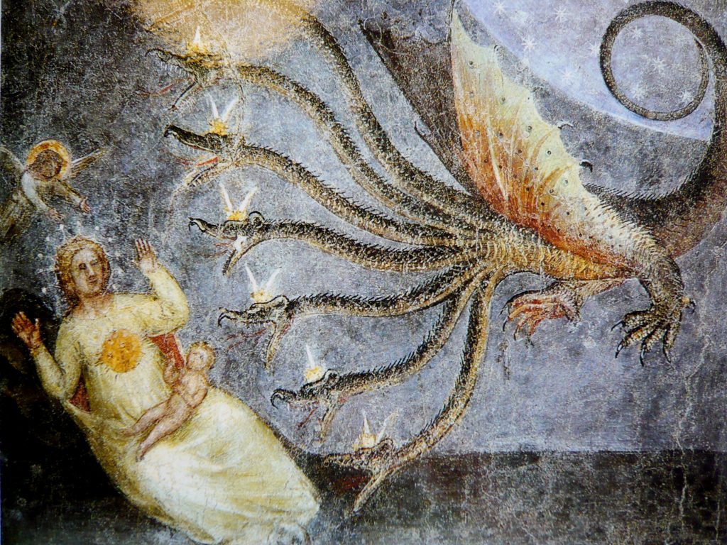
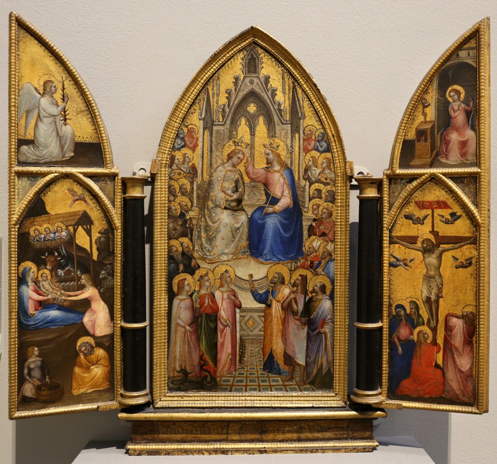
Giusto de’ Menabuoi was born in Florence, Italy in 1320 and died in Padua, Italy in 1391. He was a painter at the beginning of the renaissance period, known for his frescos and in particular, his work in the Baptistery of the Padua Duomo. While it is not confirmed, Giusto was thought to be an apprentice to the great master, Giotto. Around 1370 he moved to Padua, his work there earned him the alternative title Giusto Padovano. Giusto’s artistic style was very much his own and did not paint quite like the other artists living in the same period. Giusto was known for his vibrant use of colours, the painting “Paradise” seen in image one shows this use of colour, as well as his use of arrangement, creating an image that centres around Christ in a symmetrical fashion.

Work Cited.

F. Flores d’Arcais. “Encyclopedia of Medieval Art.” GIUSTO de ‘Menabuoi, Institute of the Italian Encyclopedia, 1996, https://www.treccani.it/enciclopedia/giusto-de-menabuoi_(Enciclopedia-dell’-Arte-Medievale)

“Giusto de’ Menabuoi.” Wikipedia, Wikimedia Foundation, 26 December 2020, https://en.wikipedia.org/wiki/Giusto_de%27_Menabuoi

The National Gallery, London. “Giusto De’ Menabuoi.” The National Gallery, https://www.nationalgallery.org.uk/artists/giusto-de-menabuoi.

Similarity

Artist: Sean Voegeli

The message is very clear in this poster for two reasons, the main text “break free” along with the visual image to reinforce this idea by using similarity. The three similar figures are the same size, colour, and position, this lets the viewer know that they are the same. The most important part of this design I would say is that there are four lines but only three figures that are attached to them. The idea that the white figure could have once been connected is achieved by having the same size as the rest of the figures, however the figure is now on its own because of the different position as well as colour. This conveys the idea that there used to be four figures all similar, but now one of them has broken free and stands alone distinguished from the rest.

Proximity

Artist: Scott Laserow

This image uses the gestalt principle of proximity, the artist has used a variety of images to create one large picture by grouping the smaller pictures together. The lower down you look the more space is in between each image to the point where the smaller images even look connected. I think that this image really uses proximity to its advantage, the symbolism of the wildlife falling away from the human representing humanity is really impactful. This image symbolizes humanity losing nature and wildlife because of humans negative impact of the climate, and soon enough our real life proximity to nature will be lost if we do not act.

Colour

Artist: Matt Taylor

The “Color Out of Space” is a movie that was based off of a short story by H. P. Lovecraft. The story focuses of a literal color from outer space. Because of this plot, the movie poster tries to capture the importance of the colour by using it as a main design aspect. The use of magentas and blues really make the poster pop, it is extremely vibrant and therefore very pleasing to look at. Without colour this poster would not nearly be as enticing and since colour is a main theme of the movie it only makes sense to reflect that in the posters design.

Texture

Unknown Artist

While this poster, created for the Olympic Paralympic games uses a variety of design elements, the overall aspect that stood out to me was the use of texture. Texture in this poster helps to amplify the visual appeal of the poster and really draws in the viewer. Texture is used in this case to show the true diversity of Canada. I like the use of the indigenous artwork as a texture at the bottom of the maple leaf, signifying that everything in Canada stands on the land of those who were here first. Other texture combined with line work is used to guide the viewers eye around the various landmarks and the important features of Vancouver, Canada. Overall I think that texture really helps to amplify the level of the poster and really makes it something that is truly unique to Vancouver.

Space

Artist: Olly Moss

In this poster design created by artist Olly Moss, we clearly see how space is being used to create a visually appealing image. Olly uses the negative space of the gun to create a face. Space is used to show the importance of the gun in the movie, as well as the relationship between the gun and the main character seen in the poster. The angle of the face is also used strategically to show that whoever this character is, they seem to almost have a relentless nature and look to them. The expression of the face and the importance of the gun is used really well to give an idea of who this “Dirty Harry” is. In conclusion we see that space is used very importantly in order to create a simple, yet very effective design of this poster.

My Yearbook Spread

For my yearbook spread I tried to capture myself and my personality by having a lot of motion and things to look at. The reason for doing this is because I am constantly moving or doing something, I am always daydreaming or thinking of something else in my head. As you can see there is a lot on the page, and because of this it is easy to get distracted by all the doodles. This is intentional as it relates to how my brain works. The doodles are not all just random little things, if you look closely a lot of them will tell you little bits of myself, what I like, and other little bits of information. The doodles remind me a lot of what my school assignments would look like during high school. I would constantly be drawing and be distracted by my own mind. I wanted to include this because it fits the theme of a yearbook and school. As you can see everything in the spread flows out of the image of me since they are all attributes and characteristics that relate to me. I started this project by drawing the portrait of me and then just let my mind wander and create the rest from there.

I would give myself an 8/10 if I were to score myself. While I do like that idea that I tried to convey I think I could have done it in a more visually pleasing way, yet at the same time I do think that this spread shows myself in it. I put a lot of effort into creating this spread probably totalling 5-6 hours spent on it, which is why I think the score of 8 is fair.