Similarity

Artist: Sean Voegeli

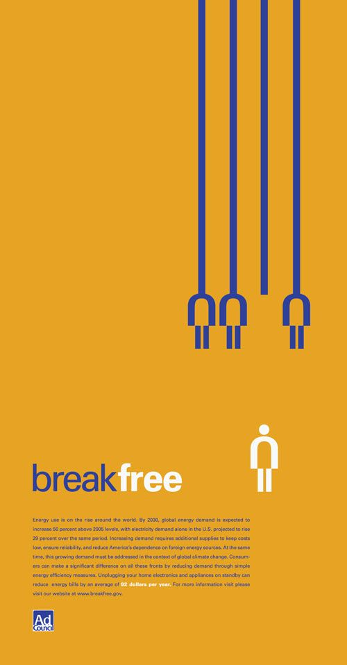
The message is very clear in this poster for two reasons, the main text “break free” along with the visual image to reinforce this idea by using similarity. The three similar figures are the same size, colour, and position, this lets the viewer know that they are the same. The most important part of this design I would say is that there are four lines but only three figures that are attached to them. The idea that the white figure could have once been connected is achieved by having the same size as the rest of the figures, however the figure is now on its own because of the different position as well as colour. This conveys the idea that there used to be four figures all similar, but now one of them has broken free and stands alone distinguished from the rest.

Proximity

Artist: Scott Laserow

This image uses the gestalt principle of proximity, the artist has used a variety of images to create one large picture by grouping the smaller pictures together. The lower down you look the more space is in between each image to the point where the smaller images even look connected. I think that this image really uses proximity to its advantage, the symbolism of the wildlife falling away from the human representing humanity is really impactful. This image symbolizes humanity losing nature and wildlife because of humans negative impact of the climate, and soon enough our real life proximity to nature will be lost if we do not act.

Colour

Artist: Matt Taylor

The “Color Out of Space” is a movie that was based off of a short story by H. P. Lovecraft. The story focuses of a literal color from outer space. Because of this plot, the movie poster tries to capture the importance of the colour by using it as a main design aspect. The use of magentas and blues really make the poster pop, it is extremely vibrant and therefore very pleasing to look at. Without colour this poster would not nearly be as enticing and since colour is a main theme of the movie it only makes sense to reflect that in the posters design.

Texture

Unknown Artist

While this poster, created for the Olympic Paralympic games uses a variety of design elements, the overall aspect that stood out to me was the use of texture. Texture in this poster helps to amplify the visual appeal of the poster and really draws in the viewer. Texture is used in this case to show the true diversity of Canada. I like the use of the indigenous artwork as a texture at the bottom of the maple leaf, signifying that everything in Canada stands on the land of those who were here first. Other texture combined with line work is used to guide the viewers eye around the various landmarks and the important features of Vancouver, Canada. Overall I think that texture really helps to amplify the level of the poster and really makes it something that is truly unique to Vancouver.

Space

Artist: Olly Moss

In this poster design created by artist Olly Moss, we clearly see how space is being used to create a visually appealing image. Olly uses the negative space of the gun to create a face. Space is used to show the importance of the gun in the movie, as well as the relationship between the gun and the main character seen in the poster. The angle of the face is also used strategically to show that whoever this character is, they seem to almost have a relentless nature and look to them. The expression of the face and the importance of the gun is used really well to give an idea of who this “Dirty Harry” is. In conclusion we see that space is used very importantly in order to create a simple, yet very effective design of this poster.