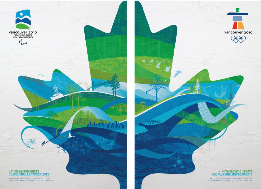
While this poster, created for the Olympic Paralympic games uses a variety of design elements, the overall aspect that stood out to me was the use of texture. Texture in this poster helps to amplify the visual appeal of the poster and really draws in the viewer. Texture is used in this case to show the true diversity of Canada. I like the use of the indigenous artwork as a texture at the bottom of the maple leaf, signifying that everything in Canada stands on the land of those who were here first. Other texture combined with line work is used to guide the viewers eye around the various landmarks and the important features of Vancouver, Canada. Overall I think that texture really helps to amplify the level of the poster and really makes it something that is truly unique to Vancouver.