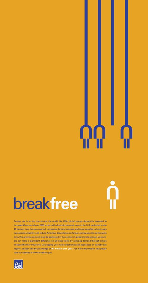
The message is very clear in this poster for two reasons, the main text “break free” along with the visual image to reinforce this idea by using similarity. The three similar figures are the same size, colour, and position, this lets the viewer know that they are the same. The most important part of this design I would say is that there are four lines but only three figures that are attached to them. The idea that the white figure could have once been connected is achieved by having the same size as the rest of the figures, however the figure is now on its own because of the different position as well as colour. This conveys the idea that there used to be four figures all similar, but now one of them has broken free and stands alone distinguished from the rest.
