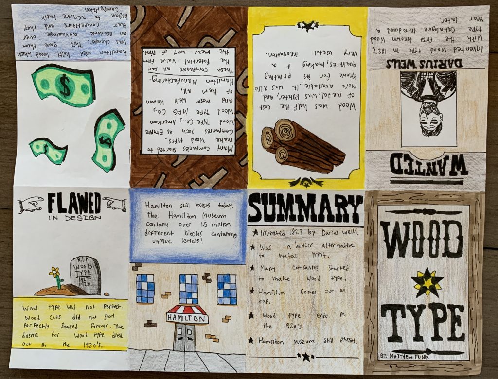
By: Matthew Funk
For my topic I chose wood type, I was drawn to this topic because of the parallels it shares with mid-western style typefaces. I thought that I could implement certain elements of the midwest such as a wanted poster and other wood-type glyphs. I tried to keep that theme flowing throughout the zine, and used various types of wood-type faces to relate the visuals of my zine to the topic at hand. I am very please with the end result, as it gives the viewer a decent understanding of the roots of wood type and different key facts as well. If I were to mark this zine I would give myself an 8/10, I think the theme fits perfectly and the visuals relate throughout and are pleasing to look at. I spent a total of around 8 hours on this project which is why I think 8/10 is a reasonable mark for my effort. I would however take 2 marks off for spelling neatness and perhaps the pencil crayon looks a little rough, overall I am happy with the outcome.
Work Cited.
Fonts by Hoefler&Co. (n.d.). Retrieved from https://www.typography.com/blog/a-treasury-of-wood-type-online.
Hamilton Wood Type and Printing Museum. (2021, September 19). Retrieved from https://en.wikipedia.org/wiki/Hamilton_Wood_Type_and_Printing_Museum.
Heller, S. (2017, June 01). The Birth of a Wood Type. Retrieved from https://www.printmag.com/daily-heller/birth-wood-type-brylski/.
What Is Wood Type? (n.d.). Retrieved from https://woodtype.org/pages/what-is-wood-type.