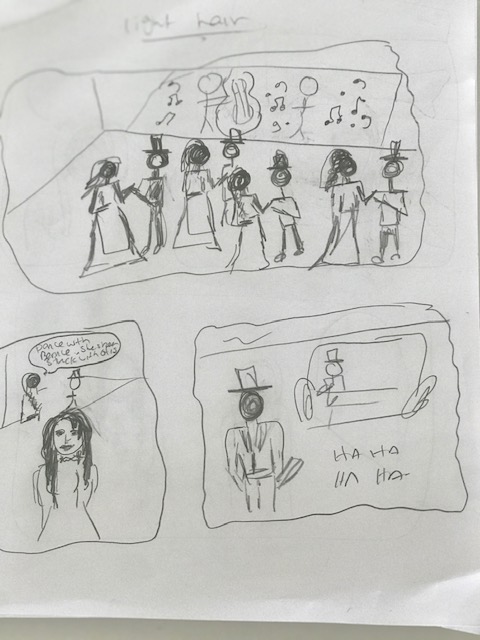
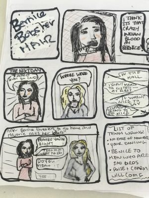
When I began planning this story, I first had to decide where to actually start it and whose storyline I was going to highlight. Bernice Bobs Her Hair seems to start from the perspective of Warren who laments about his unrequited love of Marjorie and the humdrum of her cousin Bernice. I toyed with starting with that scene (as seen in the rough sketch on the left) and including the dancing scenes along with the rather mean ones of the men laughing at Bernice. However, I decided to nix that idea because I didn’t really want to tell it from Warren’s perspective. I also thought that the later scenes were more important to show than this one. Also, I couldn’t draw dancing people. For those reasons, I decided to start the story from Bernice’s perspective—in 3rd person—and the scene where she overhears her cousin and aunt talking about her.
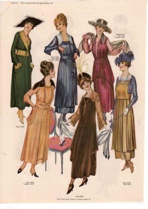
After I decided where to start the story, I then had to decide more on how to draw the characters—apart from my beautiful scribble people as seen above. I wasn’t quite sure how to draw the style of the characters because all I really know about 1920’s style is flapper style, and its made clear in the book—through the characters horror of bobbed hair and their own comments of how women should present themselves—that they are not flappers. All images I could find of 1920s women had bobbed hair too. From there, I decided to look up women’s fashion in the 1910s and simplify it from there—and I mean really simplified. I’m no Picasso—actually, of all the artists he probably the one closest to what I’m capable of. I’m no Mary Cassat.
I attempted to draw some sort of hat, like the inspiration image above, but it quickly became clear to me that hats were weird and difficult to draw. So, I decided to go with a very loose version of the outfits.
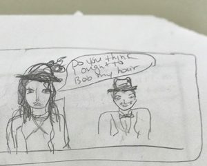
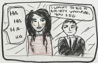
After I did away with hats, I decided that my characters were going to be a little wanton for the times and have their hair down. One of the story’s central themes was hair so I really wanted to emphasize those long locks and the drastic change later between Bernice’s long hair and her bobbed haircut later.
As you can see from the image on the right, facial features and expressions were simplified both because of the size of the paper I was working with too small to put in much detail and because of Scott Mcleods advice to not make the characters too specific. My one worry with this was that I don’t have the skill to differentiate between the characters if their faces were too similar, but I tried to reply on face shape, hair colour and dress colour to do so.
When it came to choosing what medium to draw/colour my comic in, I was stuck with what was available to me which was: 1. mechanical pencils for the outline; 2. fine liner sharpies and black gel pens; and 3. pencil crayons. I would have liked to use more vibrant colours or paints for the theme and background which I will explain later.
I didn’t colour in the characters’ faces—except for a bit of blush on Bernice’s cheeks because other characters described her as having “high colour”.
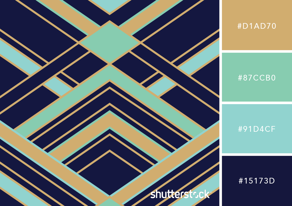
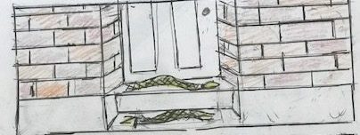
When it came to backgrounds, I knew that I wouldn’t want to add any real images, even masked, but I also didn’t want to leave it white or fill it in with a single colour. This is where I might have bitten off more than I could chew… Taking inspiration from the colours and design on the right, I tried to apply the 20s Art Deco style background. Sometimes it worked, other times it id not.
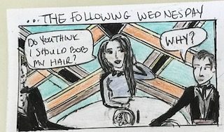
I kept it really simple for the narrative and dialogue. I used a standard speech ballon for most of the dialogue—with the exception of sound effects like laughter or snoring— and put the narrative on the empty space on top. I also simplified the language just to get the point across without relying too heavily on it.
I had some debate on where and how to end the story. I wanted to highlight the play on Majorie ignorantly speculating on Bernice’s ethnicity in the beginning and end with Bernice cutting off Majorie’s braids but I was uneasy about the language. In the end, I decided to cut the dialogue and leave it more ambiguous.
You can find my comic here. Please ignore the shaky lines, manky bits where used too much white-out, how I never learned to colour within the lines and the lack of consistency in the art deco backdrop.