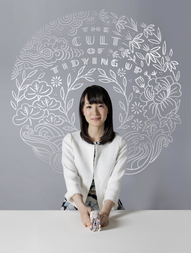
Dana Tanamachi’s work ‘Marie Condo x Wall Street Journal’ falls into the element of proximity. The subtly muted white illustrations against the grey background creating the sphere like shape. The illustrations of the nature-like materials make the entire image feel whole and well rounded.
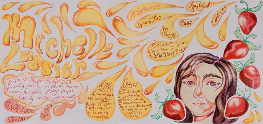
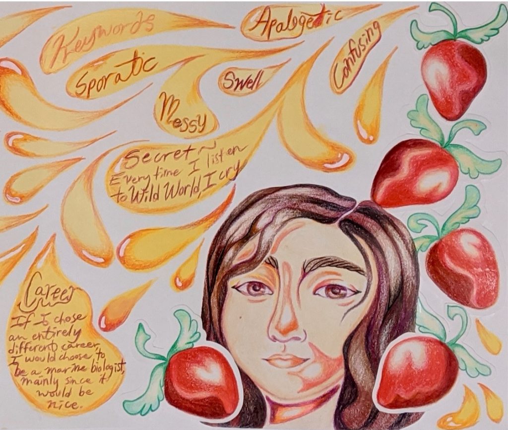
Trying to explain oneself and leave a positive lasting first impression on one’s peers is quite an intimidating project to start off with. Even the idea of making a project only revolving around me, I can’t help but shudder in disgust. Talking about myself is one of my least favourite things to do when introducing myself to new people. Unsurprisingly, due to the fact that I dread discussing myself, I procrastinated this project up until the very last few days.
I brainstormed what I enjoy, the particular colours that revolve around a strawberry-my favourite fruit and built up my piece from there. When thinking of a strawberry and the feelings it brings to me personally, I always feel soft and my mind sometimes feels like it melts in content when consuming them. The fat teardrop shapes are a recurring shape that I have been drawing since I was young. No matter what, the action of drawing these loose shapes always calms me down.
The set up and placement of the featured categories seem all over the place but not in a good way. Although I enjoy the colour palette, the multiple warm tones used to create this piece make it a bit rough on the eyes. This piece feels almost too cluttered even though the teardrops work well together. The portrait of my face almost seems out of place and should definitely be much closer to my name to help the viewer move through the spread rather than have to jump from one section to the next. This project deserved time, love and care all of which I did not provide. This project definitely stands at a strong six out of ten. The colour palette I chose is very pleasing but the set up and placement of everything is just too messy.
Although my view on the final product of this project is more negative than positive, I am glad that I got to create something that didn’t end up going my way. This project has reminded me that I still don’t enjoy talking about myself but it also let me experience the sensation of frustration and stress that I have not felt in a long time, it was nice.
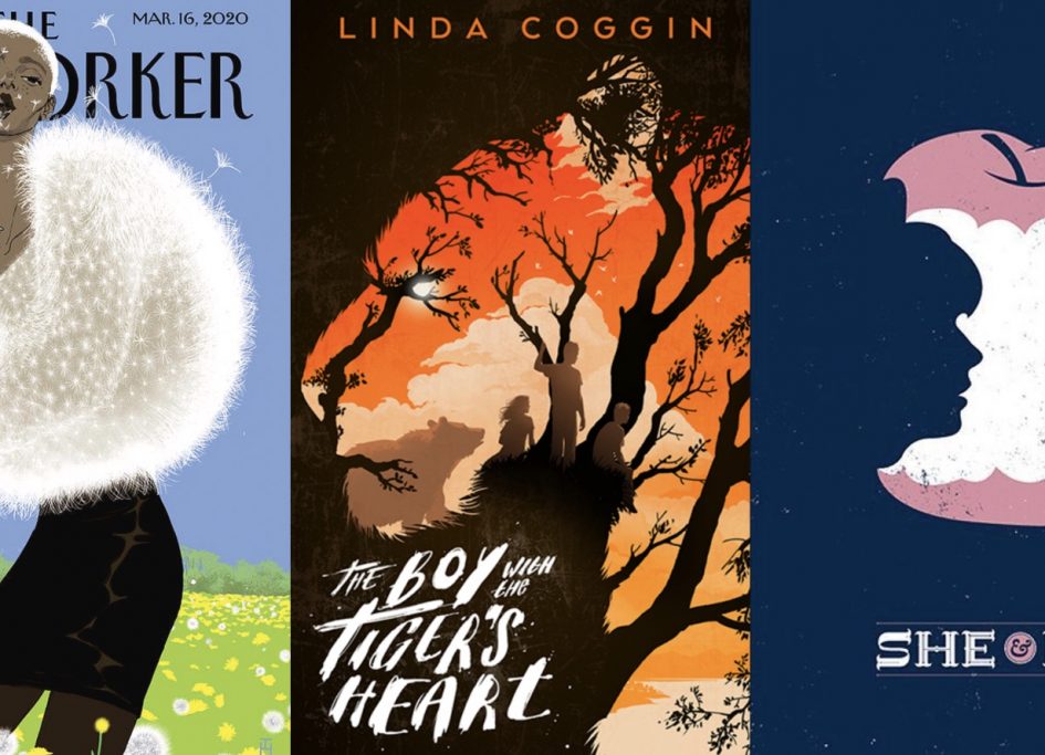
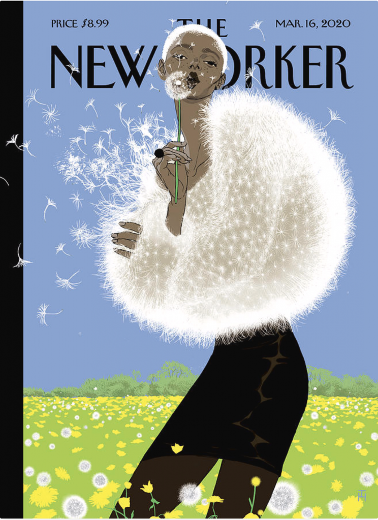
1. This cover for The New Yorker created by Tomer Hanuka incorporates the element of texture as the character in this piece is seen to be modelling a top made of dandelion fluff. Hanuka’s ability to create a texture so similar to dandelions ends up creating a sense of lightness that flows throughout the piece. 2. Levente Szabo’s use of the element of shape in the cover of ‘The Boy with the Tiger’s Heart’ creates a sense of depth as the branches of the trees and the vibrant orange sunset work together and create the shape of tiger. 3. Christopher Delorenzo presents an interesting example of using negative space in his illustration ‘She & Him’. The use of the uneven edges of the apple’s core creating a silhouette of two faces staring at each other is such a creative way of using space.