The idea for this cover came sort of out of the blue, which I guess most good ideas come from. But nevertheless, Thea, Rocio and I agreed that this was a really fun direction to take our cover and thus it was birthed!
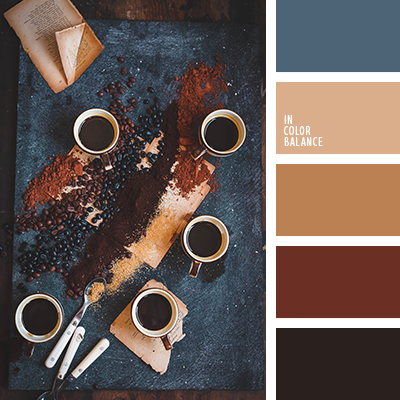
The colour scheme for this project was based on a coffee picture we found, and we thought that it had great contrast and made the subject feel whimsical.

Initially, we chose the teacup with coffee because we felt that it was an original idea. But personally, I feel that it welcomes readers to sit comfortably, sipping a warm drink, while cracking this open. It’s a perfect balance between calm and chaos as it has pieces of history spilling out along with the coffee. I think the mixed media we used in the spread also contributes well to the whimsy.
We chose a continuous layout for this spread (despite Judy’s objections) because we felt that consistency was important. The same vivacious scene could not be re-enacted just on one page!
I would give this spread a 9.5/10 because I think it works very well! There are small things that could be changed (The lettering is a tiny bit wobbly and squished, the background a tiny bit blotchy), but other than that I’m proud of it. All three of us contributed equally to the process and I’m pretty proud of that as well.