

So branding. Branding is already a difficult task (satisfying, but still difficult), but I find personal branding even more exhausting. In the past I have tried many times to come up with a logo or overall “style” and have left each time feeling I’d missed the mark. This time hasn’t been different in the sense that it’s been difficult. It’s been difficult to come up with unique ideas and make choices for design… There’s a lot of pressure because you want it to be good and something that lasts.
This time I would say, however, I feel like I have more knowledge of who I am and the goals I wish to achieve. So I think the results have turned out a lot better than my other times.
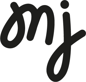
Here’s a bit of an explanation of each concept:
CONCEPT A: JUICY – This logo is plays on my brand essense, ripe determination, and also my love for fruit. The playful, script letter forms represent that I am full of creative juice, ready to be squeezed. This logo offers the adaptability of being a full wordmark or icon depending on the situation.
CONCEPT B: DOUBLE RAINBOW – This logo is based on my tone & personality traits, specifically trying to discover a balance between bubbly and genuine. It is quite whimsical in appearance while also remaining grounded as a solid mark. It’s adaptability for colour and texture leaves the opportunity for interesting animation as well.
CONCEPT C: LOOPY – I wanted to explore what the ultimate friendly and welcoming logo might look like for me. To represent this, I chose rounded edges and a swirly handwritten script. Because of the handmade feel, it also plays towards authenticity and while remaining a solid mark. There’s opportunity to use the swirly bits as graphic language.