Landing Page: Storyboard

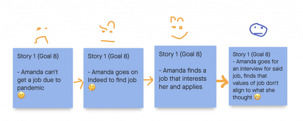
Our first storyboard we decided to focus on goal #8 which is Decent Work and Economic Growth, we decided that because of the pandemic Amanda had difficulty finding a job and decided to use an online job site like indeed to look for a job. After the interview she realizes the workplace ethics isn’t what she thought they were and doesn’t take the job.

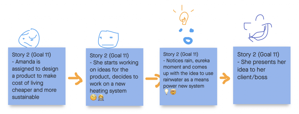
Goal # 11 is Sustainable Cities and Communities, we wanted to include a story that focuses on Amandas field of study which is industrial design and have her create a product that is eco friendly and cost effective to. make housing more affordable.

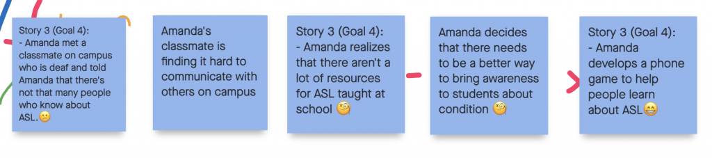
As a group we decided that our last idea was our strongest, in this story Amanda designs an app to help educate those and ASl after she realizes there arent many resources at her school.

and this is my final story board for our third idea.

Paul Rand (week 3)


Paul Rand was an American art director and graphic designer, best known for his corporate logo designs. He was one of the first commercial artists to practice the Swiss Style of graphic design in America. His diverse portfolio of work is bright and eye catching, Rand doesn’t shy away from colour and uses shape and form to his advantage.

Advertisement for Jacqueline Cochran cosmetics designed by Paul Rand. Courtesy of Steven Heller

His work to me seems timeless, and I especially love his use of negative space in some of the pieces shown I’ve put in this blog post.

Coronet Brandy magazine advertisement, 1948


Paul Rand led the way for future creative directors and designers alike and will always be a memorable piece of design history.

Frida Kahlo

Women in Art

Frida Kahlo was a Mexican painter and artist who is most well known for her vibrant self portraits. At Age 5 Kahlo was diagnosed with polio and struggled with the after effects consistently throughout her career as a painter. During her time of sickness she was encouraged by her father to play sports and stay active to help her heal which was highly unusual for a young girl of the time.

Me and My Parrots- 1941

During high school Kahlo joined a political club of students that shred her same views. On a trip with her club there was a bus accident that left her impaired for the rest of her life. After the accident she was left on bed rest and to pass the time she started painting. Later in her painter career he started more surrealist, realistic and traditional Mexican elements to her work. 

Two Nudes in a Forest – 1939

Many of her paintings are self reflections, self discoveries, and exploring who she is as an artist. After her bus accident she was unable to bear children which emotionally left a toll on her and is sometimes reflected in her imagery. She is often described as a surrealist but Kahlo always denied that statement. In her lifetime she created over 200 paintings, which were mainly self portraits, family members and still lifes.

https://en.wikipedia.org/wiki/Frida_Kahlo
https://www.fridakahlo.org/frida-kahlo-biography.jsp
https://www.britannica.com/biography/Frida-Kahlo

Women’s fashion

Survey 8 – Fashion infographic

For my infographic I wanted to implanted the style of a collage/ fashion mood board. I decided to focus on women’s fashion because it was rapidly evolving during this period and many new trends were made. I used advertisements and imagery from sewing patterns of the time to make sure things were as authentic as possible. I chose to use vertical text because it creates interest and keeps a balance between the top and bottom halves of the page. I had difficulties finding information and statistics for this time period which made the research portion of this assignment more difficult. I am really happy with how the headings turned out because I hand drew them and I feel it turned out fairly well. Over all I think this is my favourite of all the spreads I’ve made and would give myself a 8/10 because I feel I executed my vision and what I wanted almost perfectly.

abstract expressionism & pop art

Wayne Thiebaud

Wayne Thiebaud is an american “pop” artist whose best known for his thickly painted canvases which often depict classic american treats and everyday objects. I chose Thiebaud as a subject for this blog post because I admire his skills as a painter and his somewhat unique choice of  subject matter. I really love the way he is able to capture light and create a consistent mood throughout his work and how it makes me think of simpler times.

Jolly Cones
Oil on panel, c. 2002

During highschool he apprenticed at Walt Disney Studios and continued to work as an illustrator after high school. During the late 50’s he started to paint a small series of works based on food displayed in storefront windows but mainly focused on the colour and “basic shapes” of the subject. Wayne Thiebaud is often mislabeled as a pop artist because of his choice of subject, consumer goods and mass culture, which was usually claimed by the pop art movement.

Wayne Thiebaud Yellow Mickey Mouse Cake 1998 

Unlike most other pop artists of the time Thiebaud worked strictly from life which is what separates him from the pop movement, he truly belongs with the abstract expressionists and the Bay Area figurative movement. In addition to painting baked goods he was also known to paint landscapes, diner food scenes, and occasionally people he knew. His work also reminds me of Edward Hopper’s painting Nighthawks

Nighthawks by Edward Hopper 1942
https://www.britannica.com/biography/Wayne-Thiebaud
https://en.wikipedia.org/wiki/Wayne_Thiebaud
https://www.vanityfair.com/style/2019/03/wayne-thiebauds-lipstick-is-the-makeup-mood-for-spring
https://popularart.weebly.com/artistic-style.html

Fernand Leger

Cubism, Dadaism & Surrealsim

Fernand Léger (1936)

I chose to write this blog post on the French cubist painter Fernand Leger, because of his unique cubist style, depiction of the female subject and his influence in early pop art.

Early in Legers life he was a draftsman living in france to support himself as a young adult but was also taking art classes on the side at a local influential art school in france called the École des Beaux-Arts. Most of his earliest works were influenced by impressionist painter Paul Cezanne but,  you can also start to see the impact early cubism and artists like Pablo Picasso had on his late work. 

Fernand Léger, Nudes in the forest , 1910

Leger served in the French army from 1914-1917. During the period his work became more mechanical where more strong shapes came to play.

Lithograph – 1952
( in this late work you can see how he influenced many pop artists and his change ih stylr after the war)

After his time in the war, there was a distinct style change, he was reflecting on his experiences from the trenches.  The term “Machine Art” was later coined in his name to describe his mechanic-like style. 

Three Bottles 1954 Fernand L?ger 1881-1955 Presented by Gustav and Elly Kahnweiler 1974, accessioned 1994 http://www.tate.org.uk/art/work/T06800

Sources:

https://en.wikipedia.org/wiki/Fernand_Léger#1909–1914
https://www.ideelart.com/magazine/fernand-leger
https://www.guggenheim.org/artwork/artist/fernand-leger
https://www.tate.org.uk/art/artworks/leger-three-bottles-t06800

Survey 7

The Kellogg’s logo is simpler than it seems

Advertisement for Kellogg’s July 1910, Life Magazine


By now most of us know the original intention of one of America’s favourite breakfast cereals, Kelloggs Cornflakes. The cereal was created by accident but was geared towards vegetarians and those seeking a way to curb their sexual appetite. It was recommended by the church that eating bland foods was a way to stop mastrubation.

Will Kellogg’s signature on early Kellogg’s boxes

As if that was not interesting enough Will Kellogg would originally sign  Toasted Corn Flakes from each box because he felt it set his company apart and was more personal. After a few tweaks Will Kellogg’s trademark signature became the face of the Kellogg’s company. Over the years there has been slight changes to the typeface, mostly in colour and line thickness making it a common household name we all know and love. 

First “modern” Kellogg’s logo from the 1920’s

Optics During the 1880’s

Survey 5 – artifact

For my artifact I originally chose to make a set of contact lenses inspired by the original glass ones made by Eugen Fick. Although I was able to make the lenses they proved hard to photograph and I had to instead illustrate them as an advertisement. I tried to choose similar typefaces seen on a poster made by jobbing printers and I am overall pleased with how the advertisement turned out. Because I wanted to make the title very bold and in a thick font it made it difficult to fit both the era and the title without taking away from the aspect of the larger text. Overall I would give myself a 7/10 because I only like half of the spread. I spent most of my time focusing on the artifact rather then the text and that was my downfall.

Expressionism

Corinne Michelle West (Michael West)

1947. Photo: Francis Lee. Courtesy of Stuart Friedman

Corinne was an american expressionist and early cubist painter during the late 20th century. She graduated from the Cincinnati Art Academy in 1925 before continuing her schooling at the Art Student’s League and commercial art in New York.  She was said to be the lover and muse of artist  Arshile Gorky while she studied under russian painter Raphael Soyer in the early 30’s.

“Flowers,” a 1952 oil on canvas by Michael Corinne West.

In the male dominated art world of Pollock and Hoffman West was independent, bold and one of the few female expressionists of her time. and bold. Her works varied from small paintings to canvases the size of herself. As she progressed she experimented with larger brushes, brushstrokes and painting with large eccentric movements. Many of her later pieces feature dark and sombre colours but have an energetic feel because of the large brushstrokes that almost appear to be moving. 

Ash Wednesday

Poet with a Brown Hat, 1941

Sources:

https://arthistoryunstuffed.com/michael-west-the-artist-was-a-woman/

https://en.wikipedia.org/wiki/Corinne_Michelle_West

http://www.artnet.com/artists/michael-corinne-west/

Impressionism

Auguste Renoir

Self-Portrait – Pierre-Auguste Renoir

Auguste Renoir was a french painter who was known as a leader in the impressionist movement. He was most commonly known for capturing the  female subjects sensuality in his paintings. His work commonly reflects and is inspired by modern painters like Manet and Danish painter Camille Pissarro.

A Nymph by a Stream – 1869

Renior’s work was often well received from critics and mostly painted portraits in his early adulthood. He was able to effortlessly capture the human figure and the interactions between them and set a mood in his paintings with the exaggerated colours he uses. Renoir was a part of a group alongside Pissarro, Monet, Cézanne and Edgar Degas called the Impressions.

Dance in the City – 1883

They did their first gallery in 1874 in Paris but was not a success. Soon after the failed exhibition Renoir and other impressionist painters found patrons who did enjoy their work and would speed up the success of his career. In his lifetime Renoir created over two hundred pieces before dying at the age of 78.

Sources:

https://en.wikipedia.org/wiki/Pierre-Auguste_Renoir

https://www.khanacademy.org/humanities/becoming-modern/avant-garde-france/impressionism/v/how-to-recognize-renoir-the-swing

https://www.pierre-auguste-renoir.org

https://www.wikiart.org/en/pierre-auguste-renoir

https://www.biography.com/artist/pierre-auguste-renoir