Survey 8: Ouch! The History of Band-Aids.

Healing booboos since 1920, I’m sure most are familiar with the adhesive bandages: Band-Aids. 

Inventor of the BAND-AID, Earle Dickson.

Introduced by Earle Dickson, the band-aid was invented for his wife Josephine who would always cut and burn herself in the kitchen. What Earle did was prepare ready-made bandages, which were pieces of cotton gauze on a strip of adhesive tape. The tape remained sticky because he covered them with crinoline, a fabric similar to tulle. This prototype allowed Josephine to dress her own wounds without additional assistance. Earle pitched his invention to the company he worked for at the time, Johnson & Johnson. The company president, James Wood, picked up his prototype and began to market the product. 

Early BAND-AID box

Unlike today, they were made by hand, around 3 inches in width and 18 inches in length. Additionally, the sales weren’t too great either, in their first year they sold about only $3000 worth. Mainly because people didn’t know how to use them. However, Johnson & Johnson did achieve progress. Sales began to increase after the company employed salesman to introduce their new invention to doctors, pharmacists, butchers, and even the Boy Scouts. 

Mass-Produced BAND-AID 

In 1924, J&J brought in machines to mass-produce the bandages. These machines made bandages ¾ inches wide and 3 inches long. The wrappers were also being introduced for convenience, with little red strings used to open the product. They kept improving the bandages, selling them in different sizes and adding holes in the gauze pads for aeration and faster healing. 

Tin BAND-AID Packaging 

Two years later in 1926, J&J upgraded their packaging to the iconic metal tin over the cardboard boxes they’ve been using. From the immense success of Earle’s invention, he was rewarded by being named vice president and even elected to J&J’s board of directors. All thanks to Josephine’s poor cooking skills. 

Sources:

https://ourstory.jnj.com/first-band-aid-brand-adhesive-bandage

https://www.jnj.com/our-heritage/18-facts-about-the-history-of-band-aid-brand-adhesive-bandages
https://www.bandaid.ca/band-aid-history

Survey 7: The Wild Beasts of Colour

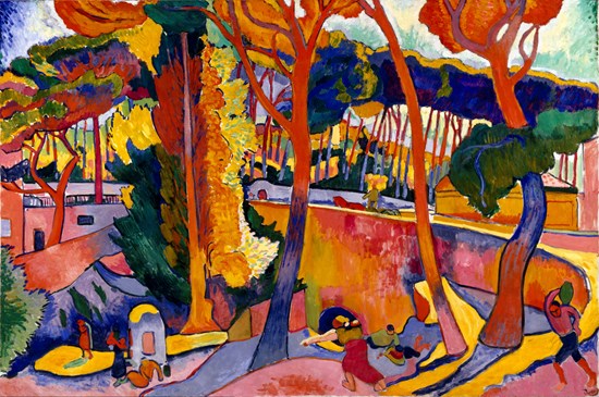
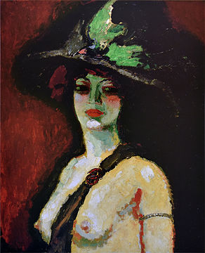
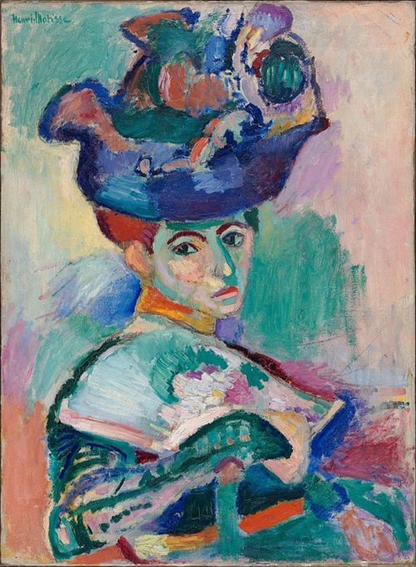
At the start of the 20th century, the Fauvism art movement began to gain recognition. The Fauves (meaning “Wild Beasts”) were known for their strong use of bright and pure colours. They valued bold linear patterns as opposed to realistic representations. The movement was short-lived and only lasted from 1905 to 1908, however in only a matter of 3 years the Fauves made a great influence on art history.

The Fauves enjoyed the emotional freedom that came through colour, but were also interested in the science behind colour theory. They specifically focused on complementary colours and how when applied beside each other on a painting, both colours will appear more vividly.

Woman with a Hat, 1905. Henri Matisse.
The Turning Road, 1906. André Derain.
Woman with Large Hat, 1906. Kees van Dongen.

Clearly from these pieces we see the Fauves have a passionate connection with colour. They experimented with intense colours to play with space, light, and atmosphere. For the most striking results, they would use paint straight out of the tube and apply their brushwork aggressively to the canvas. They were trying to convey sensations, not likeness. A pioneer of the movement, Henri Matisse, put it simply:

“When I put a green, it is not grass. When I put a blue, it is not the sky.”

Even if the subject matter the Fauves painted were traditional, the unnatural Fauve colours definitely turned common motifs into something brand new, like nudes, portraits, landscapes, etc. The contemporary audience of Fauvism believed the colours to be assaulting to the eye and thought the style was effortless and clumsy. But it just so happens that Fauvism’s “assaulting colours” would later on influence many important artists such as Munch, Kokoshcka, Kandinsky, and Rauschenberg.

Sources:

https://search-credoreference-com.ezproxy.capilanou.ca/content/entry/bght/fauvism/0

https://search-credoreference-com.ezproxy.capilanou.ca/content/topic/fauvism

https://www.tate.org.uk/art/art-terms/f/fauvism

https://www.mfah.org/art/detail/1549

Survey 5: The Oriental Fantasy at the Great Exhibit

The Great Exhibition of 1851 was the world’s first fair to showcase the vast scientific, cultural, and industrial progress. It was hosted in London and took place in the Crystal Palace, many countries were allocated their own exhibit and space. However, one country got assigned an excessive amount of space for their court. And that country was India. 

India’s location within the Crystal Palace was honourable, placed in the southwest corner of the court, meaning that India was facing the beautiful Crystal Fountain. 

Made from 4 tons of glass, this was the Crystal Fountain

The way the India exhibit had been set up was strategic, focusing on visual wonders and extravagance. Displayed hanging above were colourful exotic carpets and artifacts that had been meticulously arranged on counters. These foreign objects drew the viewers in, fascinating and inspiring them. Many items on display fueled new ideas for a second industrial revolution, which would have tools that were not only useful but also refined in their design.

A section of the India exhibit from Dickinsons’ Comprehensive Pictures of the Great Exhibition of 1851

There was a rich assortment of shawls, agricultural produce, elephant trappings, and jewels. One of the most fascinating jewels on display was the kohinoor diamond. 

186 carat Kohinoor Diamond on Display

The kohinoor is one of the largest cut diamonds in the world and part of the British Crown Jewels. In the exhibit catalog the kohinoor was described as “The Great Diamond of Rujneet Singh” or “Mountain of Light”. The kohinoor also has a mysterious history and known to be worth £1–2 million. It was a pretty big deal and long lines were made to view the diamond. Interestingly enough, visitors were disappointed, and thought the diamond was way too dull. 

Despite the let down of the kohinoor, the India court introduced attendees to a new and exciting foreign land with different cultures and innovations, it was a very exciting time!

Sources:

https://search-credoreference-com.ezproxy.capilanou.ca/content/entry/routbrithistory/great_exhibition_1851/0

https://www.historic-uk.com/HistoryUK/HistoryofEngland/Great-Exhibition-of-1851/

https://web.duke.edu/isis/crystalpalace/mzl/page3.html

https://www.thoughtco.com/britains-great-exhibition-of-1851-1773797

Survey 4: The Reading Epidemic

Back in the 19th century, when the manufacture of paper and the printing press was drastically improved, literacy rates increased at a rapid pace. Because everyone was reading, and everything was being read, people believed this drastic rise in reading was an epidemic! People named this new “disease”: Reading Mania. 

Because the price of books took a drop in the 19th century, the everyday man and woman had just as much access as the wealthy. Literacy began to lose its prestige and would no longer be associated with high status. Members of traditional reading classes believed that there should be a hierarchy in who should be given information. They believed the common folk would ruin literature, literally the most bourgeois thing to be freaked out about. 

You might be wondering, how exactly has everything become so cheap? Wood pulp and straw. This cheap paper was typically used for mass-market books being sold at crazy low prices. There was a couple different variations of mass media being spread such as: 

  • Penny dreadfuls: Gothic stories sold for a penny 
  • Pulp magazines: Made out of wood-pulp paper
  • Yellow backs: Books bounded with yellow strawboard and covered with bright yellow glazed slips. Sold from sixpence to a shilling. 
Example of a Penny Dreadful: Varney the Vampire – A Gothic Horror Story
Example of a Pulp Magazine: The Golden Argosy – First All-Fiction Pulp Mag
Example of a Yellow-Back: The Mutiny In India – Inexpensive Reprint Edition of Popular Book

It wasn’t costly to produce these types of media, therefore they were an excellent medium for artists and authors to experiment with taboo, controversial, and peculiar subject matters. But because unusual themes were explored, the audience of young children who read these cheap books were exposed to violence and crime. The suicide and murders committed by young boys were blamed on the books. Those committing crimes who also enjoyed penny dreadfuls were thought to be a “victim” of the books. Interesting how this is similar in today’s world where a movie like “Joker” was deemed dangerous by critics who believed it will inspire gun violence and is an ode to incel white men. 

Sources:

https://slate.com/technology/2017/08/the-19th-century-moral-panic-over-paper-technology.html

http://www.frankfuredi.com/article/the_medias_first_moral_panic

https://library.princeton.edu/special-collections/topics/yellow-back-collection

https://www.pulpmags.org/contexts/essays/what-is-pulp-anyway.html

Survey 3: Where Did Italics Even Come From?

I’m sure by now we all take italics for granted, whether we use it for emphasis or in our citations. But how did these slanted letters become a thing?

The history of italics starts in 15th century Venice and 2 dudes: a printer Aldus Manutius and his type designer Francesco Griffo. From Aldus’ published book in 1500, Epistole di Santa Caterina da Siena, we see just a sneak peak of Italics printed in the illustration of the book to the left and heart on the right.

 The first words printed in italics, iesu dolce iesu amore and iesus. 

Aldus was dedicated to publish Greek and Roman classics, but more specifically, Greek and Roman classics in small format. To produce small books for scholars at a low cost, he needed to save as much space as possible. Therefore, he had a type designed based off of informal letters done in calligraphy handwriting.

Enter Italic Type. 

Aldus’ type designer, Francesco cut the new italic type only in lowercase letters to which he paired with Roman capitals. An example of this odd italic and non italic pairing can be seen in the first page of Virgil’s Opera, published by Aldus himself. It is the first book to include the italic typeface as the body text.

Opera by Virgil

Manutius was very excited about italics and wrote to his friend:

“We have printed, and are now publishing, the Satires of Juvenal and Persius in a very small format, so that they may more conveniently be held in the hand and learned by heart (not to speak of being read) by everyone.”

Later on, slanted uppercase letters were shaped to complete the Italic type family we know and love.

Roman and Italic type we use today.

Sources:

https://search-credoreference-com.ezproxy.capilanou.ca/content/entry/columency/aldus_manutius/0

https://typedecon.com/blogs/type-glossary/italics/

https://www.britannica.com/topic/italic

https://www.britannica.com/biography/Aldus-Manutius

Survey 2: Runestones, Design for the Dead.

Often used as memorials to dead men, a runestone is a raised stone with runic carvings. Runic meaning a Germanic language alphabet. Today, most of these stones can be found in Scandinavia and Sweden. The majority of runestones date back to the late Viking age. This tradition of raised and inscripted stones have been around since the 4th and 5th century, appearing first in Norway and Sweden. 

An early runestone from Sweden

The reason the Vikings had runestones were to claim their territory, brag about their achievements, communicate important news, and most of all honour their fallen brothers. 94% of all runestones have been raised to commemorate dead men. The inscriptions on the stones were all fairly similar. These were the general guidelines:

  • Name in memory of who the stone is for – may include their social status, place of death, or prayer dedicated to them 
  • Who raised the stone
  • How the dead Viking and the one who raised the stone are related 
A typical memorial runestone

Many of these runestones have been damaged by the Viking enemies or harsh weather, but some runes can be found in good condition, although the bright colours many stones once bared have completely worn off. Dominating colours used by the Vikings were red and white, some even say the runes were reddened with blood. 

The Rimsø stone

Although runestones were dedicated to mostly men, some were also raised for women. The Rimsø stone in the photo above was raised by a Viking named Thorir in memory of his mother. Not only is this runestone interesting because it was for a women, engraved was an expression of emotion. Thorir claimed that the death of a mother is the worst thing that could happen to a son.

Sources:

https://en.natmus.dk/historical-knowledge/denmark/prehistoric-period-until-1050-ad/the-viking-age/power-and-aristocracy/rune-stones/
https://www.arcgis.com/apps/MapJournal/index.html?appid=9a665fa8f62a416cba11287496a2ce74
https://www.uu.se/en/support/research-on-runes/

Survey 1: Handprints and handwriting

Today we went through the earliest forms of communication in human history, looking back at the cave paintings, hieroglyphs, and Chiaku-Wen. I was most surprised by the way humans adapted, created, and translated our writing systems. My group’s focus during this time period was architecture, specifically the Parthenon.

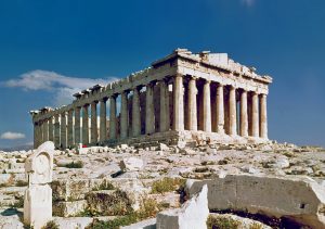
Athens, Greece: The Parthenon

The Parthenon is recognized as the architectural symbol of Ancient Greece. Located on the Acropolis of Athens, the Parthenon was built by the Athenians in 447 BCE and completed in 432 BCE. It was created as a temple dedicated to the goddess Athena Parthenos.

The most notable aspects of the Parthenon are the columns and friezes. The columns of the Parthenon follow the Doric order. The Doric order was the first and simplest style of Classical Greek architecture. These massive columns are fluted, baseless, and topped with a square slab. The silhouette of the columns curves outwards in the middle, this was done to remove the optical illusion that occurs when the column appears narrow in the center even if its proportions are equal to the top and bottom. There are 8 columns on the east and west ends of the Parthenon along with 17 columns on the north and south sides.

Doric Columns

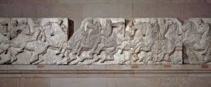
The Parthenon frieze is an Ionic order high-relief sculpture. The Ionic order was the second style of Classical Greek architecture and was used mainly for small temples and interiors. The frieze is located in the inner chamber of the temple, also known as the cella, and was made purely for decorative purposes. This contrasts the simplicity of the Doric order, creating a harmony between simple and intricate details. The Parthenon’s style of architecture integrates both the Doric and Ionic Order. Combining two forms of architecture was a rare practice in Ancient Greece, however the result gave the Parthenon an iconic look, making it a world monument.

Ionic Frieze

Citations:

Harper, A. (2016). Parthenon. In Facts on File (Ed.), World history: a comprehensive reference set. New York, NY: Facts On File. Retrieved from https://ezproxy.capilanou.ca/login?url=https://search.credoreference.com/content/entry/fofworld/parthenon/0?institutionId=6884

Parthenon. (2017). In Encyclopaedia Britannica, Britannica concise encyclopedia. Chicago, IL: Britannica Digital Learning. Retrieved from https://ezproxy.capilanou.ca/login?url=https://search.credoreference.com/content/entry/ebconcise/parthenon/0?institutionId=6884