CONTEMPORARY & POST MODERNISM – CY TWOMBLY

Edwin Parker “Cy” Twombly (1948-2011) was an American painter, sculptor, and photographer born in Lexington, Virginia. His works are graffiti-like, with speckles of detail from scratches, smudges, drips, pencil fragments and bits of written word. When defending his style he said:

“My line is childlike but not childish. It is very difficult to fake… to get that quality you need to project yourself into the child’s line. It has to be felt.”

Twombly’s approach to art is emotional and refined, but critics of his time would disagree. Artist and writer Donald Judd described his work to be “a few drips and splatters and an occasional pencil line,” and that “there isn’t anything to these paintings”. Damn Donald! What a harsh guy. Here’s one of Judd’s works:

Untitled (1973)

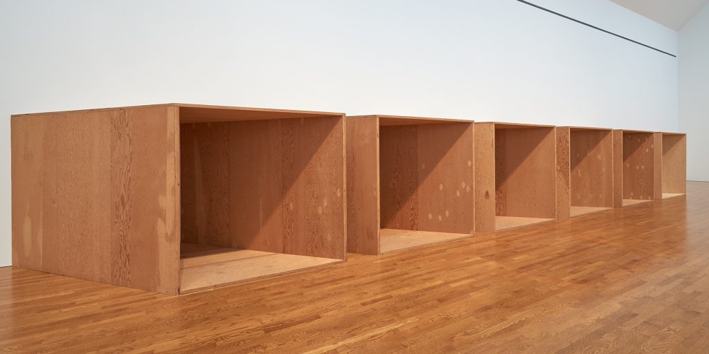
Is there anything to these wooden boxes, Judd? Ha! But I guess I do understand why someone would criticize Twombly’s paintings, or any abstract art in general. You can have an “I could do that myself” attitude about his art but I for one enjoy Twombly’s pieces.

Untitled, Rome (1960)

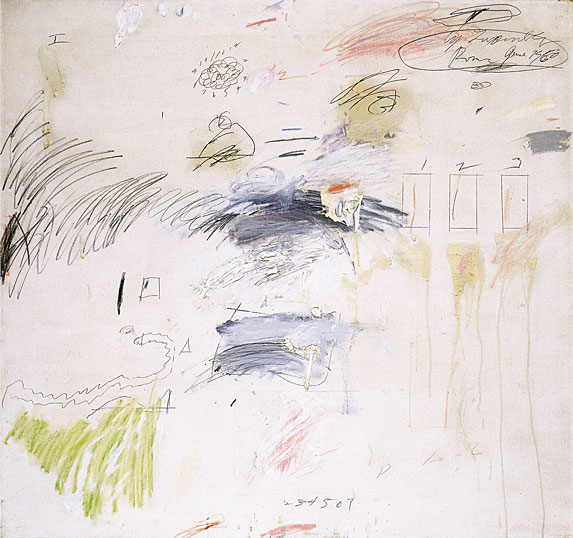
I love the unsystematic and chaotic feel of this painting, it’s like a page out of a scrapbook without the photographs. The different textures work well together. There’s numbers, rulered squares, squiggles, drips, writing, splotchy paint… Twombly puts it all on there! I agree with what he said about his work being childlike but not childish. This piece is planned disorganization.

Nine Discourses on Commodus (1963)

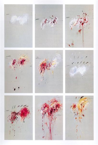
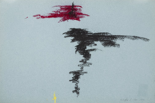
From 1962-64 Twombly’s works became more anxious and took on dark themes. This was a reflection of the somber mood in the early 60s from the Cuban Missile Crisis and John F. Kennedy’s assassination. There are bursts of colour but they have been restrained, leaving room to create negative space. In a couple of these there are grids, graphs, and geometric axes, an attempt to control mayhem with discipline and order.

Anabasis (1983)

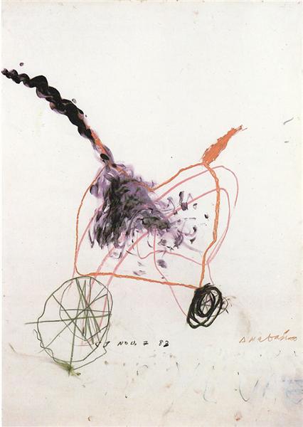
I actually think this piece is really cute, to me it looks like a greeting card of some sort. It looks very much like a bicycle, especially the two wheels with spokes. The colours are calmer than what Twombly typically uses but I think it works nicely to create a peaceful spirit.

Untitled (Say Goodbye Catullus, to the Shores of Asia Minor) (1994)

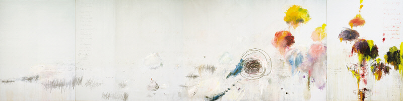
This one is a big boy, 157 by 624 inches! Wow. Twombly used 3 canvases for this one and a variety of oil, acrylic, oil stick, crayon, and graphite. I like the heaviness all pushed to the right side of the piece. It starts out tame in graphite on the left but then gets increasingly more intense with the explosions of colour.

Leaving Paphos Ringed With Waves III (2009)

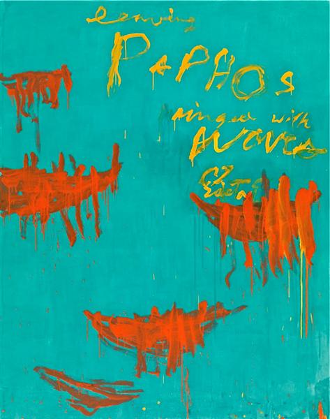
Crazy how this bright blue can evoke the atmosphere of the Mediterranean Sea. This looks like a book cover to me with the text being at the top right. All of these 3 colours work really well and I especially love the drippy spots.

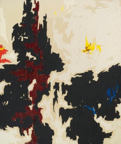
Another reason why I like Twombly is because his work reminds me of one of my favourite contemporary artists, Lewis Rossignol. Here is an example of Rossignol’s work:

Image result for lewis rossignol
Anthony Bourdain (2019)

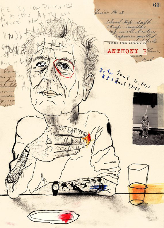
I’m unsure if Rossignol takes inspiration from Twombly but I definitely see similar techniques. The smudging, scraggly lines, pops of bright colour, neutral background, and messy handwriting. I just really love the style! Definitely going to try make my own Twombly-Rossignol hybrid drawing.

Sources:

https://www.wikiart.org/en/cy-twombly/all-works#!#filterName:all-paintings-chronologically,resultType:masonry

https://www.theartstory.org/artist/twombly-cy/life-and-legacy/#legacy_header

http://www.cytwombly.org/biography

https://www.instagram.com/lewisrossignol/?hl=en

ABSTRACT EXPRESSIONISM & ART POP – CLYFFORD STILL

Clyfford Still (1904-1980) was an American artist who made great contributions to the first generation of Abstract expressionism and large scale monochromatic painting. He made the shift into abstract painting from 1938-42 which is earlier than his colleagues who were still into representational painting. His works are categorized in the “color field” style. His approach in technique is to use thick layer of opaque paint and to depict rough forms to express aggression. There is no complicated psychological breakdown to what he does, he feels that art is simply the way of life.

PH – 1001 (1929)

In his earlier figurative work he would often paint people and machines of farm life. I really like this painting and its sketchy style, the way he painted the fabric of the pants is loose but conveys texture. The profile of the man’s head is another aspect I like, especially how high the nose bridge is.

PD – 24 (1932)

This is just a simple sketch but I find it interesting to compare his draftsmanship to his super simple abstract pieces. He has captured the subject really well and I love the woman’s snug pose. I would’ve loved to see this drawing colored in. Maybe I’ll recreate it and do it myself!

PH – 550 (1942)

Here’s where things start to make a shift into the abstract realm. I don’t know what these 3 objects are, maybe lamp posts? Dandelions? Lollipops? I like the dull colours contrasting with the pops of yellow, orange, and blue.

1947-Y-No. 2, 1947 - Clyfford Still
1947 – Y – No. 2 (1947)

Now this one I really love. It looks like a nonsensical map but also a cow print with some blotches of color. There’s something about the irregular shapes fitting in together that makes it captivating to sit and stare at. Even though the forms are rough, there’s no brushstroke feel, it’s kind of like he stamped these shapes on the canvas. I think Still’s color field style of painting could be really cool wallpapers.

PP – 387 (1970)

I found this one to be pretty eye-catching, to me it looks like a figure skater in motion spinning with their leg out. Looking at Still’s work, I want to try scribbling around with pastels and try out his style.

Sources:

https://search-credoreference-com.ezproxy.capilanou.ca/content/entry/bga/still_clyfford_1904_1980/0

https://collection.clyffordstillmuseum.org/listing

https://www.wikiart.org/en/clyfford-still/all-works#!#filterName:all-paintings-chronologically,resultType:masonry

CUBISM, DADAISM, & SURREALISM – MAX ERNST

Max Ernst (1891-1976) was a German painter and sculptor, contributing to both the Dada and Surrealist movement. His works were dream-like, humorous and favored poetic expression over plastic form. He attended the University of Bonn and is educated in literature, philosophy, and psychology. His academic background contributed to the evolution of the Surrealist ideology. As an artist, his approach was to challenge social norms and tradition by being experimental. Throughout both WW1 and WW2 he has managed to keep inventing new techniques and ideas in his work.

Image result for The Hat Makes the Man
The Hat Makes the Man (1920)

I remember I was in the school library in grade 10 and I saw a book on the shelf titled “Dada”. I’ve never heard of Dada before but I thought it was funny so I checked it out. This piece was included in the book and it stuck out to me. I didn’t know the meaning behind all these hats, and looking back at it now, I still don’t know. But apparently Ernst is challenging gender roles as these are women’s hats and he is juxtaposing the term “the hat makes the man”.

Image result for max ernst plane
Murdering Airplane (1920)

This is one of Ernst’s collages, criticizing the misuse of technology and the horrors of aerial warfare during World War 1. This is especially personal to him because he served during the war. I like how the only human aspects of the collage are colored, leaving the airplane in an ominous black and white. Ernst titling it the “Murdering Airplane” is interesting because murder is a human on human crime. Airplanes can certainly kill, but have no ability to murder. Ernst is commenting on the relationship between man and machine, and how technology is essentially an extension humans.

The Virgin Spanking the Christ Child before Three Witnesses: Andre Breton, Paul Eluard, and the Painter, 1926 - Max Ernst
The Virgin Spanking the Christ Child before Three Witnesses: Andre Breton, Paul Eluard, and the Painter (1926)

I wonder what baby Jesus did to make his mama beat him like that. This is definitely a different interpretation of the Virgin and child compared to the one’s I’ve seen before. I like the weird angle and distortion of Mary’s striking arm. But it’s that same quirky detail in her arm that I wished Ernst would’ve added in her feet because they appear too dull. Still a funny painting though.

Composition, 1943 - Max Ernst
Composition (1943)

I’m unsure of what these animals are supposed to be. The breasts are what’s throwing me off… Why do these bird creatures have human boobs? What I do like about it is the simplicity of the line work and how it transitions into different colours. The bits in yellows are also very pretty. The little and big creature look serene, but the one in the middle has it’s eye wide open. I wonder why she’s not sleeping peacefully with her other friends. Or maybe this is a three headed monster and she’s the one on watch.

Birth of a galaxy, 1969 - Max Ernst
Birth of a galaxy (1969)

Ernst did this piece in oil the same year as the moon landing, representing his fascination with new spheres in the universe. I love the dark blue colours and the repetition with the circular shapes. This piece is vibrant but also conveys feelings of contemplation.

Sources:

https://www.moma.org/collection/works/35478

https://search-credoreference-com.ezproxy.capilanou.ca/content/topic/ernst_max_1891_1976

https://www.theartstory.org/artist/ernst-max/artworks/

https://www.wikiart.org/en/max-ernst

Expressionism, Fauvism, & Early 20th Century – Otto Dix

Otto Dix (1891-1969) was a German painter, printmaker, and watercolorist. In 1910-1914, he completed his studies in Dresden which was the birthplace of the German expressionist group, Brücke. He was inspired by their emotionally driven gestural and dramatic style. His work made a shift during WW1, and he was inspired by Futurism and Dadaism, therefore incorporating strong colours and abstraction. He focused on the decaying post-war aftermath and the subjects he chose to paint were prostitutes, crippled soldiers, and veterans. He was an important figure in regards to portraying the uncensored reality of war and society through satire and grotesque manners.

Self-Portrait (1912)

This portrait is an example of his early work, it appears very traditional which isn’t what Dix is known for, however, I find it to be very beautiful. The texture of his corduroy jacket is remarkable, I can almost feel the fabric. I love how his expression is serious but he’s holding a tiny pink carnation. The shine on his fingernails is another detail I adore.

Memory of the Halls of Mirrors in Brussels, 1920 - Otto Dix
Memory of the Halls of Mirrors in Brussels (1920)

Dix is such a wild guy for painting this. Of all the paintings I’ve seen this semester, this one takes the cake for being the most shocking to me. I’ve never seen anything like it. The intimate scene is jarring enough but then Dix goes ahead and paints it again in reflections! I love the distorted perspective, especially that of the table. I also like that he combined two controversial subjects: war officer and prostitute. A double whammy for sure.

Pragerstrasse, 1920 - Otto Dix
Pragerstrasse (1920)
Image result for the skat players
The Skat Players (1920)

These two are haunting examples of crippled veterans Dix would paint. The first depict mutilated beggars on the street and the second are men playing skat, a 3 player card game popular in Germany. The wacky style of both of these draw me in. It takes awhile to deconstruct every that’s going on. I couldn’t help but laugh when I realized one of the card players were holding cards in between his toes.

Fritz Perls, 1966 - Otto Dix
Fritz Perls (1966)

Here’s one of Dix’s later works. It’s a portrait of the famous German psychiatrist Fritz Perls. The fact that Dix painted him shows the status he built for himself as an artist. The purple suit is magnificent and I like the contrast of it towards the yellow background. I think the pose is great too, the expression in the hands and tilt of the head give the portrait personality.

Sources:

https://search-credoreference-com.ezproxy.capilanou.ca/content/entry/bga/dix_otto_1891_1969/0

https://www.wikiart.org/en/otto-dix

https://www.moma.org/s/ge/collection_ge/artist/artist_id-1559.html

IMPRESSIONISM & POST-IMPRESSIONISM – HENRI ROUSSEAU

Henri Rousseau (1844-1910) was a self-taught French artist, born in Laval, Mayenne. His work had child-like and imaginative qualities. He often painted tropical scenes, even claiming he lived in Mexico when he was younger, but later on he admitted that was untrue. Pretty weird thing to lie about. His real inspiration for jungle and exotic scenes were based on the Jardin des Plantes in Paris. He wanted his work to be taken seriously, and to be considered an academic artist. However, he was both praised and mocked for his naive style. Those who admired him were Picasso, Appolinnaire, and others of the Parisian avant garde community.

Carnival Evening (1885-86)

I have a lot of questions when I look at this painting: Why is there a couple dressed in carnival costumes in the middle of nowhere? Are they going somewhere or is their destination where they are right now? What even inspired Rousseau to paint this? This painting looks like a page out of a children’s storybook except without the narrative. In fact, I find that a lot of Rousseau’s work resembles picture books.

The Mill (1986)

This landscape painting is serene and very cute. I like the solid shapes, it looks like you could recreate this scene out of legos. The blues in the water are my favourite, appearing light by the mill and transitioning into a deeper tone in the lake. The man fishing in the foreground is what makes the piece for me, I feel like if he wasn’t there, it wouldn’t be as peaceful.

The Snake Charmer (1907)

Amidst a lush jungle, a dark figure charms a bewitched snake. I like the how the charmer is painted in the same colour as the snake, creating unity between them while also contrasting the dominant green colours. I enjoy all the detail and aspects one would eventually find if they really observed the piece. For example, the red and green parrots on the top branches.

The Football Players (1908)

This is a particularly fun painting of these rag doll-like men enjoying a game of football together. I like how it looks like 2 pairs of twins playing against each other. I’m rooting for team blue stripes. The detail in the abundance of leaves are spectacular. And the overalls colours are very harmonious, meaning the reflection of the orange costume with the trees and the blue costume with the sky.

The Wedding Party (1905)

At first glance, my eye immediately goes to that creepy disproportionate dog. I wonder why Rousseau chose to paint a weird dog right in the foreground. Maybe he found it comical, I know I do. Another thing I found odd was the way the bride’s veil drapes over the other woman, making the bride look like she’s floating. The strangeness of the piece gives it charm, however, I realize Rousseau wanted to be taken serious, so maybe I’m enjoying the painting for all the wrong reasons.

Sources:

https://www.wikiart.org/en/henri-rousseau/all-works#!#filterName:all-paintings-chronologically,resultType:masonry

https://search-credoreference-com.ezproxy.capilanou.ca/content/topic/rousseau_henri_1844_1910

https://search-credoreference-com.ezproxy.capilanou.ca/content/entry/bga/rousseau_henri_le_douanier_1844_1910/0

https://www.theartstory.org/artist/rousseau-henri/

REALISM, PRE-IMPRESSIONISM, & PRE-RAPHAELITES – HONORE DAUMIER

Honoré Daumier (1808-1879) aka “Michelangelo of caricature” was a French artist known for his satirical cartoons criticizing Parisian society. However, due to the September Laws, which prohibited political satire, he gave up his caricatures and instead devoted his time to painting. He painted scenes of contemporary life, specifically the theatre and railways. He studied Rembrandt and Goya, however his style is more reminiscent of Goya’s later works. Unlike his wide reputation for his cartoons, his paintings were ignored while he was alive, however they greatly influenced Impressionism. He passed away of a paralytic stroke in Valmondois, Seine-et-Oise.

Gargantua (1831)

Daumier made this piece when he worked for the comic journal, La Caricature, which targeted the government, the law, and the bourgeoisie. This caricature of King Louis Philippe resulted in six months of prison for Daumier. I admire this drawing because of what it represents for artists vs censorship. Daumier pushed the “boundaries” too far with this one but that’s what makes me respect him. 

Past, Present, Future (1834)

This is another caricature of Louis-Philippe that I love. It depicts him as a pear, which is Daumier playing with the double meaning of the French word “poire”, translating to “pear” or “imbecile”. Daumier is showing the change of the King’s emotions during his reign and even poking fun at him through the exaggerated features of his droopy face and weight. Once again, Daumier is walking on eggshells with this one. I’m unfazed by these pieces of Louis-Philippe but I can only imagine the shock value these mocking caricatures had during its time.

Rue Transnonain (1834)

Daumier didn’t even have to depict Louis-Philippe to piss him off. This lithograph is considered one of Daumier’s best works, illustrating the events of the Massacre of Transnonain street. The Parisian public were rioting against the government in 1834 and an infrantry captain was shot down from a house on Transnonain street. The next day soldiers went into the building and killed everyone, including seniors, women, and children. Daumier published this a couple months after the massacre, it sparked so much controversy to the point that Louis ordered all copies to be destroyed. The year after, in 1835, the September Laws were enforced.

Laurent Cunin, Deputy and Peer of France (1832)

Before the September Laws, not only did Daumier make caricatures, he sculpted political members as well. This one is of Laurent Cunin-Gridaine, the Minister of Agriculture and Commerce. His experimentation with caricature sculpture hadn’t really been done before by his contemporaries. In 1832, he started to sculpt parliamentarians as a series, molding them with great exaggeration in unbaked clay and coloured with oil paints. Daumier was excellent at pulling out specific characteristics to show individuality. This sculpture series is probably my favourite of all of Daumier’s work. They look like they could be characters in a stop motion film!

The Third-Class Carriage (1862-64)

This piece best exemplifies Daumier’s interests with railway travel and the working class. The space Daumier paints is crowded and dirty, making the viewer feel claustrophobic. Interesting how a personality like Daumier’s who frequently mocked and taunted political figures, also painted pieces showing empathy. However, it also makes sense granted a big part of his job as a caricaturist was to observe society. 

Sources:

https://fr.wikipedia.org/wiki/Gargantua_(Daumier)

https://www.wikiart.org/en/honore-daumier

https://search.credoreference.com/content/topic/daumier_honoré_victorin_1808_1879

https://www.musee-orsay.fr/en/events/exhibitions/in-the-museums/exhibitions-in-the-musee-dorsay-more/article/daumier-span-classitaliquenoirles-celebrites-du-juste-milieuspan-4230.html?S=&tx_ttnews%5BbackPid%5D=649&cHash=db30bfd959&print=1&no_cache=1&

Rococo, Neoclassicism, and Romantism – Caspar David Friedrich

Caspar David Friedrich (1774-1840) was a romantic landscape painter from the southern Baltic coast of Germany. He studied at the Copenhagen Academy from 1794-8 before moving to Dresden where he stayed until he died. His works are defined by his odd and unusual use of lighting, creating an eerie atmosphere to every piece. His relationship with nature is the belief that god is all around us and humans are insignificant in the presence of mystical nature. Friedrich’s outlook was not shared among his contemporaries, therefore his influence during his time was not significant. However, after his death, his work first started to gain recognition in 1906 at a gallery show in Berlin. From then on he started to gain more popularity and now his works are well known in Western culture. 

Woman at the Window 1822

I find this painting to be very quiet and contemplative. It feels very personal to the woman and her mood, immediately I wonder what she’s looking at through the window. It appears to be a port outside, guessing by the tall pole of a ship. There’s precise vertical and horizontal lines of the interior space but the woman balances out the strict geometry with the curves of her dress. The lighting is fantastic, the yellowy orange luminosity reminds me of honey. This is definitely a favourite of mine. 

Seashore by Moonlight 1835–36

I like this piece for solely 2 reasons, the clouds and the light on the sea. The clouds are dramatic and overpowering, it was the first aspect of the painting I noticed and the reason why I was drawn to it. The lighting placed dead center on the sea is framed by two ship sails, creating balance and symmetry. The piece almost looks cinematic, like an opening shot of a film. 

The Abbey in the Oakwood 1809-10

In this somber painting we see Friedrich’s view of humanity vs divinity in nature. The human figures are walking amongst this unmended graveyard and crumbling abbey, while the knobbly oak trees stay standing tall and threateningly. Additionally, there’s a faint view of a crescent moon in the sky, going through an endless cycle. We see nature’s time is lasting forever, giving it a quality of being divine. On the other hand, human time is running out, making us insignificant. 

Wanderer above the Sea of Fog 1818

Just like “Woman at the Window”, the figure’s back is towards the viewer, creating a mood of self-reflection. He appears dignified in his green uniform and confident with his one foot propped up on the rock, leaning on his cane. The mist and fog of the sea with the mighty mountains in the back gives me the impression that the wanderer is standing in awe of his surroundings.

Cairn in Snow 1807

This painting is a haunting one due to the fact that Friedrich most often displays nature as powerful and everlasting, especially trees. However, the ones we see here are weak and neglected, even with some branches cut off. The cairn among the three trees is interpreted to be a burial site, touching on the theme of death. These oak trees are very similar to the one in “The Abbey in the Oakwood”, although both are spooky, they give off different representations. For this piece, it’s weakness, and the other is immortality.

Sources:

https://search.credoreference.com/content/entry/routromanticera/friedrich_caspar_david_1774_1840/0

https://www.britannica.com/biography/Caspar-David-Friedrich

https://www.wikiart.org/en/caspar-david-friedrich

Baroque – Frans Hals

Frans Hals (1582-1666) was a painter from the Dutch Golden Age. His style of painting was lively, best expressed in his loose and unconcealed brushstrokes. What set him apart from his peers was the cheerful mood in his works, in which his subjects convey a sense of “joie de vivre”. This quality in his style revolutionize portraiture paintings. He also plays a great role in group portraiture, Hals was a master at capturing individuality and distinguished each character through poses and facial expressions. He painted many members of society: wealthy citizens, officers, councilmen, musicians, and even the loud mouthed fishwives and drunkards.

The Banquet of the Officers of the St George Militia Company in 1616

At this point of his career, Hals was not a well known portrait painter when he made this painting. However, he nails the composition by giving the illusion of casual conversation and space. Unlike group portraits from the past, Hals’ figures aren’t stiff or in dull poses. Furthermore, the group dynamic of political status is represented and each individual has a personalized expression. Not only do we see portraiture, Hals shows off still life and landscape in the piece as well. It’s clear as to why this painting was a success for Hals, as a reward he was commissioned to do additional portraits of the subjects and their relatives.

The Laughing Cavalier (c.1624)

This is considered the most highly regarded piece of all the Baroque portraits, and I can see why. Despite the title, the subject appears not to be laughing, however he does have a cheeky smile further emphasized by his glorious upwards mustache. And when looking at his eyes and flushed cheeks, he looks like he’s holding in a fit of the giggles. Hals directed the viewpoint to be at a lower angle and had the subject be at a slight turn with his hand on his hip, this accentuates the incredible detailing on his garments. The delicate lace, colourful embroidery, and thick textiles! This piece is lively and has an aspect of spontaneity from the subject’s joyful mood.

Malle Babbe (c.1633)

The unrestricted brushwork and freedom in the handling of paint is classic Hals style. This portrait used to be interpreted as a mythical witch figure but now it is discovered that Malle (defined as “loony”) Babbe was an actual individual who lived in Haarlem. Her name was Barbara Claes and she was a resident at Het Dolhuys, a local hospital for the mentally ill. The beer mug suggests a pub scene, in this case the owl might be a reflection of the Dutch saying, “drunk as an owl”. Although the painting at first glance is lighthearted, knowing the backstory makes it eerie, perhaps even a little sad.

Verdonck (c.1627)

This painting demonstrates Hals’ impressive skill in communicating personal traits and character. The man is most likely Pieter Verdonck, an aggressive fellow who was a member of the Mennonites in Haarlem. This is seen in his tousled hair and the jawbone in hand ready for a swing.

Portrait of Unknown Man (c.1660-63)

Although this is not one of my favourites from Hals, it is an important representation of his later work. This arrangement is more contained and reserved compared to his other pieces. The most significant change would be in colour, we see black and grey dominating the canvas rather than a vivid palette. However this change in style was not a personal choice, it was the sitters who’ve changed. The Protestants he depicted had a somber wardrobe.

Sources:

https://search-credoreference-com.ezproxy.capilanou.ca/content/entry/ebconcise/hals_frans/0

https://search-credoreference-com.ezproxy.capilanou.ca/content/entry/heliconhe/hals_frans_c_1581_1666/0

https://en.wikipedia.org/wiki/Malle_Babbe

https://en.wikipedia.org/wiki/The_Banquet_of_the_Officers_of_the_St_George_Militia_Company_in_1616

https://en.wikipedia.org/wiki/Laughing_Cavalier

https://www.dailyartmagazine.com/nine-reasons-to-smile-with-frans-hals/

https://www.nationalgalleries.org/art-and-artists/5008/verdonck

High Renaissance & Mannerism – Tintoretto

Jacopo Robusti, also known as Tintoretto (1519-1594) was a Venetian painter whose works were defined in the Mannerist style by his representation of muscular figures, expressive gestures, and an understanding of perspective. The method in which he painted was bold, energetic, and speedy. He was certainly quick with a brush, resulting him with the nickname Il Furioso. He combined Titian’s handling of colour with Michelangelo’s study of forms and applied it to his skill set. Tintoretto was a lover of drama, the scenes he painted were theatrical, this style would later affect the Baroque period.

Miracle of the Slave (c.1548)

This is a great example of Tintoretto’s early work as it shows a daring colour palette and an unconventional composition of figures. The layout of the group is chaotic and filled with dramatic action, the forms almost get lost. It’s a difficult painting to digest, however the high energy makes it clear that this work was done by him.

Finding of the Body of Saint Mark (c.1562-66)

I find that this painting is haunting due to the drama created between the dark and light tones and the distorted perspective of the architecture. My eye follows the arches towards the dark back wall, then down to the first scene of the painting, the discovery of Saint Mark. Next, I focus on the foreground, the second scene with the illuminated corpse of Saint Mark laid out on the floor. I admire this piece because of how it’s been organized for the viewer to follow a narrative.

The Origin of the Milky Way (c.1575)

What I find to be the most striking about this painting is how Tintoretto manages to make the colours have an intense glow but also appear soft and delicate at the same time. However, to be quite honest I also find humour in the fact that there are dainty stars at the end of Juno’s spurting breast milk.

Last Supper (c.1594)

The Last Supper is a scene that many associate with Da Vinci’s interpretation, yet I find Tintoretto’s version more engaging. Just the different angle of the table creates so much more depth and drama to the piece versus a front facing view. I like how the halo around the head of Christ is acting as a light source affecting other figures, such as the woman on the lower right whose arms are lit but her head is casting a dark shadow. The other light source is coming from the lantern on the top left, illuminating the angels floating about near the ceiling. There is a mysterious energy to this piece further expressed by the divine nature of the angels.

The Annunciation (c.1583-87)

This work best expresses how Tintoretto creates drama in a scene. The grand fleet of angels, the startled expression of the virgin, the expressive arm gestures, the chiaroscuro, and the view from an elevated position displaying the straw chair in the house, indicating poverty. I really like how the angels are all lumped together creating a single line of action.

Sources:

https://search-credoreference-com.ezproxy.capilanou.ca/content/entry/mheren/tintoretto_jacopo_robusti_1518_1594/0

https://www.theartstory.org/artist/tintoretto/life-and-legacy/

https://www.nationalgallery.org.uk/artists/jacopo-tintoretto

Late Gothic & Early Renaissance – Jean Fouquet

Jean Fouquet (1420 – 1481) was a French painter, illuminator, and miniaturist of the 15th century. During his time, his works were greatly recognized in the French courts as he was a fine portrait painter. Fouquet’s patrons were mainly Kings and nobles, in fact he was the official painter of Charles VII and Louis XI. However, appreciation for Fouquet went beyond his native land. He travelled to Rome and painted Pope Eugenius IV with his nephews, this proves Fouquet’s high distinction as an artist, although the painting now is unfortunately lost. Because of his travels, he managed to pick up on the techniques and styles of Italian masters. It was Fouquet who was responsible for introducing Renaissance art into France.

Madonna and Child. Left Panel of Diptych de Melun (c.1450)

This painting is a favorite of mine particularly because of the contrast between the pale skin of Madonna and Baby Jesus against the rich red and blue cherubs that fill the background. The shine and the spherical shapes of the cherubs almost make it seem like they could be plastic toys. The details on the throne and crown of shiny pearls, jewels, and giant golden tassels add extravagance to the piece.

Self-Portrait (c.1450)

This piece is the earliest self-portrait miniature created, which demonstrates Fouquet’s innovation. At the time, self-portraits and even signing ones work weren’t common. I find his signature interesting as it implies he wanted to claim ownership of the medallion and was aware of his status as an artist.

Marriage of Charles IV and Marie of Luxembourg (c.1455)
Cases of noble men and women (c.1460)

These two paintings are similar in the use of colour. The boldness of the red, blue, and green allow for the white and gold accents to pop out. They both have the blue background with the fleur-de-lis pattern, establishing Fouquet’s homeland. Out of the two I would say I like Cases of noble men and women better because of the unusual composition of the figures and how they’re placed all in a square without any focus subject in the center.

Portrait of Guillaume Jouvenel des Ursins (c.1465)

This portrait is successful in showing the power of the Chancellor of France. The golden architectural decoration in the background displays nobility. So does his exaggerated red robe with brown trimming. I believe the gold and red work together to frame his face, enhancing the look of strength and prestige.

Sources:

https://www.britannica.com/biography/Jean-Fouquet

https://search-credoreference-com.ezproxy.capilanou.ca/content/entry/andbda/fouquet_jean_c_1420_c_1480/0

http://www.visual-arts-cork.com/old-masters/jean-fouquet.htm

https://www.wikiart.org/en/jean-fouquet/cases-of-noble-men-and-women

https://www.wikiart.org/en/jean-fouquet/madonna-and-child-left-panel-of-diptych-de-melun

https://www.wikiart.org/en/jean-fouquet/self-portrait

https://www.wikiart.org/en/jean-fouquet/marriage-of-charles-iv-and-marie-of-luxembourg

https://fr.wikipedia.org/wiki/Portrait_de_Guillaume_Jouvenel_des_Ursins