Edwin Parker “Cy” Twombly (1948-2011) was an American painter, sculptor, and photographer born in Lexington, Virginia. His works are graffiti-like, with speckles of detail from scratches, smudges, drips, pencil fragments and bits of written word. When defending his style he said:
“My line is childlike but not childish. It is very difficult to fake… to get that quality you need to project yourself into the child’s line. It has to be felt.”
Twombly’s approach to art is emotional and refined, but critics of his time would disagree. Artist and writer Donald Judd described his work to be “a few drips and splatters and an occasional pencil line,” and that “there isn’t anything to these paintings”. Damn Donald! What a harsh guy. Here’s one of Judd’s works:
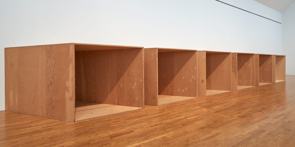
Is there anything to these wooden boxes, Judd? Ha! But I guess I do understand why someone would criticize Twombly’s paintings, or any abstract art in general. You can have an “I could do that myself” attitude about his art but I for one enjoy Twombly’s pieces.
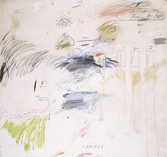
I love the unsystematic and chaotic feel of this painting, it’s like a page out of a scrapbook without the photographs. The different textures work well together. There’s numbers, rulered squares, squiggles, drips, writing, splotchy paint… Twombly puts it all on there! I agree with what he said about his work being childlike but not childish. This piece is planned disorganization.
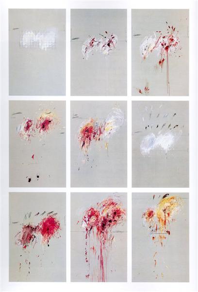
From 1962-64 Twombly’s works became more anxious and took on dark themes. This was a reflection of the somber mood in the early 60s from the Cuban Missile Crisis and John F. Kennedy’s assassination. There are bursts of colour but they have been restrained, leaving room to create negative space. In a couple of these there are grids, graphs, and geometric axes, an attempt to control mayhem with discipline and order.
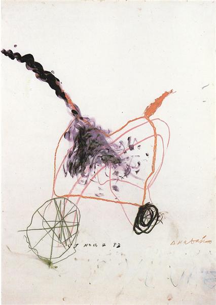
I actually think this piece is really cute, to me it looks like a greeting card of some sort. It looks very much like a bicycle, especially the two wheels with spokes. The colours are calmer than what Twombly typically uses but I think it works nicely to create a peaceful spirit.

This one is a big boy, 157 by 624 inches! Wow. Twombly used 3 canvases for this one and a variety of oil, acrylic, oil stick, crayon, and graphite. I like the heaviness all pushed to the right side of the piece. It starts out tame in graphite on the left but then gets increasingly more intense with the explosions of colour.
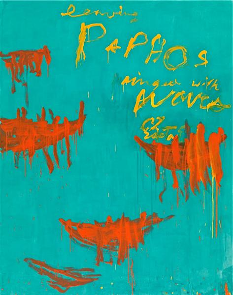
Crazy how this bright blue can evoke the atmosphere of the Mediterranean Sea. This looks like a book cover to me with the text being at the top right. All of these 3 colours work really well and I especially love the drippy spots.
Another reason why I like Twombly is because his work reminds me of one of my favourite contemporary artists, Lewis Rossignol. Here is an example of Rossignol’s work:

I’m unsure if Rossignol takes inspiration from Twombly but I definitely see similar techniques. The smudging, scraggly lines, pops of bright colour, neutral background, and messy handwriting. I just really love the style! Definitely going to try make my own Twombly-Rossignol hybrid drawing.
Sources:
https://www.theartstory.org/artist/twombly-cy/life-and-legacy/#legacy_header