Back Cover Rationale

Judy and the Crate of Knowledge

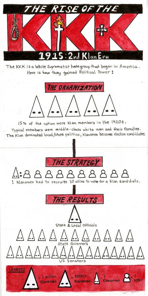
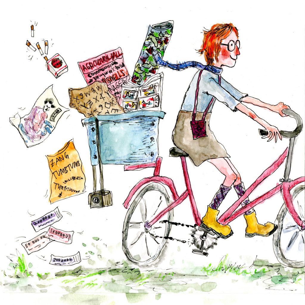
When I got assigned to do a back cover for our class book, I knew I definitely wanted to do an illustration of Judy. I feel that although the periods, places, and things we’ve learned are important, the teacher is as well. I also don’t believe I’ve seen Judy on the other IDEA book covers before so this year is the year for it to happen!!!

We see Judy cycling out of the page with her iconic yellow boots and little knit purse, bidding us farewell but also leaving behind the things she taught us. I like how I managed to smoothly integrate bits of what we learned in class by putting such objects in the rear crate. The items I chose were just things that stuck out to me during lecture and readings. I included:

  • William Morris’ wallpaper
  • 15th century block book
  • Early writing tablet
  • Jobbing printer poster
  • Lucky strike cigarettes
  • Ukiyo-e print
  • Zang tumb tumb sound poem
  • A camera
  • Herbert Bayer’s banknotes

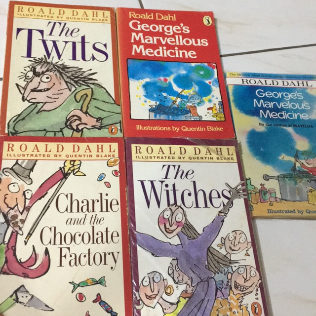
I used watercolours, watercolour pencil crayons, and ink. I wanted the style to be reminiscent of Roald Dahl book covers:

I like the loose and sketchy feel of my illustration, giving it a sense of childlike spontaneity. It’s quirky! It’s fun! I’d give myself a 9/10 for my back cover. It turned out just the way I wanted it to be. But I could’ve spiced it up more by incorporating all the typefaces we’ve learned.

Survey 9 Rationale: KKK Infographic

I was assigned to do a geopolitical infographic for this week’s spread. I decided to do mine on the KKK because I felt like it could make to be a powerful spread and I was also interested in how they became so successful.

To keep my infographic easy to follow I decided to break down the KKK’s rise to power in 3 steps. Figuring out how to clearly correlate the number of klansmen to their icons was challenging but in the critique groups it was decided that differentiating the hoods by scale is the best option.

Judy also suggested that I could do little illustrations in the KKK title so that’s what I did. I included key elements I would associate with the Klan: a noose (with my name integrated in it), a burning cross, and the KKK symbol.

I wanted to make the spread appear strong and threatening. Therefore, I limited the colour palette, made the text straightforward, and showed the KKK’s impact through the growing mass of the hood icons.

I would give myself a 9/10 for this spread. I believe it’s a quick but compelling read. But, visually, I could’ve added borders or lines around some places to make it orderly and dimmed down the intensity of the legend.

Research Time: 1 hour

Design: 5-6 hours

Survey 6 Rationale – Paris Metro Spread

This week I had to do a regular spread on architecture. I was interested in the Paris Metro because I’ve seen the entrances by Hector Guimard before and wanted to know why they were so stylized.

The illustration of the entrance was done in gouache on mixed media paper, which was then pasted on the illustration board. I used a separate paper for the entrance to allow me more control of where the illustration went because I wanted to be cautious of the borders.

The background, title, and body text were all done directly on the board. Initially, I wanted all of the text to be in white with a dark background, but after doing the light coloured title I figured it was too tedious. I learned that in art nouveau the text became integrated with other aspects of the piece. Therefore, I made it so my title matched the stars. 

I would give myself an 8/10 for this spread. Although I like the look of the title, it could’ve been more engaging. The body text is, as I said during the critique groups, nasty. And the background should’ve been lighter to read the text better. But overall I think the simplicity is successful. All focus is on Guimard’s entrance, which I think I painted pretty well. 

Research: 45 mins

Design: 4 Hours

Survey 3 Rationale – Italic Type Artefact

For my spread I had to do an artefact for typography. My team researched the history of italic type, so I decided to make a document that would’ve been printed in italics at the time. During one of the critique sessions Judy suggested that I could make my written part like a document as well and have a spread of 2 photographs. I liked the idea of making the whole spread an artefact so I went with it. 

Executing the documents weren’t difficult, however, they were rather time consuming because I had to create a grid and draft it out in pencil first. But I managed to find instructions online on how to write italics in calligraphy, which made writing the documents easy and straightforward. Conveniently, we have calligraphy markers in our art kits so I used that on mixed media paper.

I would give myself a 9/10 for this spread. I think I could’ve adjusted my camera to take a better shot of the documents and have them be positioned similarly to make it more harmonious. But overall I’m satisfied with the end result of the documents themselves. 

Yearbook Spread

The media for my yearbook spread is watercolour, pencil crayon, markers, and ink on watercolour paper. I often work in multimedia and I wanted to represent that in the spread. My choice to direct the spread as a portrait rather than landscape was influenced by the five key words. I figured it would be easy to stack all 5 words on top of each other to create a clear layout. I managed to combine both the illustration of myself and the key words into one by fitting all the words into my beanie. The portrait of myself shows my face in a serious expression which represents what I look like most of the time. However, I do laugh and joke around a lot and that part of my personality is shown through the bright lettering and yellow stars. I wanted to pair the ridiculousness of the beanie and vivid colours with my blank expression to make the spread humorous and a little odd.