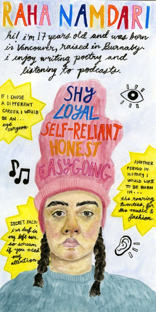
The media for my yearbook spread is watercolour, pencil crayon, markers, and ink on watercolour paper. I often work in multimedia and I wanted to represent that in the spread. My choice to direct the spread as a portrait rather than landscape was influenced by the five key words. I figured it would be easy to stack all 5 words on top of each other to create a clear layout. I managed to combine both the illustration of myself and the key words into one by fitting all the words into my beanie. The portrait of myself shows my face in a serious expression which represents what I look like most of the time. However, I do laugh and joke around a lot and that part of my personality is shown through the bright lettering and yellow stars. I wanted to pair the ridiculousness of the beanie and vivid colours with my blank expression to make the spread humorous and a little odd.