Canadian Design Today: THEO DIMSON

Theo Dimson (1930-2012) was a Canadian graphic designer most recognized for his film and theatre posters he designed in an art deco style. He got into the Ontario College of Art and Design with a scholarship and graduated in 1950. Dimson’s career ranges from commercial design for Hollywood films to commissions by Canada post.

9 Best Theo Dimson images | Graphic design, Canadian painters, Art ...

This is a great example of Dimson’s signature art deco style. The flatness and floral motif ring true to the art deco look. I like the contrast between the earthy tones of the illustration and the type that’s highlighted in bright blue. The little swirl of the lady’s hair which is then repeated again in the bulk of her hair is another detail I like.

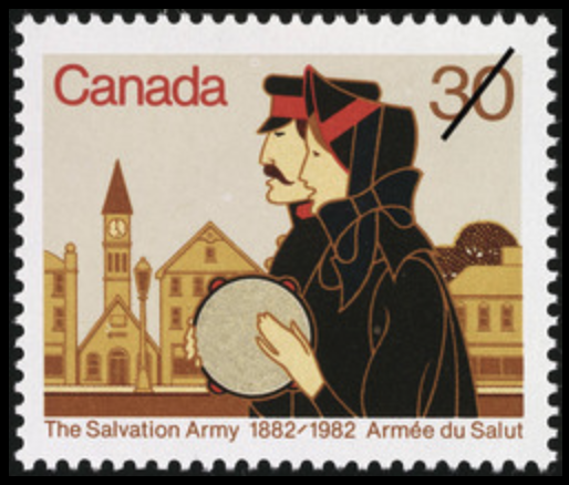
This is one of many stamps Dimson was commissioned to do by the Canada Post. He designed this stamp to commemorate the Salvation Army’s hundredth anniversary. I like how his line work isn’t black, but a copper colour instead. It’s interesting the way he simplified the figures, especially the hand of the woman, the lines in between her 3 fingers aren’t there.

He designed the titles for the 1987 romcom movie Moonstruck. His choice in type was simple, as he used Futura. However, the way he overlapped the two O’s over each other make the world of a difference compared to if he hadn’t. Crazy how the smallest tweak of putting the two O’s together suddenly make a noteworthy design. I actually really love the movie Moonstruck and it was a pleasant surprise to find out Dimson was a part of it.

Sources:

https://gdc.design/fellows/theo-dimson-fgdc

https://www.theglobeandmail.com/incoming/art-deco-designer-brought-flamboyance-to-his-work-and-life/article549542/

https://postagestampguide.com/stamps/16202/the-salvation-army-1882-1982-1982-canada-postage-stamp

Postmodernism in Europe: KAREL MARTENS

Karel Martens (1930-present) is a Dutch graphic designer and typographer. Martens graduated in 1961 from the Arnhem School of Design where he studied fine art. He then began teaching at ArtEZ in 1977, and in 1997 he became a visiting lecturer and senior critic in the graphic design department at Yale University. He was an inventive book designer, however he also designed other printed items such as stamps, telephone cards, and signs. 

Dutch Phone Cards

This is one of Martens most notable works. He was commissioned to make a series of designs for Dutch phone cards. The digits have been overlapped with other digits in multiple colours which turns out to be a code for the Dutch national anthem. His simple design holds a lot of meaning and the way he made a code for the national anthem is clever.

Monoprints

These are archival cards from the Stedelijk Museum in Amsterdam that Martens collected to use for monoprints. I like how Martens limited himself and kept the design clean by using only basic shapes. The fact that he repurposed museum cards rather than a blank piece of paper adds extra interest.

Printed Matter (1996)

His book Printed Matter was claimed as the best designed book in the world in 1998 by the Leipzig Book Fair. I’m definitely not well-read enough in design books to have an opinion on if its the best in the world. But, what I can say is that each page is exciting and refreshing to look through, the thought he put into creating the book is evident.

Sources:

https://www.artsy.net/artist/karel-martens

https://en.wikipedia.org/wiki/Karel_Martens

https://medium.com/@amberbravo/dutch-master-karel-martens-and-the-power-of-restraint-a272615b5099

Supergraphics Innovator: Barbara Stauffacher Solomon

Barbara Stauffacher Solomon (1928-present) is an American graphic designer, artist, and landscape architect. She began as a dancer and trained in her hometown, San Francisco. Later on, she studied graphic design in Switzerland in the 50s. Solomon is credited as the innovator of supergraphics and is best known for her supergraphics she designed for the Sea Ranch in Northern California.

Athletic Centre at the Sea Ranch

The managers in charge of the Sea Ranch were over budget, but the interior walls were all plain white, and they needed to spice up the space. At the time, paint was affordable and so Solomon was hired to paint some interiors. Her experience training as a dancer when she was younger helped her paint the big walls. Regarding the design of the supergraphics themselves, Solomon was inspired by bold colours of paint straight out the tube, geometric shapes, and Helvetica type. I think Solomon did a brilliant job. She completely transformed the space, giving it character and memorability.

HearHear record store in San Francisco, designe by Barbara ...
HearHear Record Store, San Francisco

I love the interior of this record store. Solomon is bringing Swiss graphics to San Francisco, which the city had never seen before. But, her choice in bright colours stays true to the west coast.

CalExpo Water Tower

This is different than the supergraphics Solomon does for interiors of buildings, but I think this really shows off the range of different ways her supergraphics can be used. Something as boring as a water tower turns into a fresh art piece.

Sources:

https://eds-a-ebscohost-com.ezproxy.capilanou.ca/eds/pdfviewer/pdfviewer?vid=10&sid=48152139-56b3-4623-b654-f157430b5af8%40sdc-v-sessmgr01

https://www.architecturaldigest.com/story/barbara-stauffacher-solomon-the-seminal-sea-ranch-designer-is-having-a-surge-of-attention-at-age-91

Psychedelic Design Hero: RICK GRIFFIN

Rick Griffin (1944-1991) was an American artist and psychedelic poster designer. He grew up obsessed with surf culture and started his art career in high school. He was hired by a magazine to illustrate a comic strip of a cartoon surfer dude named “Murphy”, a character he created himself.

Griffin’s “Murphy” character makes the cover of  Surfer  1962
Griffin’s character “Murphy” on the front page of Surfer Magazine

I think Griffin was successful in giving “Murphy” a distinct look and illustrated him with great character. It’s impressive how Griffin already had an art gig in high school, he was definitely ambitious.

Fast forward to the 60s, Griffin began designing posters, and his work would soon define the psychedelic art era.

Grateful Dead “Aoxomoxoa” title & album cover by Rick Griffin 1969
Grateful Dead – Aoxomoxoa (1969)

This is a design Griffin did for the rock band Grateful Dead, initially as a poster for show promo, but the band loved it so much they made it their album cover. The themes of life and death Griffin is playing with in this piece creates a powerful contrast. I especially love how he made the sun rays squiggly and connected a squiggle with the skull right below it.

The Doors Poster (1967)

Griffin designed this poster for the rock band The Doors for a concert they did in Denver. I think this design would look really cool on a shirt and I love the colours he used. The alien creature offering the white pill is only what I can assume to be a drug reference. Psychedelia at its peak!

Sources:

https://eds-a-ebscohost-com.ezproxy.capilanou.ca/eds/detail/detail?vid=1&sid=37682b0a-d888-4de3-887c-b3130964a597%40sdc-v-sessmgr03&bdata=JnNpdGU9ZWRzLWxpdmUmc2NvcGU9c2l0ZQ%3d%3d#AN=9109233380&db=a9h

https://www.rickgriffindesigns.com/biography

Advertising Art Director: OTTO STORCH

Otto Storch (1913-1999) was an American magazine art director and advertising photographer who changed the game in the editorial design industry. He is most recognized for his work as an art director at McCall’s magazine, where he worked for 14 years. Things were not going so great for McCall’s when Storch arrived, their ad revenues were declining and no one was buying copies. Because the magazine had nothing to lose, they allowed Storch creative freedom. He took advantage of this opportunity, taking design risks and creating experimental layouts. His work influenced and revamped the look of American magazines in the 50s. Magazines were hot again!

I love how he’s going all out with the type here, while also integrating it into the photograph. You can see he’s throwing it back to 19th century wood typefaces, which wasn’t trendy at the time. Bold move, Storch. But this paid off, because people started using those wood typefaces as well, to the point it became cliché!

The reflection of the photograph to the type is brilliant. Definitely eye catching.

I love this corn spread. The giant corn looks delicious and Storch matches that beautiful yellow corn colour with the headline. Each letter of the headline looks like a little kernel, cute!

Sources:

http://westread.blogspot.com/2011/08/otto-storch-and-mccalls-fifty-years-ago.html

https://search-credoreference-com.ezproxy.capilanou.ca/content/entry/thgraph/storch_otto_1913_99/0