Karel Martens (1930-present) is a Dutch graphic designer and typographer. Martens graduated in 1961 from the Arnhem School of Design where he studied fine art. He then began teaching at ArtEZ in 1977, and in 1997 he became a visiting lecturer and senior critic in the graphic design department at Yale University. He was an inventive book designer, however he also designed other printed items such as stamps, telephone cards, and signs.
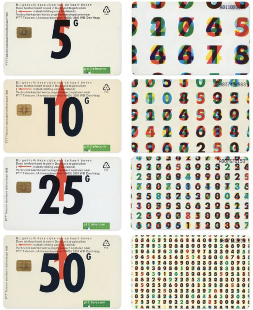
This is one of Martens most notable works. He was commissioned to make a series of designs for Dutch phone cards. The digits have been overlapped with other digits in multiple colours which turns out to be a code for the Dutch national anthem. His simple design holds a lot of meaning and the way he made a code for the national anthem is clever.
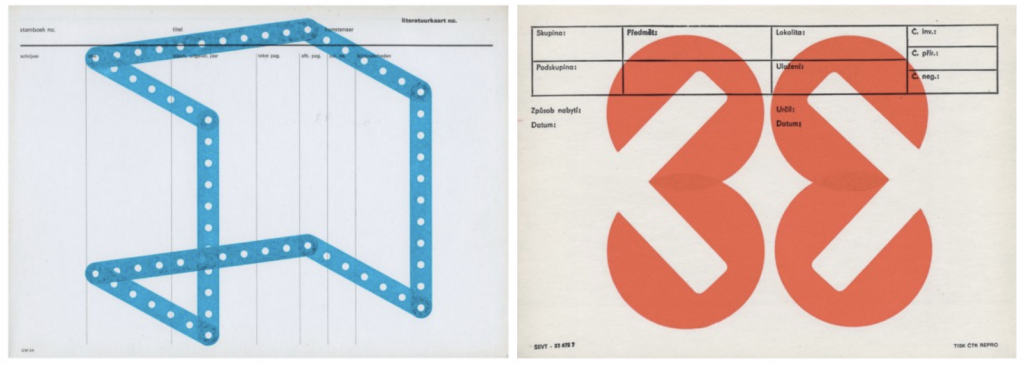
These are archival cards from the Stedelijk Museum in Amsterdam that Martens collected to use for monoprints. I like how Martens limited himself and kept the design clean by using only basic shapes. The fact that he repurposed museum cards rather than a blank piece of paper adds extra interest.
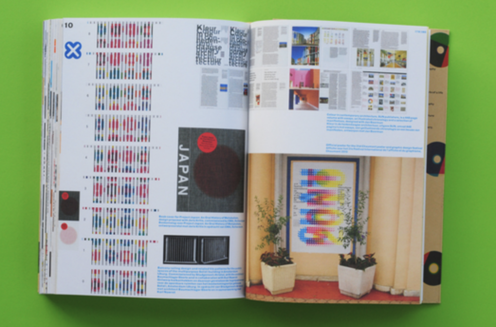
His book Printed Matter was claimed as the best designed book in the world in 1998 by the Leipzig Book Fair. I’m definitely not well-read enough in design books to have an opinion on if its the best in the world. But, what I can say is that each page is exciting and refreshing to look through, the thought he put into creating the book is evident.
Sources:
https://www.artsy.net/artist/karel-martens
https://en.wikipedia.org/wiki/Karel_Martens
https://medium.com/@amberbravo/dutch-master-karel-martens-and-the-power-of-restraint-a272615b5099