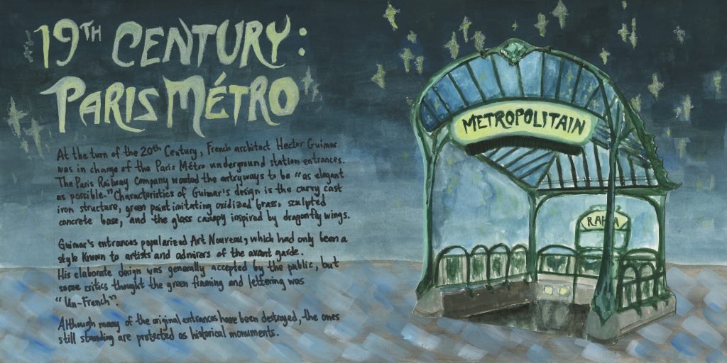
This week I had to do a regular spread on architecture. I was interested in the Paris Metro because I’ve seen the entrances by Hector Guimard before and wanted to know why they were so stylized.
The illustration of the entrance was done in gouache on mixed media paper, which was then pasted on the illustration board. I used a separate paper for the entrance to allow me more control of where the illustration went because I wanted to be cautious of the borders.
The background, title, and body text were all done directly on the board. Initially, I wanted all of the text to be in white with a dark background, but after doing the light coloured title I figured it was too tedious. I learned that in art nouveau the text became integrated with other aspects of the piece. Therefore, I made it so my title matched the stars.
I would give myself an 8/10 for this spread. Although I like the look of the title, it could’ve been more engaging. The body text is, as I said during the critique groups, nasty. And the background should’ve been lighter to read the text better. But overall I think the simplicity is successful. All focus is on Guimard’s entrance, which I think I painted pretty well.
Research: 45 mins
Design: 4 Hours