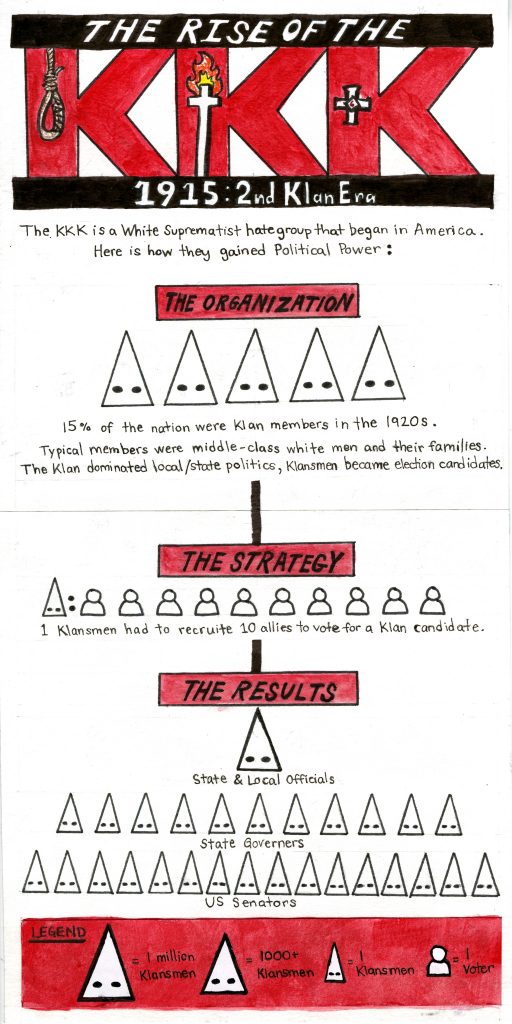
I was assigned to do a geopolitical infographic for this week’s spread. I decided to do mine on the KKK because I felt like it could make to be a powerful spread and I was also interested in how they became so successful.
To keep my infographic easy to follow I decided to break down the KKK’s rise to power in 3 steps. Figuring out how to clearly correlate the number of klansmen to their icons was challenging but in the critique groups it was decided that differentiating the hoods by scale is the best option.
Judy also suggested that I could do little illustrations in the KKK title so that’s what I did. I included key elements I would associate with the Klan: a noose (with my name integrated in it), a burning cross, and the KKK symbol.
I wanted to make the spread appear strong and threatening. Therefore, I limited the colour palette, made the text straightforward, and showed the KKK’s impact through the growing mass of the hood icons.
I would give myself a 9/10 for this spread. I believe it’s a quick but compelling read. But, visually, I could’ve added borders or lines around some places to make it orderly and dimmed down the intensity of the legend.
Research Time: 1 hour
Design: 5-6 hours