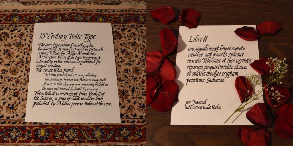
For my spread I had to do an artefact for typography. My team researched the history of italic type, so I decided to make a document that would’ve been printed in italics at the time. During one of the critique sessions Judy suggested that I could make my written part like a document as well and have a spread of 2 photographs. I liked the idea of making the whole spread an artefact so I went with it.
Executing the documents weren’t difficult, however, they were rather time consuming because I had to create a grid and draft it out in pencil first. But I managed to find instructions online on how to write italics in calligraphy, which made writing the documents easy and straightforward. Conveniently, we have calligraphy markers in our art kits so I used that on mixed media paper.
I would give myself a 9/10 for this spread. I think I could’ve adjusted my camera to take a better shot of the documents and have them be positioned similarly to make it more harmonious. But overall I’m satisfied with the end result of the documents themselves.