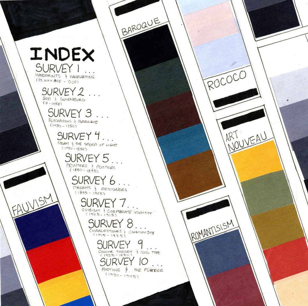
For the IDEA 23′ first year history book I was assigned an index page. I went through multiple ideas, most being fairly simple but ended up landing on this concept. In the spread I chose to line the page with pan tone strips because I thought that they would add a level of interest due to the large variety of color without it looking awkward. I also chose the strips because it allowed me to reference different eras in a simplistic fashion. The layout itself was intended to centralize the viewers eye towards the index portion of the page. I wanted to achieve this by creating contrast with the angles and text. Most of the pan tone chips and the text on them is on a horizontal/ tilted angle while the index portion is horizontal, leading the viewers eye towards the main information.
I give myself a 8 / 10 because I believe that the text could’ve been executed better and that the text on the spread is boring. Although I am happy with the overall concept of the piece and the variety of colors in it
Leave a Reply