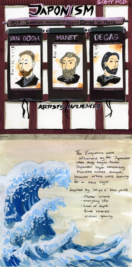
In this infographic on Japonism I made a few weeks ago, I wanted to create a heavily focused Japanese theme rather than european theme. The way I achieved this was that I created illustrations inspired by ukio-e prints and referenced one on the lower half of the page (The Great Wave of Kanagawa). The illustrations on the upper half are 3 artists that influenced the art history world that were also influenced by japonism. So to create more of a japanese theme I made them in the style that the japanese would do in their prints. Their portraits are on a scroll so that not only would it fit into the theme once again but so they would look organized on paper.
I would give myself 7/10 because the overall spread doesn’t feel like an infographic rather it looks more like a blue spread turned sideways. I also believe the infographic itself looks like its split into two different pictures and theres no good transition between one and the other. What I am happy with though are the illustrations that complete the theme which I believe are executed well.
Leave a Reply