Wooden Type & Display Typefaces
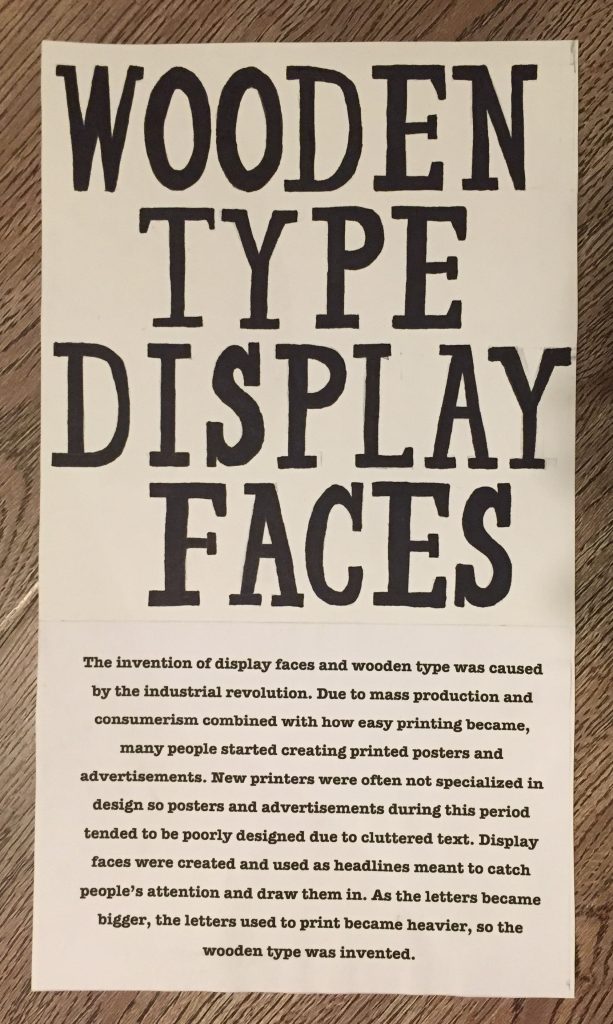

For my exhibit artifact, I chose to do display face advertisements/posters and wooden type since they both relate to each other.
I enjoyed this project since we could get really creative with it. I chose to do block carving since I really like doing it and find it relaxing. I did find it hard to properly line up/space the letters and keep them from smudging/looking blotchy so I did have to re-do the poster a couple of times which was time-consuming.
Overall I’d give myself 6 out of 10 since I ended up rushing the poster and didn’t hand draw or make the paragraph look visually interesting at all. I also only carved the letters that I needed for the heading so I wish I had given myself more time to do the entire alphabet and numbers.