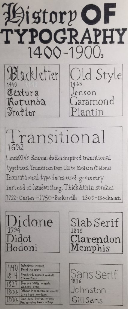
Overall I liked this project since I think drawing different typography was pretty fun. I wanted to focus on the transitional period since I think it’s interesting how it was a step in a new age of typography and I did my typography zine on Roman du Roi. I was unsure of how much information to put in overall so I’m sorry if it looks a bit bare.
I’d give myself a 6.5 or 7 out of 10 since I’m not sure if I have enough information shown on the other sections but I do like the layout/alignment of the boxes and I think adding important inventions was kind of creative.
https://www.behance.net/gallery/57613131/History-of-Typography-Timeline
https://www.sitepoint.com/the-blackletter-typeface-a-long-and-colored-history/