
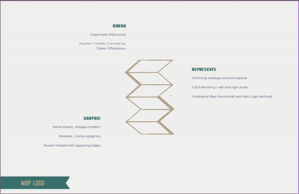
The concept we decided on was the map perspectives logo. In critique, the balanced folksy birds seemed to resonate more. I appreciated how my own personal essence is recognized by others as the whimsy in my personality is more representing in things I like versus show in style! However, Judy was helpful in recommending that the map logo represents my skillsets (eg. conceptual, technical, left/right thinking, big picture) and that my work speaks for itself if it does have a whimsical style. Also, my focus isn’t illustration so I was sold on choosing the map even if I had reservations that it was too simplistic.
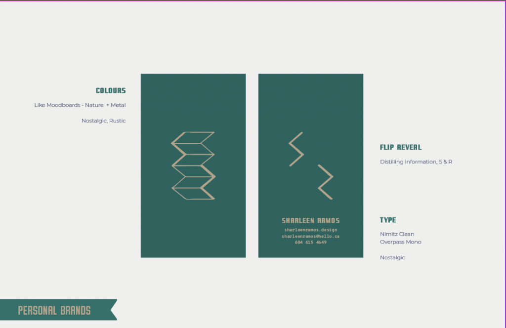
In preparing the final brand presentation, I relooked at my design and decided on an orientation that fits the strongest rationale. I then used this to compile and design the presentation with that branding. I think the logo is flexible to be used on a website/app as it can be animated! I can change its shape and potentially put some pattern into it.
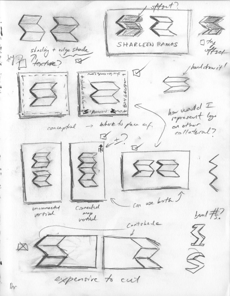
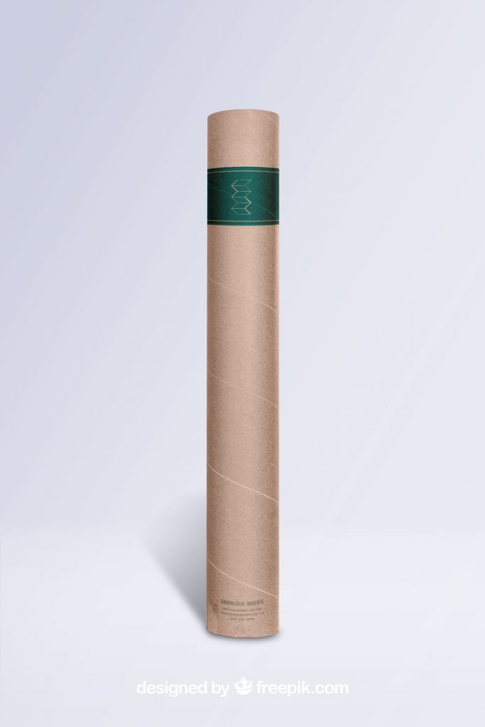
Relooking at final design and solutions on orientation. Decided on vertical, connected
map as it represents more related concepts and resembles a map.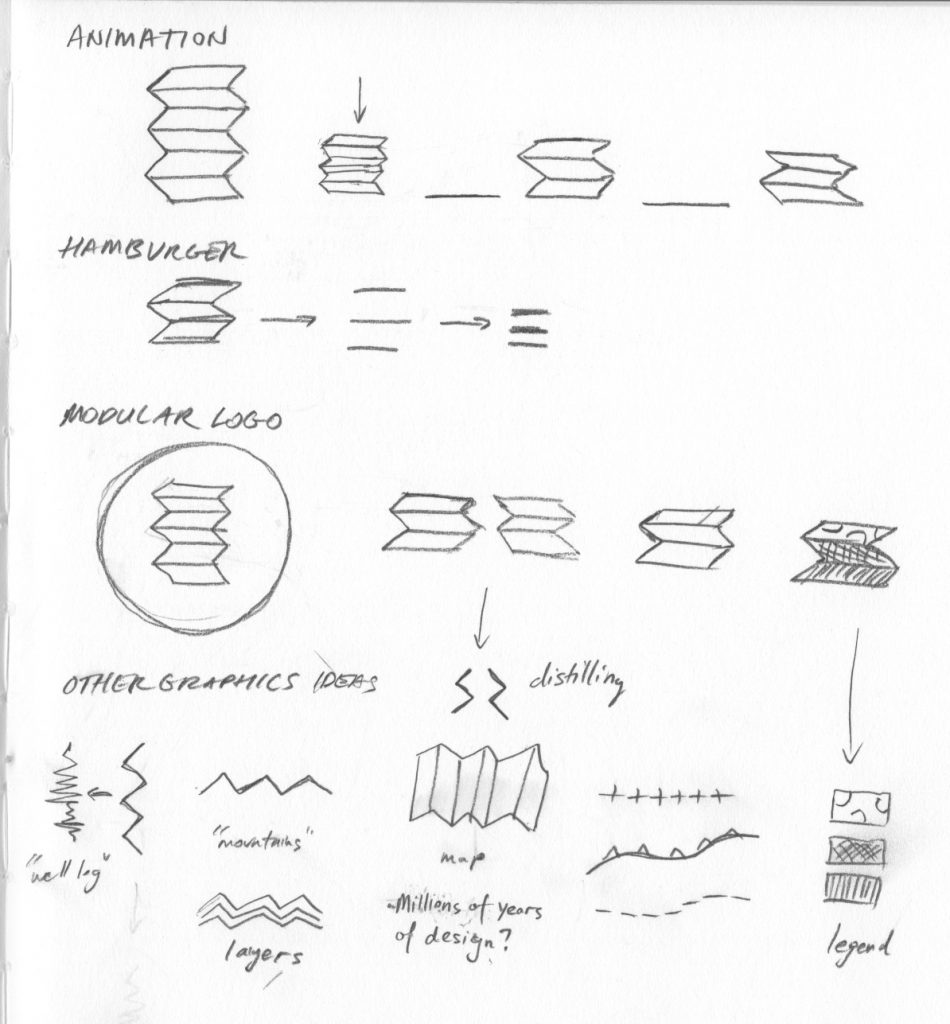
Flexible, modular and animation possibilities.
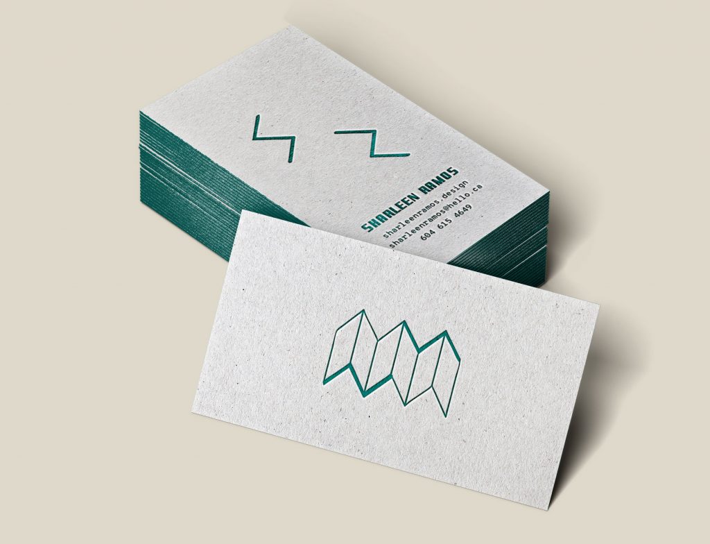
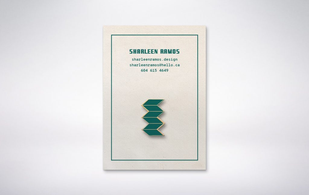
I give myself a 9/10 for this final brand presentation as I believe the logo represents my brand essence (organically meticulous, mood boards and keywords (explorer, distiller, conceptual, efficacious and clever). The map in this form is in the shape of my initials, represents my ideation skillsets, past technical/strategic work, conceptual thinking and love of the intricacies of nature!
Leave a Reply