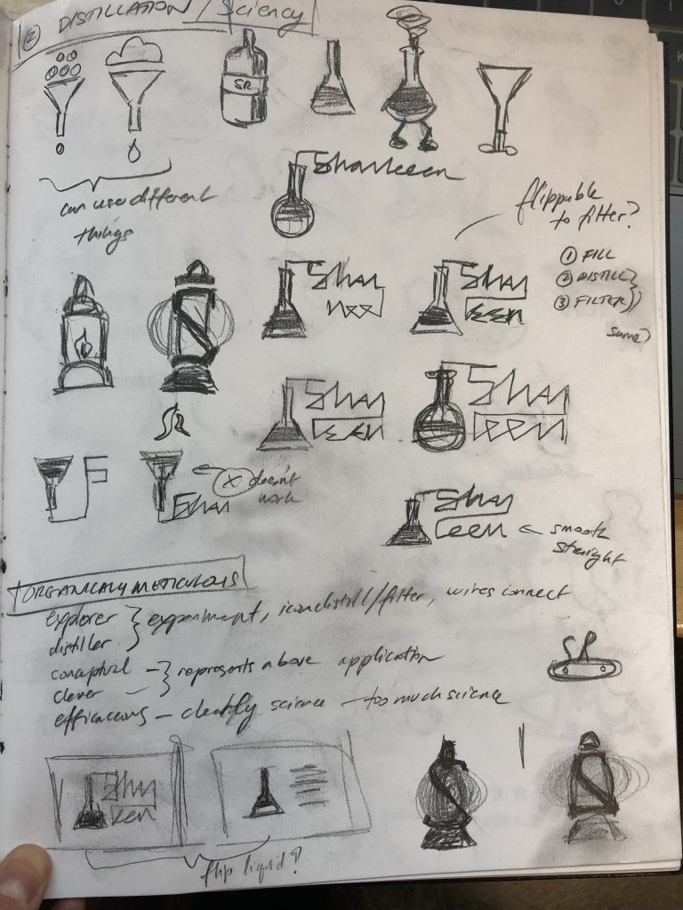
The top 3 concepts decided upon last class were further explored. I did diverge from the second concept as it did not resonate with my brand. The concepts are a map icon, a lantern (originally explored a distiller/filter), and a way to depict the shape an S and R makes between them.
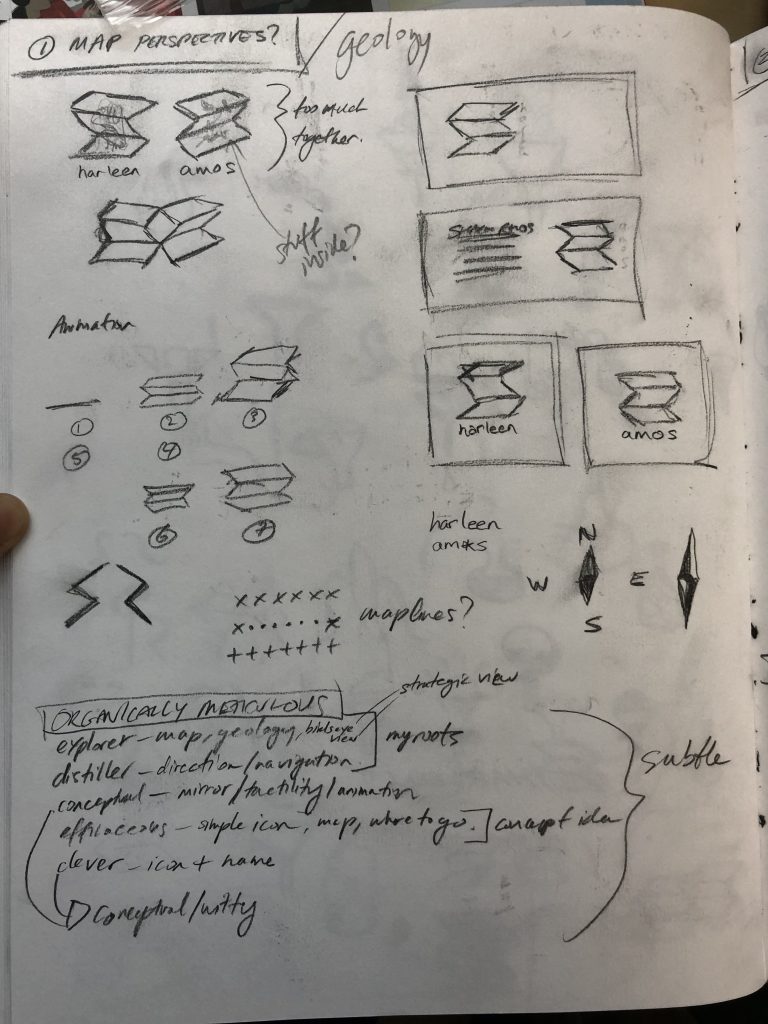


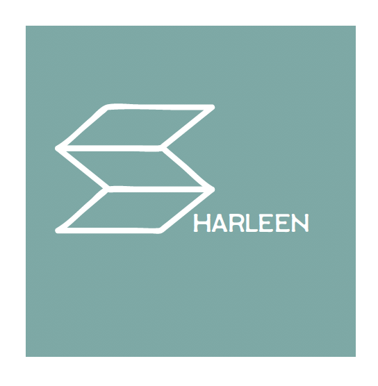
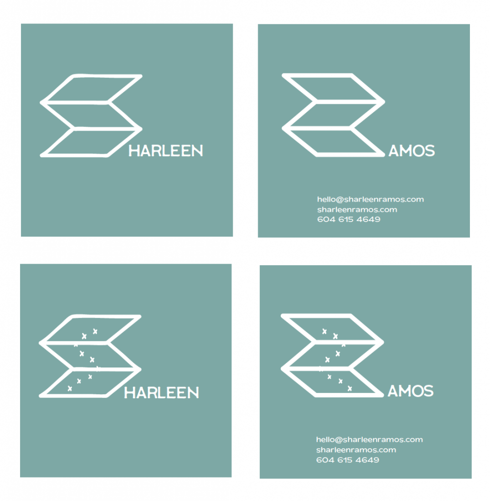
Logo 1 – Map Perspectives is a simple and subtle icon that captures my roots and represents strategic and conceptual thinking and knowing where to go and make decisions. The logo may be cut out, showing the mirror of the S & R and animated with modular markings on the website.
Logo 2 – Illuminated Lantern captures my love of nature, functional gear and incorporates my initials. It represents my exploration and conceptual thinking, which helps knowing where to go and make decisions “holding up a lantern to discover and find solutions”. The style is vintage-modern, hand-made. Could add texture/screen printed look.

Logo 3 – Balanced Folksy Birds captures my love of nature, folksy, organic things, and personal vision of a balanced simple lifestyle. Birds have a view up top (big-picture) and are subtly “S & R”. Style is vintage-modern, hand-made (personal design style direction?). Could add texture/screen printed look, patterns in birds, make birds a pattern.

What I learned through this process is to keep cross-checking these with my brand essence, keywords and mood boards. Also, I gained valuable input from the class and instructor. I think they are varied, memorable and flexible as while they each have a sense of earthiness, they each represent something different: Map – past career and skills, Lantern – personal activities and curiosity, and Birds – personal philosophy and whimsical style. I would give myself an 8.5/10 as I would have liked to explore the lantern further but I’m glad I was able to shift easily to another concept!
Leave a Reply