In this whole process, I learned how to execute a cohesive brand from research through to refining iterations. The most rewarding parts were: the refining stages as the time spent was a level detail more than I spent before in a project and everything I learned from my mentor! The most challenging parts were making decisions about a topic I know well and digitizing while still sketching ideas.
For the top concept, the rationale behind the design is described below:
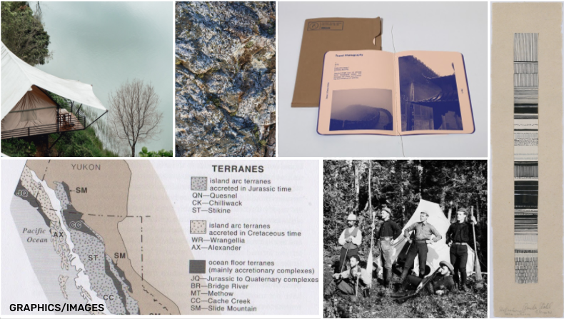
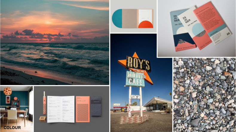
The present landscape shares stories of the geological past. Ancient groups of rock have traveled from afar and assembled to form the Coast of BC. Terrane is a camp hotel situated on the Sea to Sky corridor which has several iconic geological structures. The target audience is adults 26-35, who are adventurous and naturalists who value learning about the environment around them. The key challenge was to design a system inspired by geology, invoking a sense of discovery. Other challenges were to create a hands-on experience for the target audience and to incorporate placemaking that capitalizes on the local geology. The design solution is relevant as Terrane models a rustic field camp experience, providing guided tours, observational equipment, amenities, and local cuisine. The intent is for visitors to learn and explore what the landscape offers, providing a deeper connection to nature that promotes well-being.
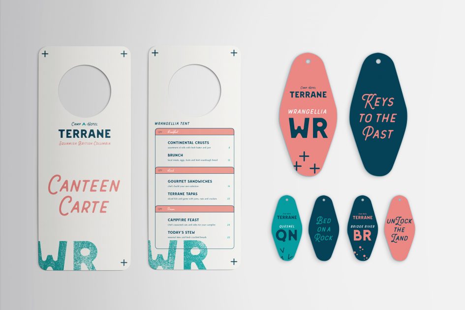
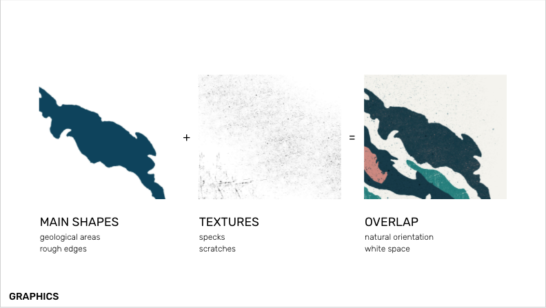
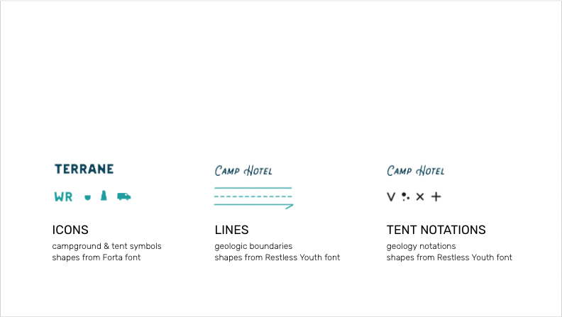
The design solution is inspired by the geologic regions in BC (terranes) and incorporates their orientation, overlap, geologic symbology, and terminology. The terranes are represented by the overlapping geologic areas orientated NW-SE and incorporate rough textures. The tents are named as BC’s terranes and their abbreviations/notations are symbols that mark tent-specific collateral. Other graphic elements such as lines, boundaries, and icons are the orientational notations from a geologic map. The identity of the brand is curious, sophisticated, and rustic which is expressed in the voice.
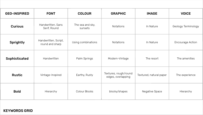
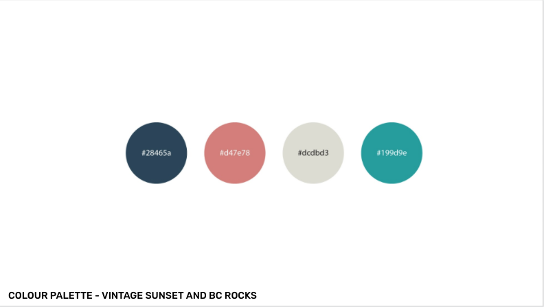
The colours chosen give a vintage-modern feel because Terrane offers a rustic experience with modern luxuries. The colour palette is inspired by the patina of the local rocks and the reds/blues the sunset (the sea to sky). Red/blue/turquoise is also found in signs from vintage roadside hotels in Palm Springs and Route 66.
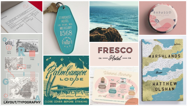
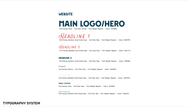
The typography pairing is a vintage-modern feel and fits how the brand invites discovery with a rustic-luxury experience. The main font Forta, which appears as the logotype and as headlines, combines sharp edges and soft curves. This fits the natural shape of rocks with both sharp and soft edges. The other headline font, Restless Youth Small Caps was chosen because of its retro-feel and script for any inviting messages. Scriptwriting is also found in mid-century hotels and handwritten notes found on geologists’ field notes. For visual consistency, secondary graphic elements are shaped from the main fonts.
The applications were chosen to express the unique differentiation of Terrane’s experience. This includes a website, notebook, door hang menu, keys, guest essentials bag, and apparel. I took attention to making sure that the experience is represented in the voice and collateral that will help guests discover the landscape.
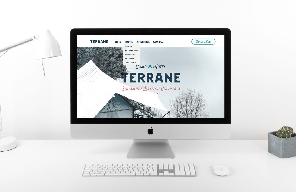
Homepage 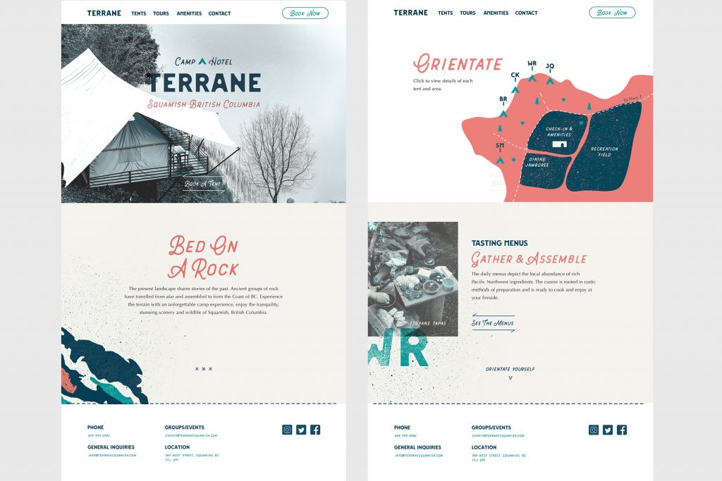
Full Home page and Example page 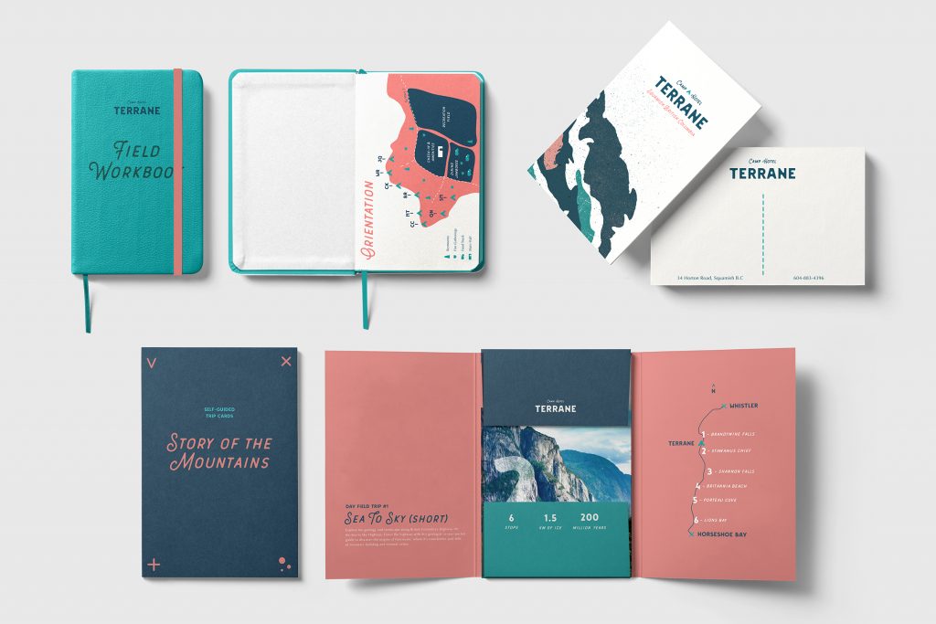
Field workbook, postcard and self-guided tour cards 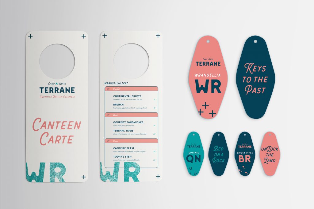
Tent-based collateral: door menu, keys 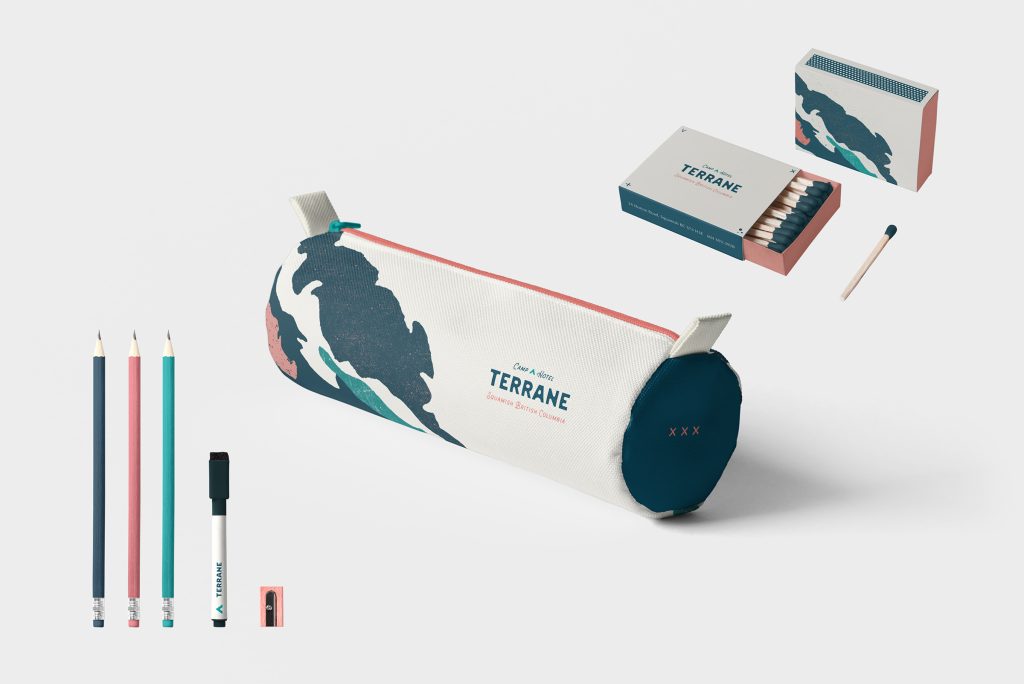
Guest essentials bag to compliment the notebook: includes pens, marker, sharpener, and matches 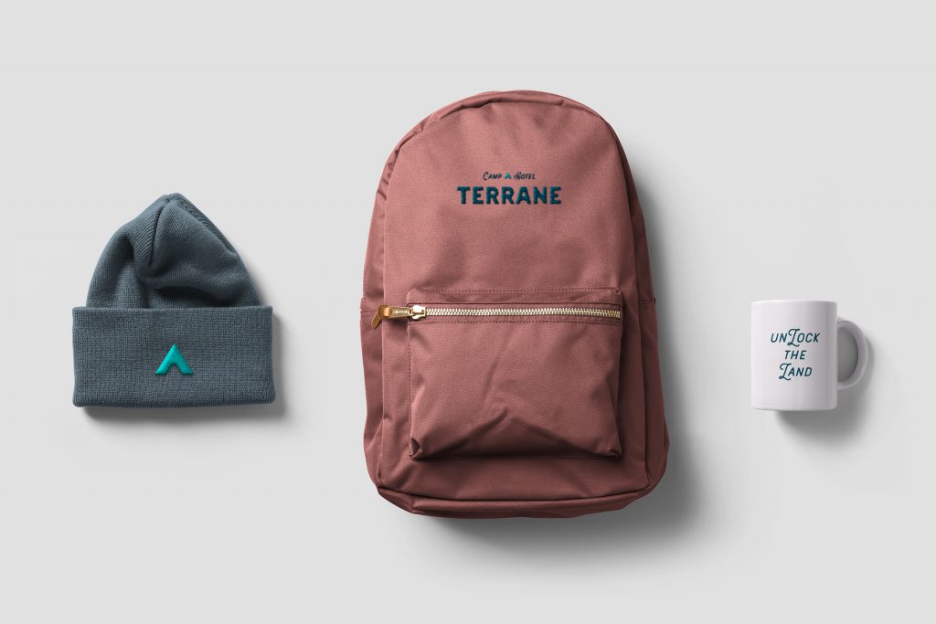
Accessories to purchase
My overall performance was 8.5. This was an excellent challenge, using a new process of being more flexible between sketch and digital. I will definitely fine-tune this, I found taking in the digital set-up early helped with my execution later. It was very rewarding as it’s the most refinement I’ve been able to do in any project so far! The most rewarding part was interacting with my mentor and I really appreciated his keen feedback, eye, and decision-making skills in making a project cohesive!
Leave a Reply