This rationalize/articulate/sell stage includes presenting top concepts and finalizing the direction of the top concept. The top 3 concepts are:
1. Abstract: more abstract representation within geometric squares
2. Deconstructed: arranged as organic shapes and terranes are shown deconstructed
3. Overlapped: rough shapes overlapped, representing how the terranes/geological layers are naturally found
Concept 1 – style tile 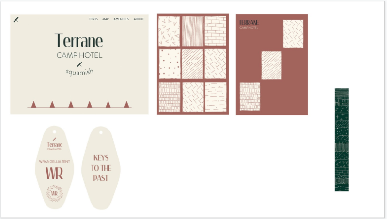
Concept 1 – application 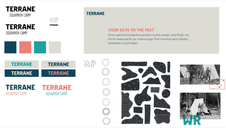
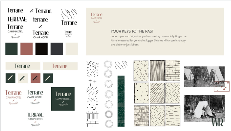
Concept 2 – style tile 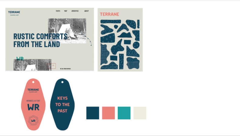
Concept 2 – application 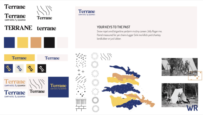
Concept 3 – style tile 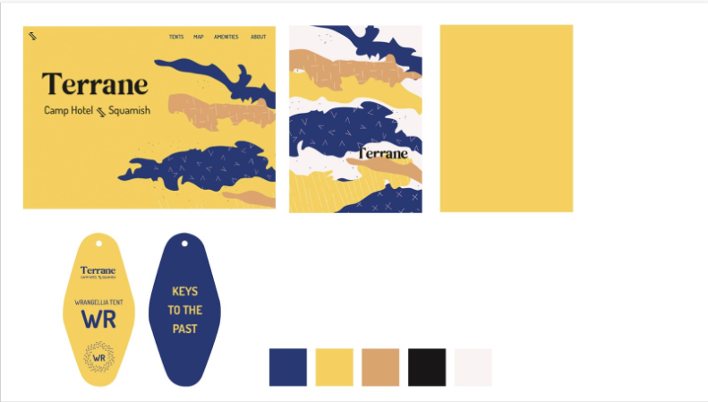
Concept 3 – application
The feedback I got was that the second concept was the strongest and cohesive, including the main font and colours. The secondary font needed more work and the graphics were a little too vector-like. I would need to combine concept 2 with the textures and rough edges from concept 3.
I then proceeded to refine concept 2. This included refining my initial moodboards and showing this concept across multiple pages with applications. I revisited the types of applications for the brand and looked for mockups. I refined the type, choosing the secondary font and paragraph font. They definitely matched the modern-vintage look I was going for. In creating the applications, I also refined the copy and tried to create a voice that represented the brand values.
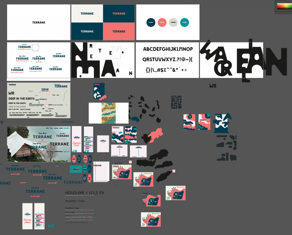
New digital testing file for this refinement stage
One new thing I applied in this project was I made new icons/graphics from the main and secondary fonts. I found that that made everything event more visually cohesive!
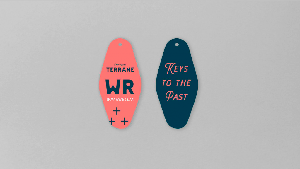
Vintage keys 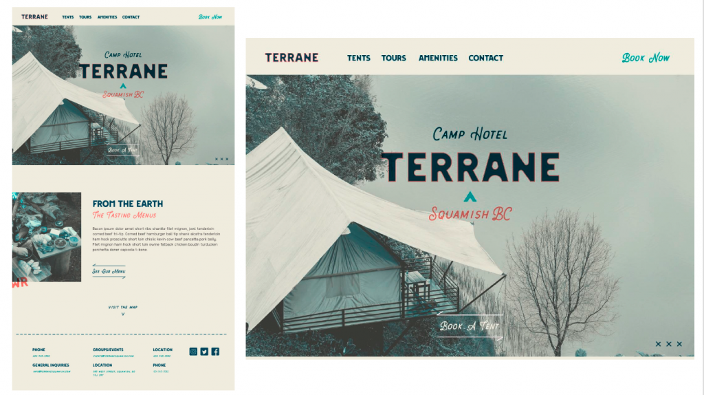
Website 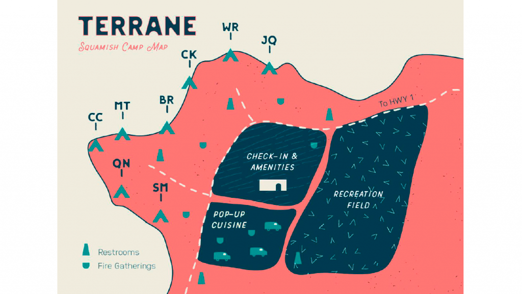
Map 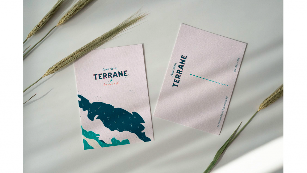
Postcards 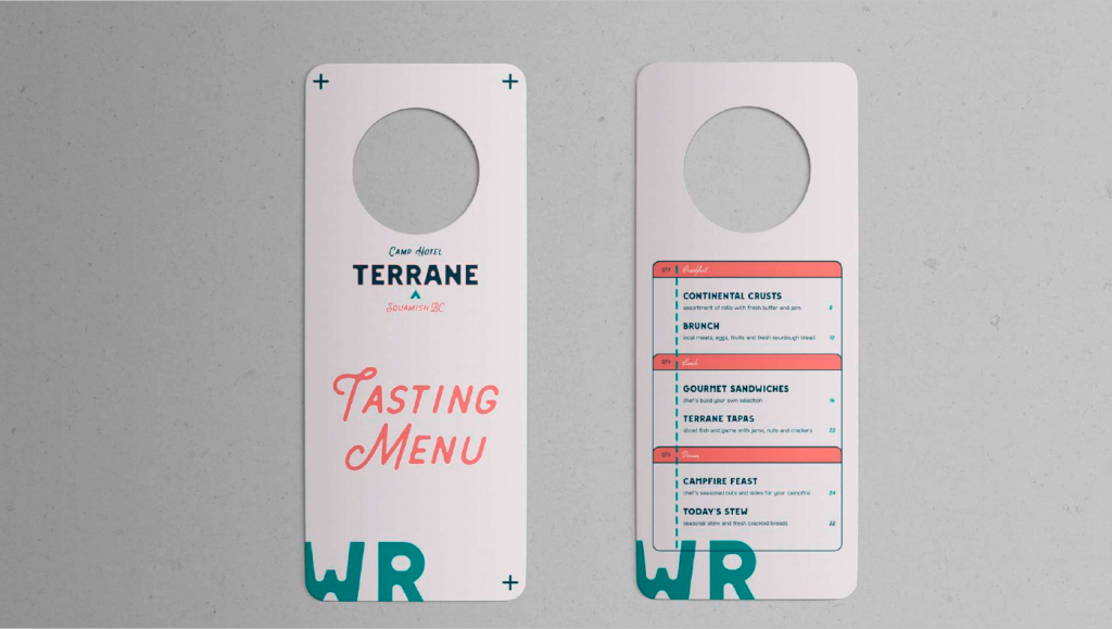
Menu door hang 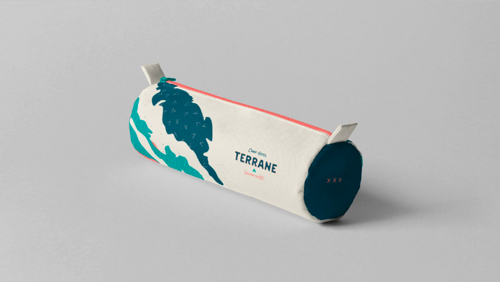
Guest essentials bag 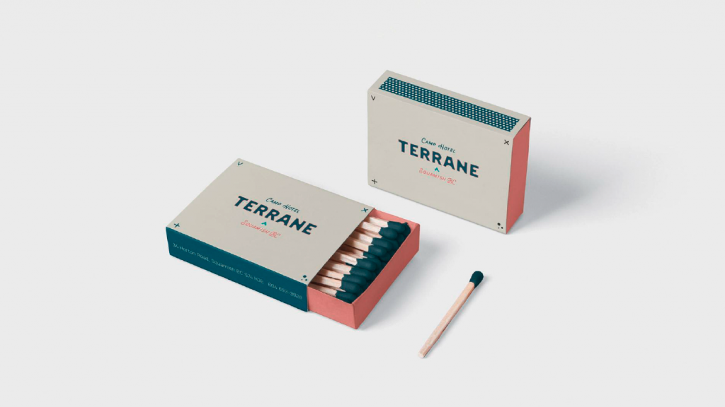
Matches 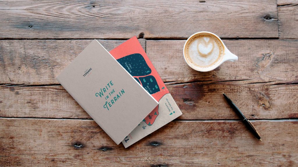
Notebook
After presenting in the applications, the feedback I got was to present the tent notations with either more key examples or with a collection. I also got additional feedback from my instructor which was another level of refinement on the logo, graphics placement, copy, and presentation! I spent some time fixing the typography – kerning the headlines/subheadlines.
I found this stage the most rewarding! The direction feels more certain and supported by all the work done before. All of the extra digitizing was worth it as everything feels thorough! I would give myself a 9 as cycled the concept back through the brand strategy and was able to further refine the top concept (more than previous projects).
Leave a Reply