STUART ASH (Canadian Design Today)

Stuart Ash is a Canadian designer, born in 1942 in Hamilton, Ontario

My Canada, 150/150: Modern by design – Teahen Tales

I like Stuart’s Centennial Symbol for a long time but I did not know who designed it until I learned him in this class.

This logo is really an impressive design for me. It was on the Calgary tower when I saw it the first time. I can still remember that when I was looking down from the tower, all the buildings are having some words or logos on the top to show to the tower, and this is the one that attracts my sight the most and makes me impressive until today. I just like this kind of simple harmony but with a great meaning behind it. Almost only using the regular triangle building up the whole image is a very excellent idea, especially the pattern is also very pure. Different colours are showing the diversity and inclusion, that makes this image a very high altitude in the behind meaning.

Gottschalk + Ash / Fritz Gottschalk

His other works are also very simple and pure. This makes his idea can be understood easily.

Designculture • Stuart Ash

When I was looking at his works, it was just like reading a kid’s story, very easy to read but very meaningful. It gives me a kind of relaxing at the spirit.

STEFF GEISSBUHLER (Postmodernism in Europe)

STEFF GEISSBUHLER (born in 1942), a Swiss visual designerd

Success Ideas and Tips from Master Graphic Designer, Steff ...

Steff is a standard European artist in my stereotypes because I think the American artist focuses more on the form and shapes and Eastern artists like to develop more in the behind thoughts but the Europeans are in the middle, they always have both. Steff’s works usually have a behind meaning, and this meaning is very obvious to be seen but not like the Chinese pursuit of making the inner thoughts as high as possible. He likes to use his design to express his idea directly to make the people can easily understand what he is saying but not let them guess. This is very different from Chinese artists because as a Chinese one of our biggest pleasures is to hide the answer and let the audiences learn from the artwork by themselves.

Steff Geissbuhler

On the other hand, Steff always makes great successes in visual design. Not like the Chinese people would like to abandon the form and shapes, Steff’s works are all very decorative crafts.

Steff Geissbuhler

He can always extract the most important meaning while keeping the form being creative. None of them will be sacrificed for the other.

Steff Geissbuhler

I like his design of using Type very much because his Type is very easy to be understood. Since I am a speaker of English Second Language, my eyes are very hard to be sensitive enough to quickly understand a lot of the Type-design, but Steff’s works are very friendly to me because they are so direct and powerful.

Steff Geissbuhler

I like Steff very much, his graphic design is one of my pursuits, that perfectly merges the thoughts together with decorative shapes.

Barbara Stauffacher Solomon(Supergraphics Innovator)

Barbara “Bobbie” Stauffacher Solomon (born 1928) is an American landscape architect and graphic designer.

Barbara Stauffacher Solomon — Curatorial Research Bureau

Barbara’s artworks are like the exaggerated logo-designs are violently put on the architectures for the decoration and function. Thus, her works are always strong in the first visual impression to let the audience feel a sense of design. This is very different from some of the artists who silently hide their idea in the environment, for example, some of the Japanese artists would consider more on something like the connection between the point of nature sight and the level of the sea outside.

Barbara Stauffacher Solomon Has Been Shaking Up Design for Seven Decades

Barbara likes to use the power of design to attract people and direct them to clearly appreciate her works. She would like to use anything geometric to build her creation including the Type, Shapes, Visual errors or habits, etc. Those elements caused her designs are like a huge man writing and painting on those walls.

Absolutely, she is also connecting her design with the environment, but this kind of connection is an exclamatory one but totally different from the silent-artists. Her arts are just like a loud radio that always playing some pop music around, it is very dynamic.

Playing With Paint and Space – MAS CONTEXT

Indeed, I like her style very much. I am always not a silent person and I always like to speak up for myself. Especially for the art creation, because it will be a shame for me if what I created did not make any attention. I like how Barbara expresses herself, and her style is very close to the younger’s aesthetics today. Showing the innermost passion and emotion at the front but not showing the hided consideration at the front, because this kind of arts will make the artist feel easier and be better to create what resonates people’s hearts.

Milton Glaser (Psychedelic Design Hero)

Milton Glaser (born June 26, 1929) is an American graphic designer.

Design guru Milton Glaser finds his mojo no more than eight blocks ...

Milton Glaser’s works are the pop arts defined in my heart. He uses various bright colours without too much worry and makes the different elements a jumble. However, this kind of Dada-like choice is making a harmonious picture in Glaser’s hands, but not some confusing jumble.

Milton Glaser, Poster for musician Bob Dylan, 1967.

Not like the later pop art, Glaser’s works are most focus no the meaning behind the art itself. He is the one who experiences and connects the modernism and post-modernism. This is not only caused by his activity-period, but also his constantly developing in art creation.

Primal Screen
Milton Glaser, Mad Men

By comparing this Mad Men to the above Poster for musician Bob Dylan, the change is obvious. After the years-by-years influence of the rising focus in decorations, Glaser’s work became much braver than his past ones. The setting looks busier and colourful, the increasing power of the public luxuriant aesthetic is shown in his creation. I think this also caused by the large commercial designs he made because most commercial artists and designers are having a trend of getting closer and closer to the public aesthetic.

Milton Glaser, I Love New York, July 15, 1977.

I Love New York logo is a witness to Glase’s changes. When he was designing this logo, he was the factual leader of fashion in society. However, after the change of time and era, Glaser was also trapped in a kind of templated creation. I think this is the biggest challenge in commercial design because the design is not art, it is for money. In order to be more acceptable by the public and society, artists have to be changed to meet the social requirement. I do not like this, I choose to be an illustrator and video maker.

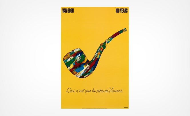
Milton Glaser, 100 Years Pipe de Vincent

Glaser had freedom in his creation, but he abandoned and sacrificed it for the commodity.

Paul Rand (Advertising Art Director)

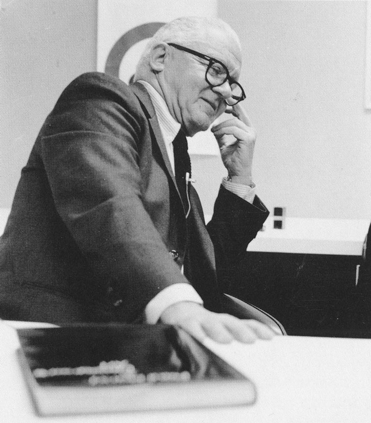
Paul Rand(August 15, 1914 – November 26, 1996)  was an American art director and graphic designer.

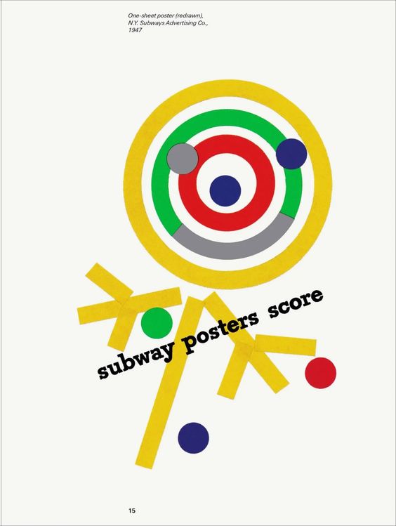
By my first impression, Paul Rand is the inheritor of the Bauhaus style but not only modernism. Although he mainly learned by himself, the style of his design strongly displays the similarity towards Bauhaus school. His colour choice is simple and pure but not less in the attractiveness of vividness. His shapes and typography design are very geometric and solid as same as the Bauhaus.

Paul Rand, Frank Davis, 1929

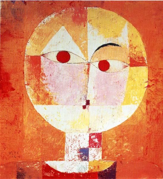
I tried to find the connection between the Bauhaus and Paul Rand but cannot have a really trustable proof. Only a few uncertain information told that Paul Klee probably had some kind of communication with Paul Rand and caused Paul Rand having the trend of a Swiss-styled internationalism. This rumour maybe not true, but I think it still points out that Paul Rand having a very obviously international style that keeps influencing the world until today. This should be one of the reasons that his design can still have a sense of fashion.

No matter if Paul Rand really had connected with some of the others famous or not, his style has a strong power which is not inferior to the other artists. His works dig deeply into the audiences’ cognition to extract their most naive view of the world. This must result from his self-taught experience. Some of his creations keep a childlike technique, such as colours are not considered, sort combination is random, different elements are put together by a very general reason.

Paul Rand, Jazzways
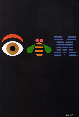
Paul Rand, Eye Bee M, 1981

I like this kind of natural part of his works. However, maybe because he made too much commercial design, a lot of his works are obviously distorted to ingratiate public aesthetics. This makes some of his works being boring at the look, not much in the behind meaning but just stopped at the standard appearance. A sense of repeating for me.

Jean-Michel Basquiat

Jean-Michel Basquiat

Jean-Michel Basquiat (December 22, 1960 – August 12, 1988) was an American artist who was known for his raw gestural style of painting with graffiti-like images and scrawled text.

Life

  • Basquiat was born in Brooklyn, New York, on December 22, 1960. His mother, Matilde Basquiat, attached great importance to his artistic passion and enrolled him as a junior member of the Brooklyn Museum of Art.
  • In 1967, Basquiat started attending Saint Ann’s School, an arts-oriented exclusive private school.
  • In September 1968, at the age of seven, Basquiat underwent surgery to remove the spleen after being hit by a car, which led him to read the famous medical and art treatise “Gray’s Anatomy”. The sinewy bio-mechanical images of this text and those equally linear personages were believed having great influence in his mature, graffiti-inscribed canvases.
  • The misfortune happened, constantly, Basquiat’s parents separated, and he and his sisters lived in Puerto Rico with their father from 1974 to 1976. His mother was diagnosed with mental illness and was eventually admitted to a shelter.
  • Beauce of the broken family, Basquiat dropped out of Edward R. Murrow High School and left home at the age of 17.
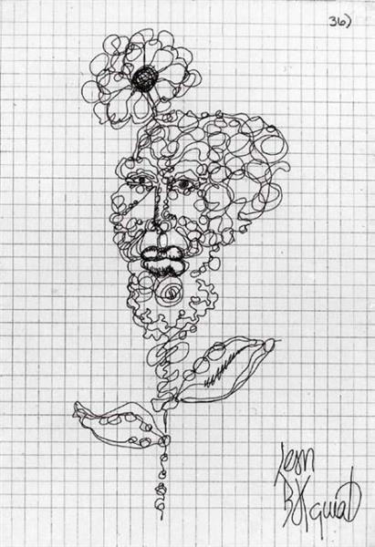
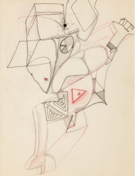
Rose Head, 1978 - Jean-Michel Basquiat
Jean-Michel Basquiat, Rose Head, 1978
  • Basquiat lived on the street, with friends or in abandoned buildings, and has graffiti activities with graffiti artists Al Diaz and Shannon Dawson. They worked under the pseudonym SAMO, an acronym for “Same Old Shit”. 
  • On December 11, 1978, Basquiat and Diaz ended their friendship, The SAMO was ended with the epitaph “SAMO IS DEAD”, inscribed on the walls of SoHo buildings in 1979.
  • In June 1980, Basquiat’s achievement raised into a new level because of his participation in The Times Square Show, a multi-artist exhibition sponsored by Collaborative Projects Incorporated (Colab) and Fashion Moda. which made him noticed by various critics and curators.
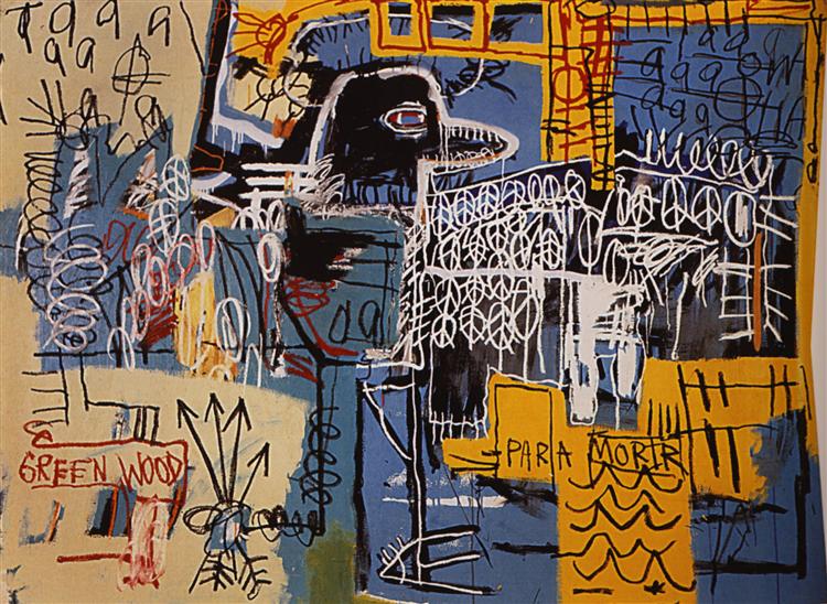
Bird on Money, 1981 - Jean-Michel Basquiat
Jean-Michel Basquiat, Bird on Money, 1981
  • In particular, the Italian gallerist Emilio Mazzoli saw the exhibition and invited Basquiat to Modena (Italy) to have his first world solo show, that opened on May 23, 1981.
  • Furthermore, Basquait had a revolutionary advancement in 1982, not only his six solo shows in cities worldwide as the youngest artist ever to be included in Documenta but the creation of about 200 artworks and his signature black oracle figure.
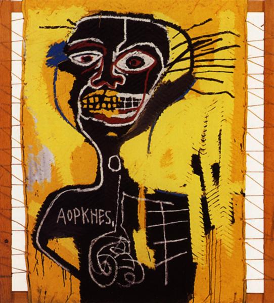
Cabeza, 1982 - Jean-Michel Basquiat
Jean-Michel Basquiat, Cabeza, 1982
  • Unfortunately, the era background and social environment still made him a serious pressure, especially, as being a young black man artist. Basquiat later addicted to heroin and cocaine which were considered as a solution for those unsolvable problems.
  • Although he attempted to get rid of the drug dependence, on August 12, 1988, he died of a heroin overdose at his art studio on Great Jones Street.

Style

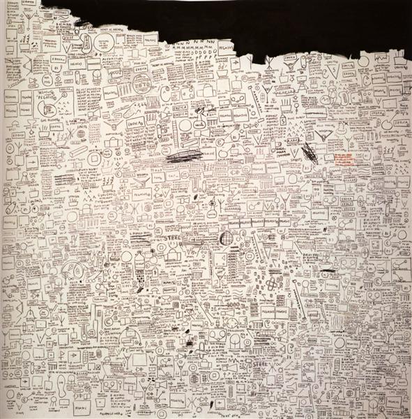
Basquiat’s art career had at least twice breakthroughs. At the most beginning, his drawings were still like the seeds which contained a powerful spirit but did not really display his appearance. Those initial sketches were more like miniatures as a part of his future creation.

Untitled, 1978 - Jean-Michel Basquiat
Jean-Michel Basquiat, Untitled, 1978

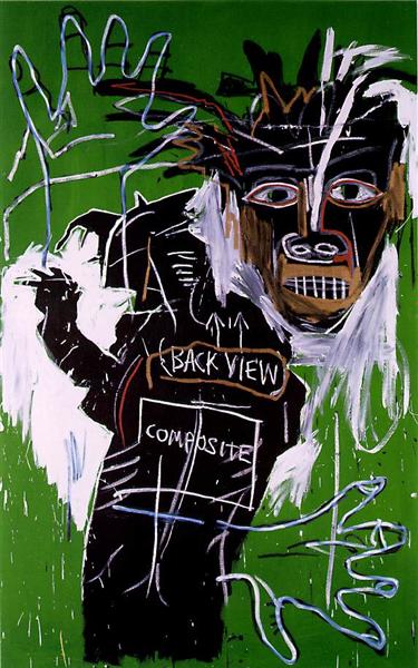
Furthermore, in 1982, Basquiat’s creation began to have a more obvious main theme, the black figure. Although the time period was not long, it is hard to say this element which appeared in hundreds of his works was not a constant development of Basquiat’s art cognition. Basquiat used this figure reflected a lot of social problems with the context in his paintings, and some of his self-portraits also used it as the basis. His arts are really hard to tell an exactly simple meaning, but really has the power of expressing the idea: “I am telling you”.

Self-Portrait as a Heel, Part Two, 1982 - Jean-Michel Basquiat
Jean-Michel Basquiat, Self-Portrait as a Heel, Part Two, 1982

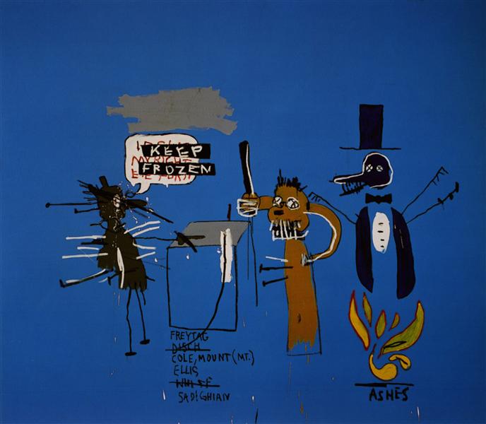
In his later works, the features of Neo-expressionism were further highlighted, which can obviously see his reaction against conceptual art and minimal art of the 1970s. He attempted to crazily increase the content in some of his work, and the using of colours became more contrastive and bright.

Pegasus, 1987 - Jean-Michel Basquiat
Jean-Michel Basquiat, Pegasus, 1987
The Dingoes That Park Their Brains with their Gum, 1988 - Jean-Michel Basquiat
Jean-Michel Basquiat, The Dingoes That Park Their Brains with their Gum, 1988

Personal Opinions

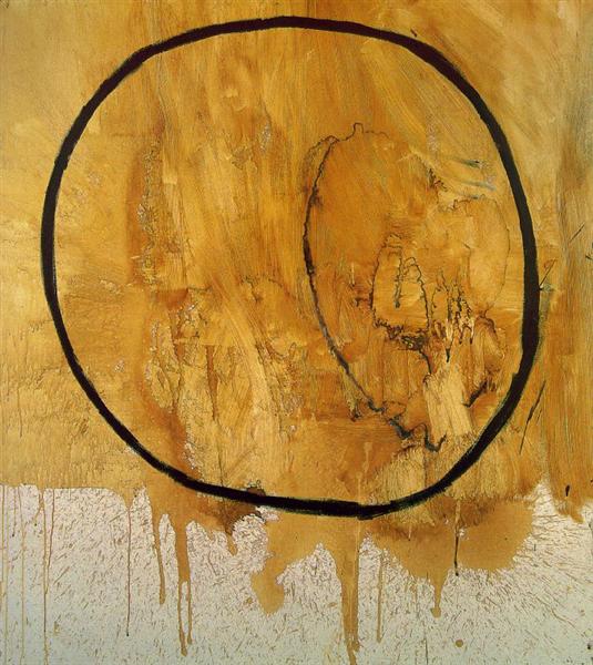
I really like the freedom in his arts. Because of the social background, Basquiat’s arts had talked about the topics of the races, politic and social class, and today’s critics still always connect his arts to those aspects, however, the innermost concept I see is what a passionate spirit who really in love with arts and freedom. Start in general, only the really enthusiasm can motive a person to crazily create the uncountable works in a short time. All his works even make me feel like created by an impulse which shortly motived his hands to do something without calm. However, his works are not something without thinking, they always have a direct topic and Basquiat just put his ideas on the audiences’ faces to let them see it by themselves. Indeed, I think this impulse is more important than the calmness because anyone will lose their impulses while the growing of age and the increasing of life experience. Basquiat was really lucky and brave in arts that he can express those innermost love so early

Earth, 1984 - Jean-Michel Basquiat
Jean-Michel Basquiat, Earth, 1984

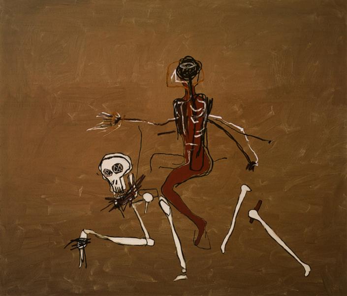
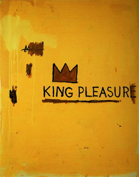
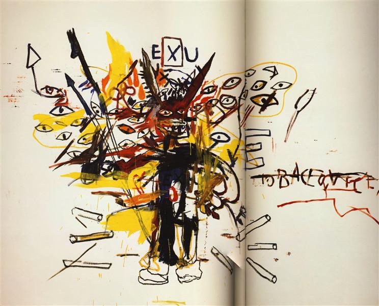
This passion was the energy of Basquiat’s art creation, but maybe also the source of his pressure in his later life. In his later creation, I can see his various attempts to the different types of arts, including further reflection on cubism, abstractionism, and expressionism.

Riding with Death, 1988 - Jean-Michel Basquiat
Jean-Michel Basquiat, Riding with Death, 1988
King Pleasure, 1987 - Jean-Michel Basquiat
Jean-Michel Basquiat, King Pleasure, 1987
Exu, 1988 - Jean-Michel Basquiat
Jean-Michel Basquiat, Exu, 1988

They are all really excellent works that obviously expressed Basquiat ‘s ideas and emotions. However, I think the sudden success and change of his life made him an extreme perfectionist who fears the failures and “not good enough”. This kind of mental pressure further developed by social attention and ultimately caused his tragedy of life.

References

https://www.wikiart.org/en/jean-michel-basquiat https://www.wikiart.org/en/jean-michel-basquiat/untitled-6 https://www.theartstory.org/artist/basquiat-jean-michel/life-and-legacy/ https://www.wikiart.org/en/jean-michel-basquiat/king-pleasure https://www.wikiart.org/en/jean-michel-basquiat/exu https://www.wikiart.org/en/jean-michel-basquiat/self-portrait-as-a-heel-part-two https://www.wikiart.org/en/jean-michel-basquiat/cabeza https://en.wikipedia.org/wiki/Jean-Michel_Basquiat https://www.britannica.com/biography/Jean-Michel-Basquiat https://www.wikiart.org/en/jean-michel-basquiat/rose-head

Roy Lichtenstein

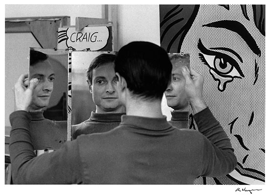
Roy Lichtenstein in his studio at 36 West 26th Street, New York, 1964.

Roy Lichtenstein (October 27, 1923 – September 29, 1997) was a famous American Pop artist and was noted for his bright and catchy colours graphic works

Life

  • On October 27, 1923, Lichtenstein was born in New York.
  • He became interested in art and design through school and often painted portraits of musicians playing musical instruments.
  • In 1937, Lichtenstein decided to take up watercolour classes at the Parsons School of Design. Aside from this course, he studied in the Art Students League, was taught by Reginald Marsh, a famous realist painter.
  • In 1943, Lichtenstein’s school life at Ohio State University was interrupted by WW2. He was drafted for the war and sent to Europe until 1946.
  • After the war, Lichtenstein came back to Ohio State and finished his college education in fine arts. Hoyt L. Sherman had an important influence on him in this period, he encouraged Lichtenstein to keep questioning of accepted canons of taste. By the way, Lichtenstein gave his first son the middle name of “Hoyt,” and in 1994 he donated funds to endow the Hoyt L. Sherman Studio Art Center at OSU.
  • Then, Lichtenstein got a master’s degree, and then took a job at Ohio State University, experienced as a commercial art instructor, industrial engineer and window display designer.
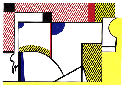
The Valve, 1954 - Roy Lichtenstein
Roy Lichtenstein, The Valve, 1954
  • In 1951, Lichtenstein held his first solo exhibition at the Carlebach Gallery in New York. He moved to Cleveland the same year and lived there for six years, although he often returned to New York.
  • In 1957, Lichtenstein moved back to upstate New York. Then, he began teaching in upstate New York at the State University of New York at Oswego in 1958.
  • In 1960, Lichtenstein started teaching at Rutgers University and was heavily influenced by Allan Kaprow who a pioneer in establishing the concepts of performance art.
  • In 1961, Lichtenstein first time created the works with large-scale use of hard-edged figures and Ben-Day dots. This unprecedented attempt of combining comic and abstraction brought him unexpected commercial achievement later.
Look Mickey.jpg
Roy Lichtenstein, Look Mickey, 1961
  • From February 10 to March 3, 1962, Lichtenstein’s first exhibition of the comic-book paintings was held at Leo Castelli Gallery. The show sold out all of the exhibited works and made Lichtenstein famous.
  • In 1963, Lichtenstein moved from New Jersey to Manhattan and resigned from Douglass in 1964 to concentrate on his work.
  • In 1970, Lichtenstein purchased a former carriage house in Southampton, Long Island, built a studio on the property, and spent the rest of the 1970s in relative seclusion.
  • Since August 1997, Lichtenstein suffered from pneumonia and numerous complications from this ailment. On September 29, 1997, Lichtenstein passed away.

Style

Girl with ball, 1961 - Roy Lichtenstein
Roy Lichtenstein, Girl with ball, 1961

Not like some of the tortuous artists who constantly break their cognitions and rebuilt their style such as Winslow homer, Lichtenstein’s arts are more like a vertical development that digging into a deeper understanding of itself.

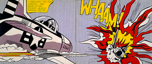
From the very beginning, his work was strongly connected with solid lines and shapes. This is the basis even the innermost nature of his all works. Those could be considered as the impact of abstractionism and cubism. As well as other artists who experienced the war, Lichtenstein created some of the war-related works but they are not depressive topics and more like the encouraging posters. Maybe because the US was easy on the front line.

Roy Lichtenstein, Whaam!, 1963

Although not obvious to see the change, Lichtenstein’s art was very well combined with the raising of Abstract Expressionism in that period. He made his work more emotional by the shapes itself, instead of expressing the practical story. Comics were really had a close connection to his development. The comic creation made him famous and further pushed his creation in the early 1960s. Conversely, he also changed the forms and creation of comics. His largely using of Ben-Day dots totally changed the way of the comic, and this influence can still be still seen until today.

Drowning girl, 1963 - Roy Lichtenstein
Roy Lichtenstein, Drowning girl, 1963

After the period of commercial comic advertisements, the thoughts of Cubism, abstractionism and expressionism had a further fusion in Lichtenstein’s arts. This mixed-style became the main theme of his 1970s arts. Until the later 1980s, the characteristic expressionism shortly became the main thoughts in his works.

Face (green nose), 1986 - Roy Lichtenstein
Roy Lichtenstein, Face (green nose), 1986

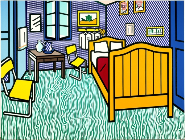
However, through the recreation of old arts in the 1990s, Lichtenstein gets back to his own mixed style. The regular lines and shapes and solid filling colours appeared as the protagonists again in Lichtenstein’s creation. I personally believe this was caused by the spread of the computer.

Bedroom at Arles, 1992 - Roy Lichtenstein
Roy Lichtenstein, Bedroom at Arles, 1992

Personal Opinions

Roy Lichtenstein found his style and road very early and became successful when he was 30. This can be considered as a really lucky artist who still had a lot of time and resource to further develop his arts. Indeed he tried. The cubism, abstractionism and expressionism displayed in his 1970s-1980s works were really great attempt and he was so close to breaking his own limit and pattern. However, until the end, Lichtenstein did not really achieve a new hight. He was restricted by his own cognitions in his young period and did not get rid of the success in the past. His later work cannot give people an astonishing sense of the same as his peak in the 1960s. He was just copying his works in the past.

References

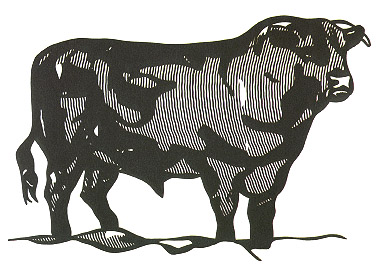
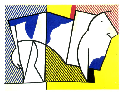
https://lichtensteinfoundation.org/biography/ https://www.roylichtenstein.com/ https://www.wikiart.org/en/roy-lichtenstein/the-valve-1954 https://www.wikiart.org/en/roy-lichtenstein/drowning-girl-1963 https://www.wikiart.org/en/roy-lichtenstein/face-green-nose-1986 https://www.wikiart.org/en/roy-lichtenstein/bedroom-at-arles-1992 https://www.wikiart.org/en/roy-lichtenstein/bull-i-1973 https://www.wikiart.org/en/roy-lichtenstein/bull-iii-1973 https://www.wikiart.org/en/roy-lichtenstein/bull-vi-1973 https://en.wikipedia.org/wiki/Look_Mickey https://en.wikipedia.org/wiki/Roy_Lichtenstein https://en.wikipedia.org/wiki/Whaam!

Research Proposal Draft

TV Anime is today’s main form of Japanese animation, it always plays a new episode every week and most of the TV Anime’s total time-length is about four months, someone can be much longer such as Naruto. However, this anime form is facing serious challenges in the coming future because of the development of the anime industry. More and more TV Anime works become only the advertisements of the original anime novel or comics, that the animation quality is integrally reduced. This seriously influences audience enthusiasm. Accompanying with the reputation reducing, many of the original anime works are made in the type of Anime Movie. TV anime’s market is further occupied by these similar art forms. In this kind of competition, the biggest differences between the two competitors are their quality and broadcast cycles, so now what advantages could the long-tern broadcast characteristic bring for TV Anime in the future industry? I have some hypothesizes. For proving my guessing, I will compare my research of the original TV Animes and the original Anime Movies of the same period to get a deeper understanding of their quality, popularity, reputation, and also the capitals they created. Currently, I believe it will show that the Anime Movies’ popularity, reputations, and created capitals will fastly have a stable trend but TV Anime may have some obvious changes when the special episodes played.

Final Research Proposal (Japanese Television Anime Needs Self-help)

Television Anime Shows are today’s main form of Japanese animations, they always play a new episode every week and most of the TV Anime’s total time-length is about four months, some works can be much longer such as Naruto. However, this anime form is facing serious challenges in the coming future because of both the external and internal factors. For example, new animators are hard to grow up in the current industry. On the other hand, more and more original anime works are made in the type of Anime Movie. TV anime’s market is further occupied by this similar art form. At this critical moment, how could the Japanese TV Anime further develop and have as much market as possible in future industrial competition? To explore my hypothesis, I will first research the industrial environment and TV Anime itself to find what the industry itself shortcoming needs to improve. Comparing, afterward, my research of the changing TV Anime and the Anime Movie to further explore the possible transformation and development of future TV Anime.

Young Generation Needs Better Work Conditions

Anime industry must first improve the current work environment to reduce the living pressure on the anime artists of the young generation. “According to the Japanese Animation Creators Association, an animator in Japan earns on average ¥1.1 million (~$10,000) per year in their 20s, ¥2.1 million (~$19,000) in their 30s, and a livable but still meagre ¥3.5 million (~$31,000) in their 40s and 50s. The poverty line in Japan is ¥2.2 million” (Eric, Margolis), we can see the slave-like salary is an average industrial standard. The animator and other labourers who work in the industry, especially the newcomers, have to face the unimaginable amount of works while living in poverty. This public “industrial secret”, however, is caused by the exploitation in the industry because “a recent report by The Association for Japanese Animations indicates the industry’s worth as a whole topped over ¥2 trillion in 2017 — a new record” (Matt, Schley). It is obvious to see that the overall value of the industry has not been fairly allocated to workers. The companies must have largely discounted the value of underlying labours because the employee’s job benefit do not have any improvement during this positive trend of the industry, especially by comparing to a decade ago that Alex Marttin noted: “a monthly wage of ¥94,000 at best — for an average of 250 hours of work — until an artist gets to handle keyframes or storyboards”(Alex, Marttin). Even Yasuhiro Irie, who the Representative Director of Japan Animation Creators Association, warns that “Production companies need to devote themselves to paying young animators properly as they improve. If they don’t, in some 10 or 15 years, there will be no animators” (Matt Schley).

The Conflict of Intra-Industry Must be Noticed

TV Anime company must solve the hostile relationship between the senior and junior employees. Resources are all monopolized by the old practitioners; however, they do not fairly treat the successors and the poor salary is impossible to support the new anime makers to grow up by themselves. Kemono Friends 2, by Ryuuichi Kimura, is the most unfortunate example resulted from this internal confrontation. Tatsuki, as the director of the younger generation, with his studio Yaoyorozu created the miraculous success of Kemono Friends which the first season. However, “TATSUKI reported in September that, per a notification from publishing and production company Kadokawa, he is no longer working on the Kemono Friends project. Soon after, the anime’s official website announced that the studio Yaoyorozu would no longer be involved. Producer Yoshitada Fukuhara confirmed in December that Yaoyorozu will not return” (Karen Ressler). Tatsuki and his studio were unilaterally removed without given any public reasons. The truth was believed as the internal conflict in the company because “Kadokawa’s statement (translation via u/kjwffr on Reddit)on the matter was conciliatory in tone, trying to recast themselves as nice guys trying to keep the band together, as the mean old animation studio stubbornly insisted ‘no way’”(David Cabrera). I have never imagined the decadence of TV Anime industry has been so serious until seeing this young generation team almost had no right to voice for their efforts and achievements. The old in power only seeks for the short-term benefits; they used the popularity of the first season to attract a lot of business cooperation and made a fortune while the broadcast of the second season. Nevertheless, this has seriously damaged the reputation of Kemono Friends because its all original plots and settings have been all discarded to erase the existence and influence of Tatsuki and his Yaoyorozu. Due to the suddenly increased interests and audiences, today’s Japanese TV Anime industry has lost its way. The newcomers need to be treated friendly and trained well by the experienced seniors but not work like tools for the company. The interests struggle between the senior and junior within the industry must be solved peacefully, otherwise, TV Anime will lose its artistic value as artwork and become a fast-food culture that only serves audiences with temporary entertainment in modern decades.

The Potential Advantages of TV Anime

To defeat Anime Movie, TV Anime must further develop its unique characteristics to the practical advantages. Like what Brown Steven T said: “If the film truly produced a perfect digital simulation of cinema, no one would see it as different from cinema. In other words, the digital film must repeat cinema with a difference” (Brown, 172), the digital film, the anime, must find its style and unique selling point to be independent and successful. This principle is fit for any artworks including both the TV Anime and Anime Movie. Especially, because Anime Movie and TV Anime are the similar industries and TV Anime’s independent work quality is hard to achieve the level of Anime Movie, TV Anime must find its market range by further developing the strength characteristics. In terms of a more practical situation, the commercial market, TV Anime must have a strategy to express its value through its distinctive conditions. The long periodic broadcast is an excellent choice among TV Anime’s characteristics for attracting investment. Not like the movies usually end in a few hours, and with an uncertain sequel, TV Anime has much longer broadcast allocated to each week in the months. This does not only provide TV Anime producer with the opportunity to read the feedback from audiences, but also build a perfect carrier for commercial advertisements. A few months of collaboration is the best news for the capitalists because the audiences will remember what their products are after a few times of repeatedly play in each week. This is one of TV Anime’s biggest advantages in contrast to Anime movies. Because many people cannot remember what the advertisement talked about after just played once, but if let them sit in the theatre to watch the repeated advertisement before playing movies, they will hate this product just like me hating Subway caused by its crazily repeated advertisement on the YouTube. Furthermore, the long-term cooperation between manufacturers and TV Anime even had created a new form of anime, the Short-Length Anime that “The three-minute length gives ample room to develop content with a strong storyline, in contrast with the standard television commercial format, which is too short for such story development since it is generally limited to just 15 seconds.” (Takashi Muto). Although it has developed and differentiated into various types, the most initial and now the main type still looks like traditional TV Anime. Usually, the short anime still weekly plays a new episode and has simple story development. This TV Anime targets at letting the audience remember the brand or the original comic, but it gives the main content to the creative animation story. For example, Teekyu, “The animation announcement came five months after the manga was first published, the fastest manga-release-to-anime-announcement time that Earth Star Entertainment has ever had” (Egan Loo). Each episode of the anime is about 2 minutes long and until now the series has had nine seasons. The TV Anime brings unimaginable sales increase of the original comics, and it has received a 12-episode anime adaptation in 2016. The cost and risks of investment are the biggest issues for making Anime Movie, however, this Short-Length TV Anime does not need to worry about it. This form of TV Anime can achieve the high-return through the step by step development and operation with only little risk at the initial investment that only loss little even if it fails.

TV Anime Needs A Revolutionary Change for Its System

In conclusion, I think the biggest problem for the development of TV Anime is the internal work system in the industry. At the most beginning, I thought the growing Anime Movie was the main threat of future TV Anime, however, I changed my mind, after researched the never involved industrial darkness. The slavery-like intra-industry can no more support TV Anime in the increasing market requirement and the newcomer should have a better working environment because they are the future. I even feel like this industry has no hope if the revolutionary transform did not happen.

Annotated Bibliography in “Japanese Television Anime Needs Self-help”

Alex Martin. “Future of ‘anime’ industry in doubt”. The Japan Times. The Japan Times Ltd. Mar 4, 2009. Web:https://www.japantimes.co.jp/news/2009/03/04/national/future-of-anime-industry-in-doubt/#.XdfmzehKhPa

Brown, Steven T. Cinema Anime: Critical Engagements with Japanese Animation. Palgrave Macmillan, 2006. EBSCOhost, search.ebscohost.com/login.aspxdirect=true&db=cat02755a&AN=cul.b1059405&site=eds-live&scope=site.

David, Cabrera. “What Was Kemono Friends?”. Nov 9, 2017.https://medium.com/@sasuraiger/what-was-kemono-friends-75a16f319510

Egan, Loo. “Crunchyroll to Stream Teekyū Anime About Girls’ Tennis Team”. Animenewsnetwork. Oct 11, 2012. https://www.animenewsnetwork.com/news/2012-10-11/crunchyroll-to-stream-teekyu-anime-about-girls-tennis-team

Eric, Margolis. “The dark side of Japan’s anime industry”. Jul 2, 2019, 8:30am. https://www.vox.com/culture/2019/7/2/20677237/anime-industry-japan-artists-pay-labor-abuse-neon-genesis-evangelion-netflix

Karen, Ressler. “Kemono Friends Director Tatsuki Reveals 2nd ‘Hentatsu’ Anime Short”. Animenewsnetwork. Feb 28, 2018. https://www.animenewsnetwork.com/news/2018-02-28/kemono-friends-director-tatsuki-reveals-2nd-hentatsu-anime-short/.128378

Matt, Schley. “Younger animators still struggling amid anime boom”. May 8, 2019. https://www.japantimes.co.jp/culture/2019/05/08/general/younger-animators-still-struggling-amid-anime-boom/#.XeqWrehKhPY

Takashi, Muto. “Harnessing the Power of Anime as an Outstanding Marketing Solution”. https://www.dentsu.com/news/ideas/harnessing_the_power_of_anime.html

Piet Mondrian

Piet Mondrian, photograph

Piet Mondrian (March 1872 – 1 February 1944) is a Dutch artist, a famous pioneer of 20th-century abstract art. He is also known as one of the originators of the “De Stijl (Neoplasticism)” movement.

Life

  • In 1872, Mondriaan was born in Amersfoort in the Netherlands. His father, Pieter Cornelius Mondriaan, was a drawing teacher and the family moved to Winterswijk when his father became a headteacher at a local primary school. His uncle, Fritz Mondriaan was a pupil of Willem Maris of the Hague School of artists. Therefore, Mondriaan was introduced to art since he was a kid.
  • Mondriaan accepted strict Protestant training and determined to be an artist. However, he first obtained a degree in education because of the insistence of his family.
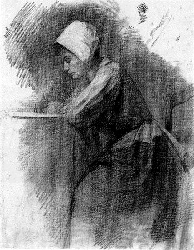
  • In 1892, instead of looking for a teaching position, Mondriaan entered and intermittently studied at the Academy for Fine Art in Amsterdam. He became a member of the art society Kunstliefde (“Art Lovers”) in Utrecht, where his first paintings were exhibited in 1893. Then he exhibited the second time in 1897.
Piet Mondriaan, Girl Writing, 1892-1895
  • In 1903 Mondriaan visited a friend in Brabant, Belgium. It is believed that the calm beauty and the clean lines of the landscape largely influence his art style.
  • In 1905, he returned to Amsterdam and his art had visibly changed to focus more on the compositional structure than the traditional picturesque values of light and shade.
  • In 1907 Amsterdam sponsored the Quadrennial Exhibition, featuring a lot of Post-Impressionists such as Kees van Dongen, Otto van Rees, and Jan Sluijters. Their influence of daring using colour soonly reflected in Mondrian’s Red Cloud, a rapidly executed sketch from 1907.
The Red Cloud, 1907 by Piet Mondrian
Piet Mondriaan, The Red Cloud, 1907
  • His new style was reinforced by his acquaintance with the Dutch artist Jan Toorop, who led the Dutch Luminist movement.
  • In 1908, Mondriaan became interested in the ideas of Theosophy and he joined the Dutch branch of the Theosophical Society in 1909.
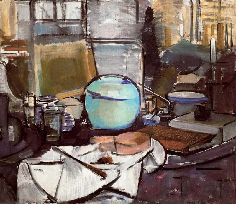
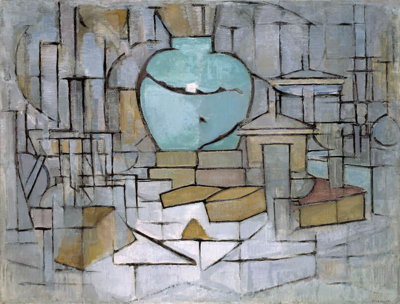
  • In 1911, in the Moderne Kunstkring exhibition of Cubism in Amsterdam, he saw for the first time the early Cubist works of Pablo Picasso. Almost immediately the concept of Cubism integrated into his work, for example, the different two versions of his Still Life with Gingerpot.
  • At the beginning of 1912, Mondriaan moved to Paris. He changed his name to “Mondrian” that dropping an ‘a’ from “Mondriaan”, to emphasize his departure from the Netherlands and his integration within the Parisian avant-garde.
  • In the summer of 1914 Mondrian returned to the Netherlands to visit his father, who was seriously ill, and the outbreak of World War I prevented him from returning to Paris. During this period, he stayed at the Laren artists’ community, where he met Bart van der Leck and Theo van Doesburg, who were both exploring their own abstract art.
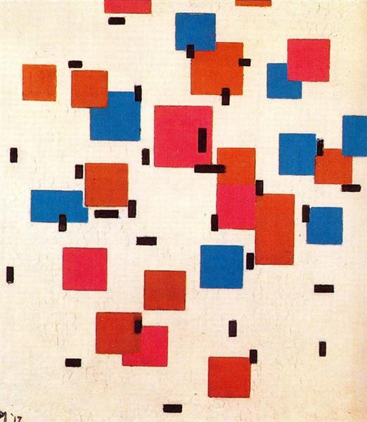
  • In 1917, with other artists, Mondrian and Van Doesburg founded the art periodical and the movement of De Stijl. In this magazine, Mondrian first published essays defining his theory, which he called neoplasticism.
  • In 1918, Mondrian went back to Paris.
Composition in Color A, 1917 - Piet Mondrian
Piet Mondrian, Composition in Color A, 1917
  • In 1924, Piet Mondrian decided to leave the group because of the disagreement with Van Doesburg. Although they were reconciled when they accidentally met in a café in Paris in 1929.
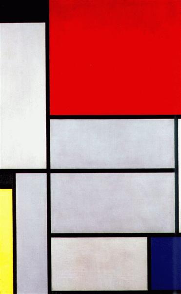
  • In 1926, Katherine Dreier, co-founder of New York City’s Society of Independent Artists, visited Piet Mondrian’s studio in Paris and acquired his Tableau I. This was then manifested during an exhibition in the Brooklyn Museum–the first major exhibition of modern art in America since the Armory Show.
Piet Mondrian, Tableau I, 1921
  • In 1931, Piet Mondrian joined the Abstraction- Creation line, which was more open to new styles, to new techniques, and to a difference in styles of work, which the artists would create.
  • In 1938, due to the advancing fascism, Mondrian moved to London.
  • In 1940, after the Netherlands was invaded and Paris fell, he left London for Manhattan, where he would remain until his death.
  • On 1 February 1944, Piet Mondrian died of pneumonia. He was interred at the Cypress Hills Cemetery in Brooklyn, New York.

Style

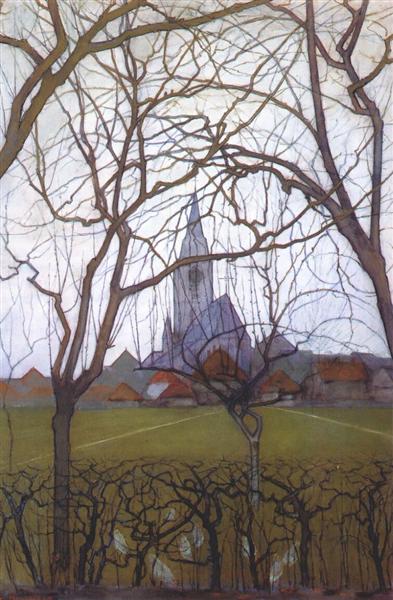
Because of the influence of his father and uncle, Mondrian’s early paintings are closely connected with realism or impressionism. He always painted the landscape and still-life subjects around Amsterdam by using subdued hues and lighting effects.

Village Church, 1898 - Piet Mondrian
Piet Mondrian, Village Church, 1895

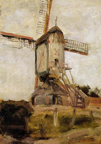
This solid foundation of technique and cognition even still reflected in Mondrian’s beginning of twenty-century. For example, in his Mill of Heeswijk Sun, although his style had some kind of subtle change, the traces of realism can still be found in this painting.

Mill of Heeswijk Sun, 1904 - Piet Mondrian
Piet Mondrian, Mill of Heeswijk Sun, 1904

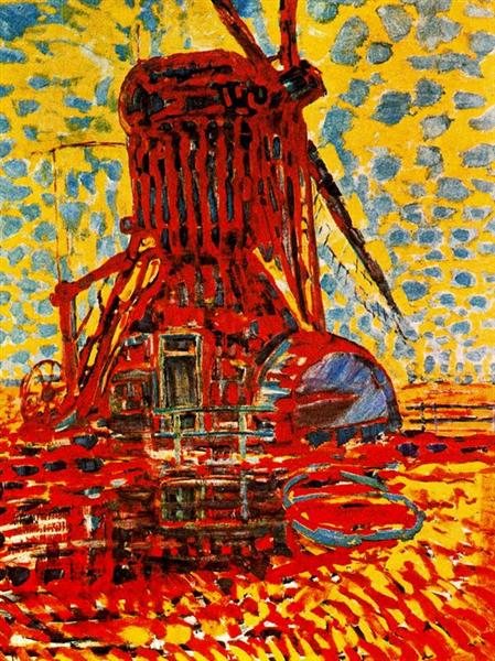
However, in contrast, the later Post-Impressionists Arts obviously had a much more powerful impact on Mondrian’s style.

Mill in Sunlight: The Winkel Mill, 1908 - Piet Mondrian
Piet Mondrian, Mill in Sunlight: The Winkel Mill, 1908

Mondrian’s colour became not as cautious as the past, his painting seems to infuse a powerful soul that told the story behind the image.

Continue to the constant style change in the first decade of twenty-century. Mondrian’s arts developed once again when he had contacted to the cubism.

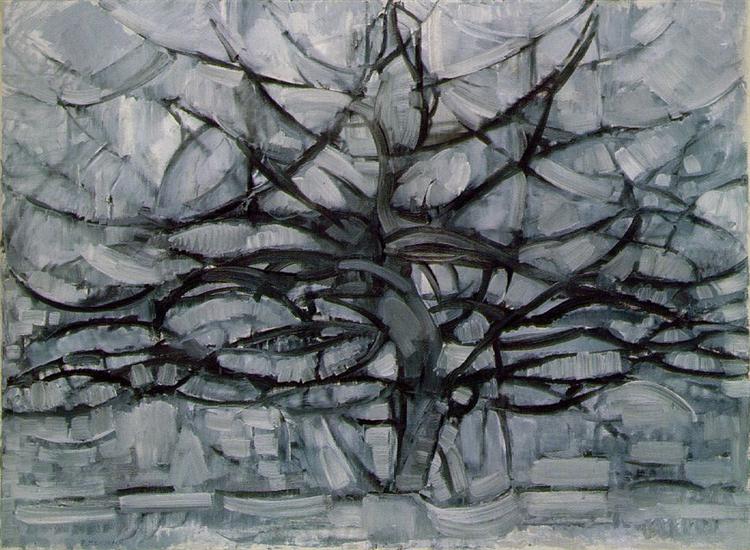
This time, Mondrian got rid of the shackles of his past. The shapes of the objects in his paintings were started to be abstracted. The early influence of his family was almost disappeared in his arts. His structures became much more simple and the entirety looks more harmonic.

The Gray Tree, 1911 - Piet Mondrian
Piet Mondrian, The Gray Tree, 1911

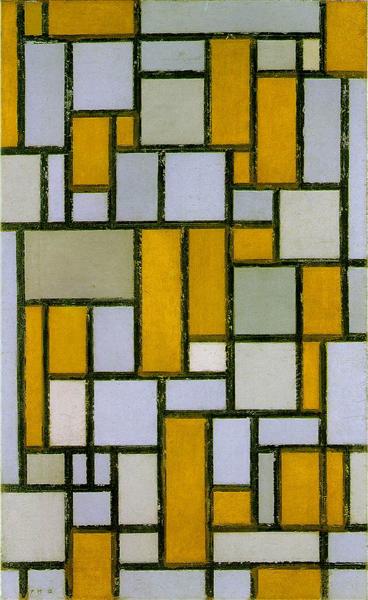
However, Mondrian who the contemporary society truly familiar with is after his meeting with Van Doesburg and Van der Leck. It could say that their abstract arts became the foundation of Mondrian’s future works to some extent. Especially, Van der Leck’s use of only primary colours in his art greatly influenced Mondrian.

Composition with Gray and Light Brown, 1918 - Piet Mondrian
Piet Mondrian, Composition with Gray and Light Brown, 1918

At the initial creation of the abstract paintings, Mondrian surpassed his limit of cognition but did not really find his own way. His works are more like the experiments, that each style had a subtle difference with another.

Until the 1920s, Mondrian finally confirmed his art style. The iconic combination of straight lines with the colours of red, yellow, blue, black, and white was determined.

Composition 2, 1922 - Piet Mondrian
Piet Mondrian, Composition 2, 1922

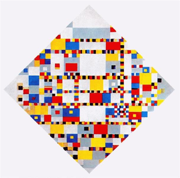
This simple abstract harmony remained the same for a long time, until Mondrian’s last few years, his works raised to the new heights. The lines were not only black and the complexity of colours had an obvious development. Mondrian’s harmony became much more dynamic but not only the visual balance in the first impression.

Victory Boogie Woogie, 1944 - Piet Mondrian
Piet Mondrian, Victory Boogie Woogie, 1944

Personal Opinion

Piet Mondrian is an artist who is good at learning new stuff and having self-reflection. No matter realism, impressionism, cubism or abstractionism, he can always absorb their essences and improve his own art understanding. In my opinion, artists’ pursuits are breakthrough the current limit of human cognition and rising human spirit into a higher level, so artists must first surpass themselves’ stereotyped frame. However, Mondrian was a miraculous genius in pushing the limits of self. He revolutionarily transformed his style again and again by endlessly studying and pursuing his spiritual harmony. Even until the end of his life, I cannot imagine how he could further develop and evolve his pure abstract arts into such vigorously complicated colour combinations. He really did that changed the world by his art and redefined social aesthetics.

I like the harmony so much in his works. Mondrian’s all works are well balanced by his spiritual pursuit. From the earliest subdued hue value to the lastest primary colour, Mondrian’s works are just like a precise balance of light. They can always guide audiences’ eyes to easily find a comfortable way to look through the whole images. This must the result of his long-term research in theology and philosophy that the high-level understanding of the human spiritual world provided him with a significant background behind his arts.

References

https://www.piet-mondrian.org/ https://www.theartstory.org/movement/de-stijl/ https://www.wikiart.org/en/piet-mondrian/girl-writing-1895 https://www.piet-mondrian.org/the-red-cloud.jsp#prettyPhoto https://www.wikiart.org/en/piet-mondrian/composition-in-color-a-1917 https://www.wikiart.org/en/piet-mondrian/avond-evening-the-red-tree-1910 https://www.wikiart.org/en/piet-mondrian/composition-2-1922 https://www.wikiart.org/en/piet-mondrian/the-gray-tree-1911 https://www.britannica.com/biography/Piet-Mondrian/Cubist-period-in-Paris https://www.wikiart.org/en/piet-mondrian/mill-of-heeswijk-sun https://www.wikiart.org/en/piet-mondrian/village-church-1898 https://www.wikiart.org/en/piet-mondrian/tableau-i-1921 https://www.piet-mondrian.org/the-still-life-with-gingerpot-2.jsp https://www.piet-mondrian.org/the-still-life-with-gingerpot-1.jsp#prettyPhoto https://en.wikipedia.org/wiki/Jan_Toorop https://kinderart.com/blog/mondrian/ https://www.piet-mondrian.org/the-still-life-with-gingerpot-2.jsp https://www.piet-mondrian.org/the-still-life-with-gingerpot-1.jsp#prettyPhoto https://en.wikipedia.org/wiki/Jan_Toorop https://kinderart.com/blog/mondrian/