Milton Glaser (born June 26, 1929) is an American graphic designer.

Milton Glaser’s works are the pop arts defined in my heart. He uses various bright colours without too much worry and makes the different elements a jumble. However, this kind of Dada-like choice is making a harmonious picture in Glaser’s hands, but not some confusing jumble.
Not like the later pop art, Glaser’s works are most focus no the meaning behind the art itself. He is the one who experiences and connects the modernism and post-modernism. This is not only caused by his activity-period, but also his constantly developing in art creation.

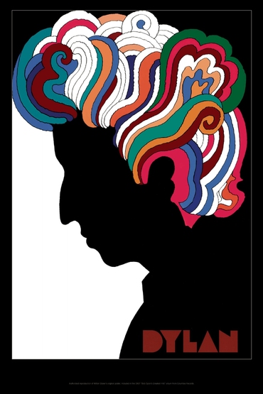
By comparing this Mad Men to the above Poster for musician Bob Dylan, the change is obvious. After the years-by-years influence of the rising focus in decorations, Glaser’s work became much braver than his past ones. The setting looks busier and colourful, the increasing power of the public luxuriant aesthetic is shown in his creation. I think this also caused by the large commercial designs he made because most commercial artists and designers are having a trend of getting closer and closer to the public aesthetic.

I Love New York logo is a witness to Glase’s changes. When he was designing this logo, he was the factual leader of fashion in society. However, after the change of time and era, Glaser was also trapped in a kind of templated creation. I think this is the biggest challenge in commercial design because the design is not art, it is for money. In order to be more acceptable by the public and society, artists have to be changed to meet the social requirement. I do not like this, I choose to be an illustrator and video maker.
Glaser had freedom in his creation, but he abandoned and sacrificed it for the commodity.