STUART ASH (Canadian Design Today)

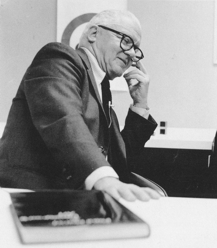
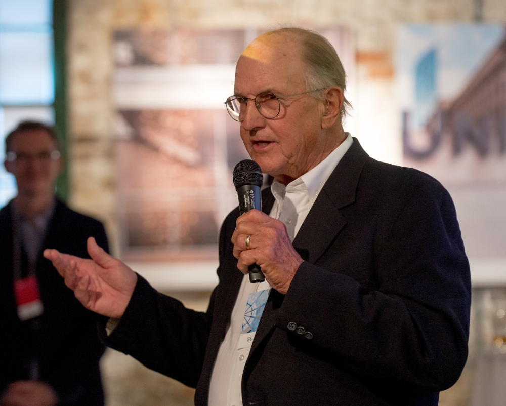
Stuart Ash is a Canadian designer, born in 1942 in Hamilton, Ontario

My Canada, 150/150: Modern by design – Teahen Tales

I like Stuart’s Centennial Symbol for a long time but I did not know who designed it until I learned him in this class.

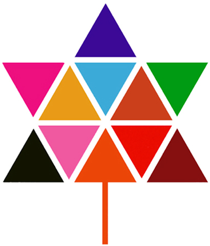
This logo is really an impressive design for me. It was on the Calgary tower when I saw it the first time. I can still remember that when I was looking down from the tower, all the buildings are having some words or logos on the top to show to the tower, and this is the one that attracts my sight the most and makes me impressive until today. I just like this kind of simple harmony but with a great meaning behind it. Almost only using the regular triangle building up the whole image is a very excellent idea, especially the pattern is also very pure. Different colours are showing the diversity and inclusion, that makes this image a very high altitude in the behind meaning.

Gottschalk + Ash / Fritz Gottschalk

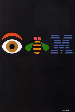
His other works are also very simple and pure. This makes his idea can be understood easily.

Designculture • Stuart Ash

When I was looking at his works, it was just like reading a kid’s story, very easy to read but very meaningful. It gives me a kind of relaxing at the spirit.

STEFF GEISSBUHLER (Postmodernism in Europe)

STEFF GEISSBUHLER (born in 1942), a Swiss visual designerd

Success Ideas and Tips from Master Graphic Designer, Steff ...

Steff is a standard European artist in my stereotypes because I think the American artist focuses more on the form and shapes and Eastern artists like to develop more in the behind thoughts but the Europeans are in the middle, they always have both. Steff’s works usually have a behind meaning, and this meaning is very obvious to be seen but not like the Chinese pursuit of making the inner thoughts as high as possible. He likes to use his design to express his idea directly to make the people can easily understand what he is saying but not let them guess. This is very different from Chinese artists because as a Chinese one of our biggest pleasures is to hide the answer and let the audiences learn from the artwork by themselves.

Steff Geissbuhler

On the other hand, Steff always makes great successes in visual design. Not like the Chinese people would like to abandon the form and shapes, Steff’s works are all very decorative crafts.

Steff Geissbuhler

He can always extract the most important meaning while keeping the form being creative. None of them will be sacrificed for the other.

Steff Geissbuhler

I like his design of using Type very much because his Type is very easy to be understood. Since I am a speaker of English Second Language, my eyes are very hard to be sensitive enough to quickly understand a lot of the Type-design, but Steff’s works are very friendly to me because they are so direct and powerful.

Steff Geissbuhler

I like Steff very much, his graphic design is one of my pursuits, that perfectly merges the thoughts together with decorative shapes.

Barbara Stauffacher Solomon(Supergraphics Innovator)

Barbara “Bobbie” Stauffacher Solomon (born 1928) is an American landscape architect and graphic designer.

Barbara Stauffacher Solomon — Curatorial Research Bureau

Barbara’s artworks are like the exaggerated logo-designs are violently put on the architectures for the decoration and function. Thus, her works are always strong in the first visual impression to let the audience feel a sense of design. This is very different from some of the artists who silently hide their idea in the environment, for example, some of the Japanese artists would consider more on something like the connection between the point of nature sight and the level of the sea outside.

Barbara Stauffacher Solomon Has Been Shaking Up Design for Seven Decades

Barbara likes to use the power of design to attract people and direct them to clearly appreciate her works. She would like to use anything geometric to build her creation including the Type, Shapes, Visual errors or habits, etc. Those elements caused her designs are like a huge man writing and painting on those walls.

Absolutely, she is also connecting her design with the environment, but this kind of connection is an exclamatory one but totally different from the silent-artists. Her arts are just like a loud radio that always playing some pop music around, it is very dynamic.

Playing With Paint and Space – MAS CONTEXT

Indeed, I like her style very much. I am always not a silent person and I always like to speak up for myself. Especially for the art creation, because it will be a shame for me if what I created did not make any attention. I like how Barbara expresses herself, and her style is very close to the younger’s aesthetics today. Showing the innermost passion and emotion at the front but not showing the hided consideration at the front, because this kind of arts will make the artist feel easier and be better to create what resonates people’s hearts.

Milton Glaser (Psychedelic Design Hero)

Milton Glaser (born June 26, 1929) is an American graphic designer.

Design guru Milton Glaser finds his mojo no more than eight blocks ...

Milton Glaser’s works are the pop arts defined in my heart. He uses various bright colours without too much worry and makes the different elements a jumble. However, this kind of Dada-like choice is making a harmonious picture in Glaser’s hands, but not some confusing jumble.

Milton Glaser, Poster for musician Bob Dylan, 1967.

Not like the later pop art, Glaser’s works are most focus no the meaning behind the art itself. He is the one who experiences and connects the modernism and post-modernism. This is not only caused by his activity-period, but also his constantly developing in art creation.

Primal Screen
Milton Glaser, Mad Men

By comparing this Mad Men to the above Poster for musician Bob Dylan, the change is obvious. After the years-by-years influence of the rising focus in decorations, Glaser’s work became much braver than his past ones. The setting looks busier and colourful, the increasing power of the public luxuriant aesthetic is shown in his creation. I think this also caused by the large commercial designs he made because most commercial artists and designers are having a trend of getting closer and closer to the public aesthetic.

Milton Glaser, I Love New York, July 15, 1977.

I Love New York logo is a witness to Glase’s changes. When he was designing this logo, he was the factual leader of fashion in society. However, after the change of time and era, Glaser was also trapped in a kind of templated creation. I think this is the biggest challenge in commercial design because the design is not art, it is for money. In order to be more acceptable by the public and society, artists have to be changed to meet the social requirement. I do not like this, I choose to be an illustrator and video maker.

Milton Glaser, 100 Years Pipe de Vincent

Glaser had freedom in his creation, but he abandoned and sacrificed it for the commodity.

Paul Rand (Advertising Art Director)

Paul Rand(August 15, 1914 – November 26, 1996)  was an American art director and graphic designer.

By my first impression, Paul Rand is the inheritor of the Bauhaus style but not only modernism. Although he mainly learned by himself, the style of his design strongly displays the similarity towards Bauhaus school. His colour choice is simple and pure but not less in the attractiveness of vividness. His shapes and typography design are very geometric and solid as same as the Bauhaus.

Paul Rand, Frank Davis, 1929

I tried to find the connection between the Bauhaus and Paul Rand but cannot have a really trustable proof. Only a few uncertain information told that Paul Klee probably had some kind of communication with Paul Rand and caused Paul Rand having the trend of a Swiss-styled internationalism. This rumour maybe not true, but I think it still points out that Paul Rand having a very obviously international style that keeps influencing the world until today. This should be one of the reasons that his design can still have a sense of fashion.

No matter if Paul Rand really had connected with some of the others famous or not, his style has a strong power which is not inferior to the other artists. His works dig deeply into the audiences’ cognition to extract their most naive view of the world. This must result from his self-taught experience. Some of his creations keep a childlike technique, such as colours are not considered, sort combination is random, different elements are put together by a very general reason.

Paul Rand, Jazzways
Paul Rand, Eye Bee M, 1981

I like this kind of natural part of his works. However, maybe because he made too much commercial design, a lot of his works are obviously distorted to ingratiate public aesthetics. This makes some of his works being boring at the look, not much in the behind meaning but just stopped at the standard appearance. A sense of repeating for me.

Survey 7 Design 3 What Ya See?

Shuchang Feng, What Ya See, Nov 2019

Self-grading: 9/10

German expressionism was more like a result of the complicated social environment. It closely connected to the German peoples’ mental cognition and anxiety towards the future. Social depression seriously influenced peoples’ lifestyles and aesthetics. People just wanted to timely squander their money in entertainment. More and more expressionism movies appeared accompanied after this social and market requirement. The movie content became a materialized emotion to help people to vent their anger and dissatisfaction. When I saw the shadow and the distorted sceneries in The Cabinet of Dr. Caligari by Robert Wiene, I was astonished by how violent and powerful the movie shows. It used the simplest and the most direct way to demonstrate people’s innermost fear and anger. I tried to imitate this style by my spread. The photo and shadow painting really achieved the initial goal I want but the text does not work well. Although I still think they are combined closely, the text does not make a powerful impression on the audience. I reverse this spread to let people read the text first because I want to make readers an uncomfortable sense to let them be easier to understand what the important point that what the mood expressionism has. The title “What Ya See?” is the question I give to the audiences, actually I think this question is equal to “what the expressionism is?” There is a dot under the “I”, it is a hint for the answer that “What I Want to Say is Expressionism.” My name is written under the dot and “I” by English and Chinese is also a kind of emphasizing that my thoughts are what important in expressionism art.

Maybe because I always think that I am a self-centred person, expressionism was really what I like in the past. I want to let others see what my works mean and hope them to understand what I want to say. When I was researching the information about expressionism and German society in that period, it makes me consider and reflect on myself and my future and pursuit. I realized that I have not been the person who I thought I was. My life environment and the future road can never be what I thought in the past because I have had no time now, I am not even a teenager now. The German peoples’ anxiety and what the expressionism advocate is what my future life I need to actually plan and practice but not only just think of it. I need to do something useful, I need to make my pursuit more clear, I need to understand what I truly want to express and stand by. My life needs to be mine but not just repeating what the people did in the past. My works must not be the copy or recreation of some previous thoughts from historical masters.

Survey 4 Design 2 YunChi

Shuchang Feng, YunChi,

Self-grading: 9/10

The idea of YunChi is from the mixed style of Eastern and Western in that period. Its colour and patterns both refer to this sort of mixture. Indeed, the real works from that time were too complicated and hard to be accepted by contemporary people. However, I think this mixed style can be very beautiful if people just remake it basing on modern aesthetics. This is also the reason I made this work. In terms of YunChi, the overall style is still not really creative, its more is a kind of imitating to that period, but I believe that I will create a more revolutionary work in this style because I like this East-West communicated result.

At the beginning of the text, I used the name “雲池(YunChi)” as the “Initial”, just kind of practicing for what I learned. The lower-right corner is my Chinese last name. I made it look like a seal just like what Chinese people always did in the past, printing their seal on something they own. The lower-left corner is the mountains means the earth and the upper-right corner is the peaks through the cloud layer means the sky. They are not the only meaningful pictures but the functional signs that help to focus audiences’ eyes in the middle. This version looks a little bit flat, and I still like the original one that the versions from three different angles make me a sense of 3D visual experience that strongly points to the lower-right corner. Making this work really makes me reflect a lot about art itself. Really before doing this research, I never realized that the western influence in Chinese decorations, at least not so much. The mix ages really changed very many things but they have become a part of common sense today. Although my personal pursuit is to make something truly belongs to my-self, this researching makes me think of that if I can truly get rid of the influence of the past people. The concealed past cognitions have already been a part of my knowledge, but how could I develop it but not only recreate a similar copy of it. I must make something mine.

Survey 1 Design 1 Iron Tools

Shuchang Feng, Iron&Tool, Oct 2019

Self-grading: 7/10

When I started to sketch this spread, the first idea was to list the tools corresponding to the various parts of human society. Then the ages remind me of the invention of smelting iron technology so I listed the iron-made tools and made the spread a metal texture. Initially, I was afraid that my idea cannot full fill the paper so I wrote a lot of describing sentences to label each of the tools. However, this became the same mistake as the Yearbook spread, the final version looks too busy and hard to read so many words. After the suggestion of blurring the pictures into the entirety, I drew the shading grids around the cut-paper to erase the edges. This amends worked well and maintained the entire style in the spread. Then the dotted lines are used to guide peoples’ eyes and increase the connection between each separated part. By the way, I find that the dotted line is easier to attract and direct peoples’ eyes than the solid line.

During making this spread, I have learned very much about controlling the entirety. My initial version was too scattered, each the images of the tools were just the independent sections and the overall version was less in . It did not have the power that attracting audiences to be interested and to read in detail. The title is still a little bit disjointed to the content, this is my fault in design the sketching. In the future creation, I will pay more attention to make a sense of the entirety in my works.

Survey 8 (Bush Tower)

Bottom View of Bush Tower

Bush Tower is located in Midtown Manhattan, New York City. It was built in 1916–1918 and originally designed as a commercial display area and social place. The building is 146m high but only 15m wide and 27.5m deep, and the architects said that they wanted to create “a model for the tall, narrow building in the center of a city block.”

Style

The main building style abided by the regular early skyscraper style with its Neo-Gothic appearance. On the outside walls, trompe l’oeil brickwork made the vertical projections with a fake shadow which enhanced its verticality. Most of the windows are on the north and south facades, and a recessed mid-facade lightwell on the east side.

Interior

As an office building, Bush Tower’s interior is full of extensive oak panelling, eastern carpets and antique furniture.

References

https://www.nytimes.com/2002/04/21/realestate/streetscapes-130-west-42nd-street-skinny-gothic-tower-get-modern-partner.html https://www.nyc-architecture.com/MID/MID137.htm https://en.wikipedia.org/wiki/Bush_Tower