Self-grading: 7/10
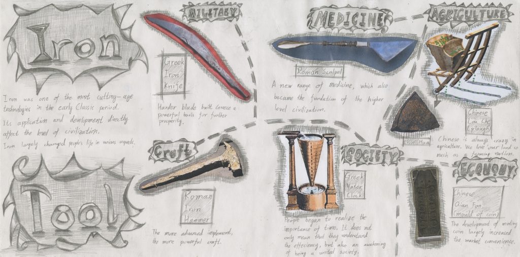
When I started to sketch this spread, the first idea was to list the tools corresponding to the various parts of human society. Then the ages remind me of the invention of smelting iron technology so I listed the iron-made tools and made the spread a metal texture. Initially, I was afraid that my idea cannot full fill the paper so I wrote a lot of describing sentences to label each of the tools. However, this became the same mistake as the Yearbook spread, the final version looks too busy and hard to read so many words. After the suggestion of blurring the pictures into the entirety, I drew the shading grids around the cut-paper to erase the edges. This amends worked well and maintained the entire style in the spread. Then the dotted lines are used to guide peoples’ eyes and increase the connection between each separated part. By the way, I find that the dotted line is easier to attract and direct peoples’ eyes than the solid line.
During making this spread, I have learned very much about controlling the entirety. My initial version was too scattered, each the images of the tools were just the independent sections and the overall version was less in . It did not have the power that attracting audiences to be interested and to read in detail. The title is still a little bit disjointed to the content, this is my fault in design the sketching. In the future creation, I will pay more attention to make a sense of the entirety in my works.