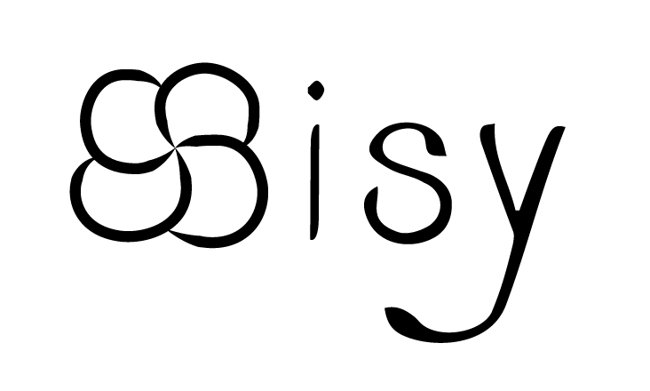
For this week, we are choosing one out of three logos we did last week and I finally choose the one with the flower element as I think it can show more my personality when people first look at it. The other two are more minimal, simple and not too special for a personal style logo.
The two “S” are combined together and formed a flower shape which I replace for my first letter “S” and I found a curvy and elegant typeface to match the flower. I was thinking of using all capital letters at the very beginning but it seems like nothing surprised the reader so I use lower letters for the remaining words and I found the “s” and “y” look fun.
Here’s my final logo: