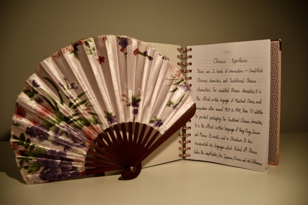
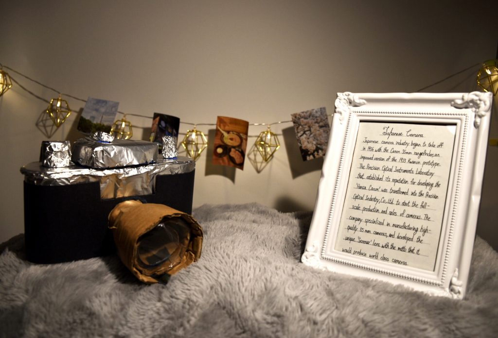
Category Archives: 141 P

Rationale IV

Sisy Wong

Fai Chun

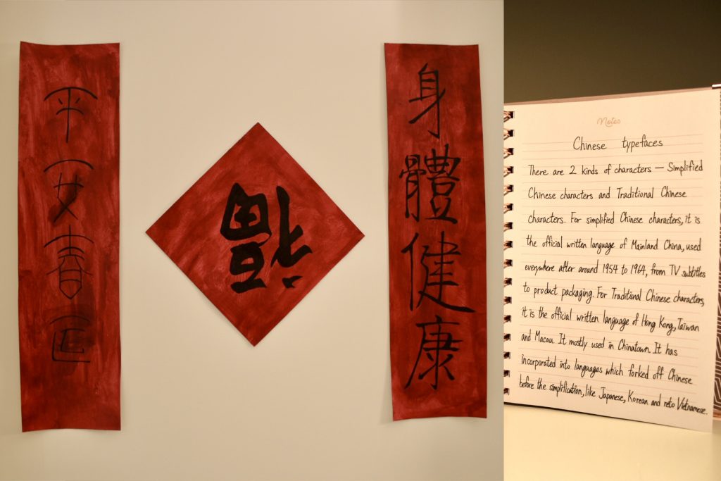
For survey 10, I’m doing a free-wheeling spread. I am doing research on comparing Traditional Chinese characters and Simplified Chinese characters. They are both Chinese characters that people are using right now but used in different provinces. Traditional Chinese characters are used in Hong Kong, Macau, and Taiwan. Besides, they appear in most of the Chinatown. Simplified Chinese characters are used in mainland China. For what I’m doing is Fai Chun. It’s a traditional decoration that is frequently used during Chinese New Year. People put Fai Chun in the doorways to create a jubilant festive atmosphere since the phrases are written on it mean good luck and prosperity. I used acrylic paints to paint it all red and used a black marker to draw to characters on the paper. Then I put the introduction in the separate picture as if I put it with the Fai Chun, the words will be unclear. I would give myself a Grade B as I think most of it is working except the left Fai Chun can be bolder more.

Introduction

Rationale III

Sisy Wong

Japanese camera

For Survey 9 I am doing research on tools and technology, so I came up with an idea of researching Japanese cameras. The Japanese Camera industry began to take off in 1936 with the Canon 35mm rangefinder, an improved version of the 1933 Kwanon prototype. The Precision Optical Instruments Laboratory that established its reputation for developing the ‘Hansa Canon’ was transformed into the Precision Optical Industry, Co., Ltd. to start the full-scale production and sales of cameras. The company specialized in manufacturing high-quality 35mm cameras and developed the unique ‘Serena’ lens with the motto that it would produce world-class cameras.

For the camera part, I used toilet paper rolls and wrapped them with tinfoil. Then, used a transparent film for the lens part. For the background, I hanged up some photos that I took in Japan tried to make it related to the topic. The outcome is good but not the clarity of the picture. I tried to retake the pictures with my camera but the spread still looks blur. I would like to give myself a grade B+.

Draft

Rationale II

Sisy Wong

For the survey 6 project, I was assigned to be a designer of the typeface and I did a regular spread on it. At the very beginning, I decided to work on the Akzidenz- Grotesk typeface and did some research on that. I found out that Akzidenz-Grotesk typeface was created by a typeface company called Berthold and it owns the publishment of that. The Berthold was a company that published a lot of high-quality classic typefaces, such as Formata, AG Book, Imago and corporate ASE were all its typefaces. For the poster, I would like to present it in a newspaper format as it is a part of the printing technique and it’s related to typefaces. I would give me a grade B- as the image of the Chinese metal is not related to Akzidenz-Grotesk and maybe can work more on the bottom left corner. Also, there are not enough words in the poster, maybe I can tell more about who or where this kind of typeface has been used.

Rationale I

Sisy Wong

I was assigned to be a designer of color a few weeks ago. I am doing research on colors during the Rococo and Baroque periods. First of all, I did research on Baroque periods and I found the colors of most of the paintings are painted in rich colors. For instance, Dark red, dark green and dark blue always appeared in the paintings. Besides, paintings during that period were more focusing on the palette. For the Rococo period, my teammate David did some research on it and he found that compare to the colors of the Baroque period, the colors of the Rococo period paintings were more light and worked more focused on the lights and shadows. For the Rococo period, artists used lots of golden yellows, light pinks, and light blues. For my poster of this research, I had the idea of split the poster into two sides and each side explain one period of colors. Then, I have an idea of putting a color wheel in the middle of the poster, which can clearly show each period’s unique colors. Also, I came up with an idea of putting some unique patterns in the very middle which related to each period. Finally, I put some Baroque period patterns at each of the corners. I will get myself of a grade B as I think I can work more on the fronts on the words.

Yearbook

Sisy Wong

Hi everyone, I am Sisy Wong. I was born and grow up in Hong Kong. I designed my yearbook as a poster style to let audiences feel interesting and comfortable to read. I put my large digital self-picture on the right side of this whole paper, so everybody can recognize me easily. In this yearbook, I used yellow and purple tones to make it looks high-end. Besides, I added some of the drawings, such as the rabbit and the panda to convey my personalities. Apart from that, you can see there are some flags beside the paragraphs which helps audience not to feel bored in reading words but the drawings.