Category Archives: 142 R

Blog 5: Canadian Design Today

Sisy Wong

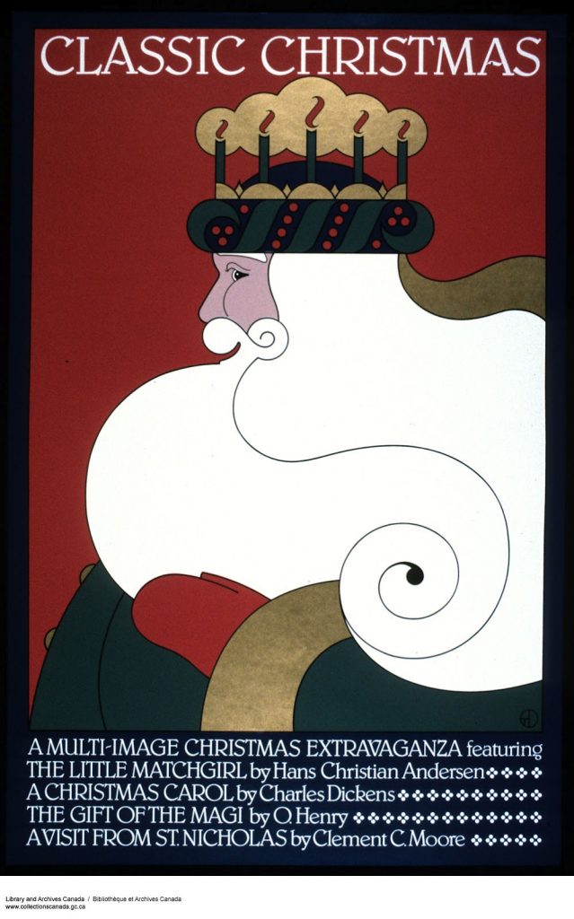
In week 13, we discussed the Canadian designers. Theo Dimson is the one who I inspired. He was born in London, Ontario and passed away in 2012. He was a Toronto graphic designer. Art Deco-Style movie and theatre posters were his well-known pieces. He studied at Ontario College of Art and Design with a scholarship and graduated in 1950.

Theo Dimson

I think his art style is very special which mostly using lines and shapes with colours. Also, I found that in some of his art works he included spiral shapes.

Source: https://gdc.design/fellows/theo-dimson-fgdc

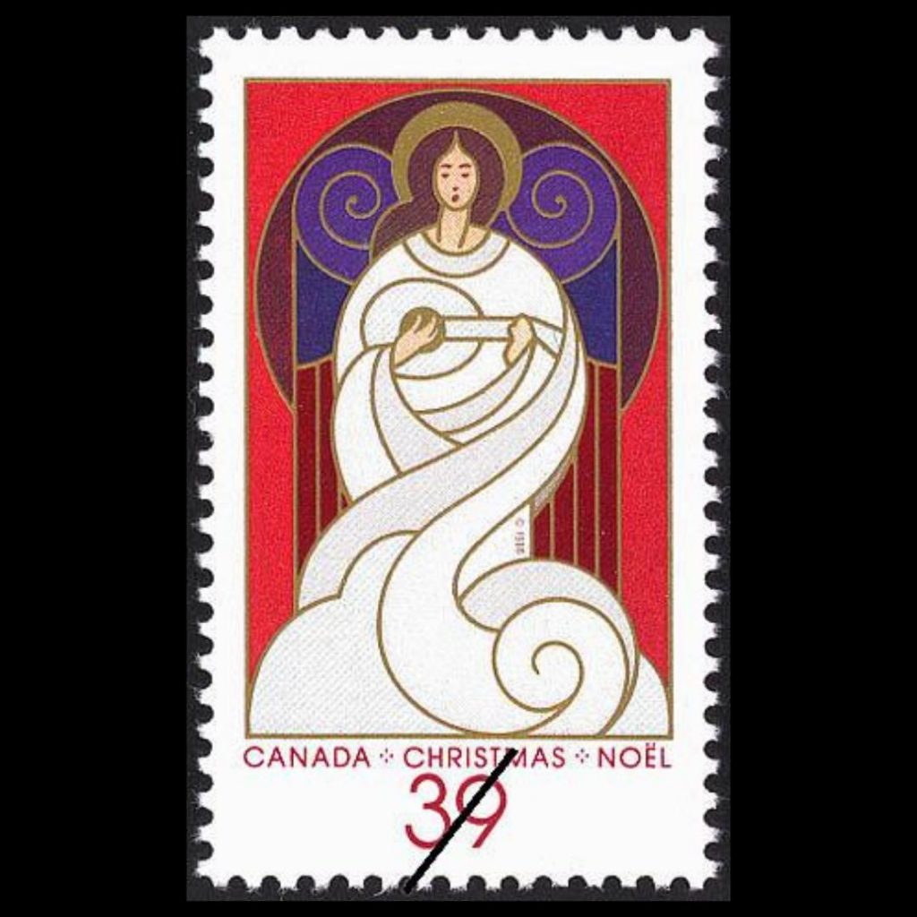
He was the author of Great Canadian Posters and commissioned by Canada Post to create stamps.

I think the images in his stamps design are cute and I like his colour palettes, they are always related to the art work topics.

POSTERS FOR FALCON BRIDGE

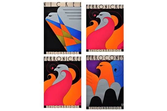
This is one of my favourite Theo Dimson’s work. This is a series of posters for Falcon Bridge. I really like design of the bird’s eye, it looks funny and cool.

Blog 4: Postmodernism in Europe

Sisy Wong

During week 9, we discussed the postmodernism artist in Europe.

Gerard Unger is the one who impressed me the most. He was a Dutch typographer and graphic designer. He was born in Arnhem, Netherlands in 1942. Unfortunately, he passed away in 2018 which five months after his wife’s death. He studied at Gerrit Rietveld Academie. Also, he took lots of guest lectures at the University of Reading which he taught lots of young modern typeface designers.

He created lot of typefaces in his life. Most of them are available from Linotype and the Dutch Type Library.

Alverata 2013

This is my favorite Unger’s design typeface, it’s called the Alverata. It was created in 2013. It’s a twenty-first-century typeface whose design is inspired by capitals in inscriptions from the Romanesque period. It also reflects developments in design and arts of twentieth century.

I think he is such a genius, he created tons of typefaces in his lifetime. I appreciated the perseverance that he has as I can never create typefaces. In all his works, I especially love this book cover, I like the pin and thread style of typeface and I think it looks cool.

Sources: https://en.wikipedia.org/wiki/Gerard_Unger#Work

Blog 3: Supergraphics Innovator

Sisy Wong

In week 7, we discussed the difference between modern and postmodern. Paula Scher is one of my favourite designers in this topic. She is an American graphic designer, painter and art educator. Also, she joined the Pentagram in 1991 and became the first female principal. She studied at the Tyler School of Art in Elkins Park, Pennsylvania. She was born in Washington then moved to New York City for her layout artist for Random House;s children’s book division job.

The map is one of my favourite. I can’t believe how well she organized those colourful, different size and the streamline of types together. She is really good at playing types in different angles.

Lots of her art works included types and she always join the types with two lines together which make the types pop out.

I like the way she combine the types and images together so well.

Sources: https://en.wikipedia.org/wiki/Paula_Scher

Blog 2: Psychedelic Design Hero

Sisy Wong

In week 5, we discussed the design of dissent. The most interesting part in the 1960s is the bold, special type style which most of the designers used it in their art works. One one them is Stanley Mouse.

Stanley Mouse

Stanley Mouse is an American Artist. He was well-known for his psychedelic rock concert designs for the Grateful Dead and Journey albums cover. Mouse completed his formal education at Detroit’s Society of Arts and Crafts. He developed the skill of using airbrush and began painting T-shirts at custom car shows. In 1964, people invited him for designing the Monogram automobile model kits, he then created his famous monster cartoon characters.

I really like his art style which I think it looks like a poker card and I love he used bright and bold colours especially the red really captures my eyes. Besides, most of his arts give me a sense of misery which led me to think the meaning behinds the designs.

Resource: https://en.wikipedia.org/wiki/Stanley_Mouse

Blog 1: Advertising Art Director

Sisy Wong

In week 3, we discovered the New York school. Leo Lionni was the one who inspired me. He was an author and illustrator of children’s book. He was an art director for advertising agencies, then for the “Fortune” magazine.

Press the Button, from the Early Series

This is a photo montage with gouache on paperboard piece. Also, this is one of my favourite piece of Leo Lionni. I like the way he organized and combine multiple photos which gave a strong message of stopping the war.

Fortune Magazine cover

One of Leo Lionni’s biggest clients was Fortune magazine. He loved using bauhaus style which gave lots of geometry shapes, texture and bold colours.

“A Color of His Own” was one of his famous children’s book illustrations. His illustrations were colourful and the subject always catches my eye. It’s a children’s book about chameleon distressed that he doesn’t have a color of his own like other animals. He cannot move around without changing colour. Then he finds another chameleon, they travel together and set off on a new life of adventure.

I really like his illustrations on children’s book as they are all simple, full of color with joy and energy.

Sources: https://www.penguinrandomhouse.ca/books/101927/its-mine-by-leo-lionni/9780679880844