Monthly Archives: October 2019

Survey 7 (St. Hedwing’s Cathedral)

Sisy Wong

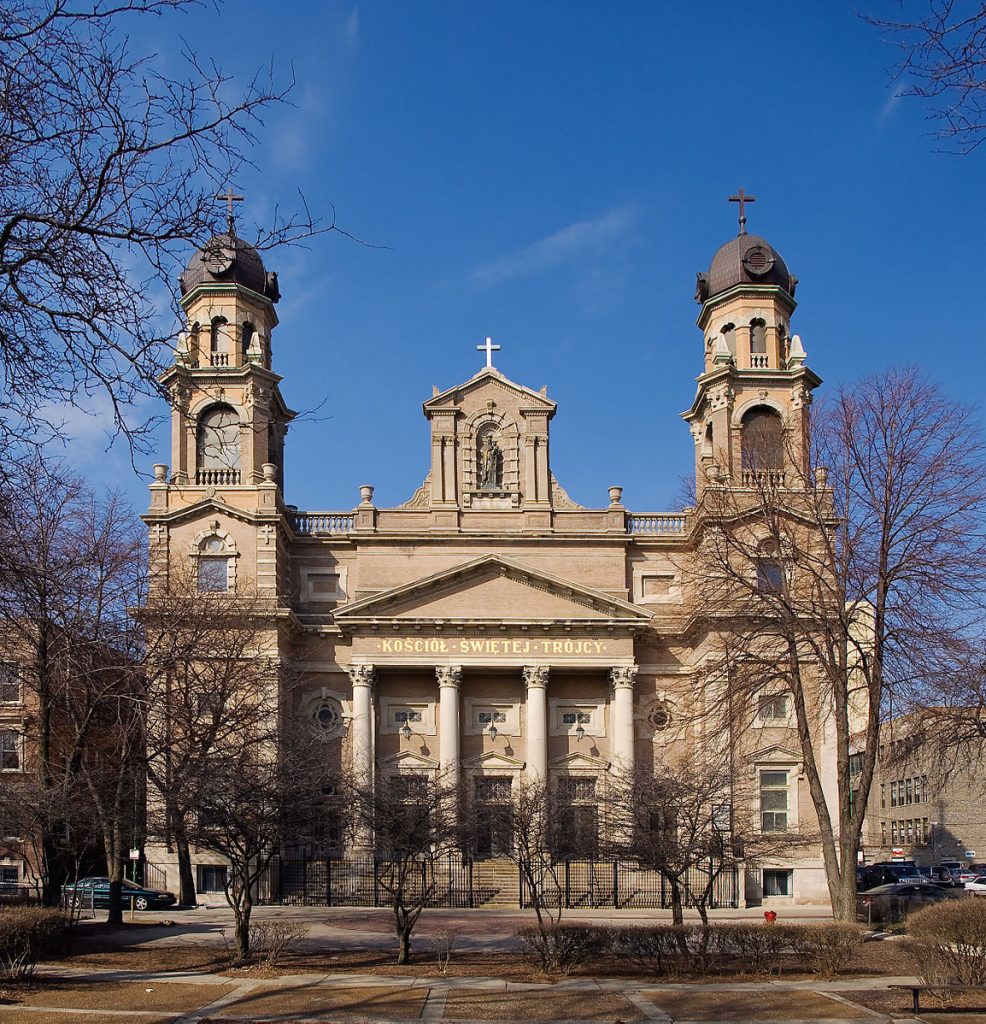
St. Hedwing’s Cathedral

The church, St. Hedwing’s Cathedral is a Roman Catholic cathedral on the Bebelplatz in Berlin, Germany. It is the seat of the Archbishop of Berlin. St. Hedwig’s Church was built in the 18th century. King Frederick II was the one who donated the land on which the church was built. The church was created for Silesia and Brandenburg, Saint Hedwig of Andechs. The church was the first Catholic Church in Prussia after the Reformation. St. Hedwig was designed by Georg Wenzeslaus von Knobelsdorff and modelled after the Pantheon in Rome. It was built from 1747 to 1 November 1773. The construction stop several times due to the economic problems.
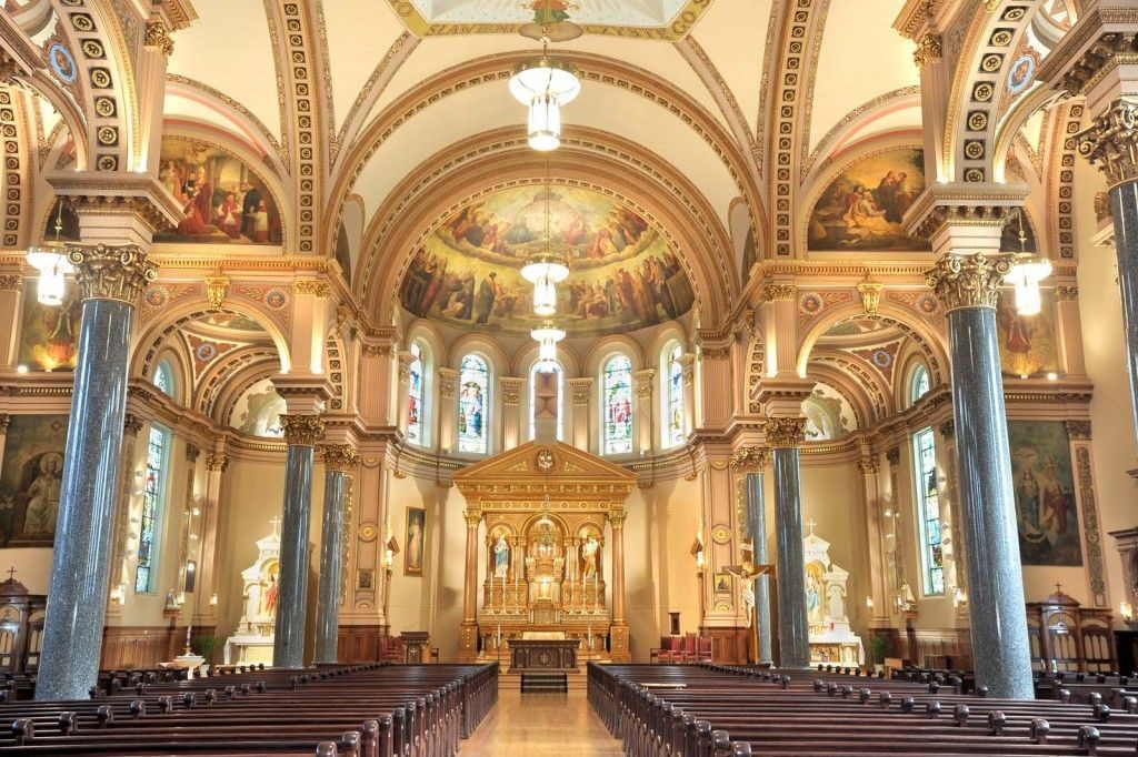
Inside the building

After the Kristallnacht pogroms that took place on the night of 9- 10 November 1938, Bernhard Lichtenberg, a canon of the cathedral chapter of St. Hedwig since 1931, prayed publicly for Jews at evening prayer. Lichtenberg was then caught by Nazis and past away during the way to the concentration camp at Dachau. The crypt at St. Hedwig’s was transferred from Lichtenberg’s remains in 1965. The cathedral was severely damaged by allied bombing in an air raid on 1 March 1943. Fortunately, only the damaged shell of the building was left standing. The reconstruction started in 1952 and on 1 November 1963, All Saints’ Day, the new high alter was consecrated by the Bishop of Berlin, Alfred Cardinal Bengsch.
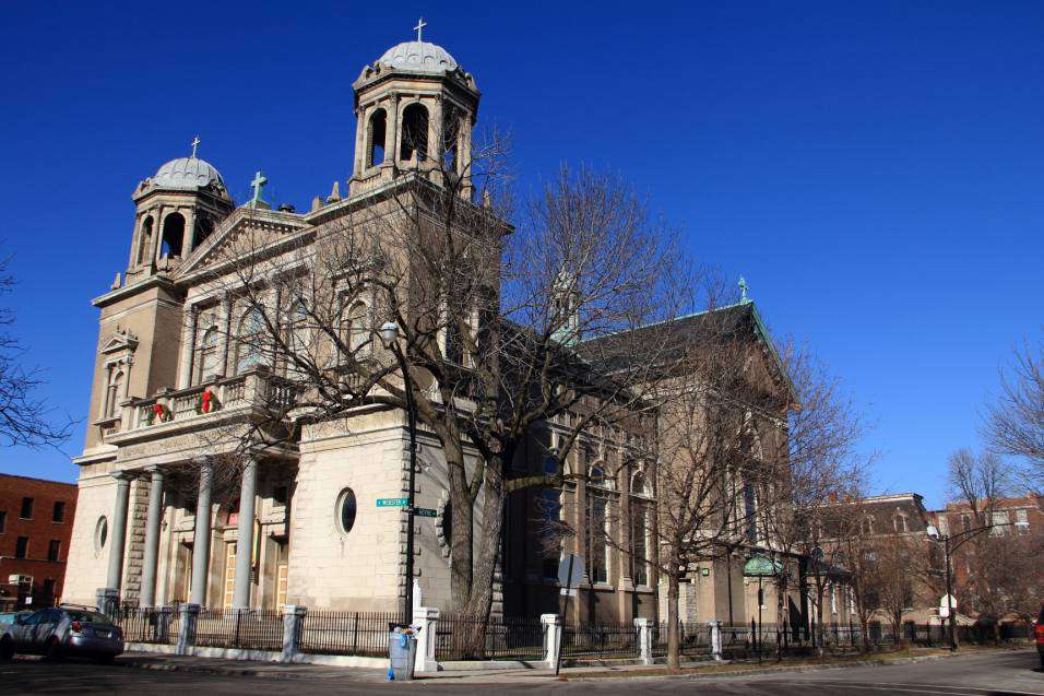
St. Hedwing’s Cathedral

Three impressive tapestries are now used in the reconstructed cathedral. All three share the motif of the heavenly Jerusalem but only one is set up and viewable at any one time. The tapestries of Erfurt’s former Bauhaus student, Grete Reichardt, were hand woven in 1963. It depicts a stylized city with the names of the apostles on the cornerstones. The tree of life represents God, and the character of the Lamb represents Christ.

Recourse: https://en.wikipedia.org/wiki/St._Hedwig%27s_Cathedral
Realism, Pre-Impressionism, and Pre-Raphaelites

Sisy Wong

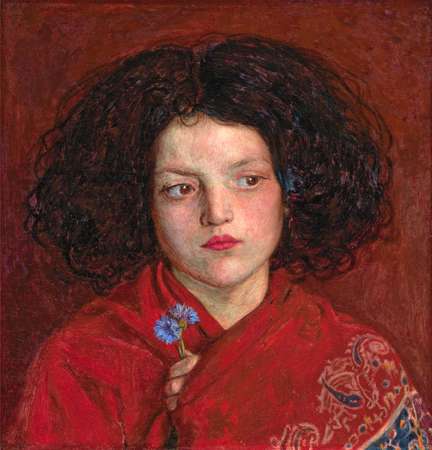
The Irish Girl
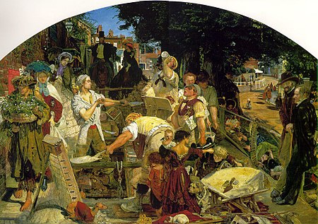
Work

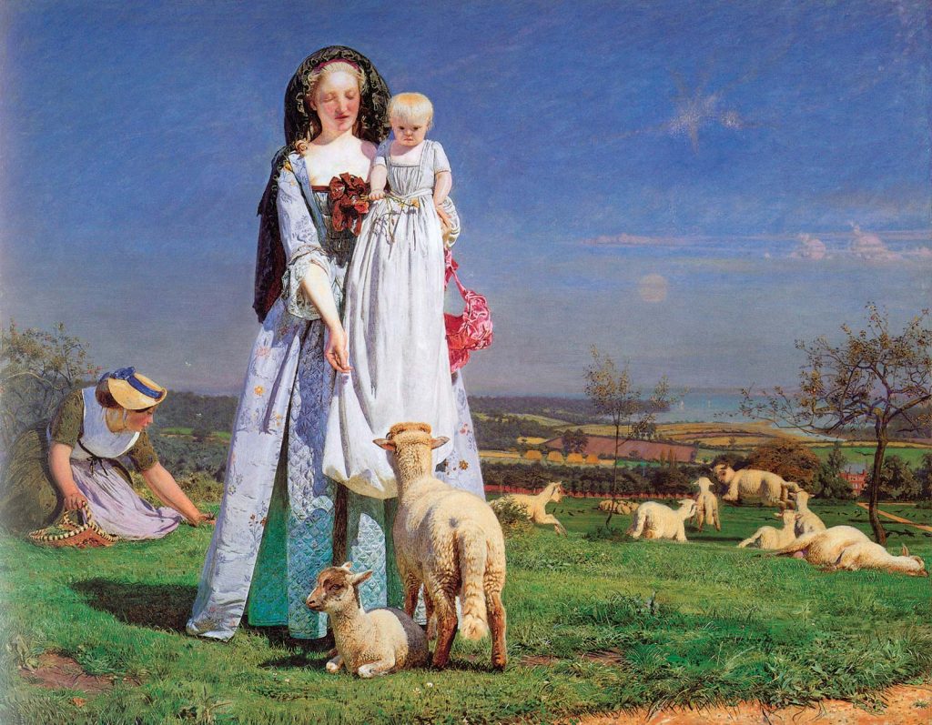
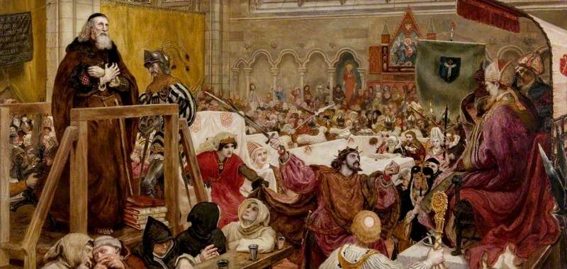
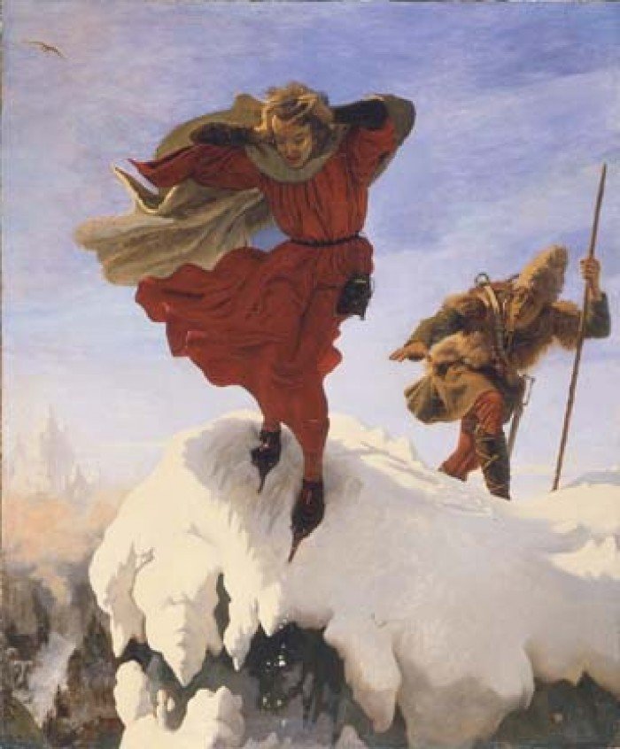
Ford Madox Brown was an English painter whose work was relevant to the Pre- Raphaelite Brotherhood. He was born in Calais, France on April 16, 182, and died on October 6, 1893, in London. He studied art in Bruges, Antwerp and Belgium from 1837 to 1839. His most well-known painting was”Work”. It has been seen as a Victorian social document. It was first shown in the exhibition held in London in 1865. From 1879 to 1893, he finished a series of twelve murals for the Manchester town hall which created scenes of city’s history. I like the texture of his painting in both “Work” and “The Irish Girl”.

Pretty Baa-Lambs
Wycliffe on Trial
Manfred on the Jungfrau

Resource:https://www.britannica.com/biography/Ford-Madox-Brown

Neoclassicism, Romanticism & Rococo

Sisy Wong

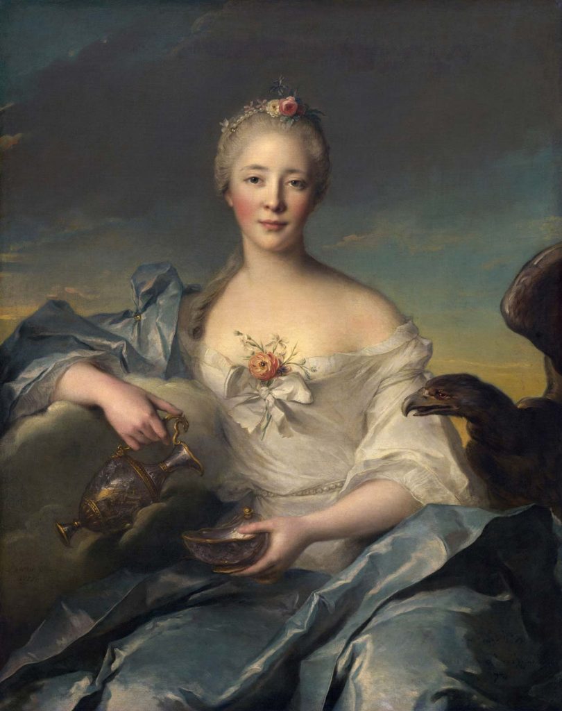
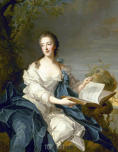
Madame Le Fèvre de Caumartin as Hebe
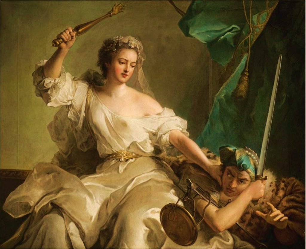
Justice punishing Injustice (1737)

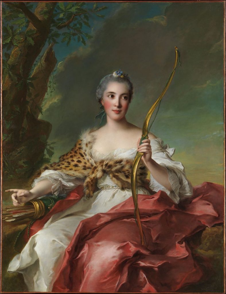
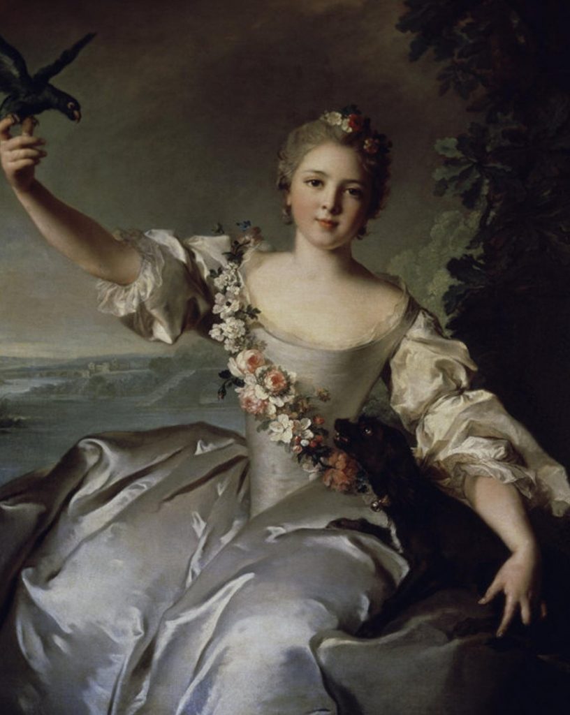
Jean-Marc Nattier was a French Rococo painter who was known by his portraits of the ladies of King Louis XV’s court in classical mythological costumes. He was born in Paris on March 17, 1685, and died on November 7, 1766. He was first taught by his portraitist father- Marc Nattier and his history painter uncle- Jean Jouvenet. He painted a series painting of Marie de Médicis during his studied at Royal Academy in 1710 which made him became famous. One thing I like in his paintings is the rich colors especially in the “Madame Le Fèvre de Caumartin as Hebe”.

Madame Bergeret de Frouville as Diana
Portrait of Mathilde de Canisy Marquise d’Antin
A Portrait of Princesse de Rohan

Resource: https://www.ranker.com/list/famous-rococo-artists/reference, https://www.britannica.com/biography/Jean-Marc-Nattier

Baroque

Sisy Wong

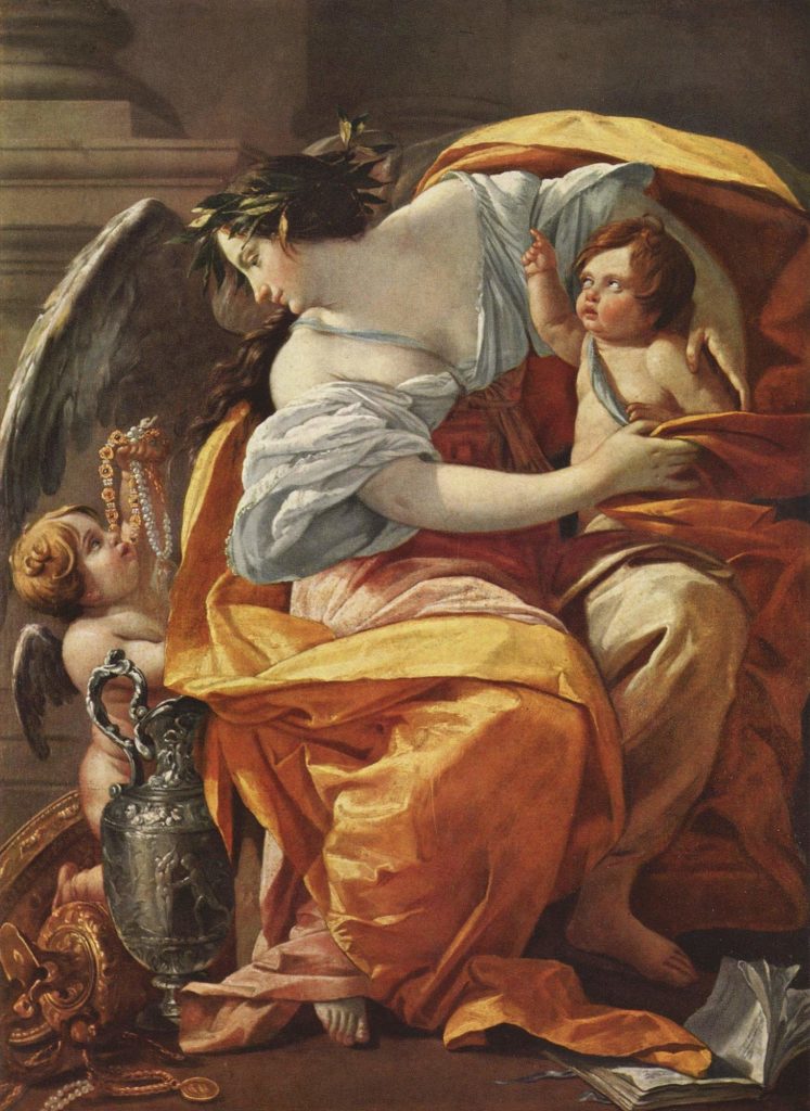
Riches (1630)
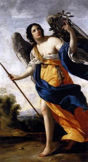
Allegory of Virtue c. 1634
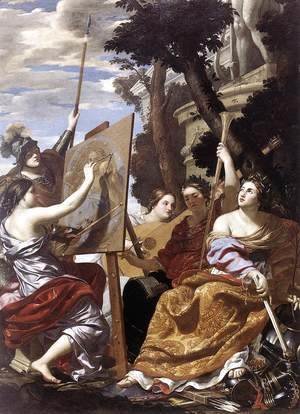
Allegory of Peace c. 1627
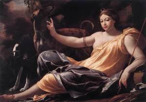
Diana 1637
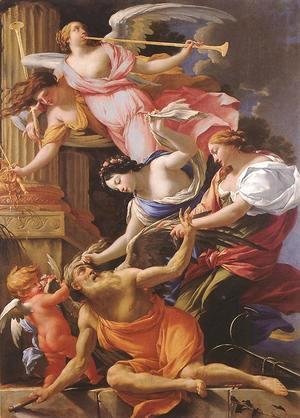
Saturn, Conquered by Amor, Venus and Hope 1645-46

Simon Vouet was a French painter who brought the Italianate Baroque style to French. He was born in Paris on January 9, 1590, and died on June 30, 1649. He studied and learned drawing skills in Italy. He was a masterpiece of using lights and shadows in his paintings. He beyond Caravaggio’s painting and used even more uniform diffused white light that made a symbol of his later painting style. One of his famous paintings is “Riches” which was the ornament program of the château of Saint-Germain-en-Laye. I like the way how he used lights, shadows, and bright colors to create soft and smooth figures.

Resource: https://courses.lumenlearning.com/boundless-arthistory/chapter/painting-of-the-baroque-period/, https://www.britannica.com/biography/Simon-Vouet

Survey 5 (Science, Eye chart)

Sisy Wong

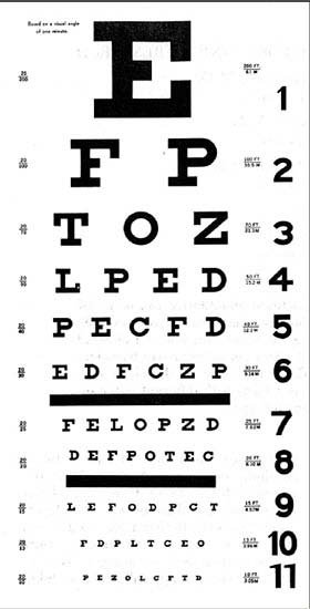
Snellen chart

Snellen eye chart is a chart that measures visual acuity by determined the visual level of different sizes of characters. It was invented in 1862 by a Dutch ophthalmologist called Herman Snellen. The Snellen eye chart is something where you can often see in the hospital or in physician and optometrist offices. It has 11 lines of block letters, which also called “optotypes”. Besides, they are constructed according to geometric rules and the size of the blocks is decreasing on each lower line of the chart.

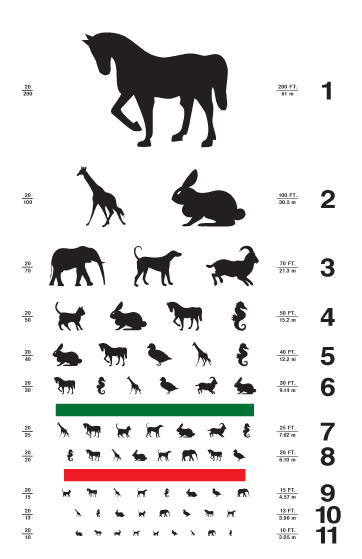
A kids’ eye chart

In a common Snellen eye chart, it always starts with a letter “E” and following by other 9 letters: “C”, “D”, “E”, “F”, “L”, “O”, “P”, “T” and “Z”. The right way to test the visual acuity is to stand 20 feet away from the eye chart and read each line of the chart by using only one eye. Each line of the eye chart assigned a ratio of visual acuity and for a normal vision is 20/20 in the US. In some metric system countries, the normal vision is 6/6. The ratio that is less than 1 is assigned a worse sight and greater than 1 is assigned a better sight.

There are lots of different styles of the eye chart, like the one on the left-hand side, it’s a kids’ eye chart that using animal logos instead of the blocks to make children feeling interested in being an eye test. In my opinion, different styles of eye charts are making “eye chart” become interesting. However, in most of the block eye charts are using different letters, so people criticize that it’s not fair as different letters have different difficulties. Thus, the eye chart that uses for an eye test has changed into all letter “E” with different rotations.

The eye chart that use for an eye test

Resource: https://www.britannica.com/science/Snellen-chart

Survey 4 (Tools and technology, Lithography printing)

Sisy Wong

Chicago in Flames

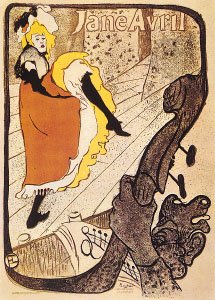
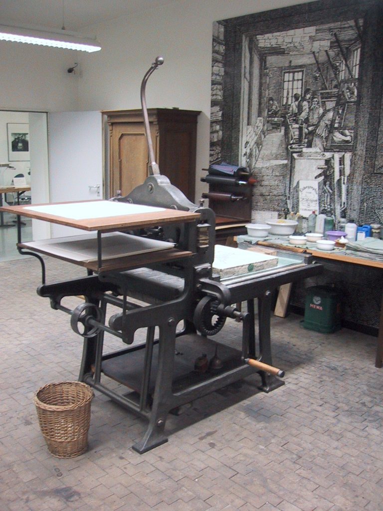
Lithography printing is a planographic printing process that makes use of the immiscibility of grease and water. The printing process is using the ink to a grease-treated image on the flat printing surface. The ink will then directly print on the paper by a unique press or a rubber cylinder. The lithography printing was invented in 1798 by Alois Senefelder. He used a porous Bavarian as his plate. This technique was well-known when Senefelder published Vollständiges Lehrbuch der Steindruckerey.

There are two ways of lithography printing, one is fine art lithography and the second one is commercial lithography.

For fine art lithography, the earliest but not the only method of making lithographs are using the porous limestone. The art lithography method has changed in the Senefelder’s time. The image is created with tusche and litho crayon before the painting surface is fixed, moistened, and inked. Honoré Daumier is the first lithographers who use tusche instead of lithographic stone. The color lithography is called chromolithographs which were developed during the second half of the 19th century. In the twentieth century, people like  Max Beckmann, Ernst Kirchner, Henri Matisse, Edvard Munch, and Pablo Picasso made great impact and power on the media.

For the commercial lithography, it was used to show popular topical, historical, and religious subjects to a wide audience. Some of the well-known commercial lithography publisher was Currier & Ives of New York City. The lithographs were printed in black ink and were hand-colored by an assembly line of women. They were often shown in watercolor form. The early color lithographs were done in colored inks. The steam-driven lithographic press was created by Hughes & Kimber of England in 1865 and was introduced to United States in 1866. In 1853 the offset lithography was first patented by John Strather of England.

Jane Avril, lithograph poster by Henri de Toulouse-Lautrec, 1893
Lithography press

Resource:https://www.britannica.com/technology/lithography

Survey 3 (Colour, Baroque era)

Sisy Wong

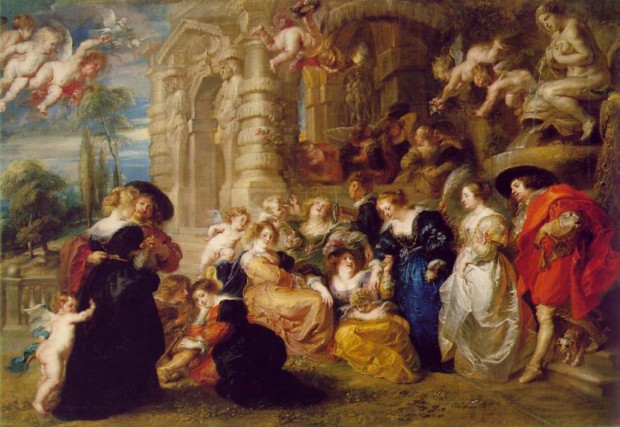
The garden of love
Landscape with a calm

Have you ever think about how color is important to the painting?

Back in the 17th century in Europe, Baroque is one of the most important painting movements in the history of Western art. During that time, Caravaggio, Rembrandt, and Vermeer are famous Baroque artists.

In the Baroque period, artists liked to use rich and vibrant colors for their color palette. The artists used mostly deep red, greens, and blues for the Caravaggio painting and deep and luminous in earth tones. The rich color was used to show the texture and surface of the object like gold, silk, and velvet. Therefore, the painting was shown with a tactile quality.

For the lights and shadows, the artists painted theatrically lit scenes, so the characters were spotlighted from the darkest shadow area. The juxtaposition of light and shadow made the subjects in the painting pop up and the contrast of black and bright color made the paintings clear. Paintings in the Baroque period tried to bring the emotion and power of the stage to the painting. In most of the paintings, the light in paintings like a spotlight on the stage. Thus, the theatre color and materials of theatrical costumes were evoked. Also, the artists in that period can paint the emotion that they have never painted before.

Using the combinations of deep red or green with gold and using extreme dark and light is a signature Baroque technique.

Red is a rich color. It was considered to be a color of intense emotions, ranging from anger, sacrifice, danger, and heat, through to love, passion, and sexuality.

Green is a color that closes to nature. Green is the color of nature and health and it also has close ties with emotions of empathy, kindness, and compassion.

Resource: https://ourpastimes.com/colors-in-baroque-art-12587828.html, https://www.dailyartmagazine.com/5-greatest-baroque-painters/

High Renaissance and Mannerism

Sisy Wong

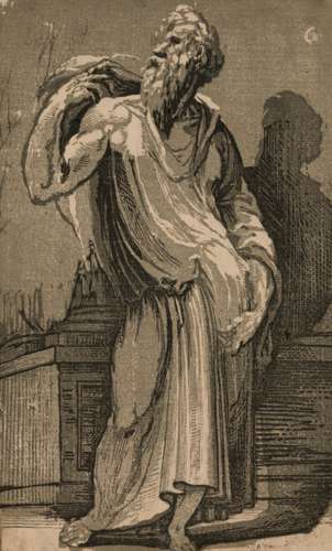
A Philosopher
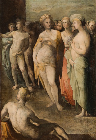
The virgins of Croton
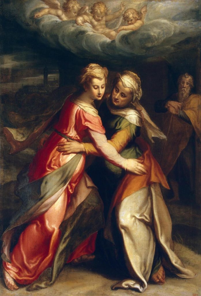
Mary meeting Elizabeth
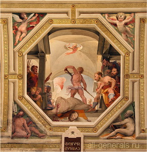
The execution of Spurius Vecellinus

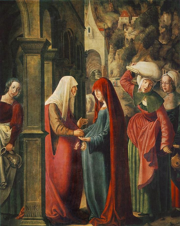
Domenico Beccafumi was an Italian greatest painter and sculptor in Mannerism time. He was also a leader in the post-Renaissance style. He was born Montaperti, Siena, the Republic of Siena in 1486, and he died in May 1551. He went to Rome to study the work of Raphael and Michelangelo during 1510. During 1518 and 1546, he created great fine designs for the commesso in the pavement of the Siena cathedral. The images on the commesso were colorful and rich and the Old Testament scenes made a good impression for Charles I of England. I love the way how he just focusing on showing the cloth of the “A Philosopher” figure and tried to let us guess.

The meeting of Mary and Elizabeth

Resource: https://www.britannica.com/biography/Domenico-Beccafumi