Sisy Wong
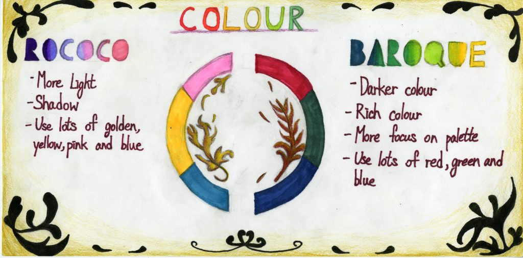
I was assigned to be a designer of color a few weeks ago. I am doing research on colors during the Rococo and Baroque periods. First of all, I did research on Baroque periods and I found the colors of most of the paintings are painted in rich colors. For instance, Dark red, dark green and dark blue always appeared in the paintings. Besides, paintings during that period were more focusing on the palette. For the Rococo period, my teammate David did some research on it and he found that compare to the colors of the Baroque period, the colors of the Rococo period paintings were more light and worked more focused on the lights and shadows. For the Rococo period, artists used lots of golden yellows, light pinks, and light blues. For my poster of this research, I had the idea of split the poster into two sides and each side explain one period of colors. Then, I have an idea of putting a color wheel in the middle of the poster, which can clearly show each period’s unique colors. Also, I came up with an idea of putting some unique patterns in the very middle which related to each period. Finally, I put some Baroque period patterns at each of the corners. I will get myself of a grade B as I think I can work more on the fronts on the words.