Hilma af Klint (1862-1944 Sweden)
Swedish Abstract Painter
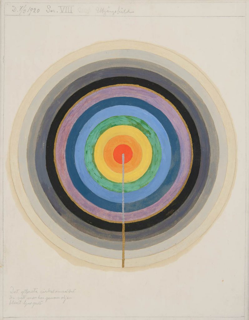
Series VIII. Picture of the Starting Point (1920) 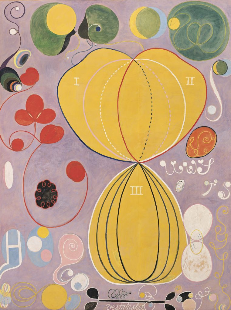
The Ten Largest, №7., Adulthood, Group IV (1907) 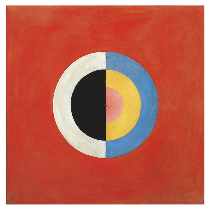
The Swan, No 17, Group IX, Series SUW (1915)
Hilma af Klint was an overlooked artist of her day and much of her work wasn’t seen until after her death in 1944. Her work predates the first “official” abstract art by Vasily Kandinsky in 1911 by 5 years and also the works of Franz Marc and Piet Mondrian. She was painting non-objectively before these pioneers of abstract art were doing so. Her works were strikingly original. Being overlooked isn’t surprising considering she was a woman, didn’t have any connections to the art world, and her work was just considered too radical for the time. Also, despite not being aware of what was happening in the art world of her contemporaries, it’s bizarre that all their works hold such similarities.
She was enrolled at the Royal Academy of Fine Arts in Stockholm from 1882 to 1887, which was considered rather early for a woman, because Sweden was a country that actually allowed women to study art from a much earlier time than the rest of Europe. She studied portrait and landscape drawing and painting during her time there.
Af Klint was also a part of the first religious organization in Europe called Theosophy that did not discriminate against women. She was 17 when she started exploring spiritualism. Over the years, her work as a medium resulted in many of her paintings telling the story of the world. The messages she received from the spirits were the foundation of her art. These ideas may have constituted her as a witch at the time but the ideas and methodswere not too dissimilar to those of the Surrealists. She represented these ideas in geometric shapes, symbolism in letters and numbers, and in the use of bright bold colours.
Group X, №1, Altarpiece (1915) 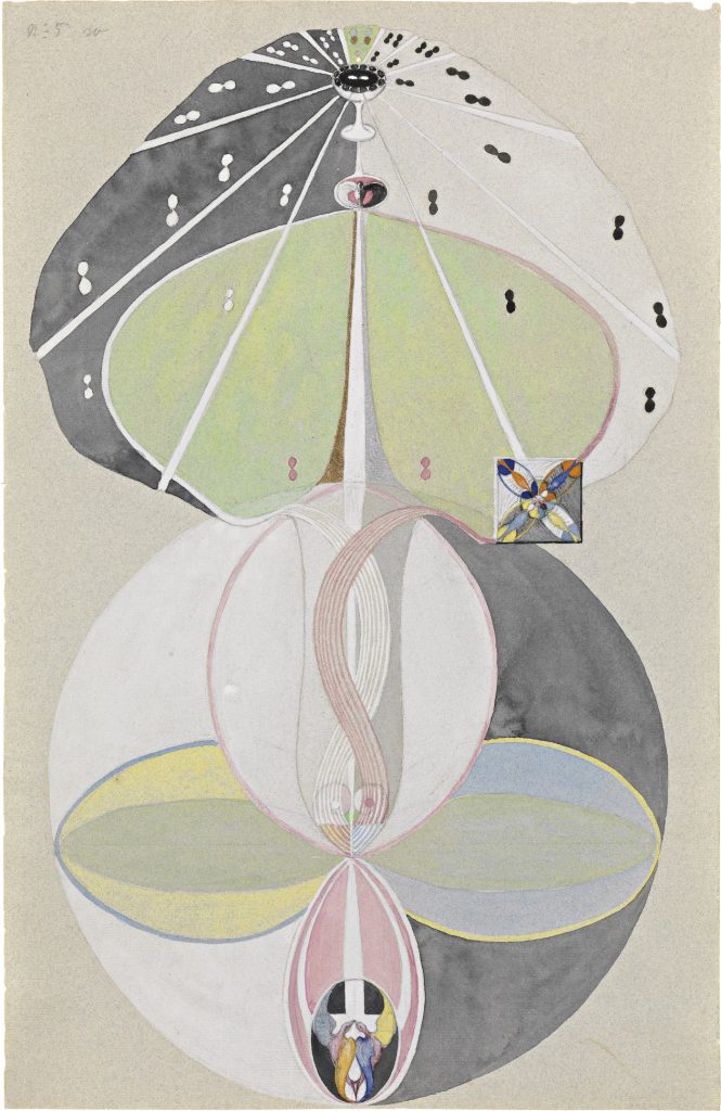
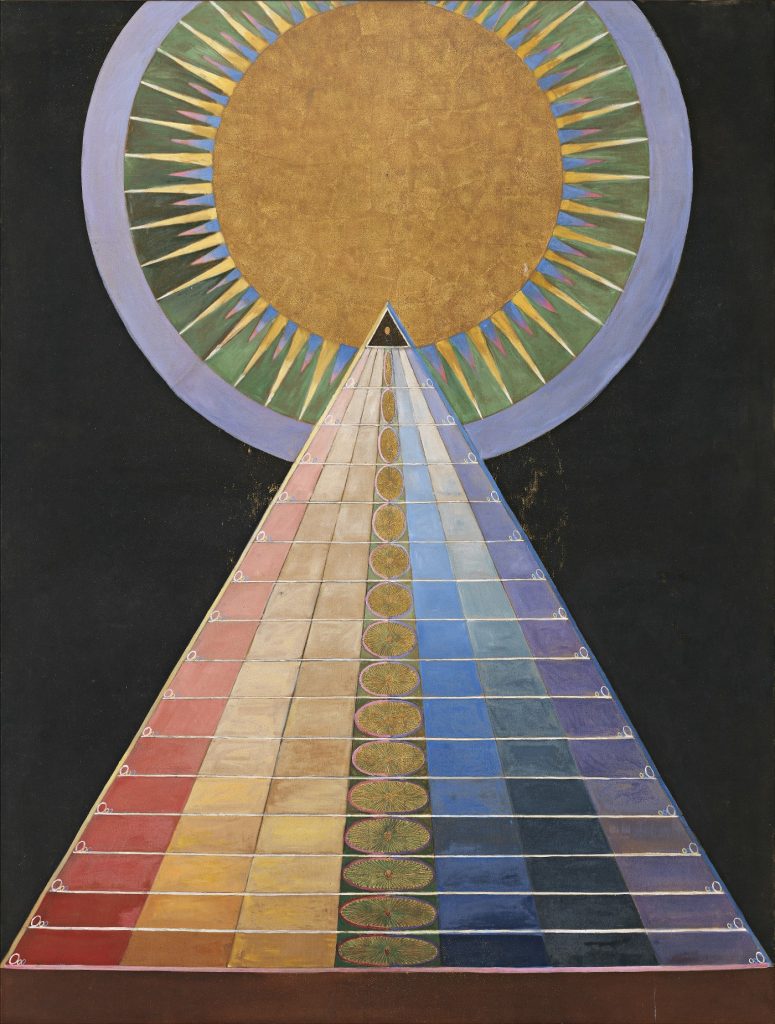
Tree of Knowledge, №5 (1915)
Between 1906 and 1915, she created 193 paintings called The Paintings for the Temple which explored a dualistic perception of creation, evolution, and the universe. She requested that her art to not be shown until 2o years after her death and, incredibly, her wish was respected. Her full series was installed at the Guggenheim in New York from 2018-2019.
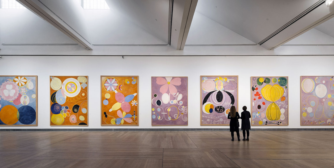
I was lucky enough to catch that exhibition while I was in New York, and it was so fascinating to experience her art in the way she meant for it to be seen—all together. Walking upwards towards her final paintings of full ascendence was pretty spectacular. I think it’s great that Hilma af Klint is getting some recognition and finding her way into the canon of the art history because her work fits so neatly into the timeline of the story. Maybe I also had an affinity to her work despite having never heard about her before stumbling upon her work at the Guggenheim because I had just returned from studying abroad in Sweden for my final year of university and the coincidence of it all was just too unbelievable.
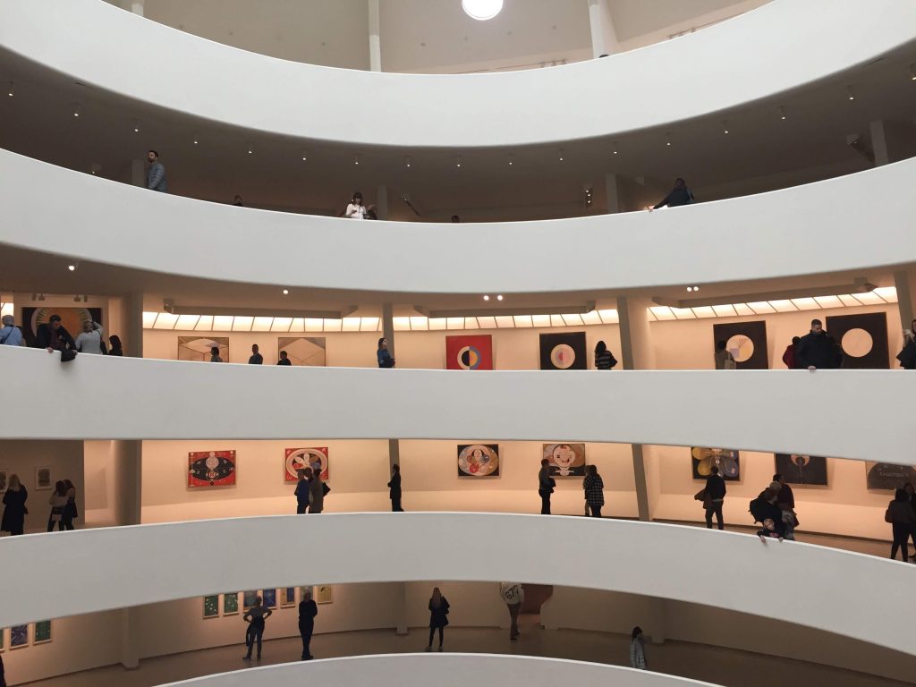
My own photo from the Guggenheim from Nov 2018! 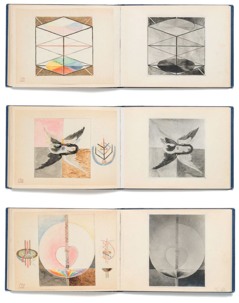
Hilma af Klint’s sketchbook spreads
References
https://www.bookforum.com/print/2504/the-otherworldly-abstraction-of-hilma-af-klint-20434
https://www.tate.org.uk/tate-etc/issue-27-spring-2013/first-abstract-artist-and-its-not-kandinsky