Categories
142

Canadian Design Today

Douglas Coupland (1961-Present)

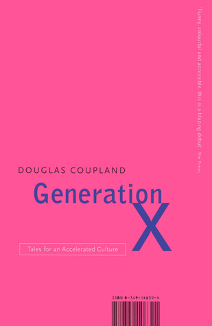
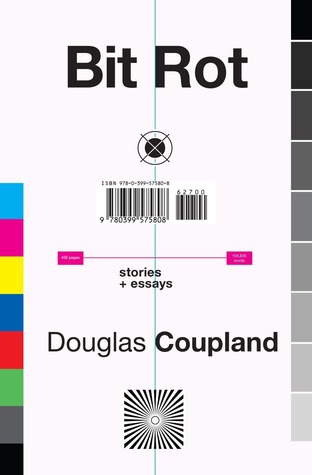
Douglas Coupland is a Vancouver-based novelist and artist who is known for his novel Generation X: Tales for an Accelerated Culture and also for coining the term Gen X. He often explores themes of modern-day culture in North America, often through a pessimistic lens. He has writen 13 fiction and non-fiction books since 1991 and has won numerous awards for them.

His accolades include: being a member of the Royal Canadian Academy, being an Officer of the Order of Canada, an Officer of the Order of British Columbia, a Chevalier de l’Ordre des Arts et des Lettres and receiver of the Lieutenant Governor’s Award for Literary Excellence.

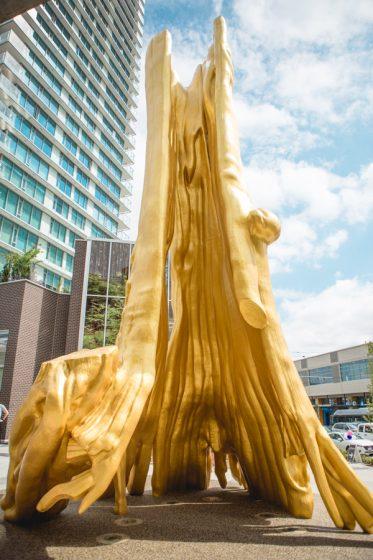
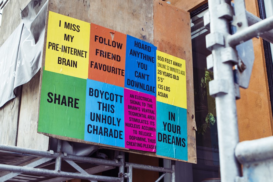
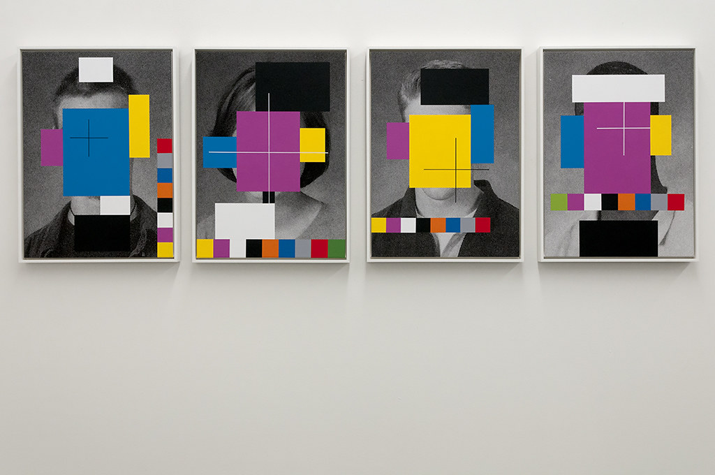
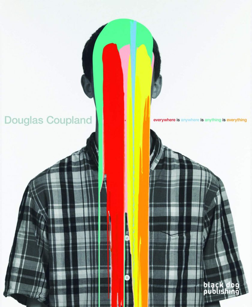
On the art side of his career, he attended the ECUAD and has continued on his visual artist journey throughout his life. He’s had shows across Canada and Europe and even retrospective shows on his work. He often uses bright solid colours and explores themes of what it means to be human in this increasingly digital world we all engage with on a daily basis.

On a more personal note, I get to see his work everyday. His 43 feet tall Golden Tree sculpture set in front of a 25-foot by 40-foot image of Stanley Park is situated right outside my building so I get to experience a bit of the artistic genius that is Douglas Coupland.

Categories
142

Postmodernism in Europe

Siegfried Odermatt (1926-2017)

Siegfried Odermatt was a Swiss designer based in Zurich who was mostly self-taught. His most successful part of his career was running a studio with Rosmarie Tissi since 1968 called Odermatt & Tissi. They are both considered pioneers of graphic design in their own rights.

He got his break into the design world while working as a delivery boy for Graphis Press where he became acquainted with the painter and graphic artist Hans Falk with whom he later collaborated on some freelance work in the mid 40s. He became an independent designer in 1950 before he joined forces with Rosmarie Tissi.

The work done at Odermatt & Tissi fell right into the timeframe of postmodernism—from around 1968 to 1985. Odermatt has won many international distinctions and awards. Notably, the books he designed were among “The Most Beautiful Swiss Books” in 1986, 1987, and 2000. In 1992, he secured the first prize with his poster and visual identity of the “Kieler Woche” 1994.

Odermatt never studied typography so it’s only fitting for him to go off the grid in a lot of his work. He’s experimental with his placement of type and he always seems to find a creative design solution just using type and simple geometric shapes. Post-modernism saw designers move away from the rigid grids of the Swiss International Style and Odermatt did exactly that.

Categories
142

Supergraphics Innovator

Morag Myerscough

Morag Mystercough is a British designer based in London who is known for her monumental bright and neon supergraphic designs. Her work ranges from prints, public art installations, children’s hospital interiors, to the exterior of parkades.

Exterior of the FORM Building, Australia
Colour Block Cranes in London
Interiors of Sheffield Children’s Hospital

She is particularly taken with colour and pattern and how they interact with the urban environment and the people that move through it. She credits her city upbringing to her continued interest in the bustle of urban environments. Myerscough’s designs are loud and joyous and are unmistakeably meant to be noticed.

She’s been quite active during the pandemic creating pieces thanking frontline workings in Leeds and also creating outdoor pavilions to cheer people up during lockdown across London. She was also commissioned to do an installation in Paris that was meant to uplift the public. Her goal is to engage the public and create inviting spaces that appeal to everyone and her work certainly does just that. What is also interesting about her is that she often works with community groups in the area of the installations to ensure she’s accurately capturing and creating something that is meaningful to the locals.

Public Art Installation in Paris

Categories
142

Psychedelic Design Hero

Victor Moscoso (b. 1935)

Victor Moscoso was a Spanish-born American who studied art at Cooper Union in New York and at Yale University before moving to San Francisco to study at the San Fransisco Art Institute and later teach there. He was best known for being one of the first formally trained artists at the forefront of the psychedelic art scene and for his contribution to the underground comic, Zap Comix.

Signature features of his rock posters are the use of fully saturated contrasting colours melding into a swirling patterns with handlettered copy. He was taught by Josef Albers while he was at Yale so his colour usage may be quite inspired. The combination of colour, pattern, and handlettering often made the poster illegible, but despite that, his designs were bright and eye-catching which made people stop and look a little deeper.

His style is so distinctively iconic of the times and but his compositions, framing, and focal subject matter harken back to the Art Nouveau posters. It’s very interesting to see someone ahead of their times looking back to use some of what he probably learned in school to bring into the present.

References

http://www.victormoscoso.com/about.htm

https://www.moma.org/artists/4117?=undefined&page=&direction=

Categories
142

Advertising Art Director

Bea Feitler (1938–1982)

Bea Feitler lived a short but successful life and career as not just a designer, but also as an art director. She was born in Brazil and later moved to study at the Parsons School of Design in New York and by the age of 25 in 1968, she was named already the an art assistant at Harper’s Bazaar.

After 10 years at Harper’s Bazaar, she moved over to be the AD at the launch of the Ms. magazine with the feminist and journalist, Gloria Steinem. It was the magazine of the women’s liberation movement. She was at the forefront of the feminism movement in the 70s, creating the look and feel for the movement. She was also the first art director to feature a Black woman on the cover of a magazine when she worked for Vanity fair.

What signified her work was her collaboration with artists and photographers, many claim that she inherited the spirit of Alexey Brodovitch (who was also a former AD at Harper’s Bazaar) as she also understood that spreads should be intentionally and individually constructed, yet at the same time should be connected to one another to form a harmonious rhythm.

References

https://designingwomen.readymag.com/profiles/bea-feitler/

https://www.aiga.org/medalist-beafeitler