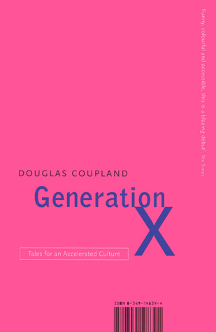
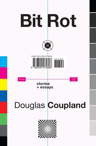
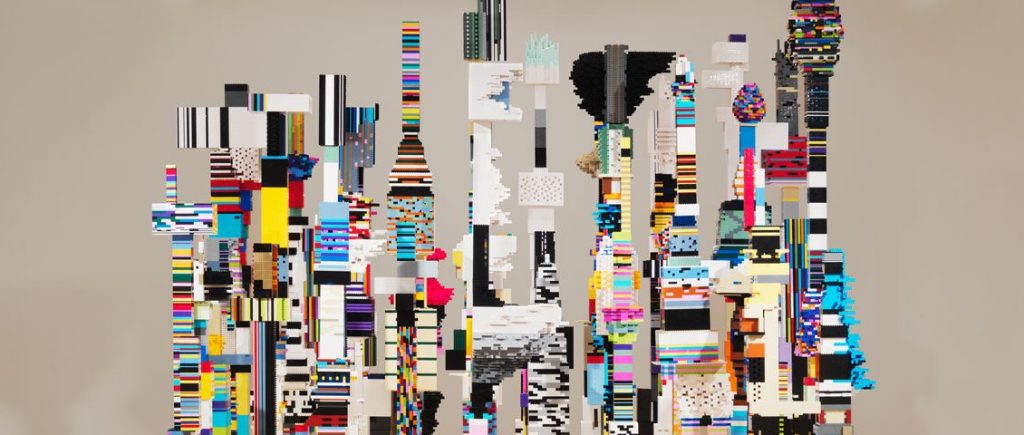
Douglas Coupland is a Vancouver-based novelist and artist who is known for his novel Generation X: Tales for an Accelerated Culture and also for coining the term Gen X. He often explores themes of modern-day culture in North America, often through a pessimistic lens. He has writen 13 fiction and non-fiction books since 1991 and has won numerous awards for them.
His accolades include: being a member of the Royal Canadian Academy, being an Officer of the Order of Canada, an Officer of the Order of British Columbia, a Chevalier de l’Ordre des Arts et des Lettres and receiver of the Lieutenant Governor’s Award for Literary Excellence.
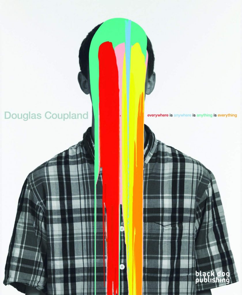
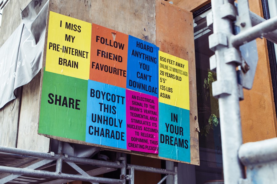
On the art side of his career, he attended the ECUAD and has continued on his visual artist journey throughout his life. He’s had shows across Canada and Europe and even retrospective shows on his work. He often uses bright solid colours and explores themes of what it means to be human in this increasingly digital world we all engage with on a daily basis.
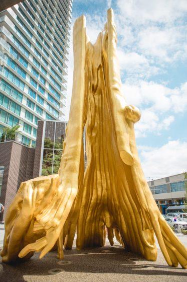
On a more personal note, I get to see his work everyday. His 43 feet tall Golden Tree sculpture set in front of a 25-foot by 40-foot image of Stanley Park is situated right outside my building so I get to experience a bit of the artistic genius that is Douglas Coupland.
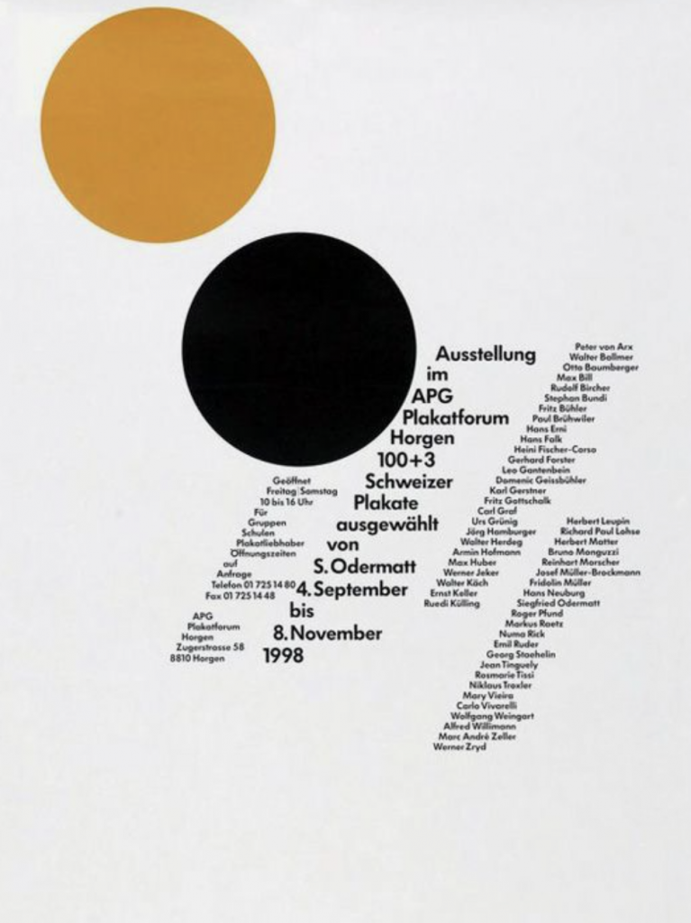
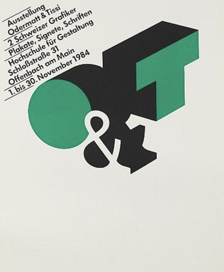
Siegfried Odermatt was a Swiss designer based in Zurich who was mostly self-taught. His most successful part of his career was running a studio with Rosmarie Tissi since 1968 called Odermatt & Tissi. They are both considered pioneers of graphic design in their own rights.
He got his break into the design world while working as a delivery boy for Graphis Press where he became acquainted with the painter and graphic artist Hans Falk with whom he later collaborated on some freelance work in the mid 40s. He became an independent designer in 1950 before he joined forces with Rosmarie Tissi.
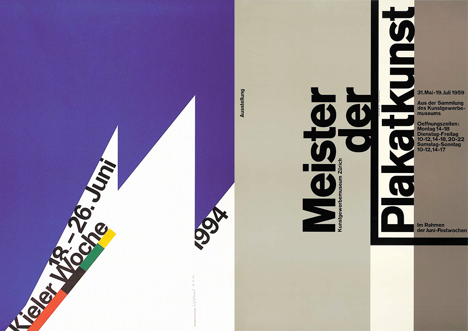
The work done at Odermatt & Tissi fell right into the timeframe of postmodernism—from around 1968 to 1985. Odermatt has won many international distinctions and awards. Notably, the books he designed were among “The Most Beautiful Swiss Books” in 1986, 1987, and 2000. In 1992, he secured the first prize with his poster and visual identity of the “Kieler Woche” 1994.
Odermatt never studied typography so it’s only fitting for him to go off the grid in a lot of his work. He’s experimental with his placement of type and he always seems to find a creative design solution just using type and simple geometric shapes. Post-modernism saw designers move away from the rigid grids of the Swiss International Style and Odermatt did exactly that.
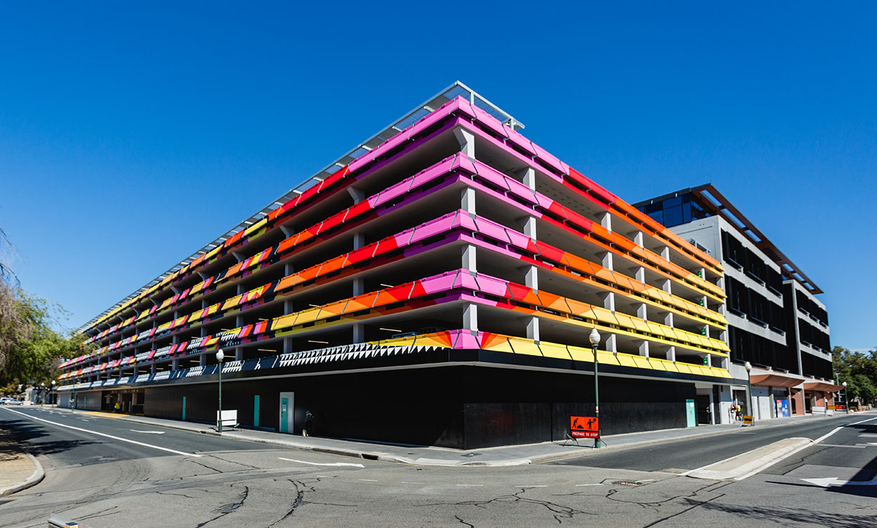
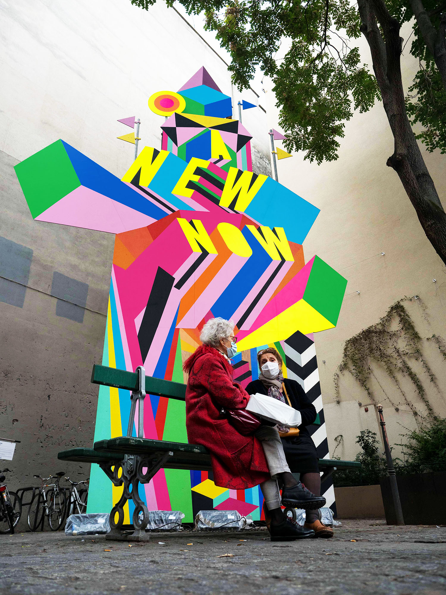
Morag Mystercough is a British designer based in London who is known for her monumental bright and neon supergraphic designs. Her work ranges from prints, public art installations, children’s hospital interiors, to the exterior of parkades.
Exterior of the FORM Building, Australia
Colour Block Cranes in London
Interiors of Sheffield Children’s Hospital
She is particularly taken with colour and pattern and how they interact with the urban environment and the people that move through it. She credits her city upbringing to her continued interest in the bustle of urban environments. Myerscough’s designs are loud and joyous and are unmistakeably meant to be noticed.
She’s been quite active during the pandemic creating pieces thanking frontline workings in Leeds and also creating outdoor pavilions to cheer people up during lockdown across London. She was also commissioned to do an installation in Paris that was meant to uplift the public. Her goal is to engage the public and create inviting spaces that appeal to everyone and her work certainly does just that. What is also interesting about her is that she often works with community groups in the area of the installations to ensure she’s accurately capturing and creating something that is meaningful to the locals.
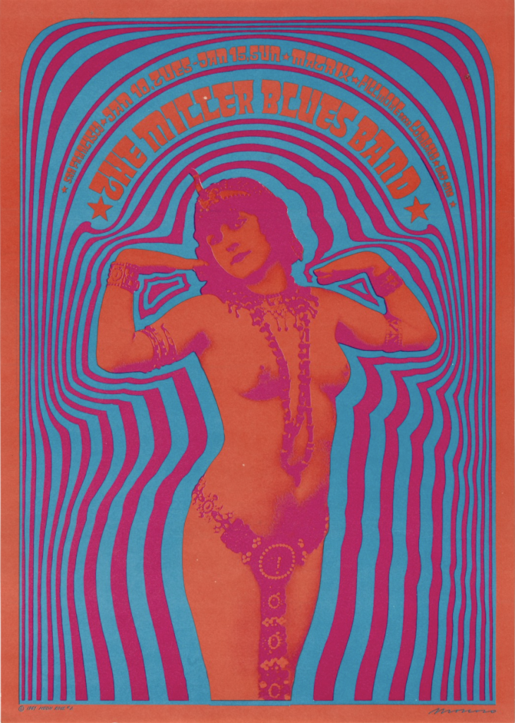
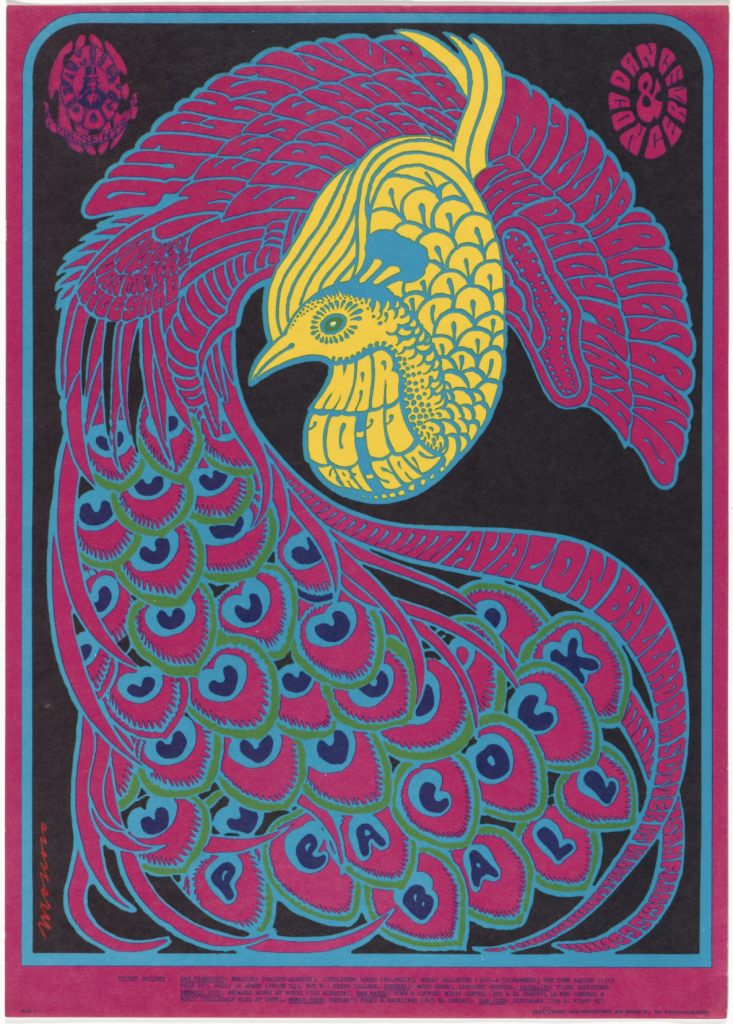
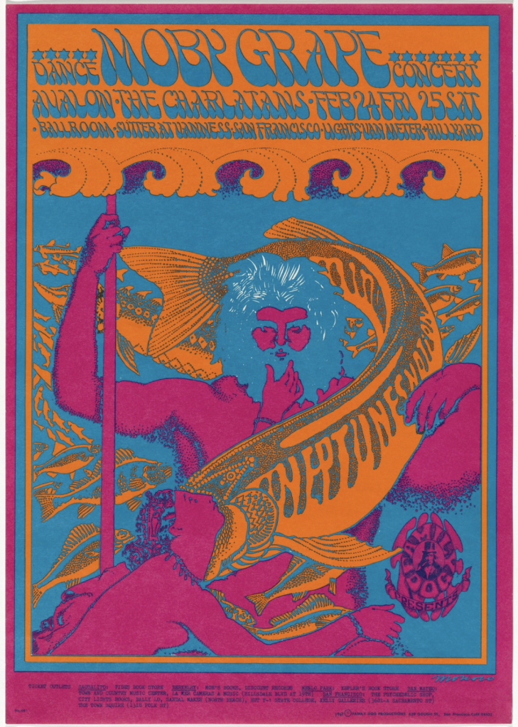
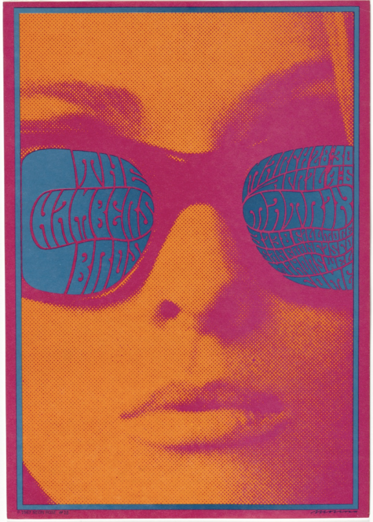
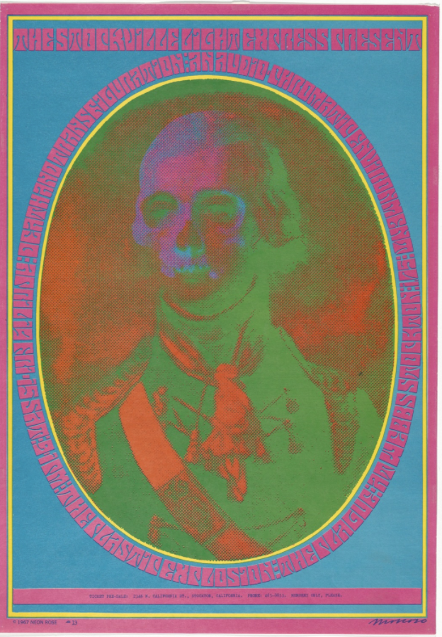
Victor Moscoso was a Spanish-born American who studied art at Cooper Union in New York and at Yale University before moving to San Francisco to study at the San Fransisco Art Institute and later teach there. He was best known for being one of the first formally trained artists at the forefront of the psychedelic art scene and for his contribution to the underground comic, Zap Comix.
Signature features of his rock posters are the use of fully saturated contrasting colours melding into a swirling patterns with handlettered copy. He was taught by Josef Albers while he was at Yale so his colour usage may be quite inspired. The combination of colour, pattern, and handlettering often made the poster illegible, but despite that, his designs were bright and eye-catching which made people stop and look a little deeper.
The Miller Blues Band (1967)
Quicksilver Messenger Service, Miller Blues Band, The Daily Flash (1967)
His style is so distinctively iconic of the times and but his compositions, framing, and focal subject matter harken back to the Art Nouveau posters. It’s very interesting to see someone ahead of their times looking back to use some of what he probably learned in school to bring into the present.
Moby Grape, The Charlatans (1967)
The Chambers Brothers (1967)
The Stockville Light Express Present: Death and Transfiguration: an Audio-Chromatic Environment (1967)
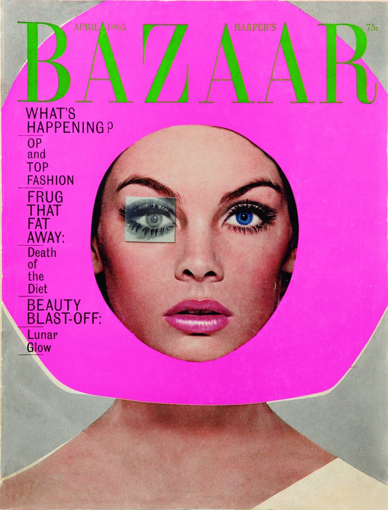
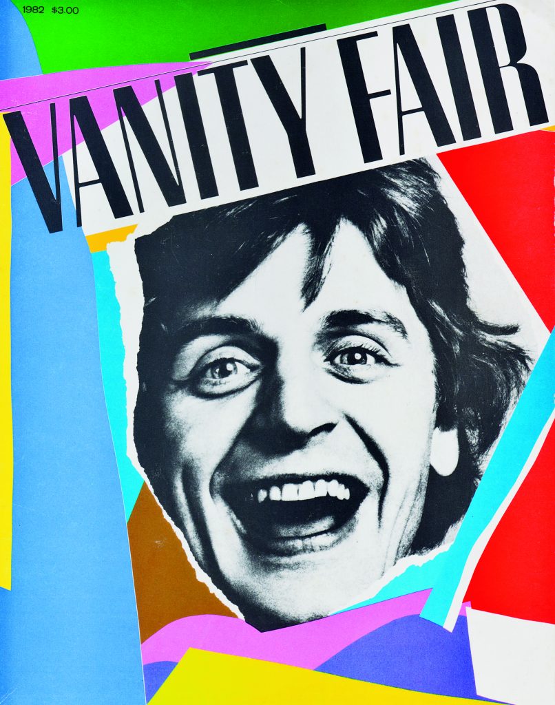
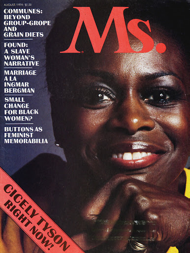
Bea Feitler lived a short but successful life and career as not just a designer, but also as an art director. She was born in Brazil and later moved to study at the Parsons School of Design in New York and by the age of 25 in 1968, she was named already the an art assistant at Harper’s Bazaar.
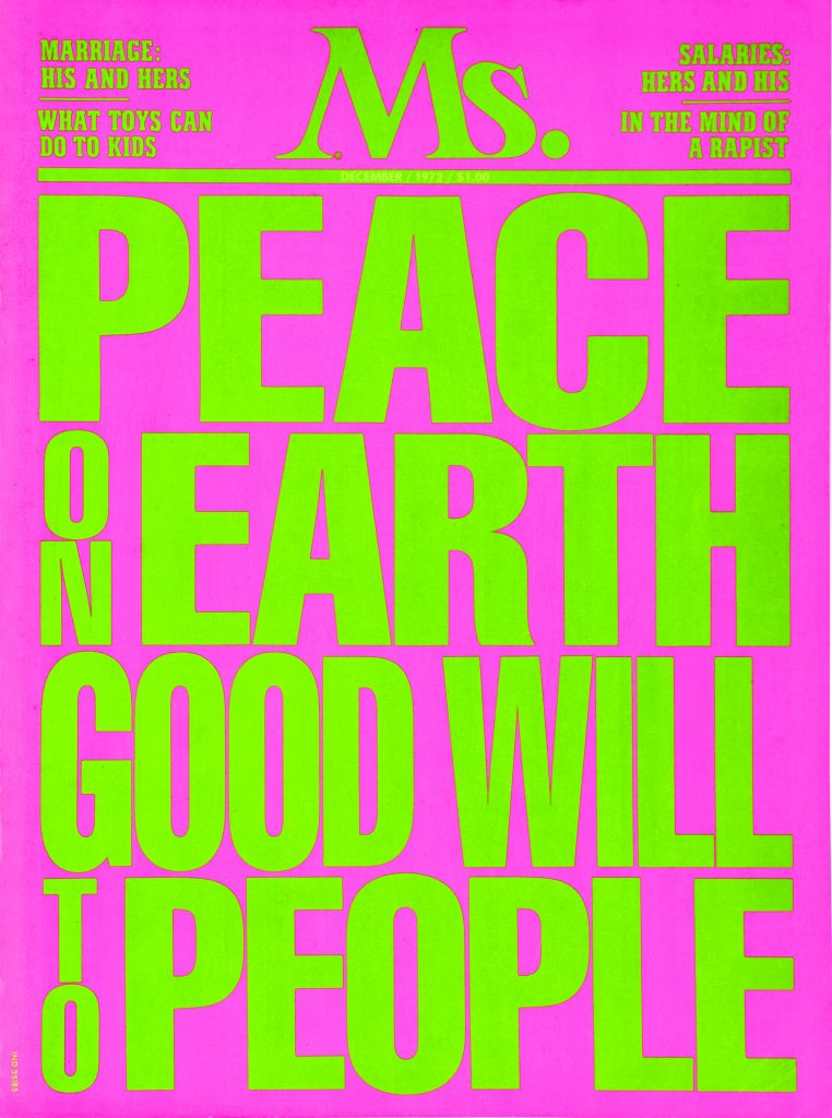
After 10 years at Harper’s Bazaar, she moved over to be the AD at the launch of the Ms. magazine with the feminist and journalist, Gloria Steinem. It was the magazine of the women’s liberation movement. She was at the forefront of the feminism movement in the 70s, creating the look and feel for the movement. She was also the first art director to feature a Black woman on the cover of a magazine when she worked for Vanity fair.
What signified her work was her collaboration with artists and photographers, many claim that she inherited the spirit of Alexey Brodovitch (who was also a former AD at Harper’s Bazaar) as she also understood that spreads should be intentionally and individually constructed, yet at the same time should be connected to one another to form a harmonious rhythm.
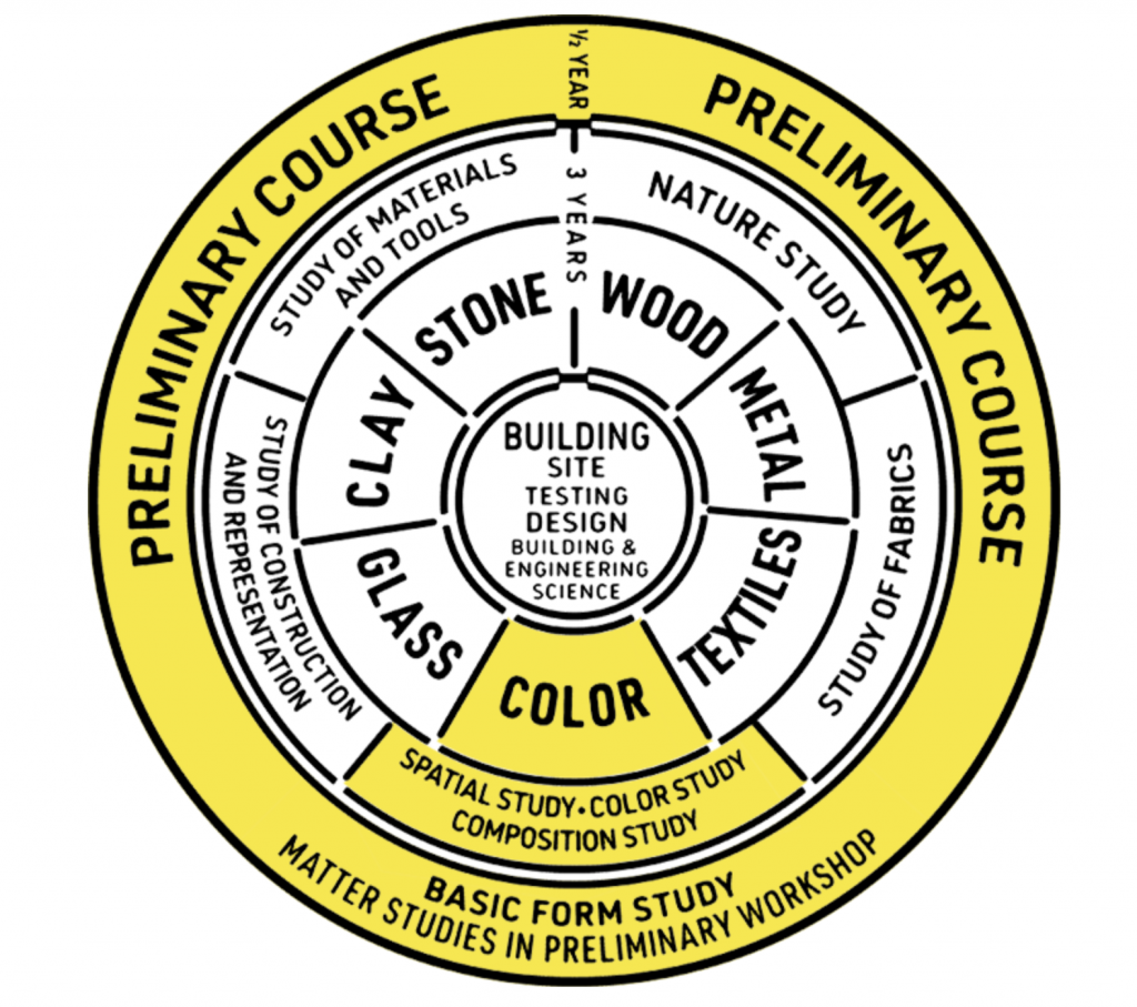
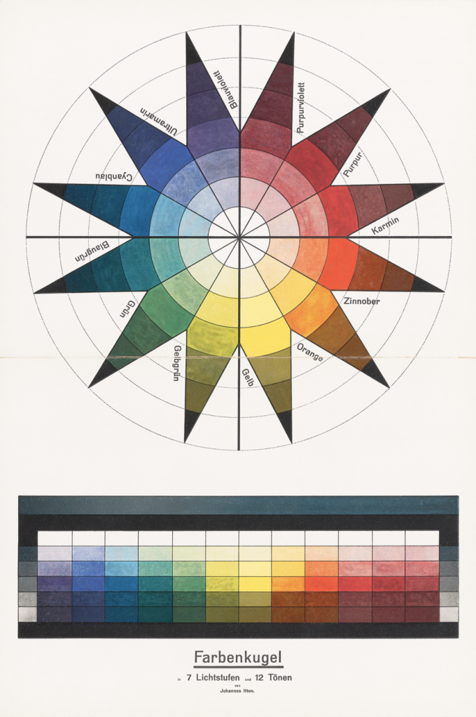
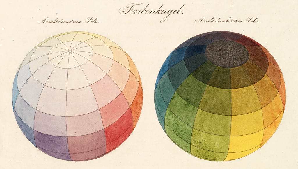
Johannes Itten was a professor at the Bauhaus who taught the study of colour. His teachings were shaped by a diverse body of previously developed artistic, psychological, and scientific theories of colour, tested and innovated through practical exercises. Itten correlated his to the 12 pitches of a chromatic musical scale as a visual depiction of colour harmony. He researched the hues’ contrasting properties and developed strategies for pleasing colour combinations. He was also inspired by Philipp Otto Runge’s colour sphere and created this star that would fold into that sphere. This was undoubtedly a complicated system and many other colour theories were developed by instructors at the Bauhaus, including Paul Klee, Vasily Kandinsky, and Josef Albers. One can only imagine how confused (or extremely knowledgable) about colour Bauhaus students must’ve been by the end of their studies.
Adapted diagram of the Bauhaus cirriculum
Color sphere in 7 light values and 12 tones, Johannes Itten, 1921. Lithograph.
Color sphere, Philipp Otto Runge, 1810
Architecture
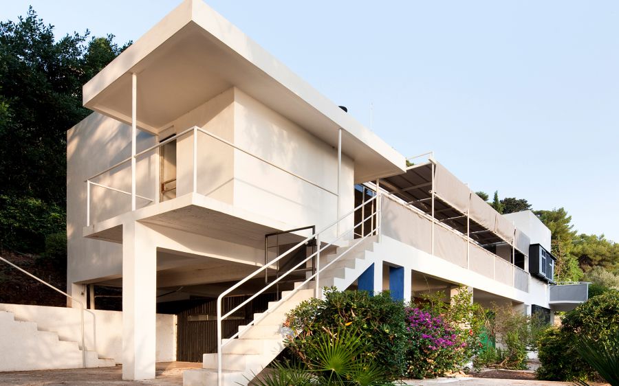
The bizarre legacy of E-1027
There’s a bizarre story behind Eileen Gray’s marvel of a villa named E-1027 in Roquebrune-Cap-Martin on the French Riviera. While she was overshadowed by many celebrated modernist architects of her time, her work was literally covered over by Le Corbusier—more specifically, by his uninvited murals on the walls of the villa.
Villa E-1027 was Eileen Gray’s first architectural creation, and she poured a lot of thought and attention into every detail of the design. It was designed as a flat-roofed white building that responded to her keen observation of weather patterns and sunlight. Gray spent three whole years designing the built-in and free-standing furniture while working with her partner and fellow architect, Jean Badovici, on the plans, but it is argued that the credit should be mostly on Gray.
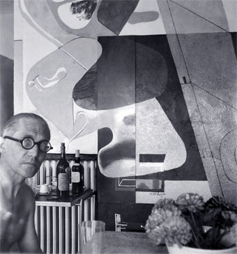
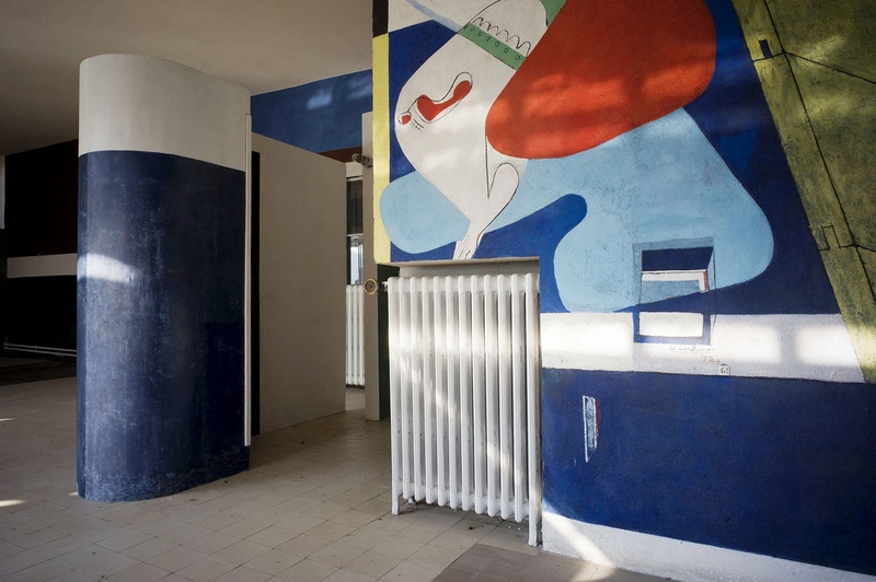
They ran in the same circle as Le Corbusier and he would be a guest in the villa while the couple were together and after they separated in 1932. Le Corbusier would be encouraged by Badovici to paint provocative sexually-charged murals on the white walls Gray had planned the villa to have. Gray was apparently unhappy with the murals, but by this time, she was no longer visiting the villa but it is still odd that someone would alter the original look and feel of a building as a guest. I wonder what Le Corbusier would have felt if another architect stayed in one of his buildings and decided to paint all over it against its original design… It’s unfortunate that Le Corbusier is so tied into the credit and story of Gray’s modernist masterpiece.
E-1027 Exterior
Le Corbusier in front of one of his murals in the bar area of the drawing room
Sturgis, Daniel. “Bauhaus: To Turn Away from Normality.” Art, Design & Communication in Higher Education, vol. 19, no. 1, Apr. 2020, pp. 9–18. EBSCOhost, doi:10.1386/adch_00010_1.
Constant, Caroline. “E. 1027: The Nonheroic Modernism of Eileen Gray.” Journal of the Society of Architectural Historians, vol. 53, no. 3, 1994, pp. 265–279. JSTOR, www.jstor.org/stable/990937. Accessed 8 Dec. 2020.
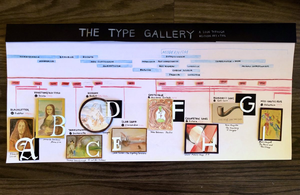
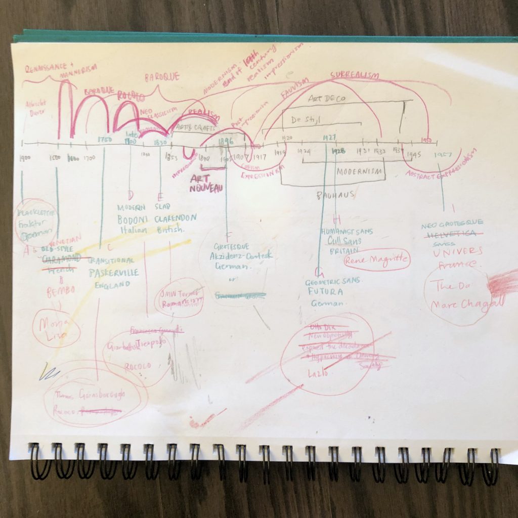
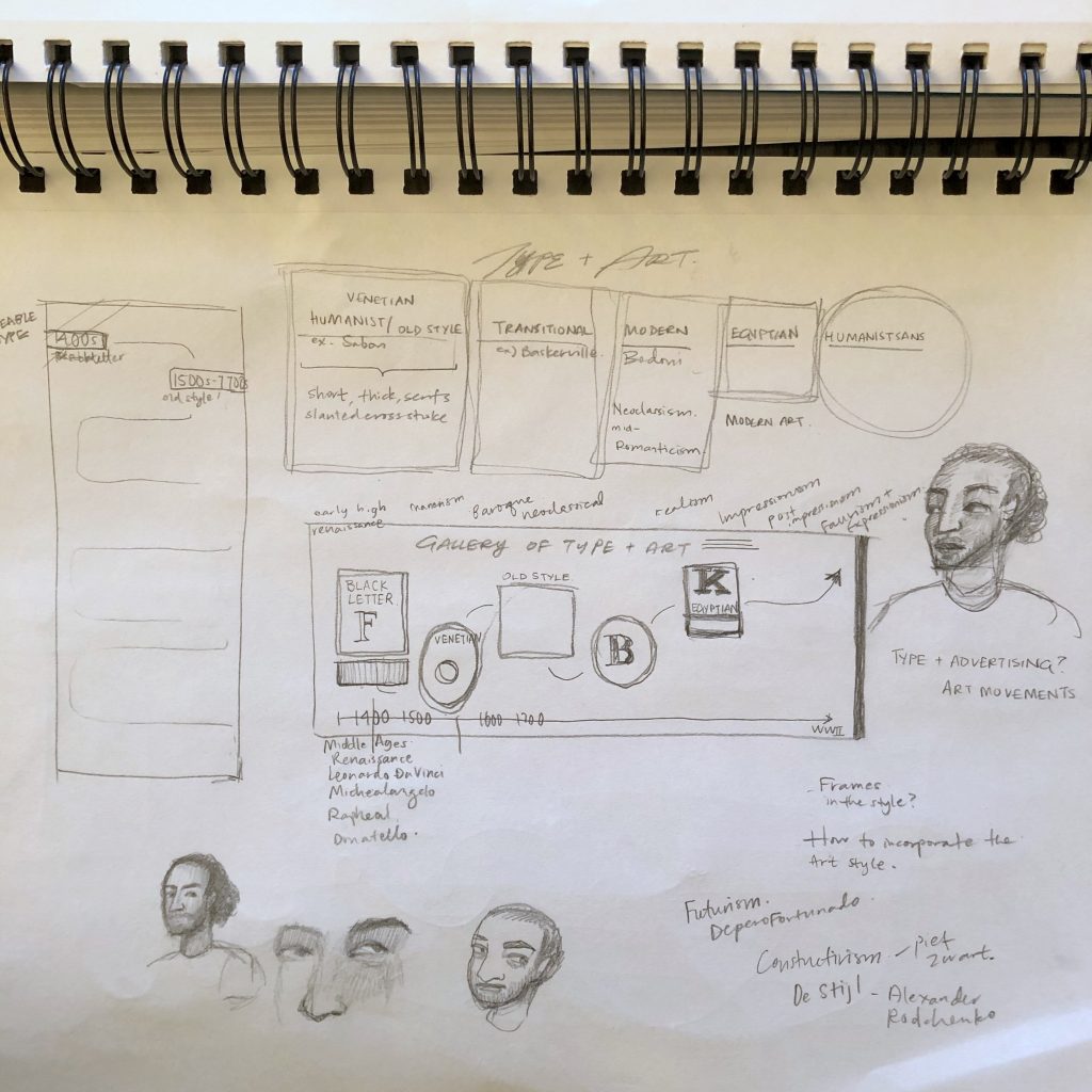
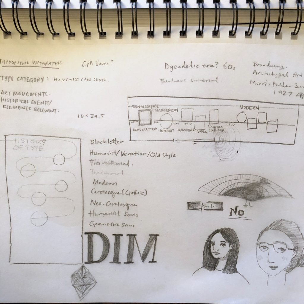
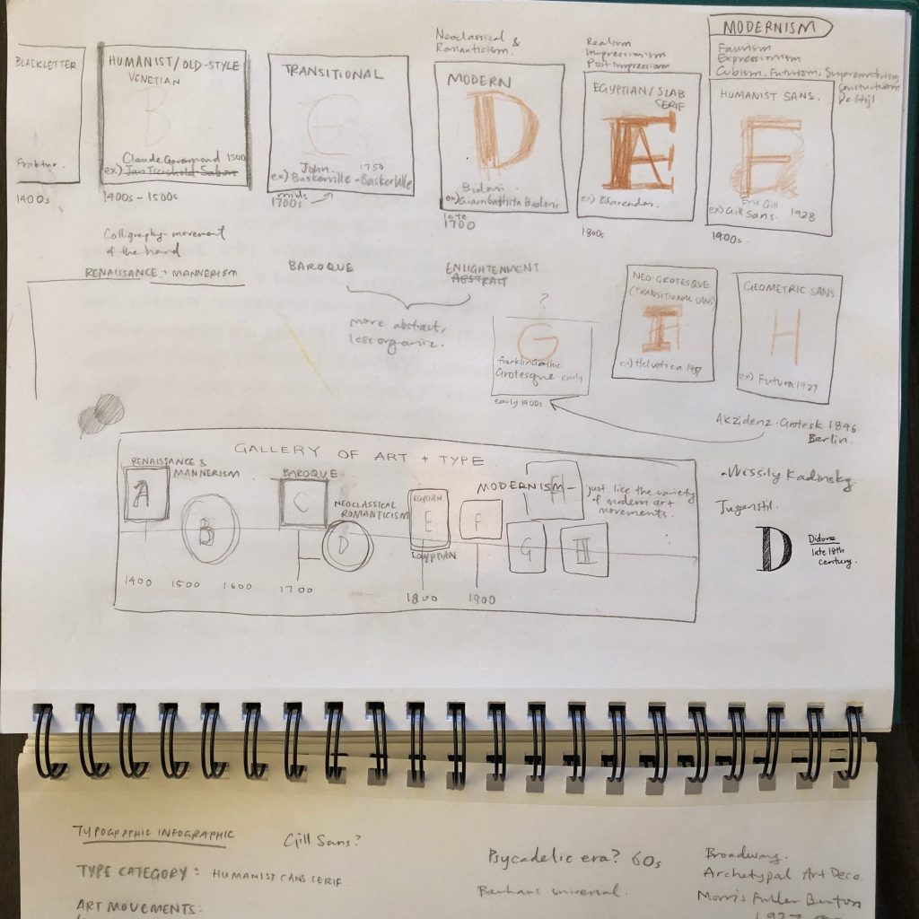
I decided to connect my typography infographic to the art movements we’ve been looking at in this class as well as Jeff’s class. My aim was to plot out the timing of the art movements to the typefaces that were created at the time to better understand where art and typography intersect.
The whole infographic aims to tell the story and connection between the two visually and without the support of too many words in a more general survey view. I decided focus on the visuals by making them the biggest and most colourful parts of the project. I recreated mini versions of famous artworks by artists who were popular at the same time as the typeface and then I overlaid a letter from the typeface mentioned, in its actual form. I tried my best to select artworks from the same country and year the type was created (only 2 are slightly off by country or date). I also chose artists that we’ve covered this term in our class so it would be familiar for all of us.
Grade
9/10
I did a lot of background research in an attempt to get the timeline right, but even between your class and Jeff’s, there are a few minor discrepancies in dates and the internet just makes it even more confusing. I did a lot of planning ahead of time to find artworks and artists who we’ve already heard of from the exact same time the type was invented. I also did several rounds of sketches so I could just execute once. I think the final result isn’t 100% what I imagined and planned, but it captures the spirit of what I was going for.
This was another multi-media project where I found myself using different kinds of papers, pens, and pencil crayons. I also dyed some string red for the main timeline as well as making use of extra black for contrast.
I’m quite proud of the fact that I completed this entire term’s projects without the use of a printer. It has made work a bit more tedious and time-consuming, but it was a fun challenge figuring out how to recreate things with good old fashioned methods.
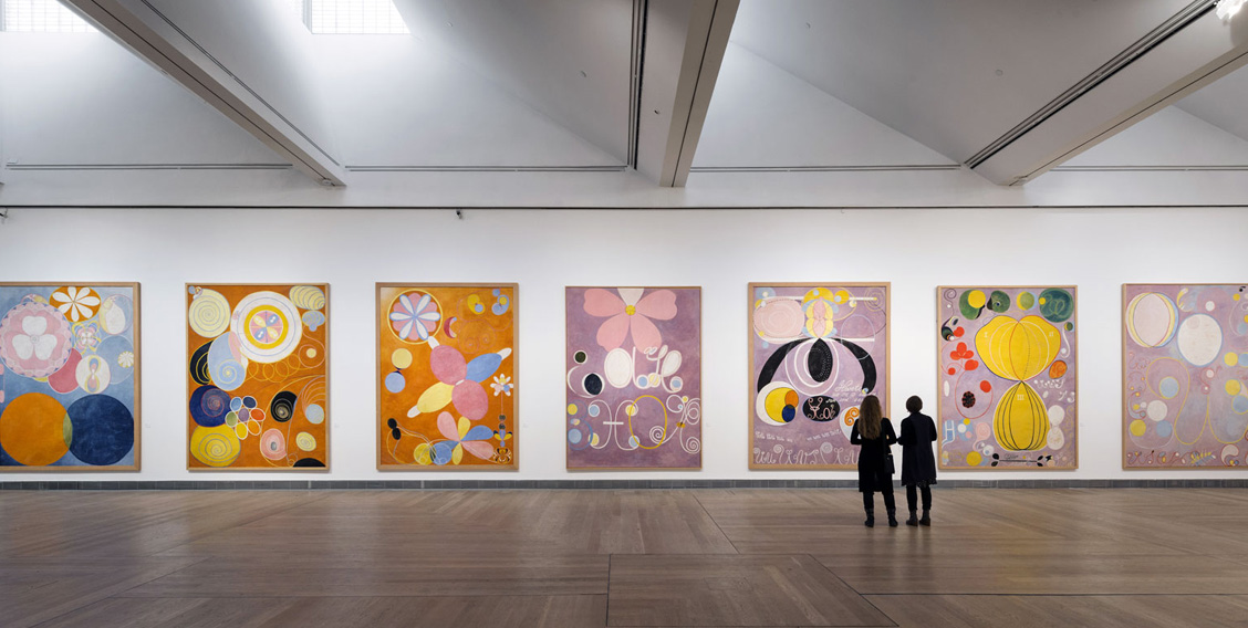
Hilma af Klint was an overlooked artist of her day and much of her work wasn’t seen until after her death in 1944. Her work predates the first “official” abstract art by Vasily Kandinsky in 1911 by 5 years and also the works of Franz Marc and Piet Mondrian. She was painting non-objectively before these pioneers of abstract art were doing so. Her works were strikingly original. Being overlooked isn’t surprising considering she was a woman, didn’t have any connections to the art world, and her work was just considered too radical for the time. Also, despite not being aware of what was happening in the art world of her contemporaries, it’s bizarre that all their works hold such similarities.
She was enrolled at the Royal Academy of Fine Arts in Stockholm from 1882 to 1887, which was considered rather early for a woman, because Sweden was a country that actually allowed women to study art from a much earlier time than the rest of Europe. She studied portrait and landscape drawing and painting during her time there.
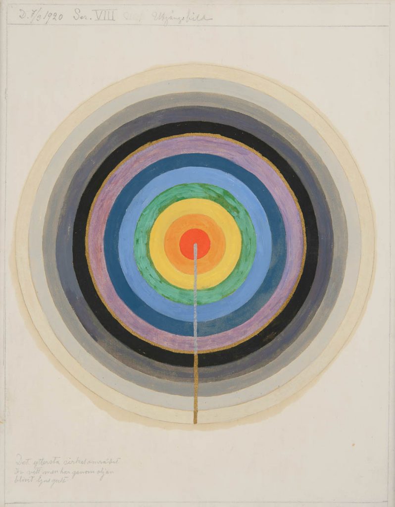
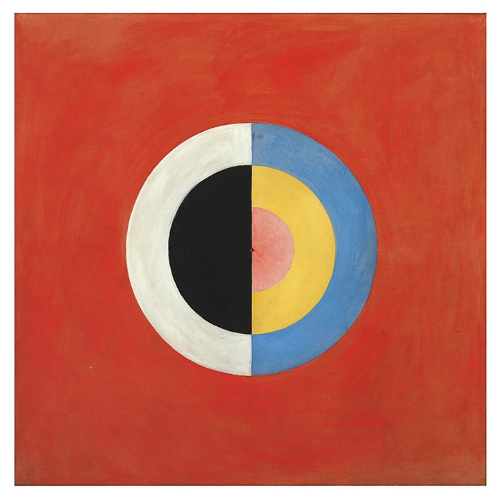
Af Klint was also a part of the first religious organization in Europe called Theosophy that did not discriminate against women. She was 17 when she started exploring spiritualism. Over the years, her work as a medium resulted in many of her paintings telling the story of the world. The messages she received from the spirits were the foundation of her art. These ideas may have constituted her as a witch at the time but the ideas and methodswere not too dissimilar to those of the Surrealists. She represented these ideas in geometric shapes, symbolism in letters and numbers, and in the use of bright bold colours.
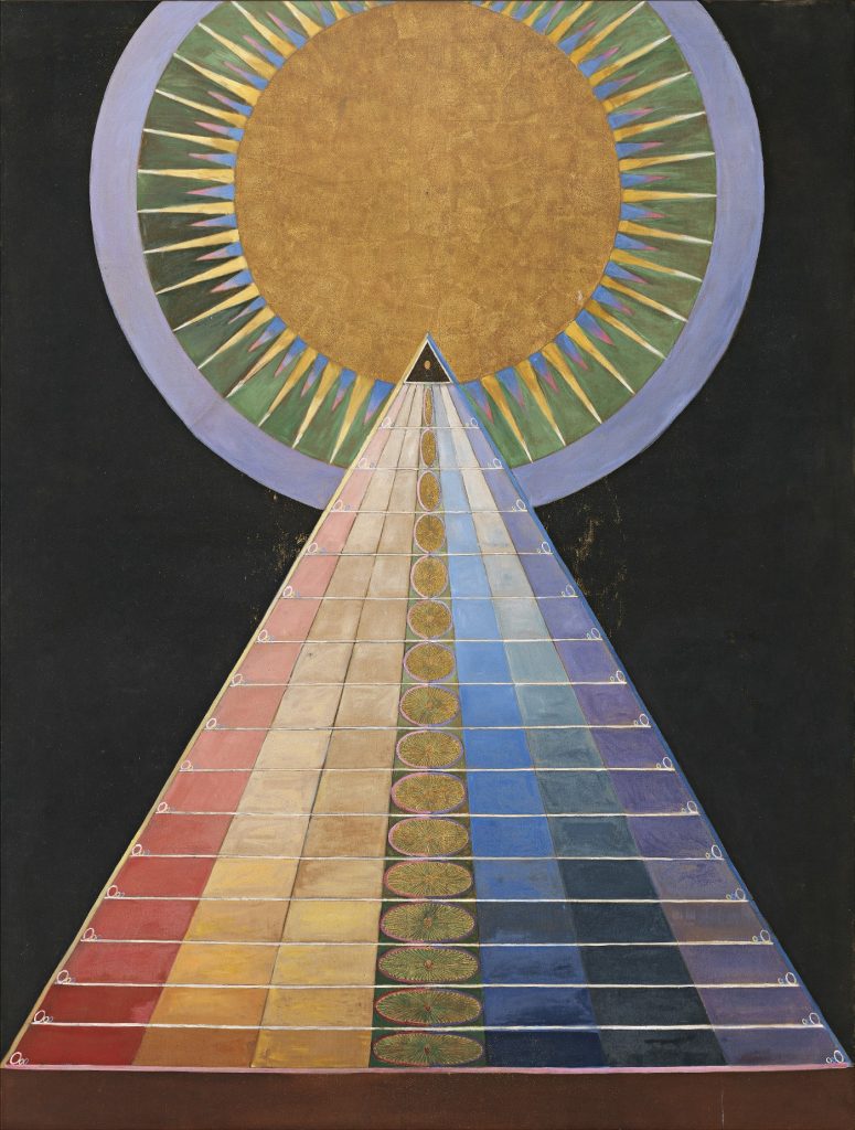
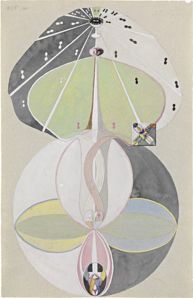
Group X, №1, Altarpiece (1915)
Tree of Knowledge, №5 (1915)
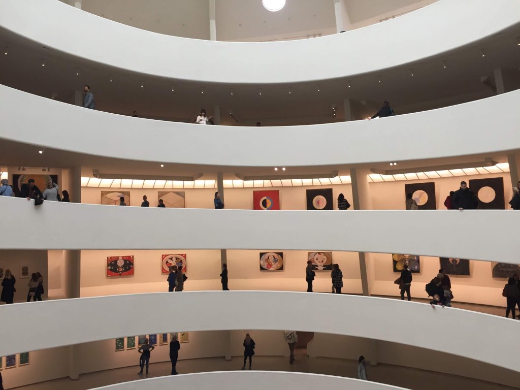
Between 1906 and 1915, she created 193 paintings called The Paintings for the Temple which explored a dualistic perception of creation, evolution, and the universe. She requested that her art to not be shown until 2o years after her death and, incredibly, her wish was respected. Her full series was installed at the Guggenheim in New York from 2018-2019.
I was lucky enough to catch that exhibition while I was in New York, and it was so fascinating to experience her art in the way she meant for it to be seen—all together. Walking upwards towards her final paintings of full ascendence was pretty spectacular. I think it’s great that Hilma af Klint is getting some recognition and finding her way into the canon of the art history because her work fits so neatly into the timeline of the story. Maybe I also had an affinity to her work despite having never heard about her before stumbling upon her work at the Guggenheim because I had just returned from studying abroad in Sweden for my final year of university and the coincidence of it all was just too unbelievable.
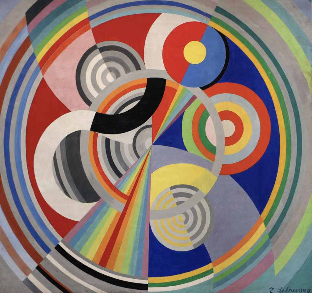
Robert Delauney was a French Cubist artist best known for his repertoire of colourful geometric paintings. His paintings evoke a sense of movement with its use of contrasting colours, lines, and shapes. He was a leader, alongside his wife Sonia, of the Orphic Cubism art movement which was originally named as such by a critic in reference to the mythical Greek musician and poet Orpheus—to emphasize the lyricism and musicality in Delaunay’s works. He exhibited at the Salon des Indépendants in 1904 in his late teens and it solidified his position amongst the avant-garde artists in France early on. We was also invited to exhibit at first Der Blaue Reiter exhibition in 1911 by Wassily Kadinsky.
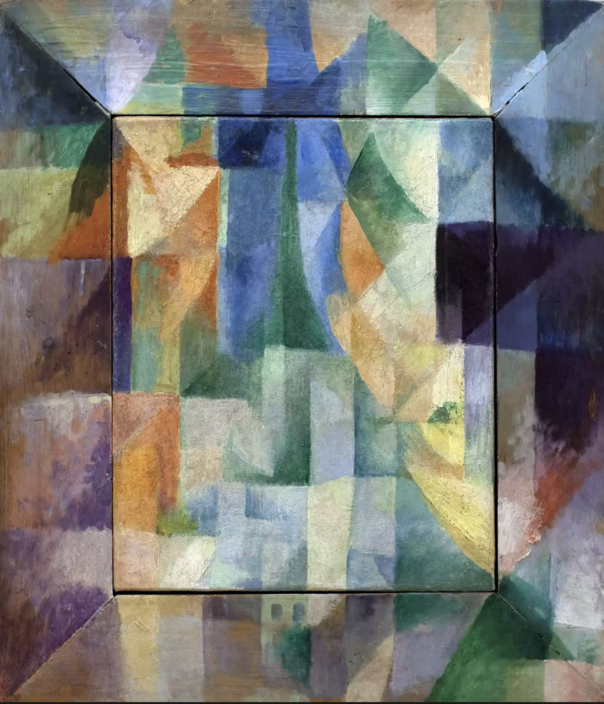
Simultaneous Windows on the City (1912)
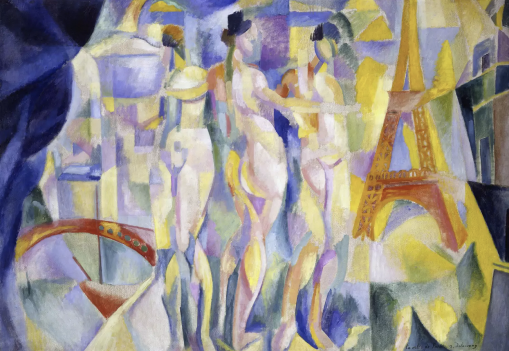
La Ville de Paris (1911)
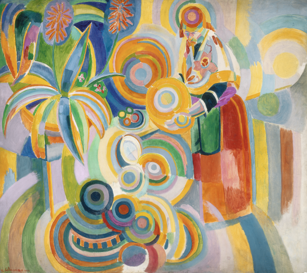
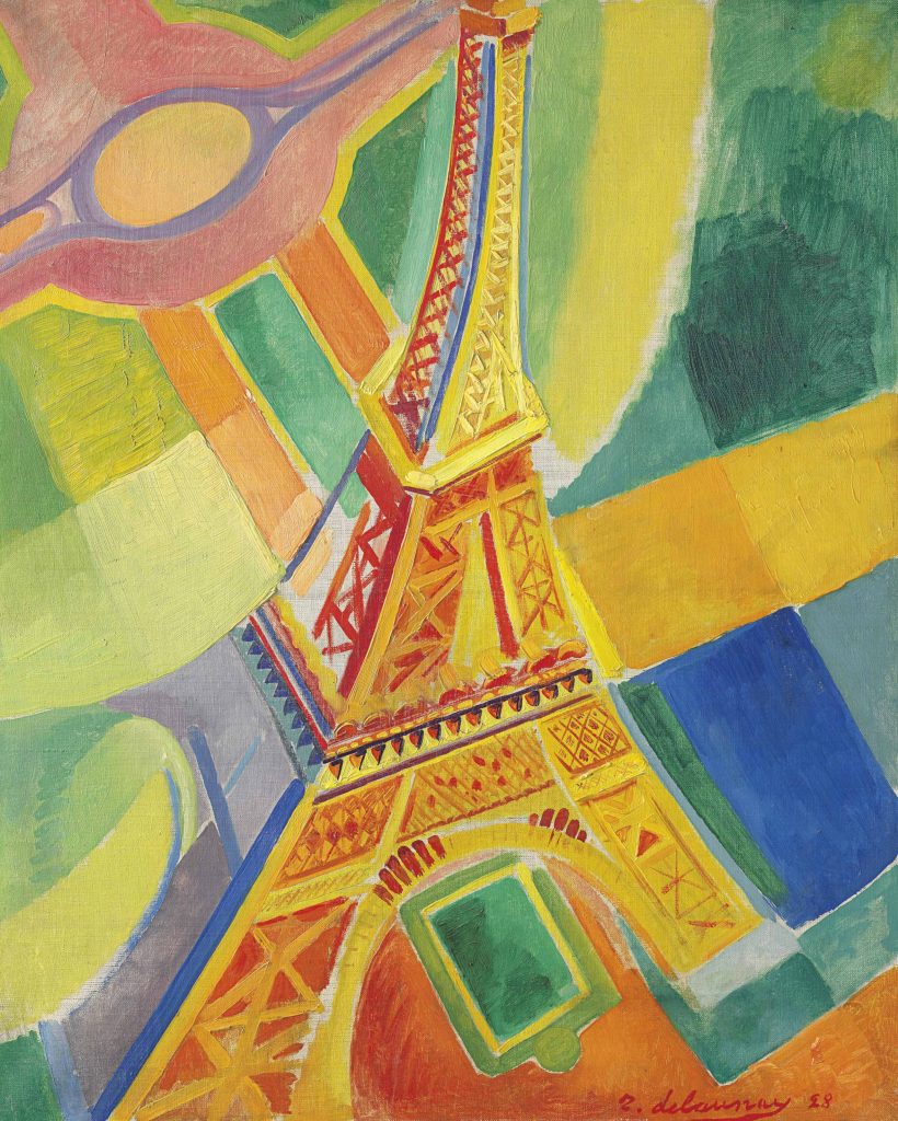
At the outbreak of WWI, he and his wife fled to Spain and later Portugal, where the warm, clear light of northern Portugal would be a source of colour inspiration for them both (as seen in his Portuguese Woman painting). In contrast to the two paintings above created in Paris, there is a clear shift in colour to a much brighter palette. It’s fascinating to see how a change in scenery can impact an artist’s work and continue on to influence their work as they adopt it as a part of their new style. The Eiffel Tower shown below was painted n Paris post-Portugal and yet it retains the luminosity of the palette he used from those days.
Portuguese Woman (The Large Portuguese) (1916)
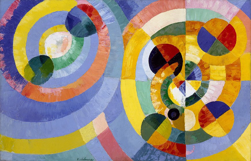
Delaunay’s notable series include his Windows, Eiffel Towers, Circular Forms, and Rhythms. His work trended towards becoming more and more abstract post war. I enjoy his use of contrasting colours and at first glance of his disc paintings and at first glance, it reminded me of a bolder version of some of Hilma af Klint’s work.
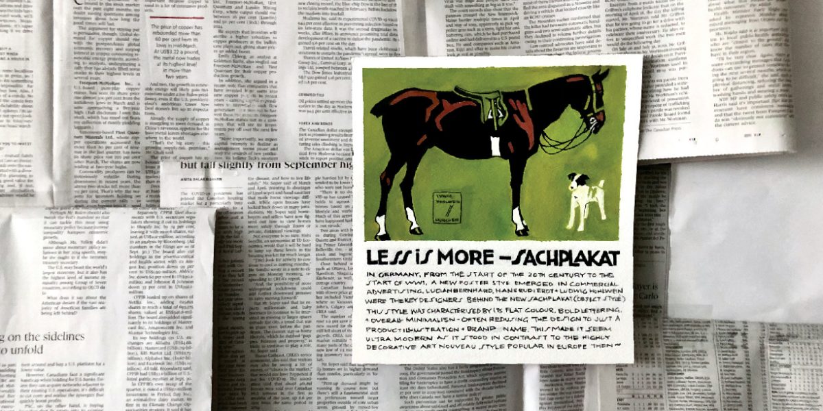
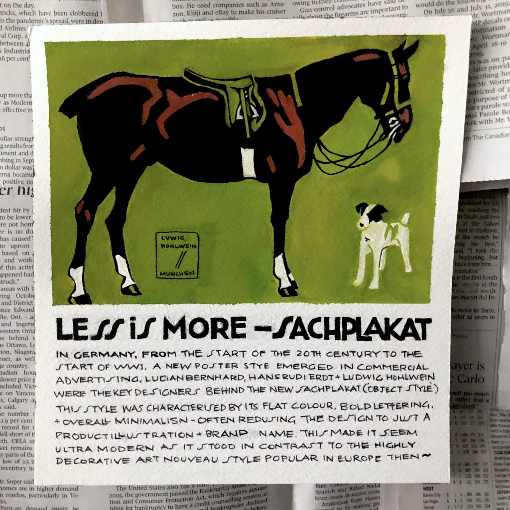
While I loved the Art Nouveau style and wanted to create something related, the German Plaktstil/Sachplakat style also stood out to me as it was a completely 180° from the highly decorative aspect of Art Nouveau. I like the simplicity and the graphic quality of the posters so my artifact is half a replica of a Ludwig Hohlwein poster advertising fancy riding lessons. While I kept the illustration the same, I changed up the copy below to the paragraph explaining the significance of the Sachplakat style in the history of visual communication. I chose to follow the original lettering style of the copy for the description to keep within the authenticity of the original.
I placed the poster on a backdrop of newsprint to show a contrast between the boldness of the Sachplakat style to plain text type. This goes to show just how effective this style could be in a sea of text and how the viewer does not need to try very hard to understand what is being advertised as its clearly stated in the imagery and text.
Grade
7.5/10
I definitely planned well in advance but left the execution for a bit later. Though I wrote the paragraph several times before and revised a couple of times as I went along, I still had trouble getting it perfectly down on the paper and despite the pre-planning, mistakes were made as I went to the inking stage. This just makes me appreciate the magic of working digitally even more.
I could have worked out the dimensions of the poster to be a bit bigger to fill up the eventual space allotted, but I actually quite like the layout of the final result. I know I could’ve experimented a bit more with layout before I landed on this.
I also really enjoyed painting the illustration part at the top of the poster as its in a style completely different from my own. It was a great exercise in simplifying shapes and colours for the sake of clarity and I think I did alright in replicating that part!