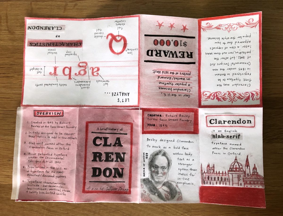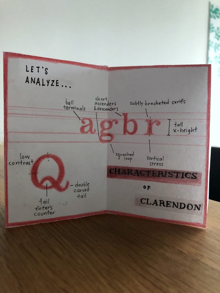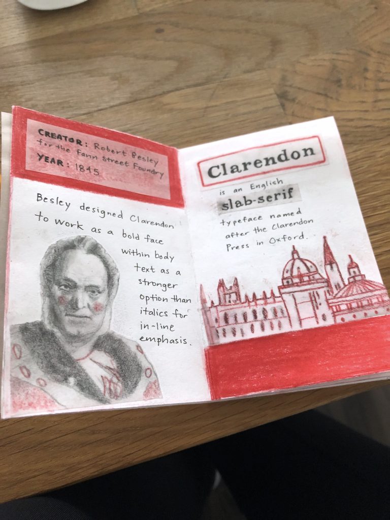
Dreams & Designers
(1895 – 1905)
Peter Behrens was a key figure in the later part of the Jugendstil movement (the German counterpart to the Art Nouveau movement). Its elements showed up in all of his work as an artist, type/graphic/furniture designer, and architect. Behrens’ work would bridge movement into modernism in the early 20th century.
Typography
A Quintessential German Typeface
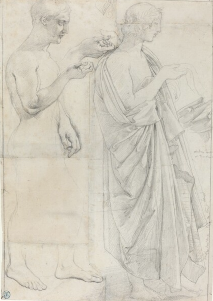
Peter Behrens’s typeface Behrens Schrift was released in mid-1901 by the Rudhard’sche Foundry of Offenbach. It was Behrens’ attempt at a simplified gothic style with a broad-pen calligraphic look in a very German way. He was going for the hand-lettered feel of which he associated with integrity and formality of letterforms. He was also inspired by the handiwork of the medieval scribes. It was ideas like this that tied him to the philosophies of William Morris’ Arts and Crafts Movement in Britain from the the 1860s on. Though it is simple, this typeface still holds some Jugendstil characteristics, such as the elemental decorations like the whiplash curve at the tops of the I and J.

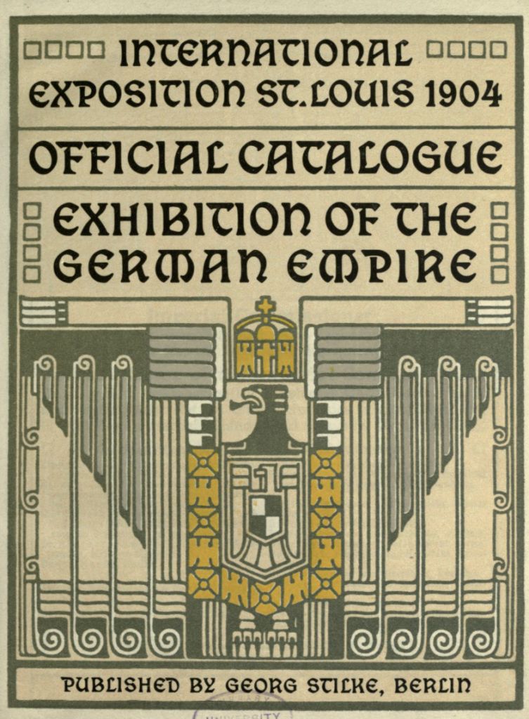
Page from the Rudhard Foundry specimen 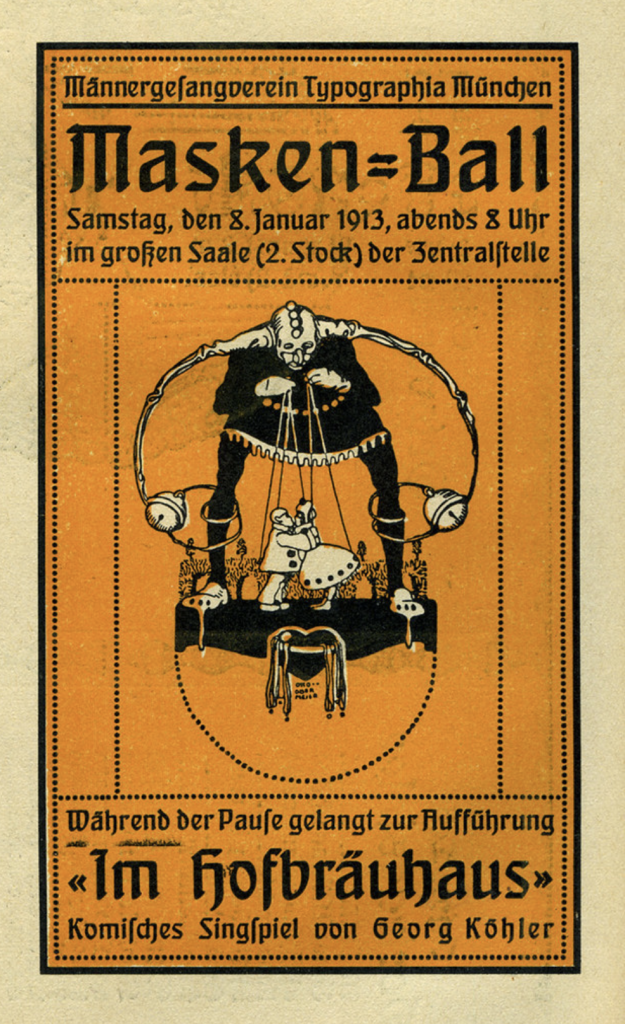
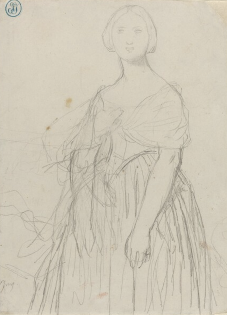
Poster for a masked ball
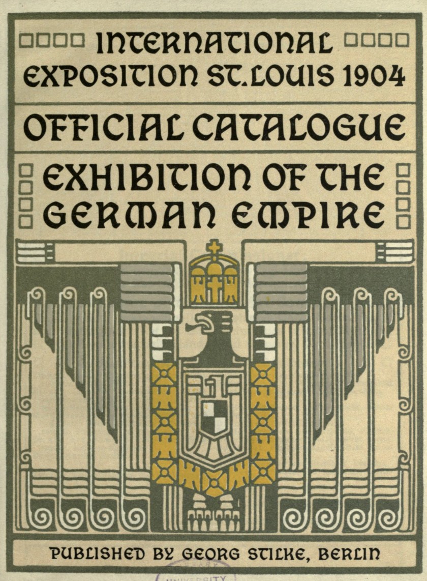
This typeface became very popular for the foundry. It was most popular in advertising and fine printing. A variation of it was even used for the German exhibitions at the 1904 World Expo in St. Louis and for the 1910 World Expo in Brussels. At the bottom of the second page, you can even see that Peter Behrens was in charge of the printing and supervision of the German catalogue.

Architecture
Peter Behrens was a multi-talented man, much like William Morris, the father of the Arts and Crafts movement in England in latter half of the 19th century. When he was invited to participate in the Darmstadt Artists’ Colony in 1890, he got to design his own house, now called the Behrens House, and all the interior furnishings—down to the dishes. In his endeavours into architecture, he was interested in creating functional forms and improving and modernizing the designs of factory-produced everyday objects. His “model family house” was the most elaborate of all those in the colony. You can see from the photos that he was still highly decorative, even adding linear geometric designs to the ceilings and in other pieces in the house. He was a huge proponent of getting these designs into production by local factories and he was backed by the governments to make this happen. At the time, artist-designed products were not typically sent off for general production runs, but he found some success for his items which help solidify his reputation as the first industrial designer.
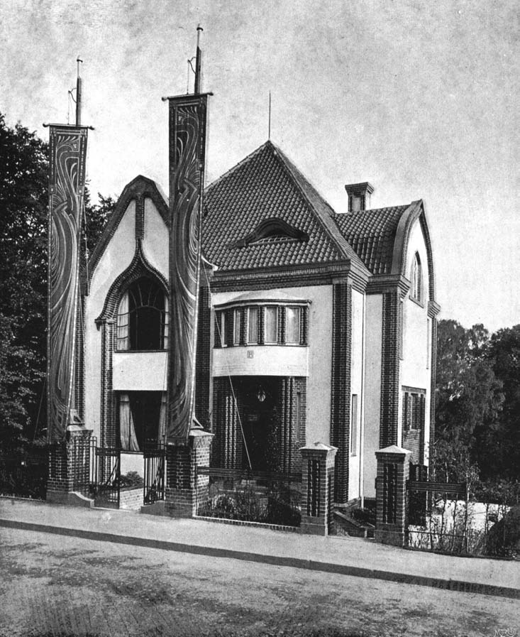
Exterior 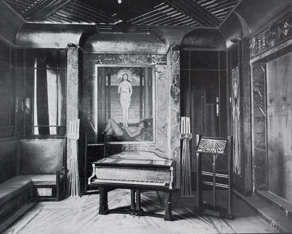
Living Room 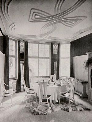
Dining Room
Behrens and his group the Deutscher Werkbund (modelled after William Morris’ design group) would go on to train the future head of Bauhaus, Walter Groupius, and another pioneer of modern architecture, Le Corbusier. The work of Behrens and his group was at the forefront of the transition from the Jugendstil movement into modernism in Germany.
References
Type Images: https://fontsinuse.com/typefaces/14729/behrens-schrift https://archive.org/details/internationalexp00germrich/page/n9/mode/2up
Architecture Images: http://architectuul.com/architecture/behrens-house
Burke, Chris. “Peter Behrens and the German Letter: Type Design and Architectural Lettering.” Journal of Design History, vol. 5, no. 1, 1992, pp. 19–37. JSTOR, www.jstor.org/stable/1315850. Accessed 2 Nov. 2020.
Rudoe, Judy. “Aspects of Design Reform in the German Ceramic Industry Around 1900, As Illustrated By The British Museum Collection.” The Journal of the Decorative Arts Society 1850 – the Present, no. 14, 1990, pp. 24–34. JSTOR, www.jstor.org/stable/41809173. Accessed 2 Nov. 2020.