
Gestalt Principle: Figure/Ground
This logo cleverly depicts a fountain pen nib as well as a spoon.
Gestalt Principle: Figure/Ground
This logo cleverly depicts a fountain pen nib as well as a spoon.
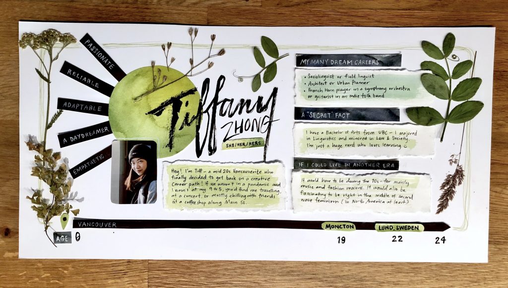
My spread aims to capture my preferred aesthetic-rustic yet organized. I incorporated collage-y elements of ink and watercolour—two of my favourite mediums. I kept the colour palette simple with just black, white, and green—something I often do in my work to not overcomplicate a project. You’ll hardly ever find edges that are perfectly straight in my handmade work. I go more by my brain’s intuitive ruler (if that’s a thing). Though the layout is, for the most part, organized, I love when “mistakes” show through in the rough edges, crooked lines, and subtle colour variations. This all parallels who I am as a person—put-together on the surface, but if you look a bit closer, quite wonky. I decorated with a bit of my collection of dried and press foliage which kept in line with the green and it adds a personal touch. I tend to look to nature for inspiration and I think it adds dimensionality to the entire piece.
I would give myself a 7 on this project. I think I captured who I am stylistically and I enjoyed how I did my name and the location timeline. I could’ve planned out the write-ups a bit more. Copywriting about yourself is much harder than expected. It’s hard to convey your essence in short answers. I also could have been more thoughtful and creative with a theme. It ended up being quite simple and just a project that ticked off the surface-level boxes.

I really enjoyed how Sarah used scale to emphasize the relationship between the human figures and the devices. The illustration uses that device well to portray an abstract concept.

This poster uses the element of line to create the orbit rings around a planet. The angle and scale of the rings add drama to the poster while all other elements on the page are kept relatively small.
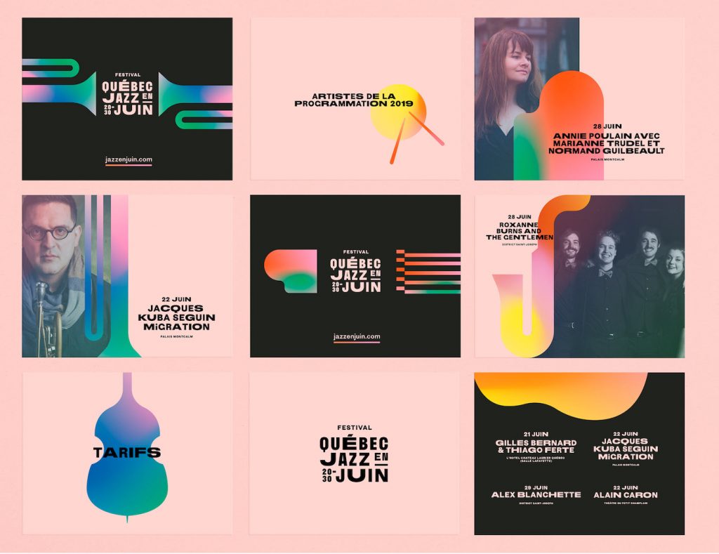
This jazz festival’s brand identity effectively uses space and colour to depict musical instruments in their simplest form. The textured gradients adds character within the forms when they’re placed against the solid coloured backgrounds.