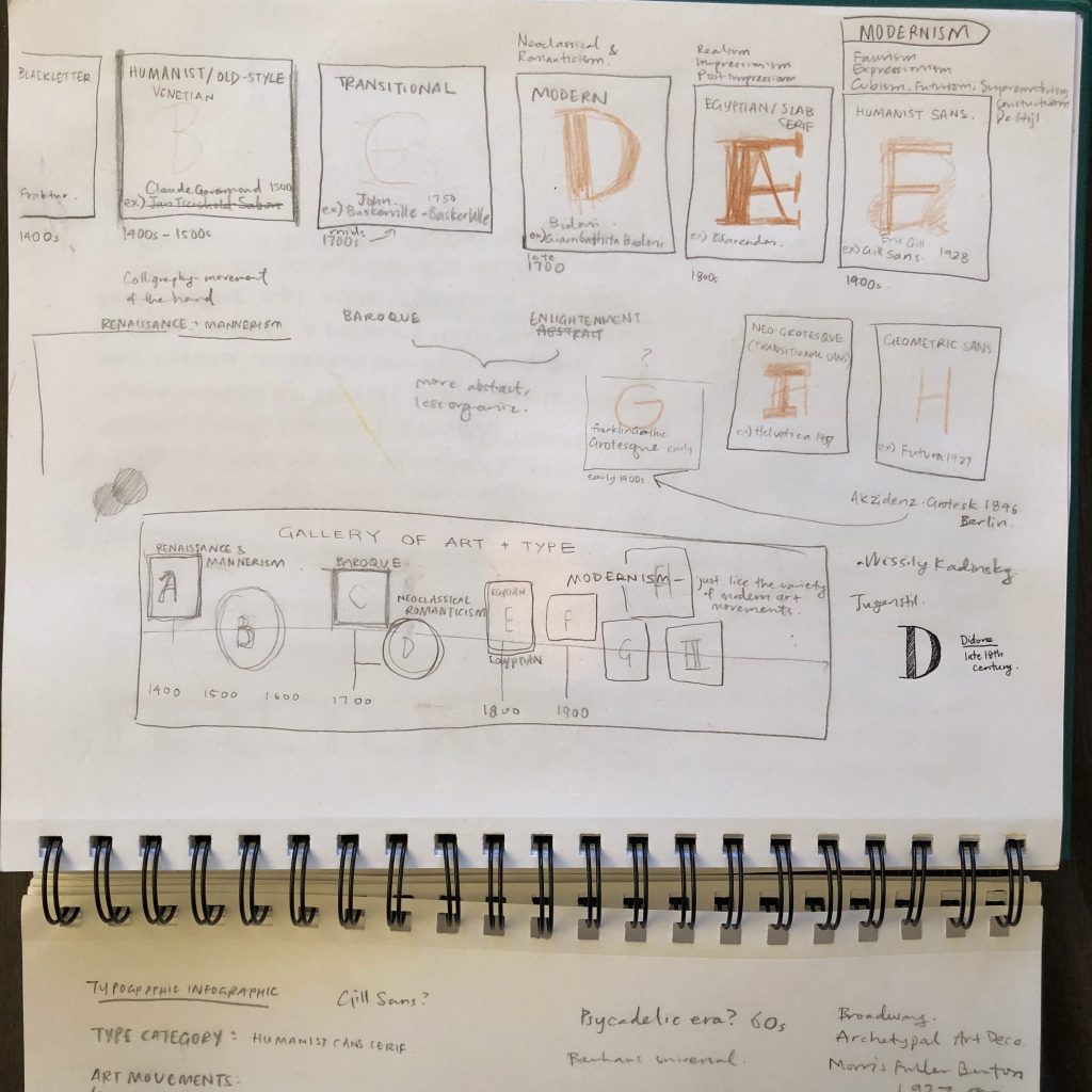
Colour Theory & Cool Type (1925 – 1930)
Colour
The Exploration of Colour
Johannes Itten was a professor at the Bauhaus who taught the study of colour. His teachings were shaped by a diverse body of previously developed artistic, psychological, and scientific theories of colour, tested and innovated through practical exercises. Itten correlated his to the 12 pitches of a chromatic musical scale as a visual depiction of colour harmony. He researched the hues’ contrasting properties and developed strategies for pleasing colour combinations. He was also inspired by Philipp Otto Runge’s colour sphere and created this star that would fold into that sphere. This was undoubtedly a complicated system and many other colour theories were developed by instructors at the Bauhaus, including Paul Klee, Vasily Kandinsky, and Josef Albers. One can only imagine how confused (or extremely knowledgable) about colour Bauhaus students must’ve been by the end of their studies.
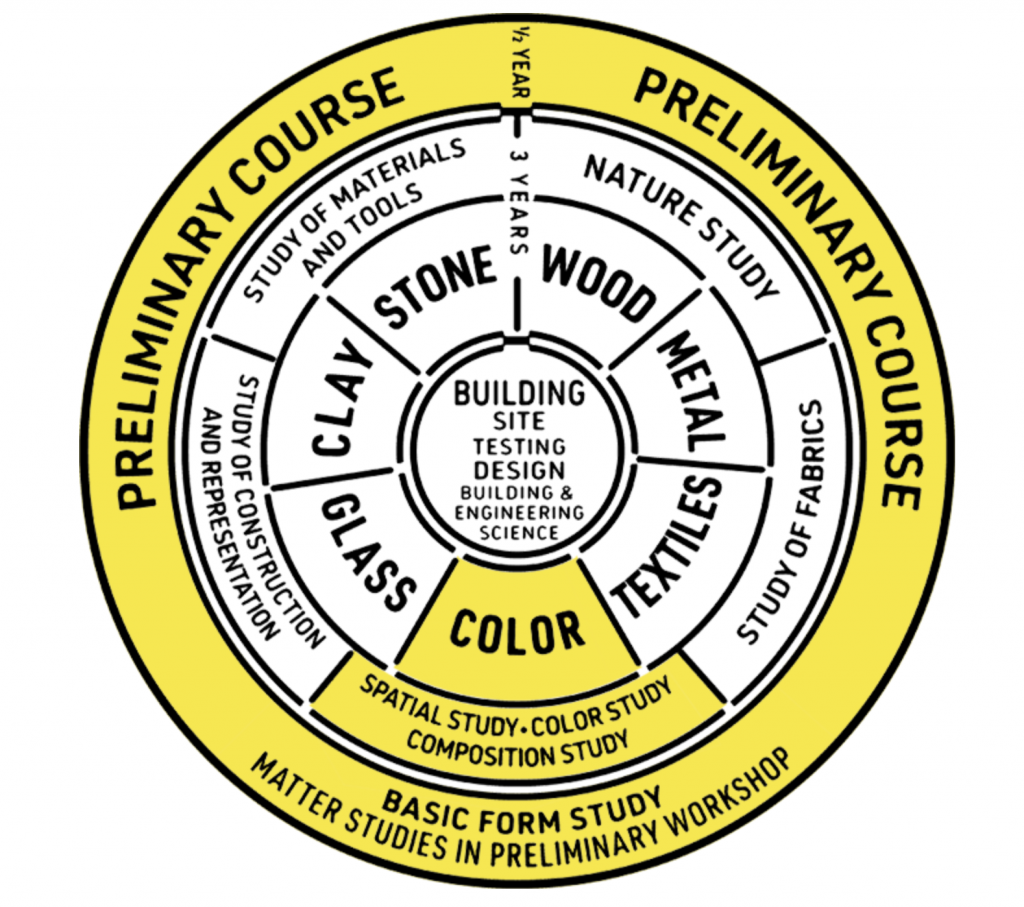
Adapted diagram of the Bauhaus cirriculum 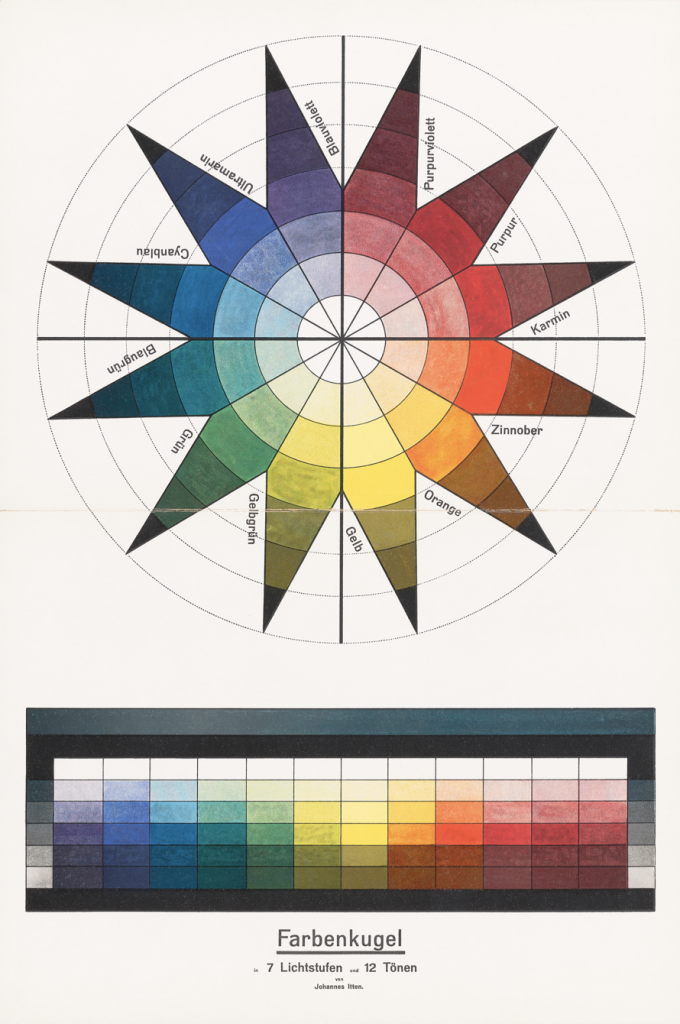
Color sphere in 7 light values and 12 tones, Johannes Itten, 1921. Lithograph. 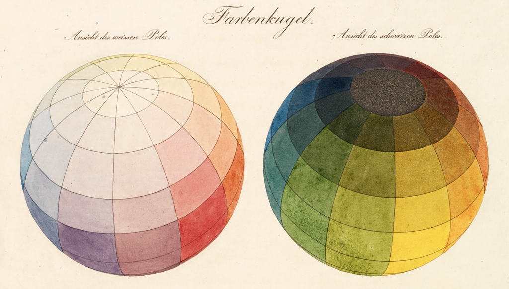
Color sphere, Philipp Otto Runge, 1810
Architecture
The bizarre legacy of E-1027
There’s a bizarre story behind Eileen Gray’s marvel of a villa named E-1027 in Roquebrune-Cap-Martin on the French Riviera. While she was overshadowed by many celebrated modernist architects of her time, her work was literally covered over by Le Corbusier—more specifically, by his uninvited murals on the walls of the villa.
Villa E-1027 was Eileen Gray’s first architectural creation, and she poured a lot of thought and attention into every detail of the design. It was designed as a flat-roofed white building that responded to her keen observation of weather patterns and sunlight. Gray spent three whole years designing the built-in and free-standing furniture while working with her partner and fellow architect, Jean Badovici, on the plans, but it is argued that the credit should be mostly on Gray.
They ran in the same circle as Le Corbusier and he would be a guest in the villa while the couple were together and after they separated in 1932. Le Corbusier would be encouraged by Badovici to paint provocative sexually-charged murals on the white walls Gray had planned the villa to have. Gray was apparently unhappy with the murals, but by this time, she was no longer visiting the villa but it is still odd that someone would alter the original look and feel of a building as a guest. I wonder what Le Corbusier would have felt if another architect stayed in one of his buildings and decided to paint all over it against its original design… It’s unfortunate that Le Corbusier is so tied into the credit and story of Gray’s modernist masterpiece.
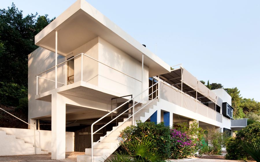
E-1027 Exterior 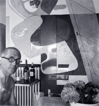
Le Corbusier in front of one of his murals in the bar area of the drawing room 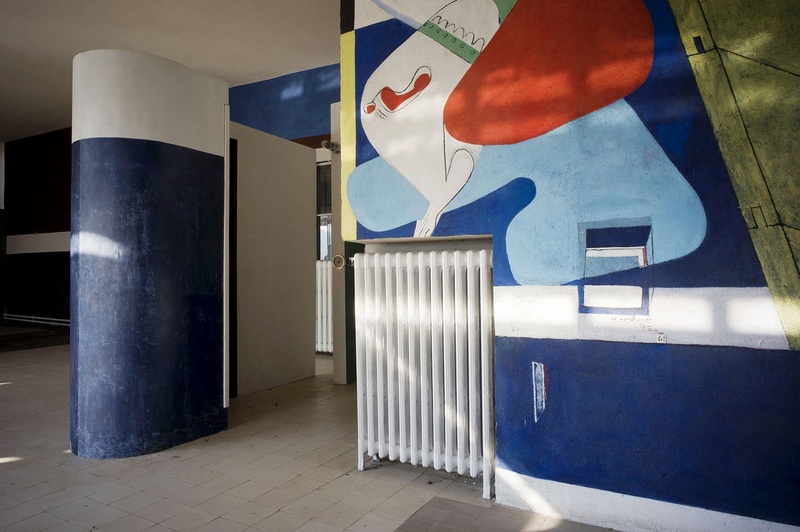
The mural in colour
References
Colour Images: https://www.getty.edu/research/exhibitions_events/exhibitions/bauhaus/new_artist/form_color/color/
Architecture Images:
1: https://www.wmagazine.com/story/eileen-gray/
2: https://www.vogue.com/article/eileen-gray-sheftel-gallery
3: https://capmoderne.com/en/lieu/la-villa-e-1027/
Sturgis, Daniel. “Bauhaus: To Turn Away from Normality.” Art, Design & Communication in Higher Education, vol. 19, no. 1, Apr. 2020, pp. 9–18. EBSCOhost, doi:10.1386/adch_00010_1.
Constant, Caroline. “E. 1027: The Nonheroic Modernism of Eileen Gray.” Journal of the Society of Architectural Historians, vol. 53, no. 3, 1994, pp. 265–279. JSTOR, www.jstor.org/stable/990937. Accessed 8 Dec. 2020.