Rationale
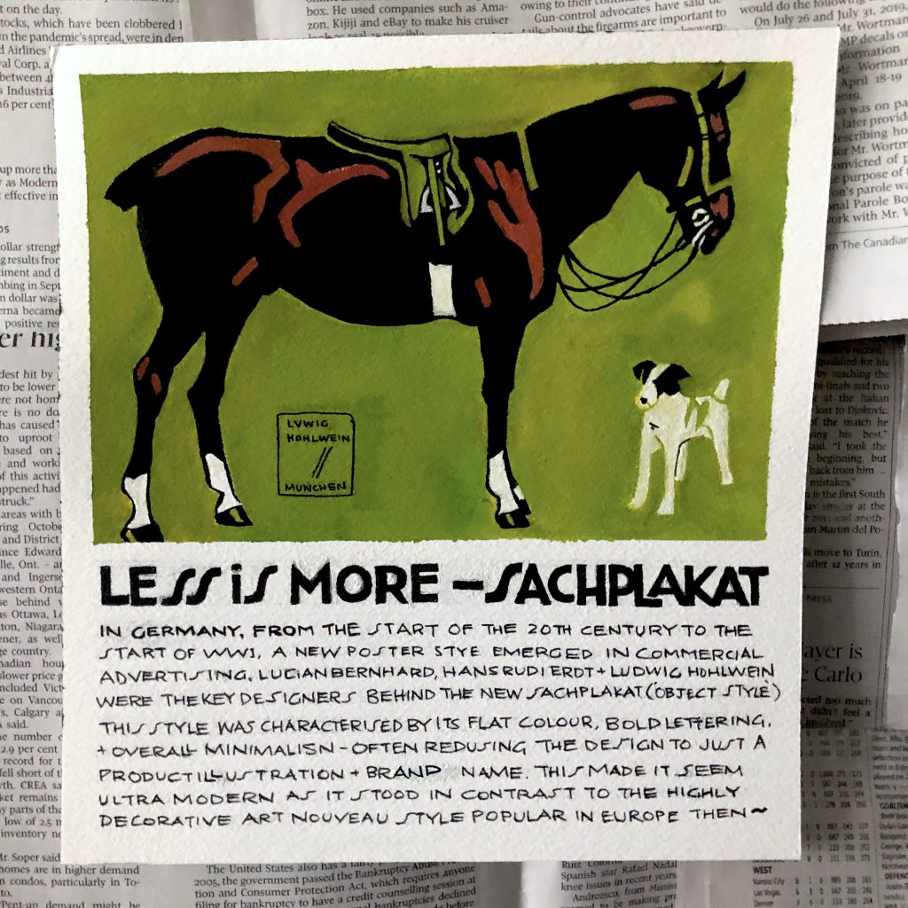
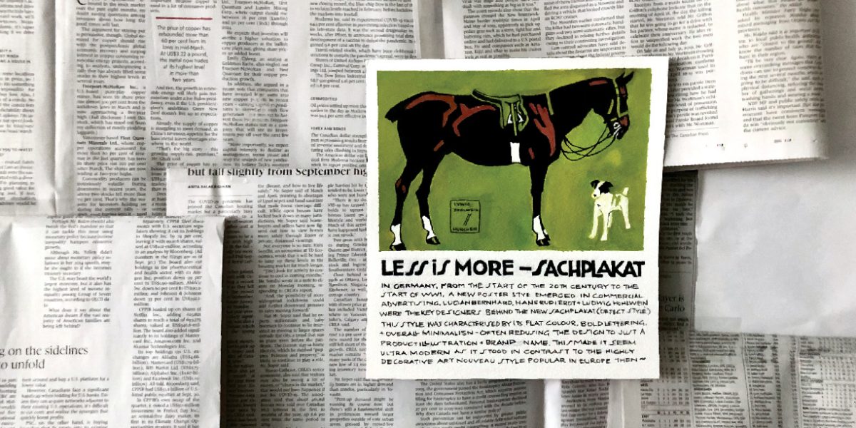
While I loved the Art Nouveau style and wanted to create something related, the German Plaktstil/Sachplakat style also stood out to me as it was a completely 180° from the highly decorative aspect of Art Nouveau. I like the simplicity and the graphic quality of the posters so my artifact is half a replica of a Ludwig Hohlwein poster advertising fancy riding lessons. While I kept the illustration the same, I changed up the copy below to the paragraph explaining the significance of the Sachplakat style in the history of visual communication. I chose to follow the original lettering style of the copy for the description to keep within the authenticity of the original.
I placed the poster on a backdrop of newsprint to show a contrast between the boldness of the Sachplakat style to plain text type. This goes to show just how effective this style could be in a sea of text and how the viewer does not need to try very hard to understand what is being advertised as its clearly stated in the imagery and text.
Grade
7.5/10
I definitely planned well in advance but left the execution for a bit later. Though I wrote the paragraph several times before and revised a couple of times as I went along, I still had trouble getting it perfectly down on the paper and despite the pre-planning, mistakes were made as I went to the inking stage. This just makes me appreciate the magic of working digitally even more.
I could have worked out the dimensions of the poster to be a bit bigger to fill up the eventual space allotted, but I actually quite like the layout of the final result. I know I could’ve experimented a bit more with layout before I landed on this.
I also really enjoyed painting the illustration part at the top of the poster as its in a style completely different from my own. It was a great exercise in simplifying shapes and colours for the sake of clarity and I think I did alright in replicating that part!

